pronounced tie-see
Menu

Menu
After completing a comprehensive rebrand, WPS Health Solutions needed its new identity to come to life throughout its 170,000-square-foot Madison, Wisconsin headquarters—and they needed visible progress fast.
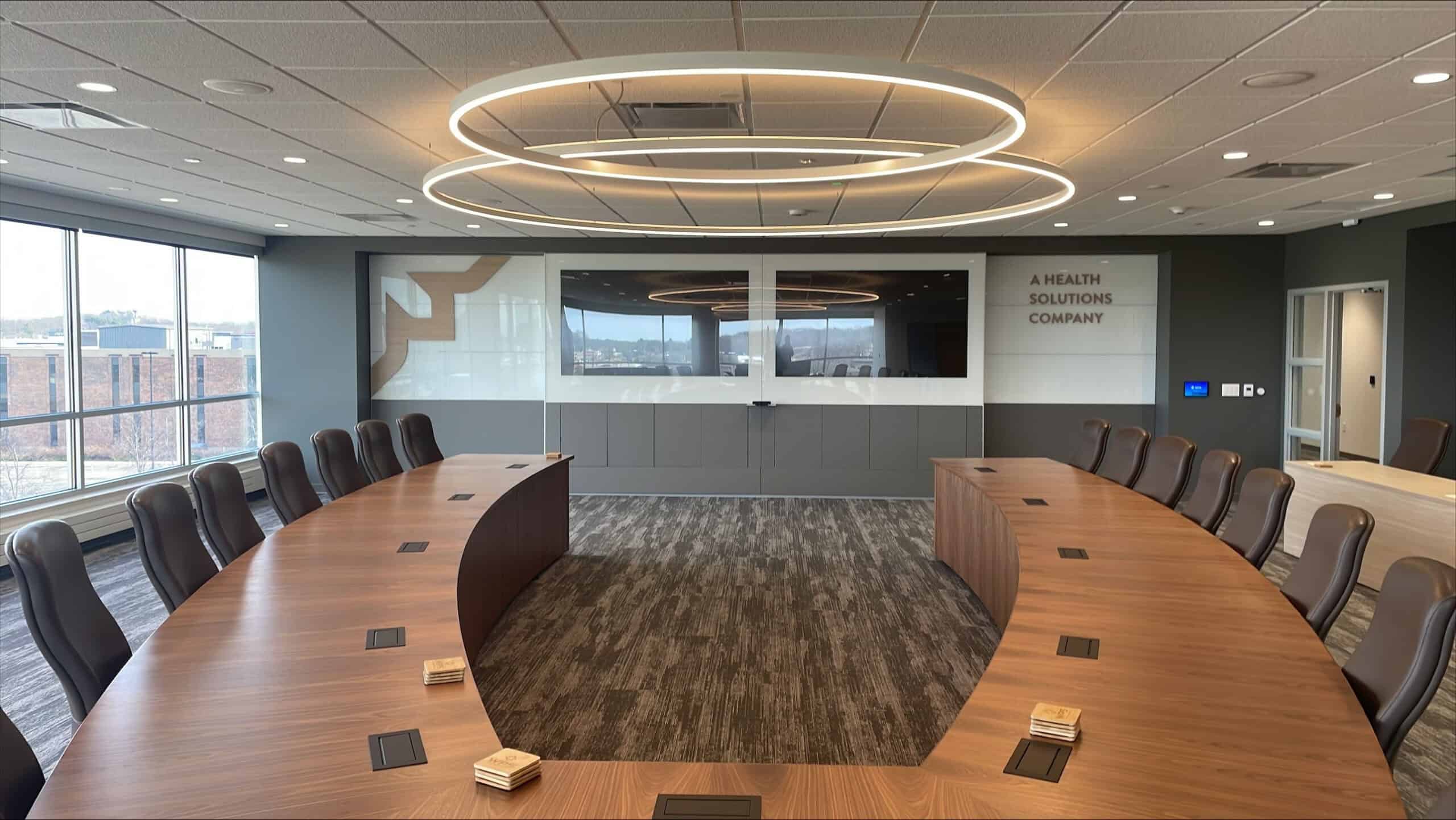
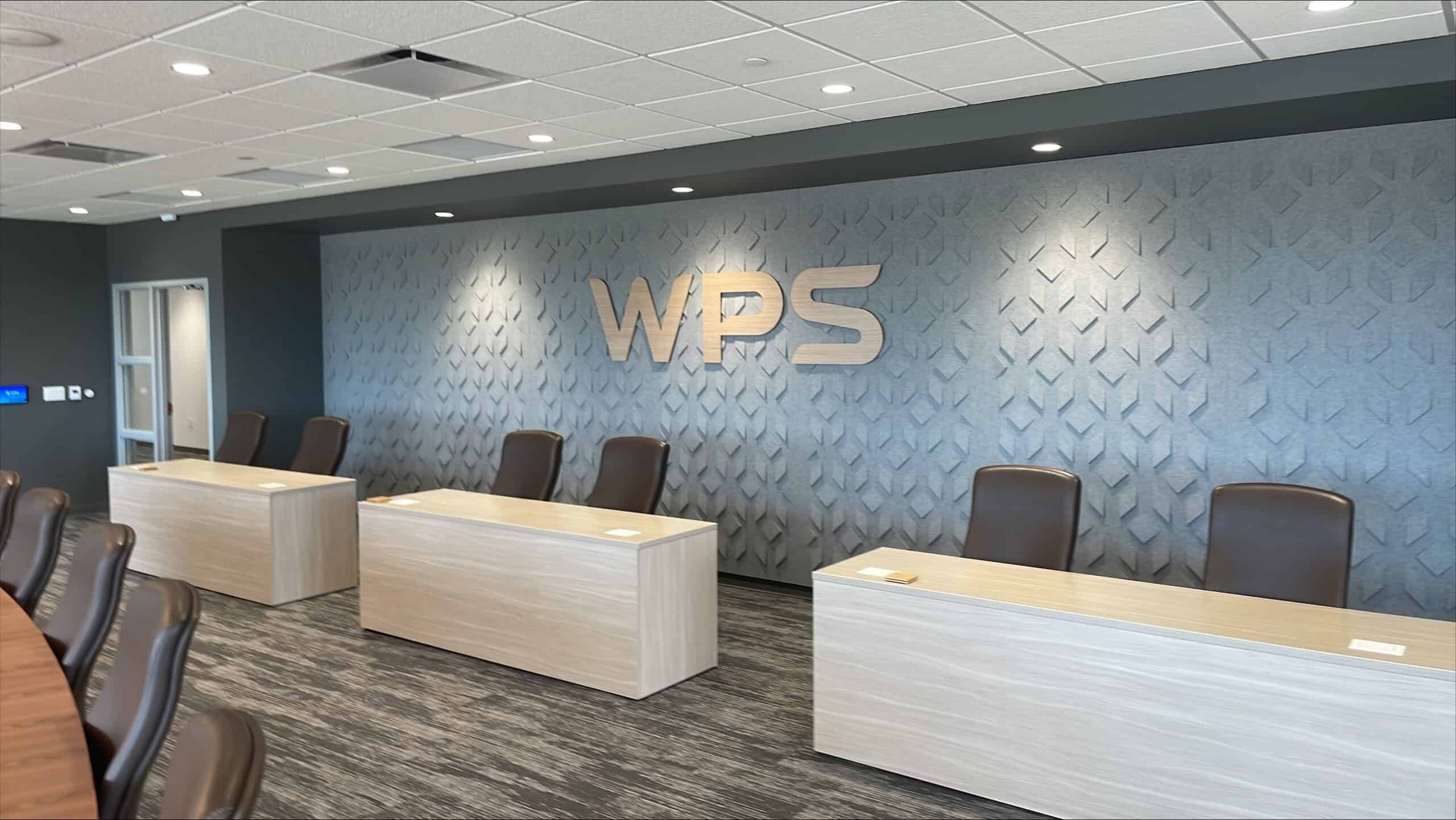
Thysse partnered with WPS across two phases of experiential branding, environmental graphics, and wayfinding design, transforming a newly launched brand into a cohesive workplace experience. The project included lobby and reception branding, elevator-corridor and IT wayfinding, executive and conference environments, privacy graphics, dimensional architectural features, and a preserved-moss installation—all delivered alongside an active headquarters renovation.
This case study follows both phases of the project: a high-speed Phase 1 rollout built around a two-month deadline and a Phase 2 expansion that extended the brand's visual language throughout the facility as the renovation and workplace needs continued to evolve.

WPS approached Thysse after completing a comprehensive rebrand of their visual identity. The next step? Bring that new identity to life throughout their then-under-renovation 170,000-square-foot Madison headquarters.
In the discovery phase of large projects, we ask clients about priorities so we can tailor our approach accordingly. Sometimes the answers are broad. Sometimes they're predictable.
WPS was refreshingly direct.
Speed.
They wanted visible progress before January 1—roughly two months away.
That timeline would have been aggressive under any circumstances. Layer in an active renovation, a newly launched brand, evolving workplace needs, and a design language that was still finding its footing, and the challenge became much bigger than simply putting graphics on walls.
The question wasn't whether the work could be done.
The question was how to do it well.
One of the biggest misconceptions about experiential branding is that the work begins when something goes into production.
In reality, production is the easy part.
Before a graphic is printed, a sign is fabricated, or a wall is installed, designers are studying architectural plans, evaluating mounting surfaces, selecting materials, reviewing code requirements, developing concepts, building prototypes, and gathering feedback from stakeholders.
The timeline compressed all of those activities into a remarkably short window.
To make things even more interesting, the newly developed WPS identity presented opportunities that extended beyond what the brand standards guide explicitly allowed.
The logo mark naturally lent itself to abstract patterning, texture, and environmental applications—but exploring those possibilities required conversations, experimentation, and approvals.
In other words, exactly the things that take time.
To their credit, the WPS team met the moment with quick decisions, thoughtful feedback, and a willingness to keep the project moving.
"Intentional, deeply impactful brand experiences are the result of a process that takes research, concept development, experimentation, analysis, and rounds of client feedback before anything is ready to produce, let alone install."
- Kris Marconnet, Senior Experiential Designer at Thysse
One of the earliest decisions proved to be one of the most important.
Rather than treat the headquarters as a single massive project, Thysse proposed a phased approach that aligned branding efforts with the broader renovation schedule.
Phase 1 focused on the spaces that mattered most immediately—areas employees and visitors would encounter first and areas where visible progress could have the greatest impact.
That approach kept conversations relevant, approvals moving, and priorities clear.
Just as importantly, it created a strong foundation for everything that would follow.
Phase 1 concentrated on high-traffic, high-visibility environments where brand and function intersect:
The goals were straightforward:
Create a strong first impression.
Improve functionality.
Establish a visual language that could expand throughout the rest of the building.
Like many newly launched brands, WPS was still defining how its identity should behave in the real world.
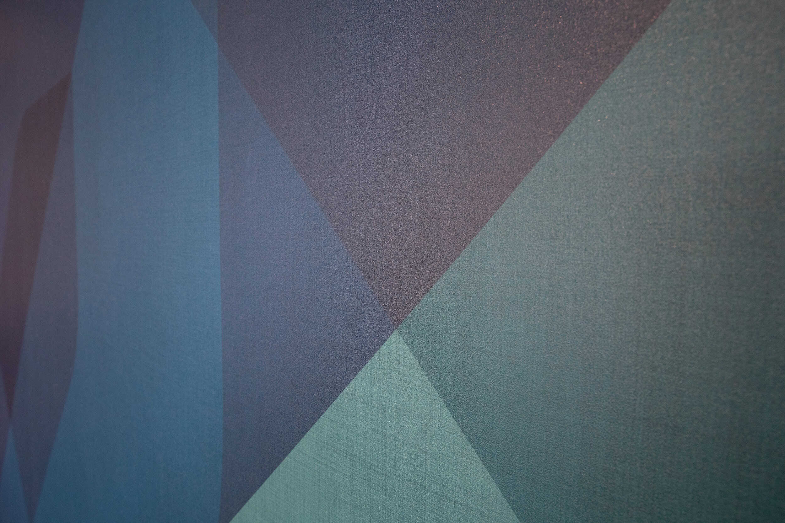
Guideline amendments allowed narrowly defined logo crops, which opened the door to something more interesting than simply placing logos on walls.
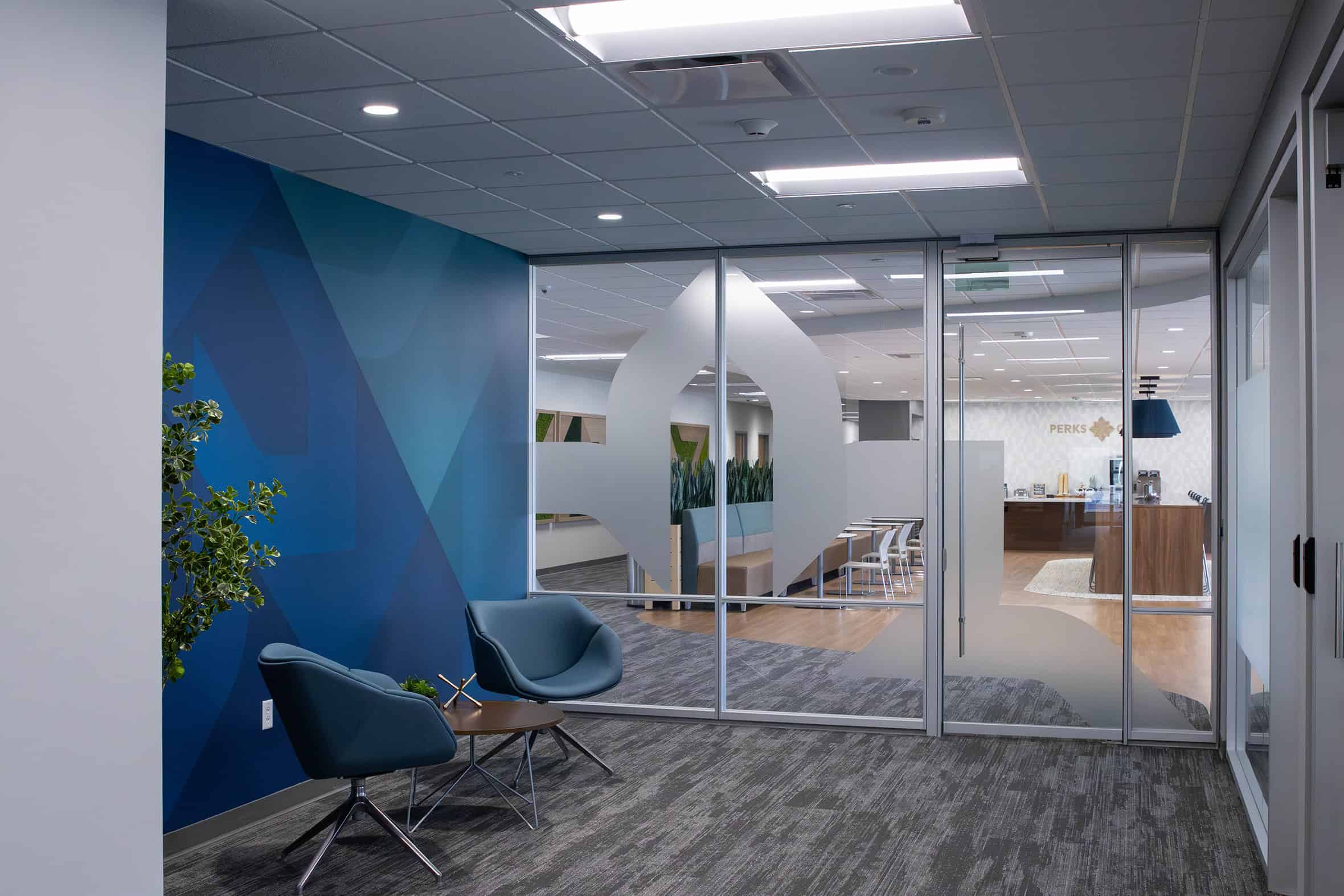
The team translated the WPS mark into a faceted geometric language that feels distinctly WPS without repeating the logo itself.
The result is subtle, modern, and brand-forward without becoming overwhelming—a visual system capable of carrying the identity throughout the headquarters without feeling repetitive.
That design language would eventually become the foundation for many of the ideas explored further in Phase 2.
The timeline demanded efficiency, but efficiency didn't mean cutting corners.
It meant finding smarter solutions.
The lobby offered one of the best examples.
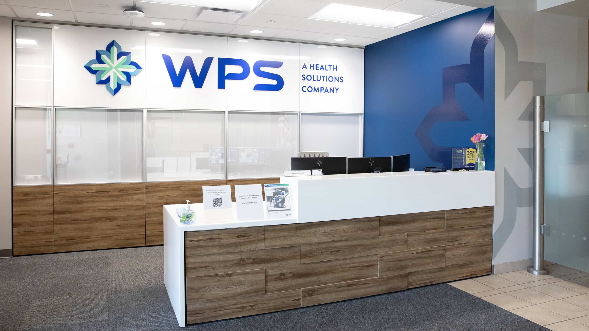
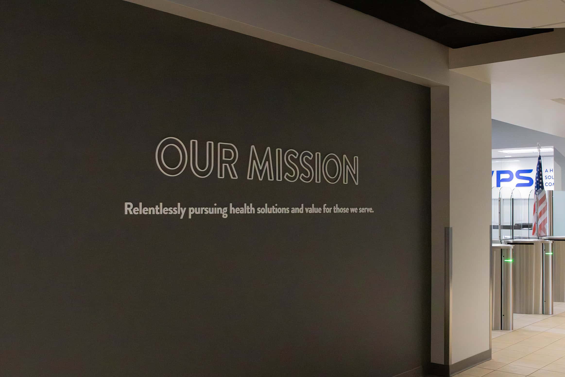
Rather than removing and replacing existing back-printed glass containing the previous logo, the team applied gloss-white opaque vinyl to mask the old identity and introduced dimensional lettering for the new brand.
The solution delivered a stronger visual result, reduced costs, shortened the schedule, and avoided unnecessary demolition.
It's also a bit of a time capsule.
Someday, during some future renovation, someone may discover the old logo still hiding behind the new one.
For touchdown offices, WPS's gradient language was translated into painted color bands executed by the facilities team—simple, scalable, and cost-effective.
Not every branding element needs to be expensive to be effective.
One of the recurring themes throughout Phase 1 was balancing aesthetics with functionality.
Take privacy graphics.
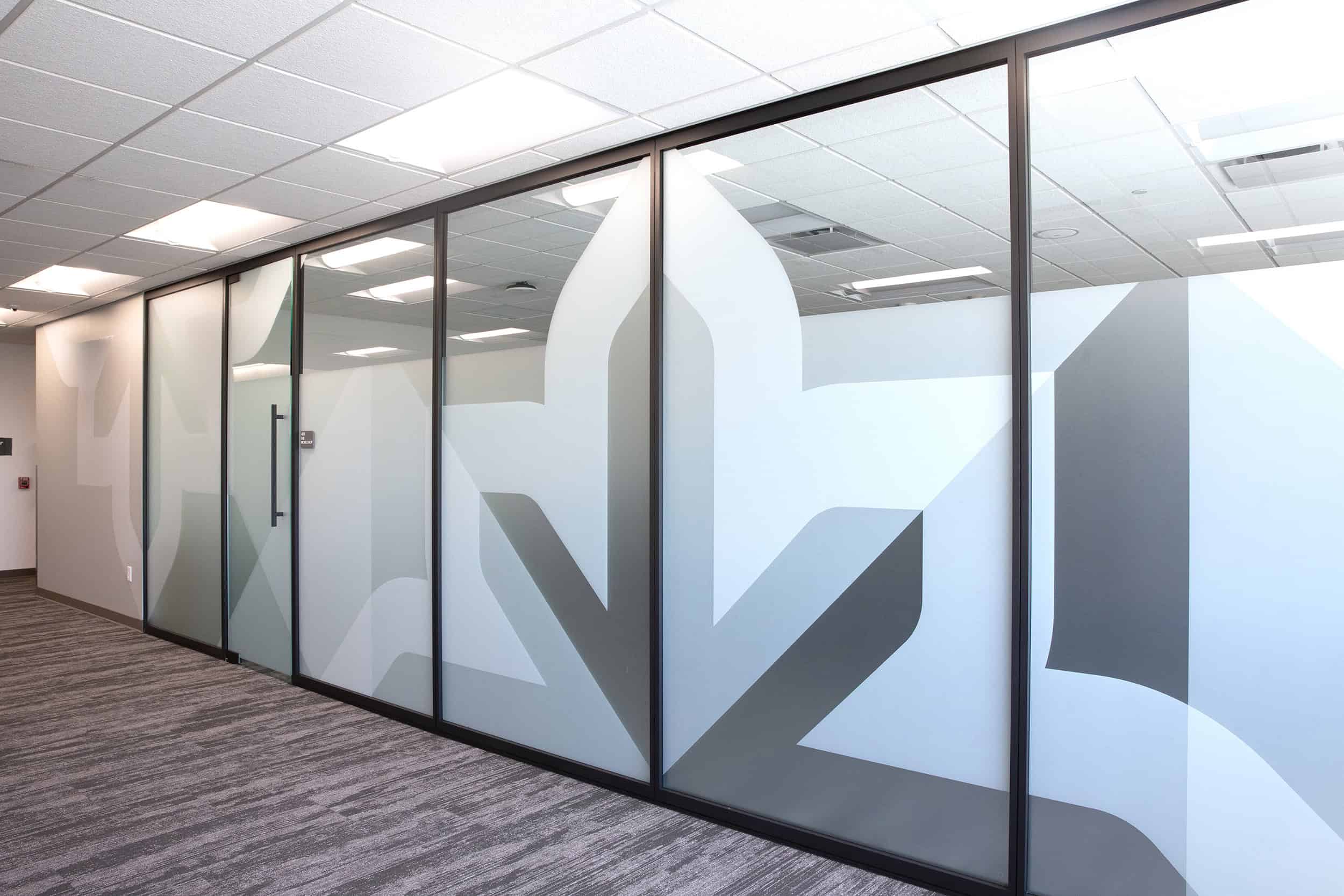
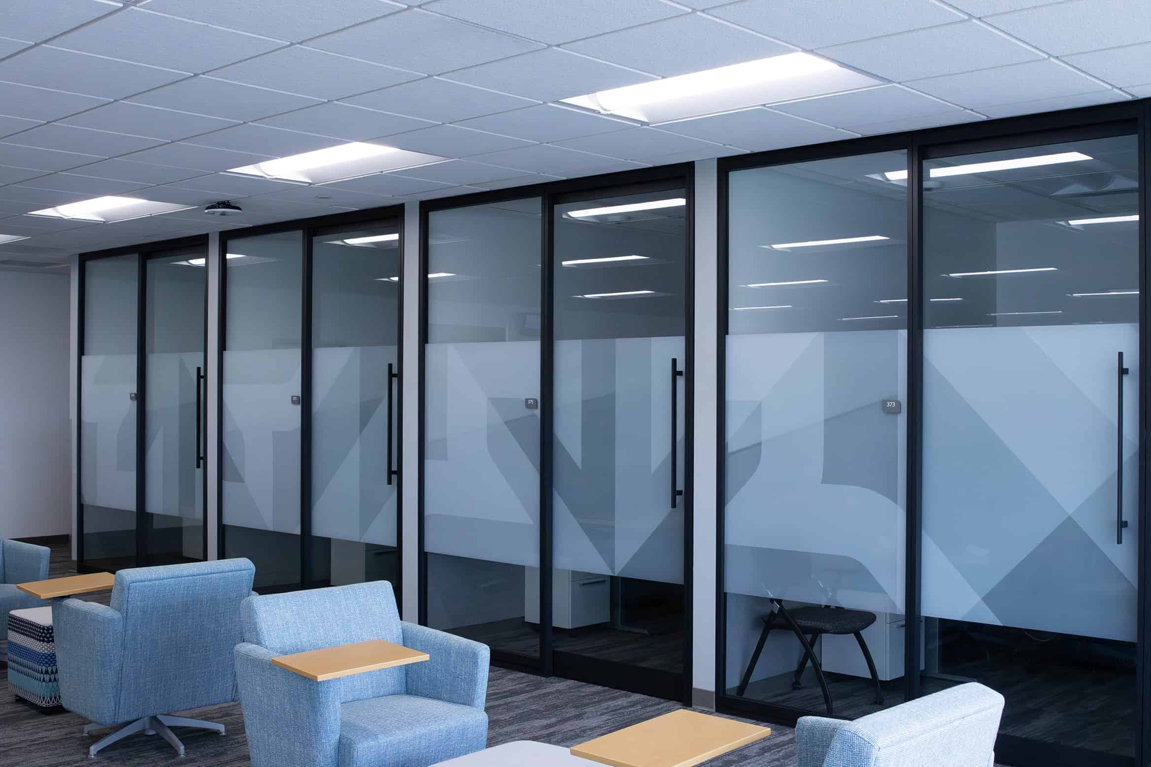
Traditional frosted film provided privacy, but in some environments it blocked too much visibility. People couldn't tell whether rooms were occupied, which often led to interruptions.
The solution was optically clear film printed with calibrated white densities.
Sensitive content remained protected while allowing passersby to understand whether a room was in use.
The same thinking influenced the elevator corridors.
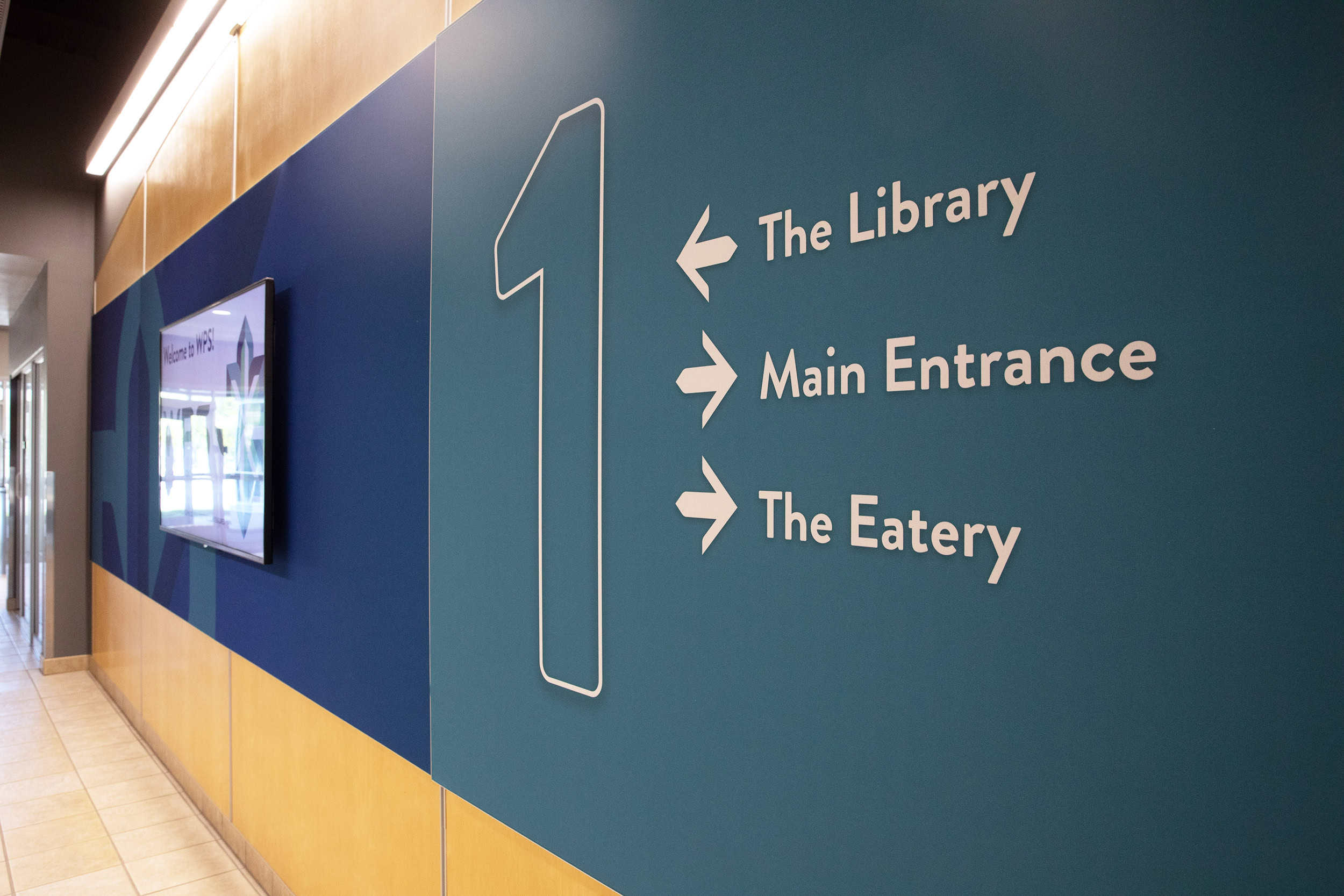
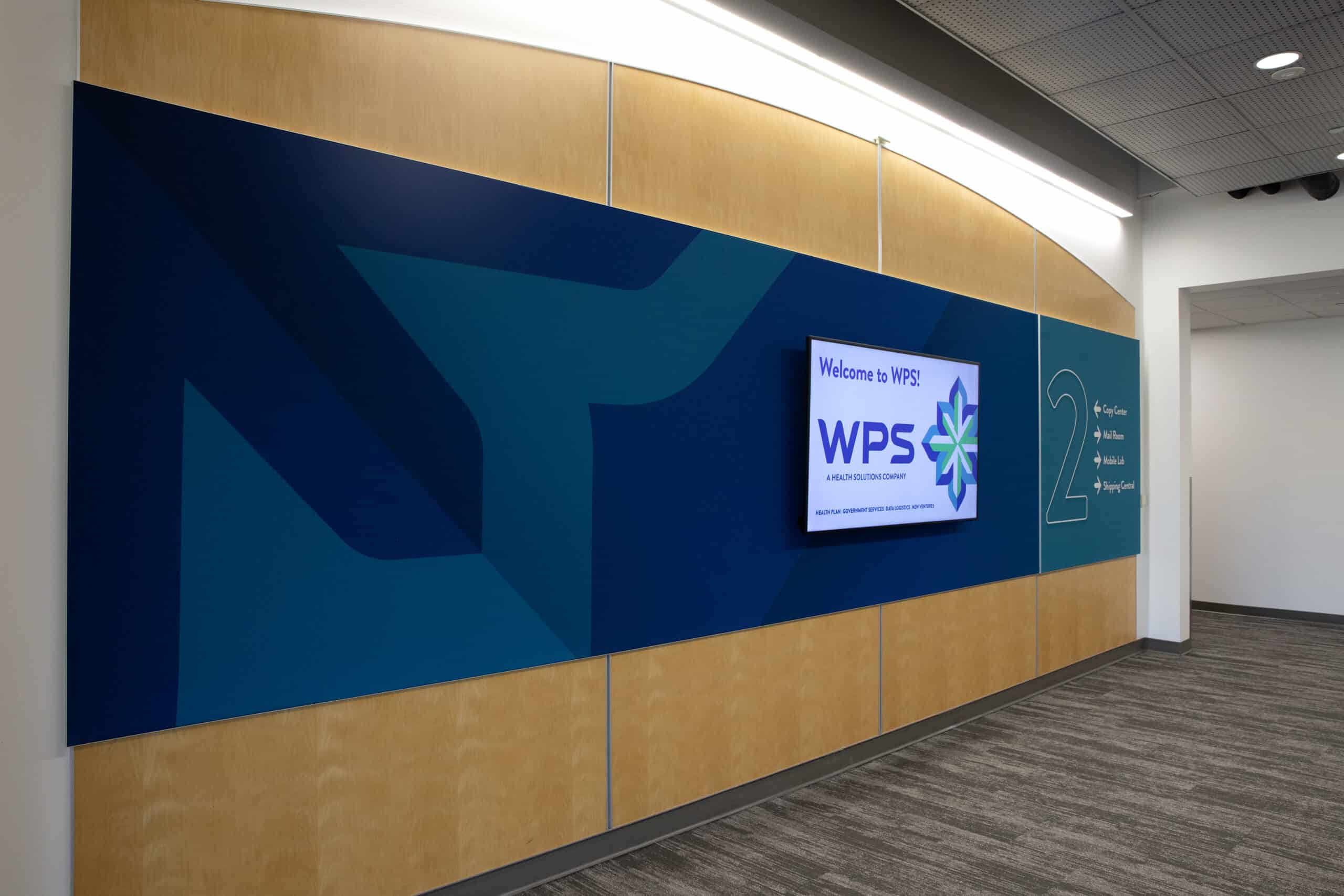
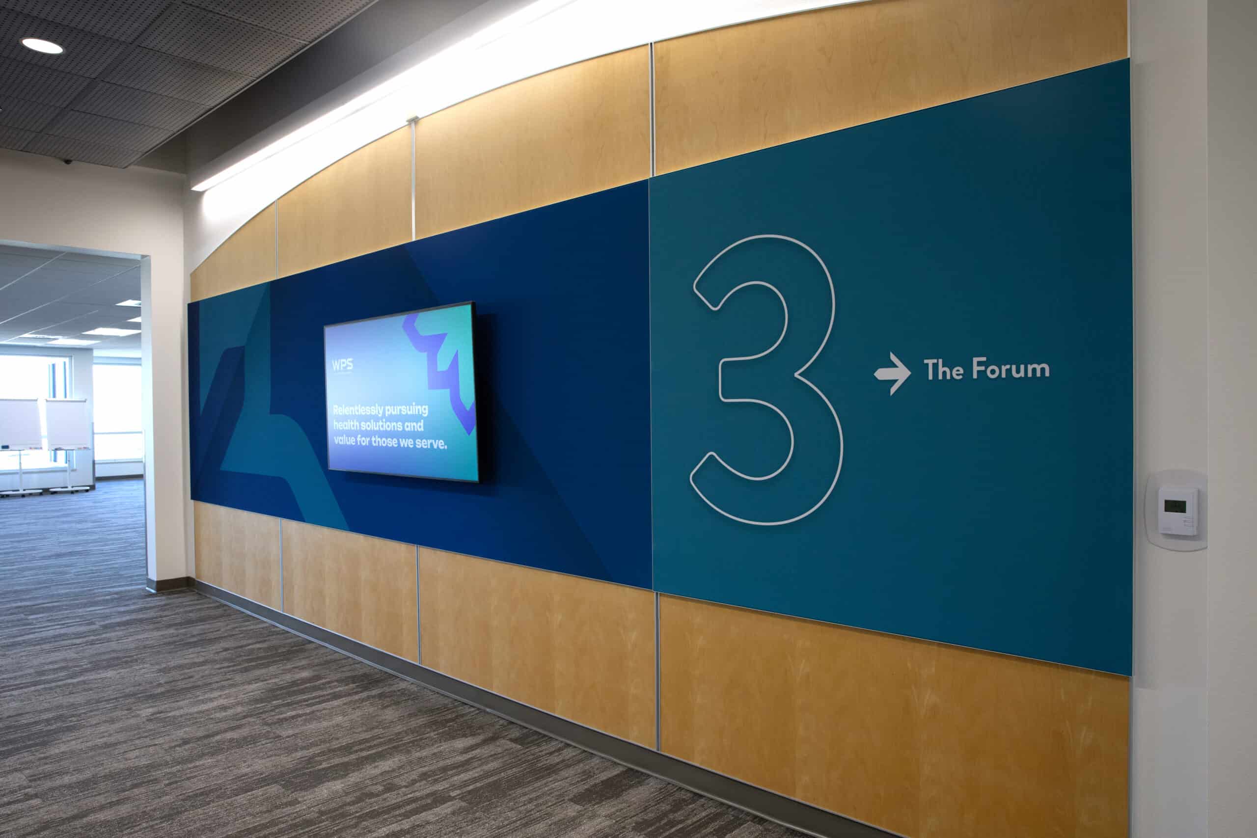
Digital displays already carried important information, so the surrounding environmental graphics were intentionally restrained. Subtle geometry reinforced the brand without competing for attention. It's one of those details people rarely notice consciously. They simply experience the space as feeling right.
Phase 1 delivered exactly what it set out to accomplish—visible progress, strong first impressions and functional improvements.
And perhaps most importantly, a visual language capable of growing with the building.
Many of the ideas introduced here—the faceted geometric forms, privacy systems, material strategies, and flexible branding language—would eventually evolve into the larger, more ambitious installations that defined Phase 2.
The brand had arrived. Now it was time to see how far it could go.
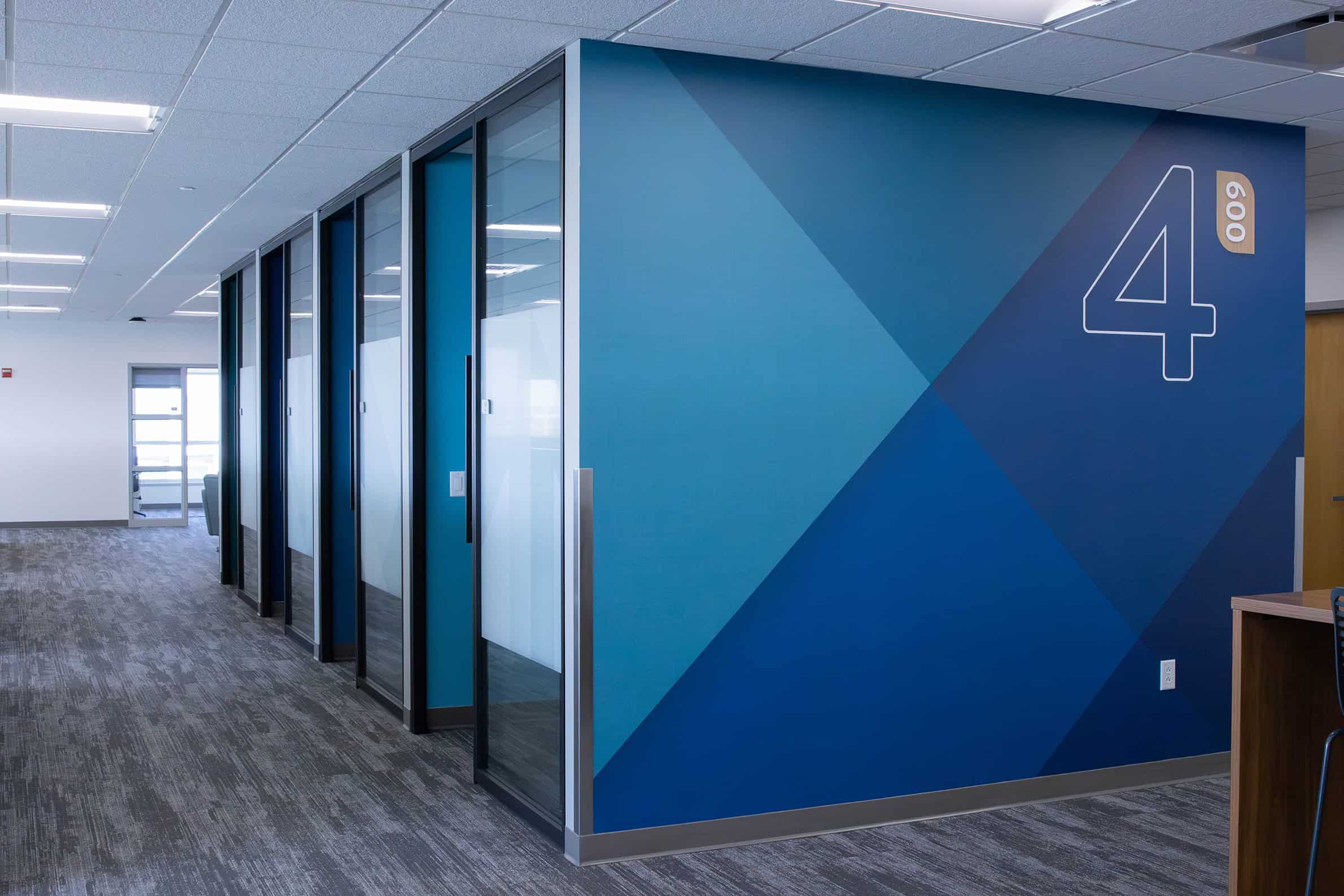
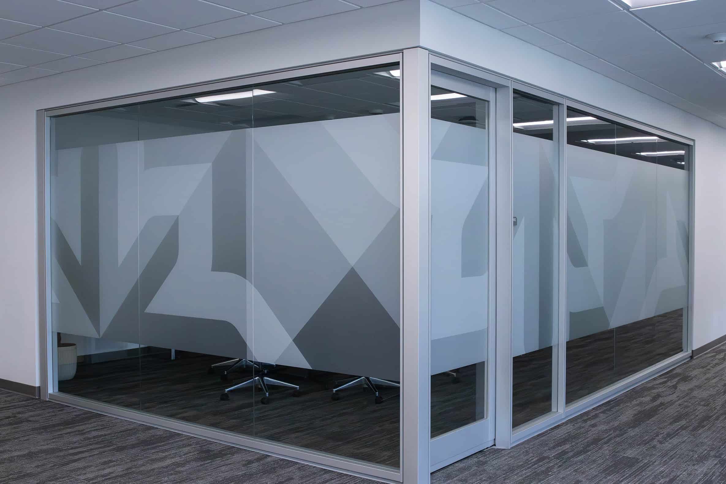
When we closed the Phase 1 story, we left a short list of what was coming: Workshop privacy refinements, trapezoid elevator frames, a preserved-moss feature, layered wood art for Perks Café, and wayfinding built for the way WPS actually works. Phase 2 delivered all of it—and more.
Phase 1 established the foundation for the new WPS headquarters and translated a newly launched brand into a physical environment for the first time. Phase 2 focused on spaces that were still evolving as the renovation progressed, which gave both WPS and Thysse room to build on the visual language from Phase 1 and explore how the identity could expand throughout the rest of the building. And perhaps most importantly, it gave everyone a chance to get comfortable with the brand itself.
WPS came to us so early in the life of their new identity that some of the rules were still being written. A lot of the conversations across both phases were about how the logo could “behave”.
Repetition with variation is baked into the WPS identity. The gradient. The facets. A logo that wants to be rebuilt rather than simply repeated.
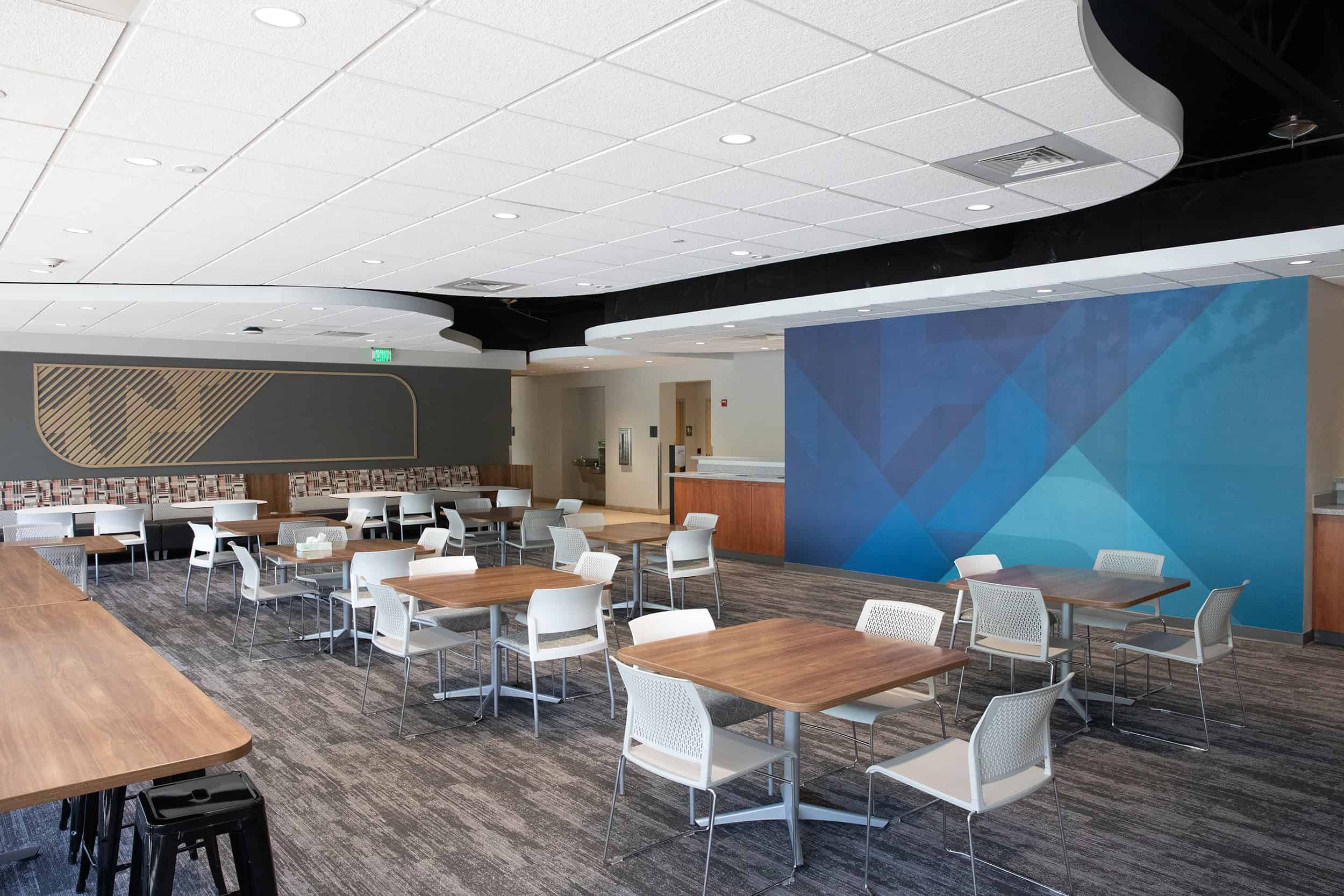
Phase 2 gave us the chance to expand the material vocabulary of the brand—to find out how many surfaces could carry the same idea without any two of them feeling alike.
Glass. Vinyl. Paint. Frosted film. Optically clear film. Laminate. Acrylic. Preserved moss.
Each application reads as WPS in its own way, and none of them rely on placing the logo on a wall and calling it finished. The result is a workplace that feels cohesive without feeling repetitive.
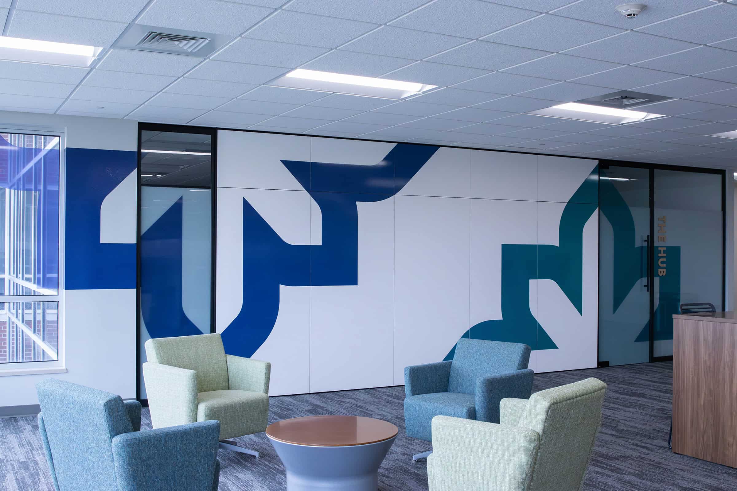
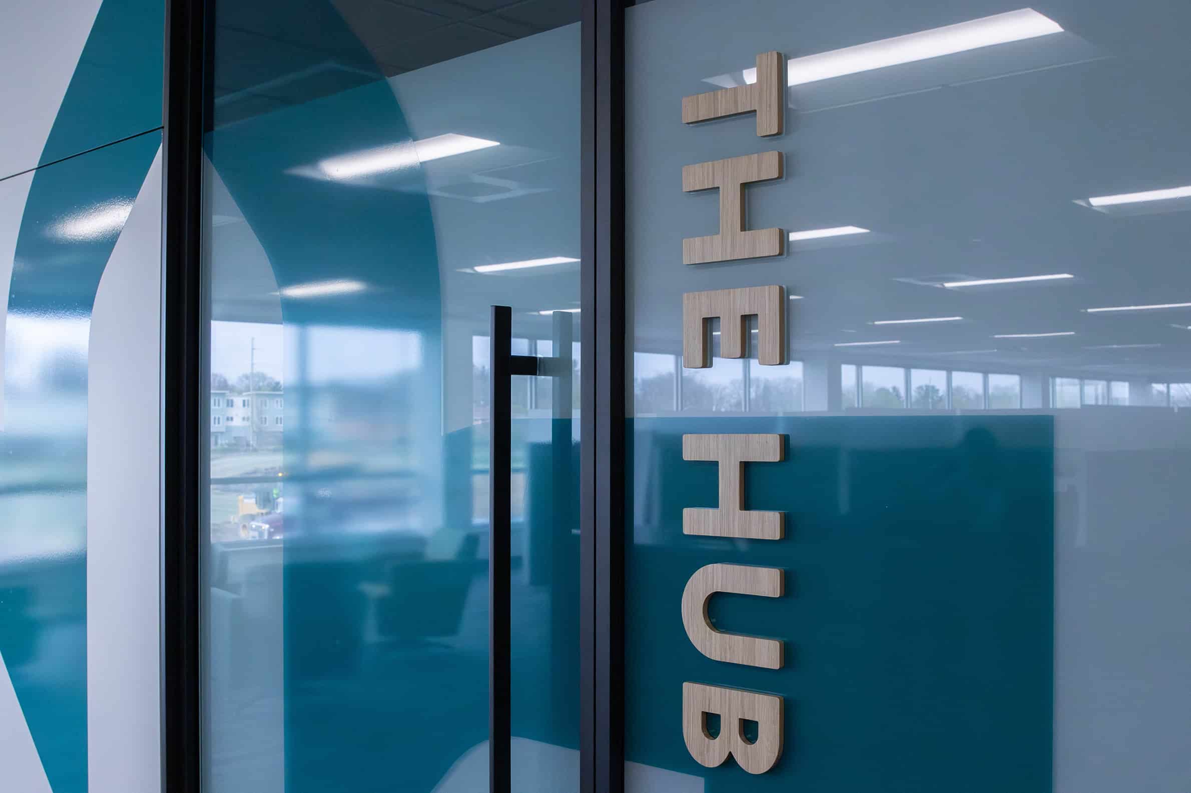
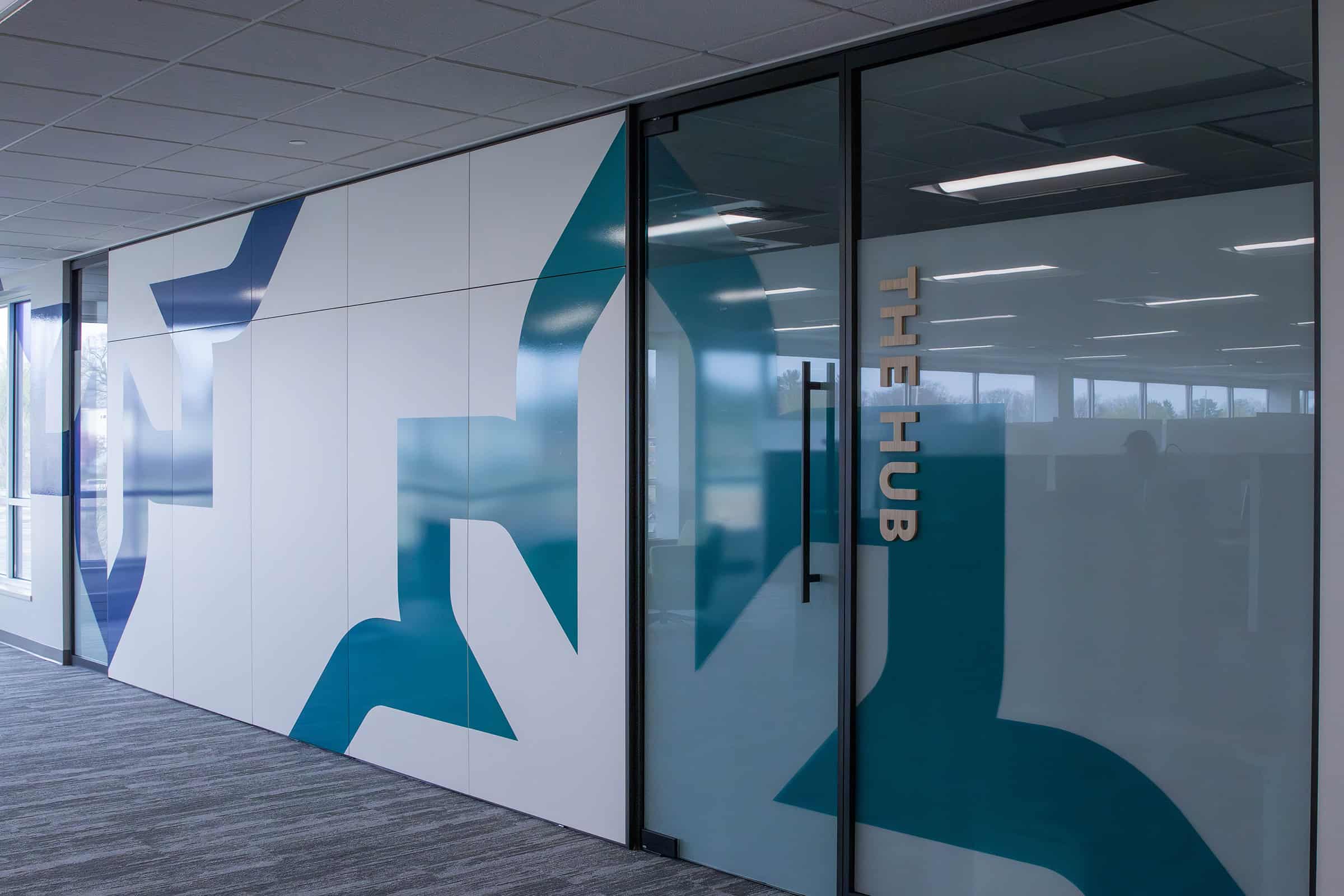
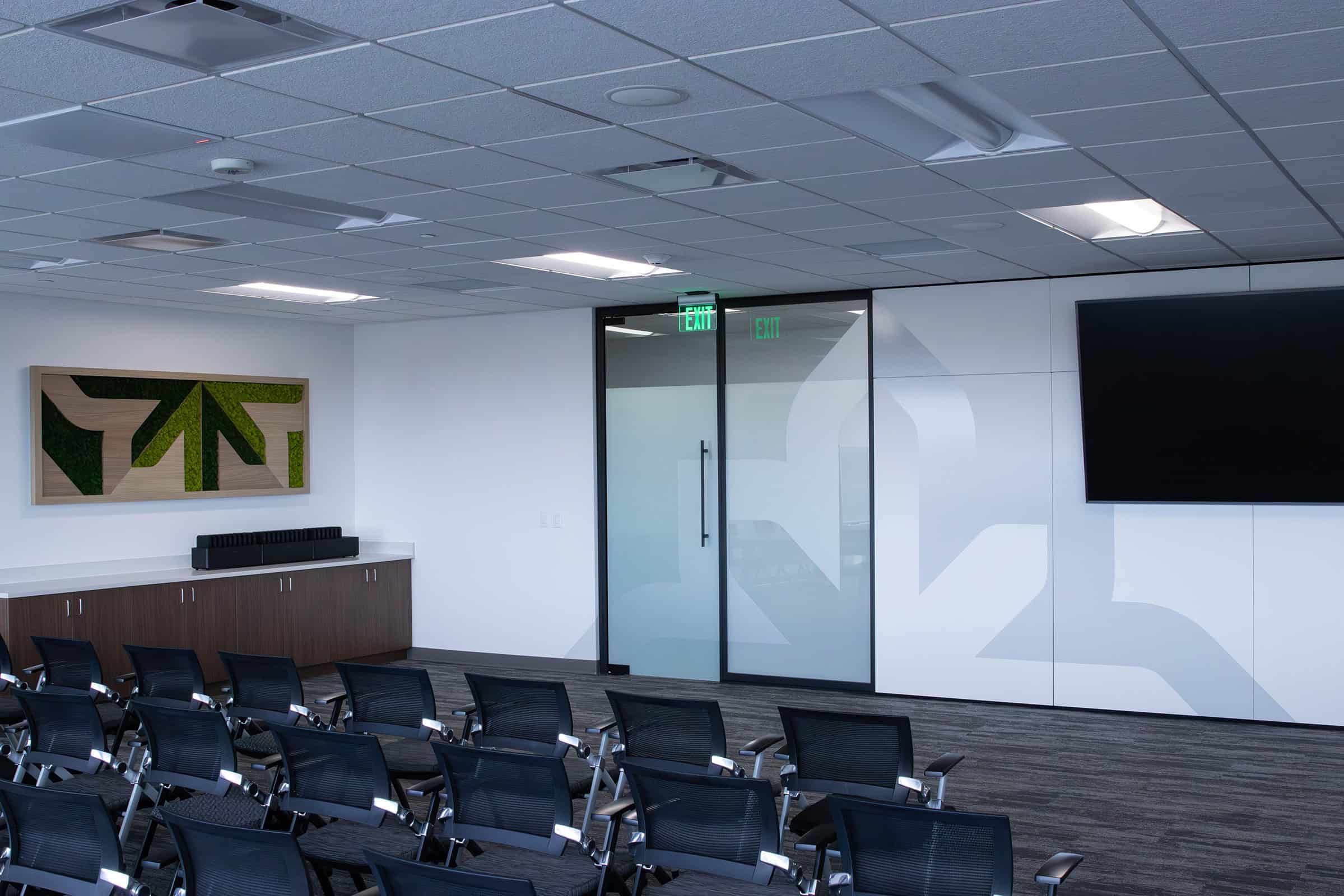
One of the most ambitious installations in Phase 2 lives inside The Hub, a new conference space built from modular DIRTT architectural wall systems—solid panels, sidelights, and glazed sections that can be reconfigured or relocated as the floor plan evolves.
The branding doesn't stay politely on the glass. It crosses the door, continues onto adjacent drywall, wraps a sidelight discovered late in the design process, and turns the corner through dimensional returns. Backed in white so it reads cleanly from multiple angles, a single graphic element becomes something genuinely architectural.
It's the type of installation that looks effortless once it's finished—which is a telltale sign it was probably anything but.
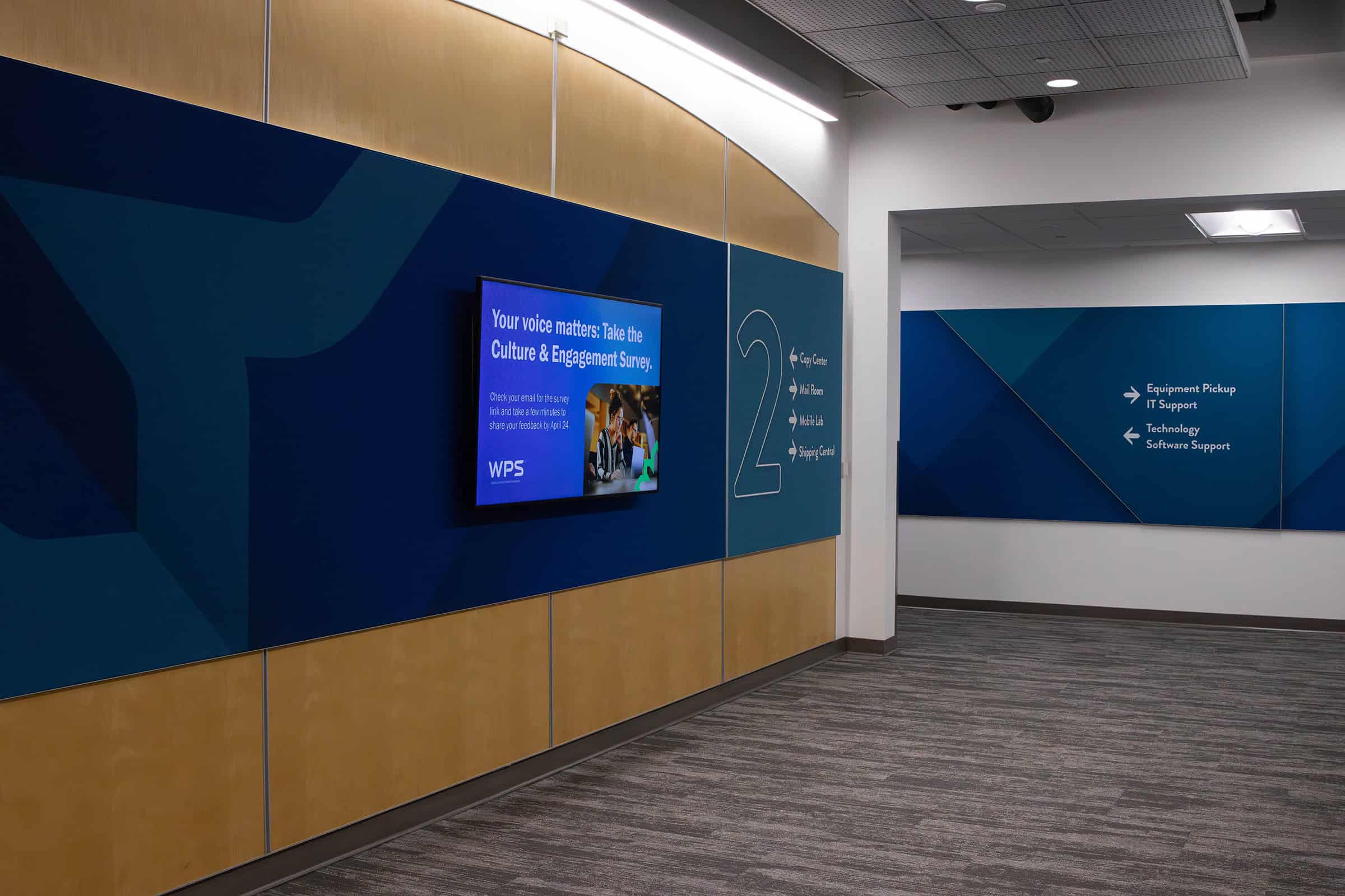
WPS runs on a hoteling model, with some employees sharing workspaces rather than occupying permanently assigned desks. That reality shaped the wayfinding strategy from the beginning: the building needed to orient people quickly while remaining easy and affordable to update over time.
Instead of hard-coding departments into signage that would eventually go stale, the system uses broad numerical zones—200s, 400s, 600s, and 800s—that tell you roughly where you're headed the moment you step off the elevator, without locking in which team lives where.
The elevator corridors and IT-support areas introduced a series of trapezoid-inspired SEG frame systems that carry the visual language forward from Phase 1. What looks like a single graphic panel is actually three frames, with the directional panel intentionally separated in the center. If an arrow changes or a department relocates, only that one panel needs to be replaced.
The IT-support corridor earns a little extra visual weight on purpose. In an open-plan office, that's where people go when they need help. It should be easier to find than the spaces around it—and it is.
And the modular approach has already proven itself. Within a couple of years of installation, an update went in exactly as intended—one midsize panel swapped instead of the overall wall-sized installation.
That's great design foresight doing its job and quietly saving resources.
Some of the most useful lessons came from a space called The Workshop.
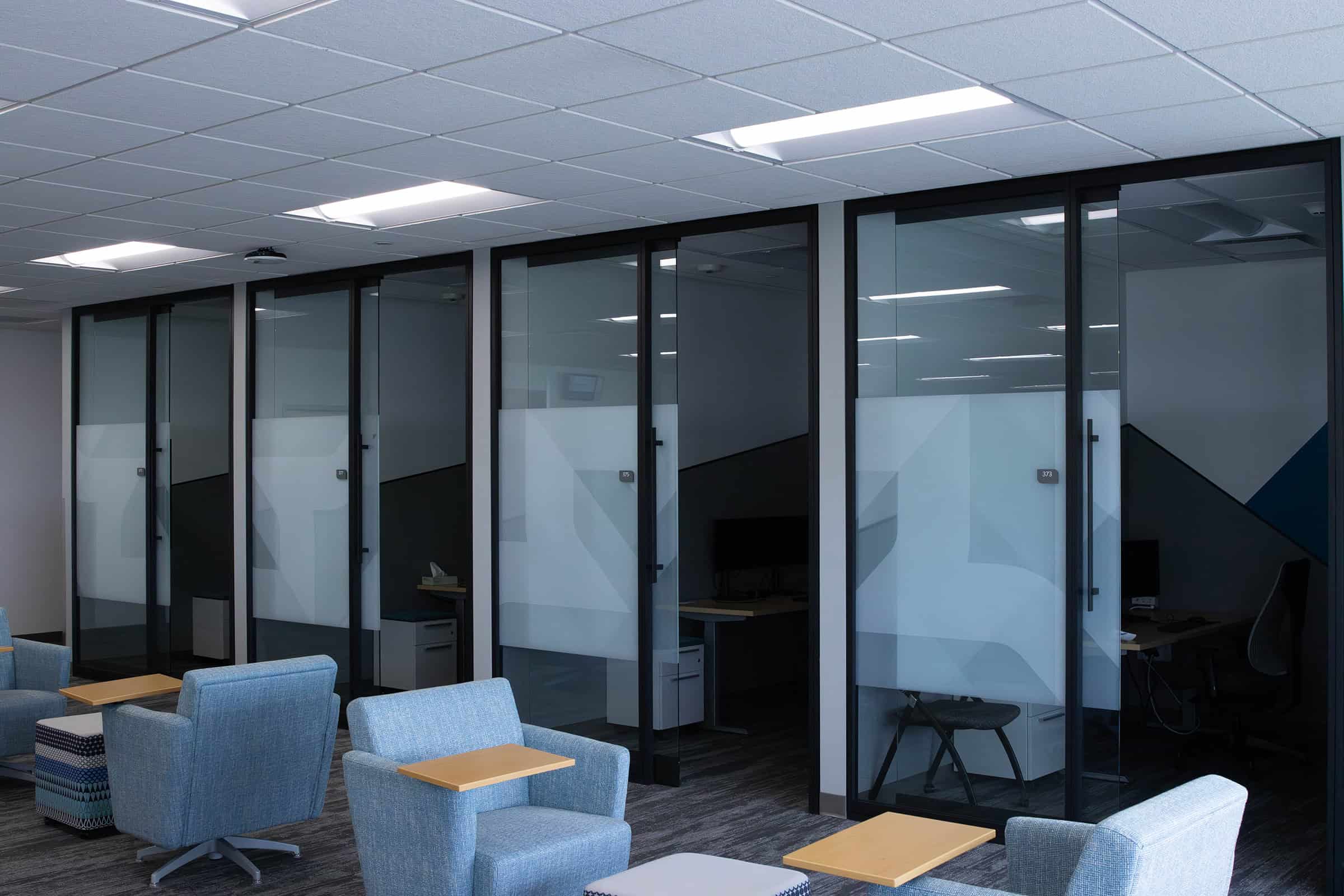
The room houses monitors and frequently displays sensitive content, so privacy mattered. The first version used frosted graphics—but it created a new problem. With nothing on the door to indicate occupancy, people couldn't tell whether the room was in use, so they'd end up peeking in.
Nobody loved that.
The fix wasn't more privacy. It was smarter privacy.
By printing calibrated white densities onto different clear films, we could obscure what's on the screens while still allowing people to sense occupancy before reaching for the handle.
The balance between the privacy you need, occupancy you can read and an "anti-claustrophobic" room experience takes expertise to get right. Exactly how we do this is a trade secret.

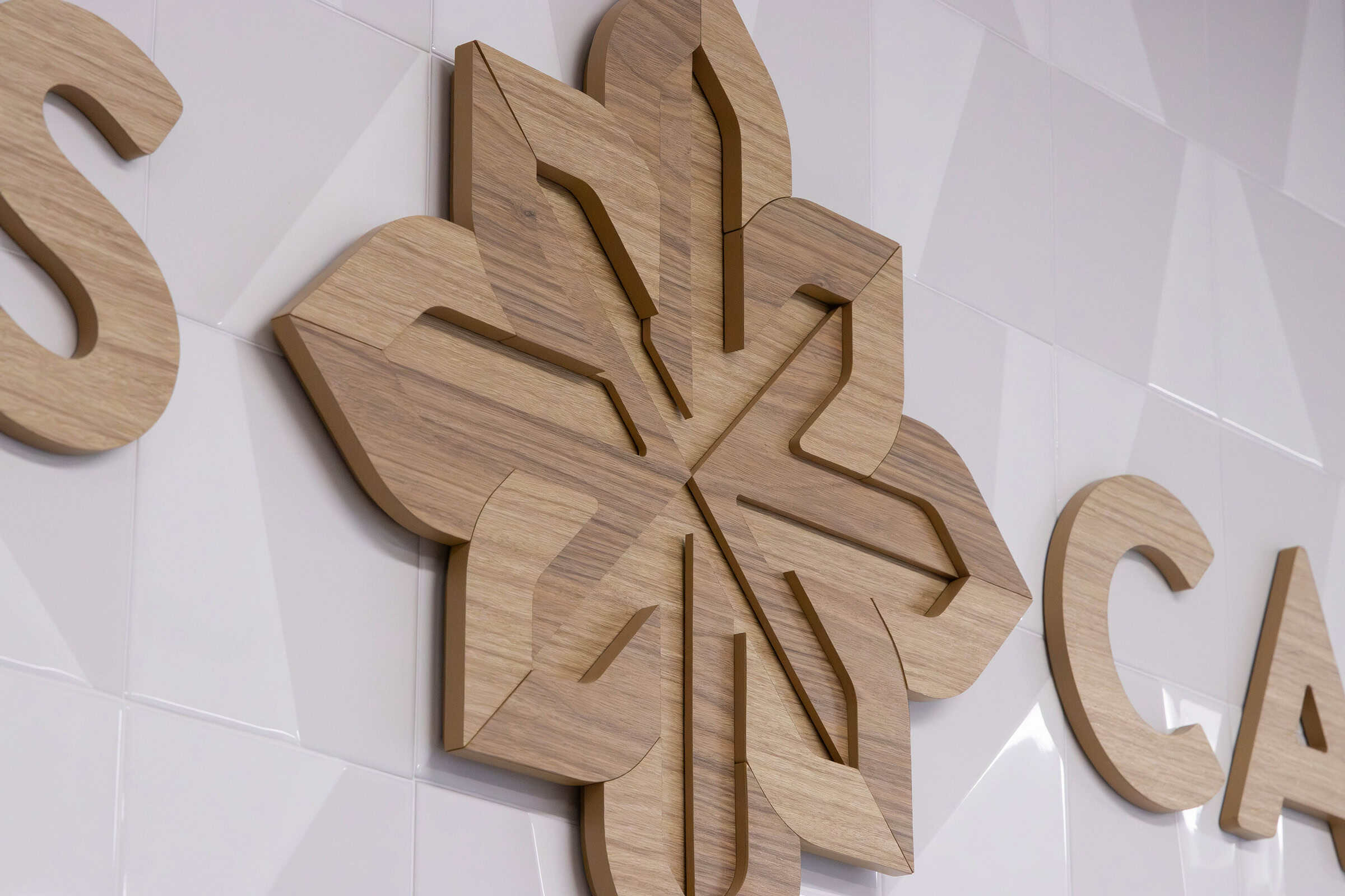
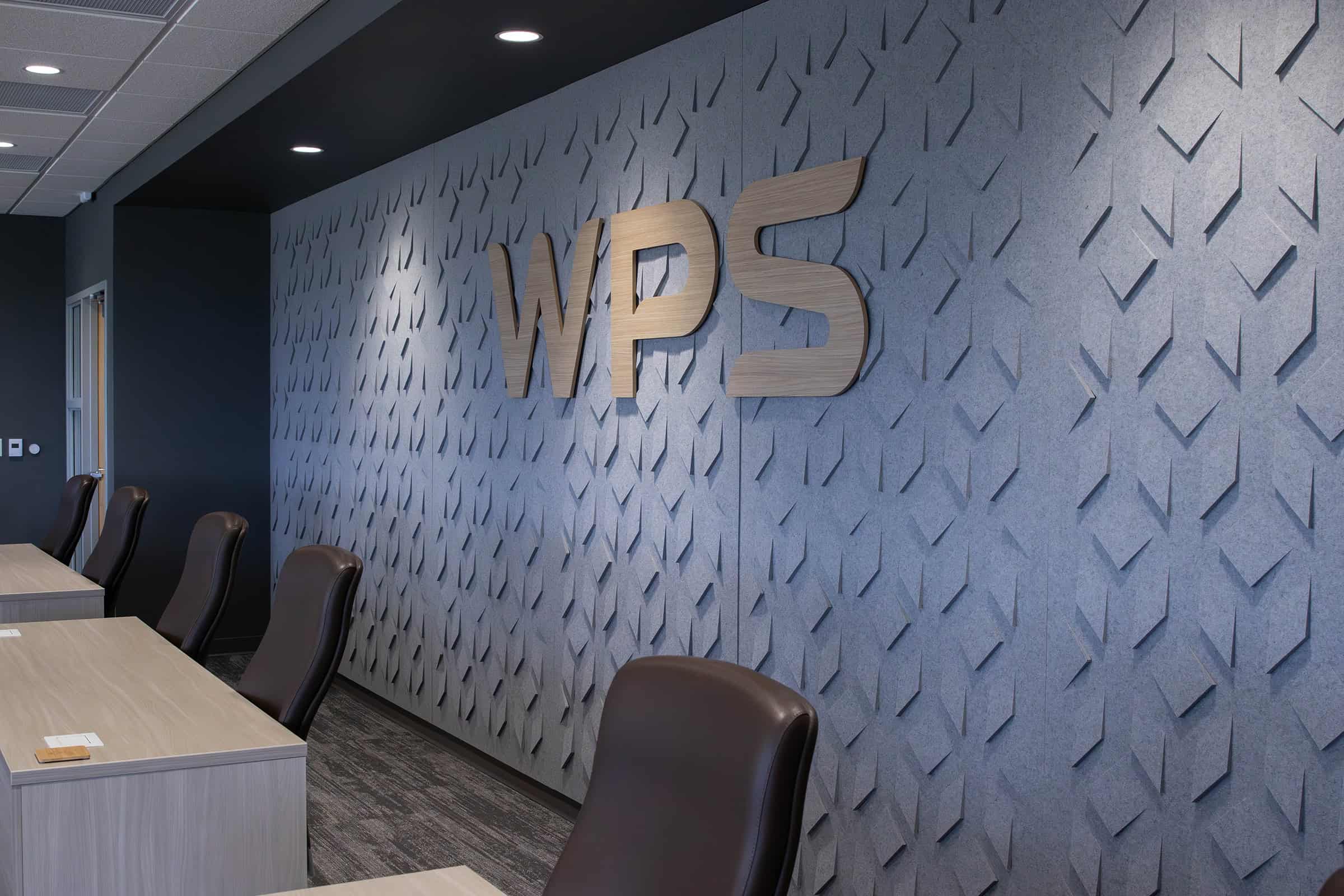
Several of the most prominent branded features introduced during Phase 2 appear to be wood.
They're not.
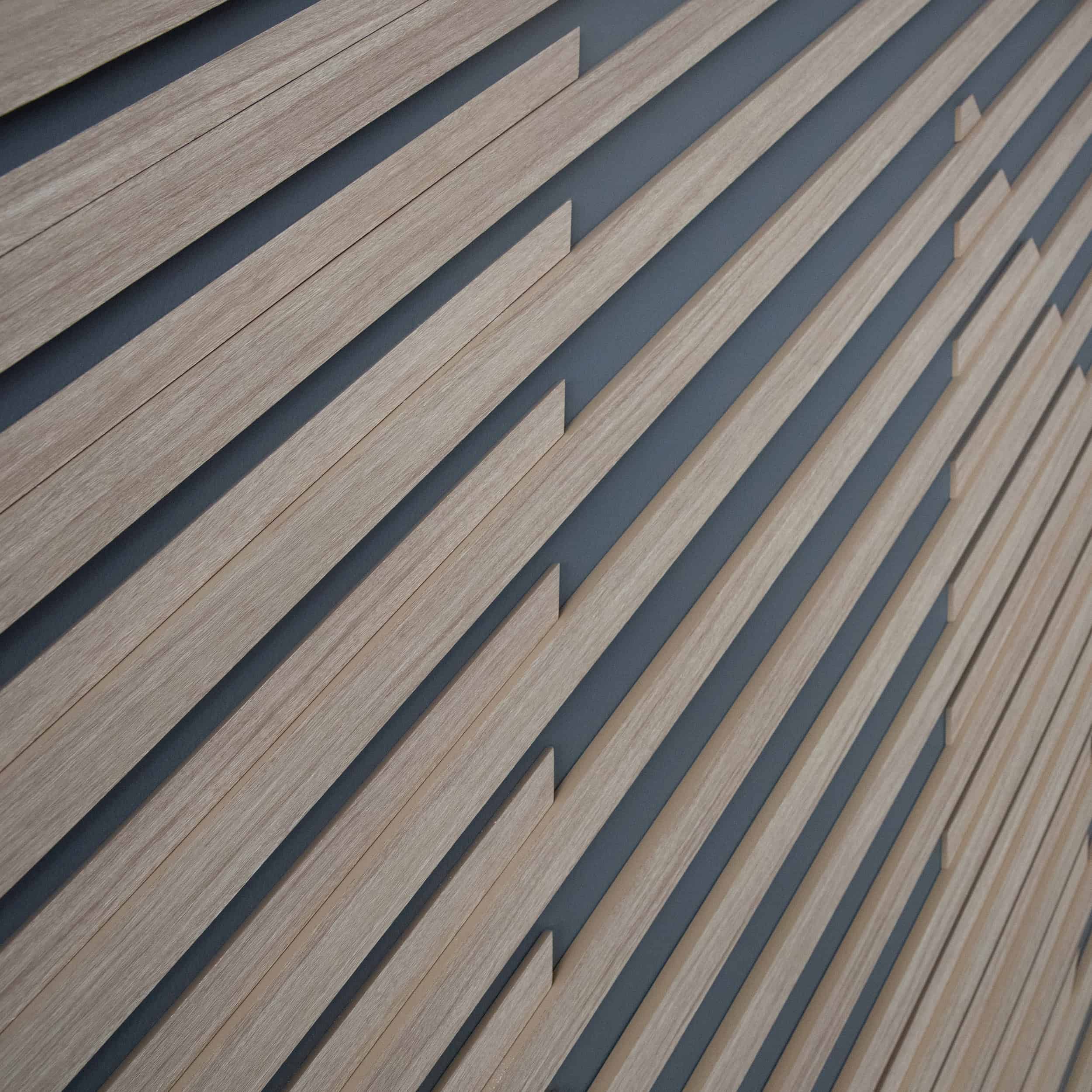
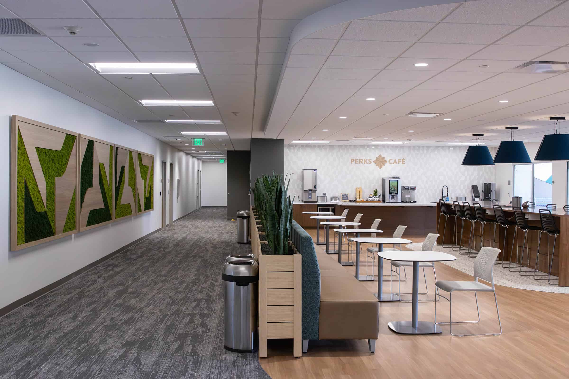
The large-scale installations in Perks Café and The Forum are constructed from laminate-faced acrylic with painted returns. The approach delivers the warmth and dimensionality of wood while offering greater stability, tighter color matching, and a more cost-effective solution at scale.
Just as importantly, it allows those pieces to feel integrated into the architecture rather than applied on top of it.
The Perks Café installation stretches more than twenty feet across the space. Most visitors will never realize it isn't wood—which is exactly the point.
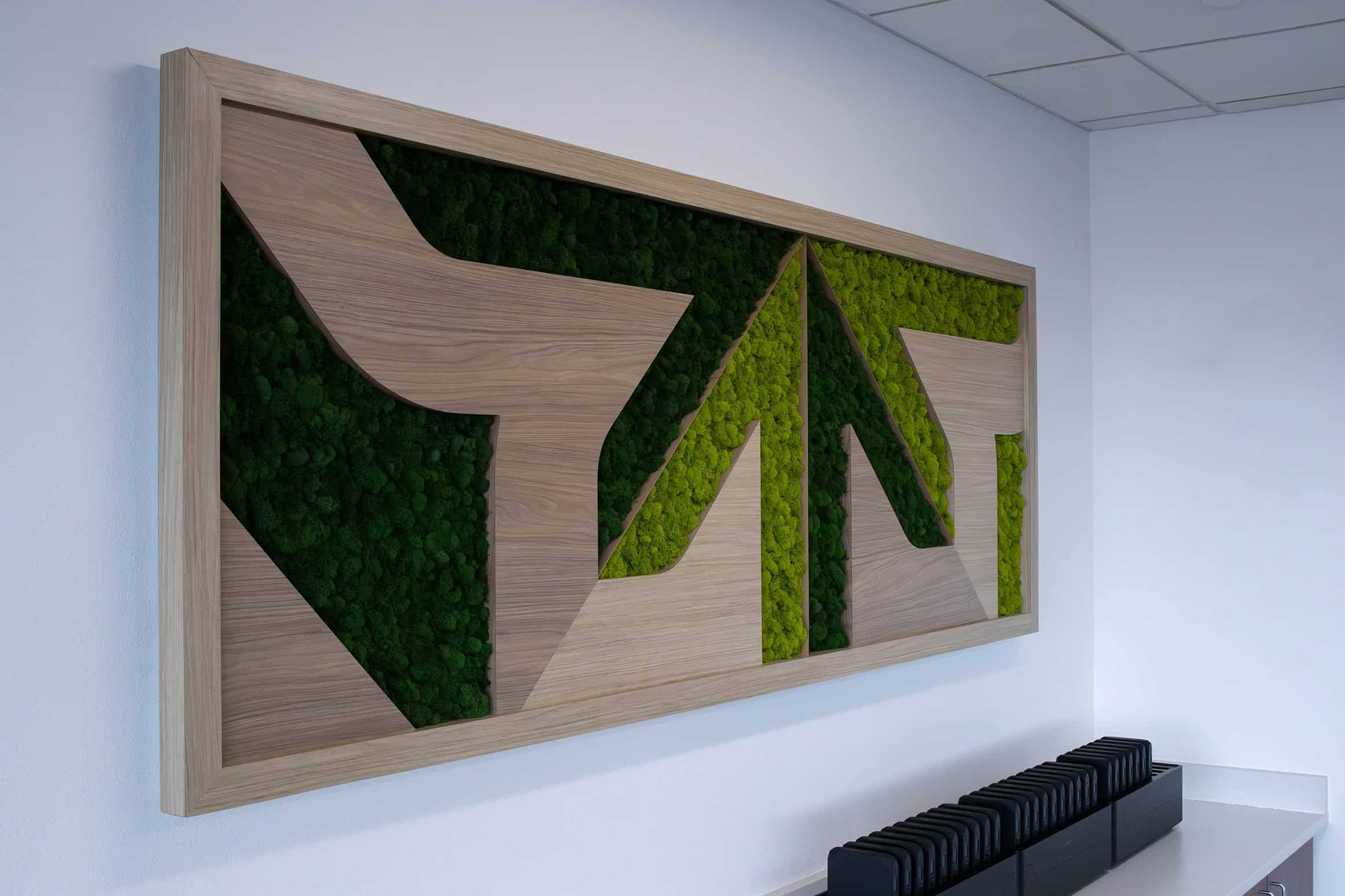
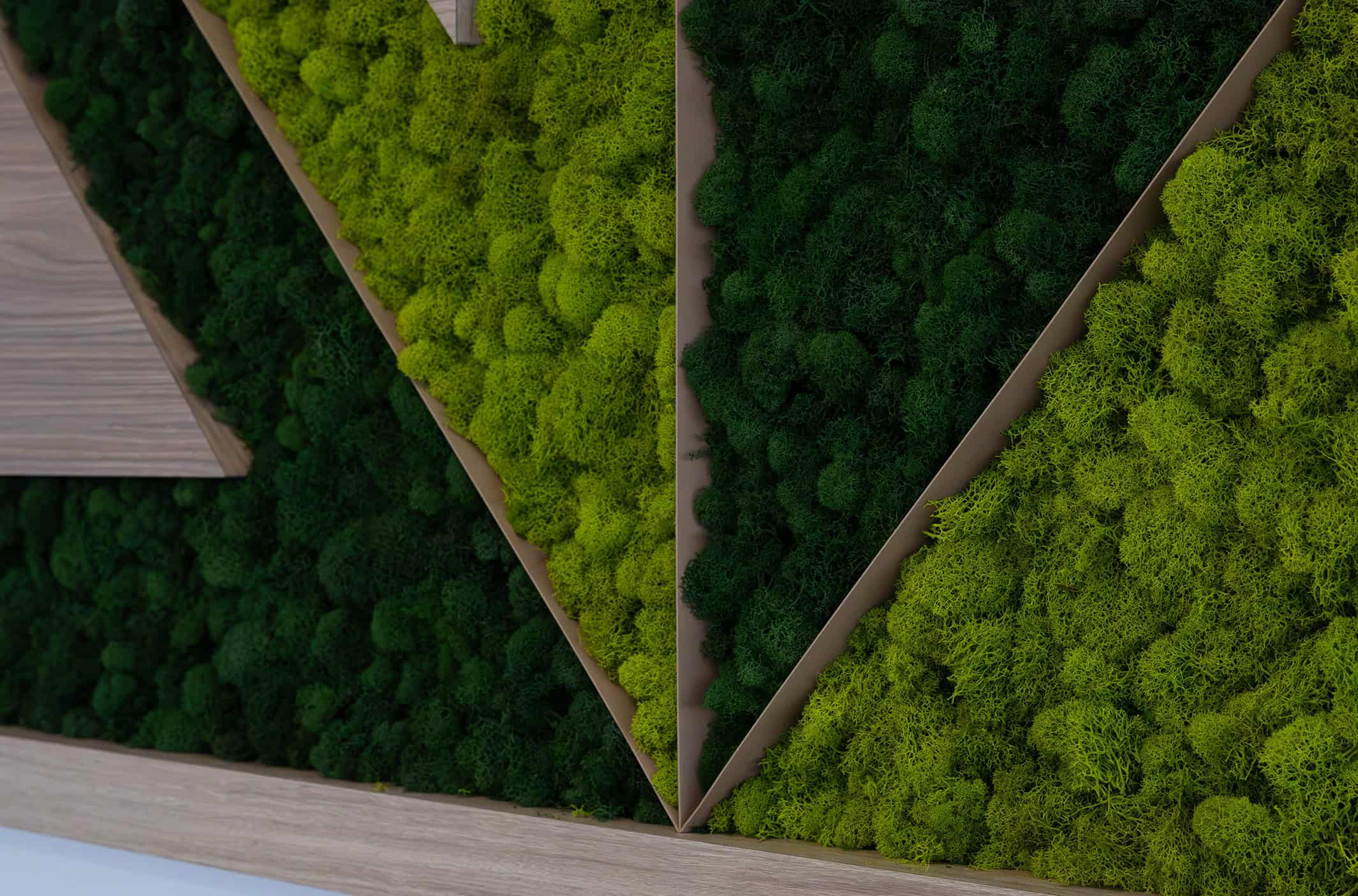
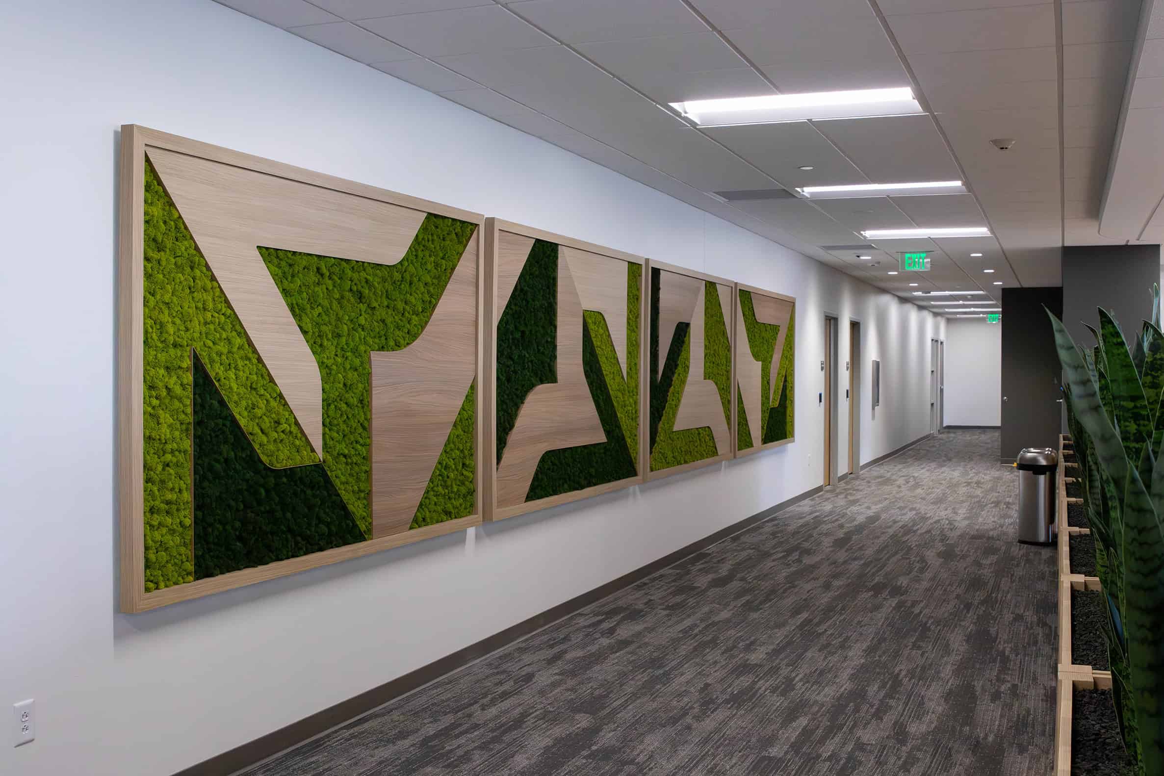
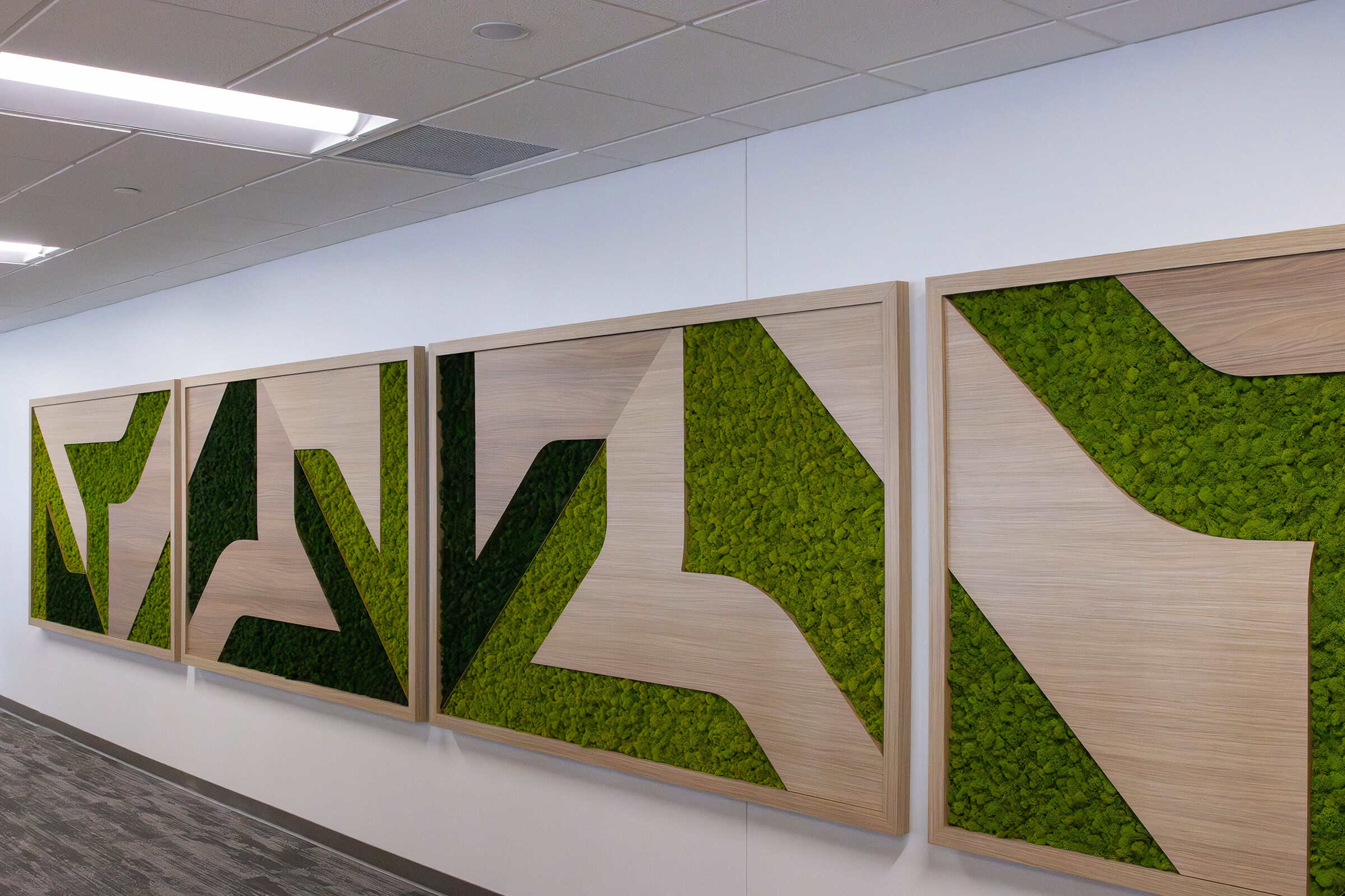
No experiential branding project is complete without at least one opportunity to bring in something natural.
For WPS, that took the form of a preserved moss feature in the executive cafeteria (technically a lichen, for the curious).
Arranged as yet another interpretation of the WPS mark, it introduces organic texture, color, and warmth without the maintenance requirements of a living wall. Think of it as the upgrade from a live plant wall: all of the green, none of the watering or decay.
One of the most rewarding parts of this project was watching the brand evolve from a newly launched identity into a lived experience.
Phase 1 established the foundation. Phase 2 expanded the vocabulary. And what began as conversations about logo usage, privacy films, and wayfinding systems became a broader exploration of how a brand can inhabit a workplace. WPS started cautiously—understandably, with a brand that new—and gradually loosened up as they saw how far the mark could flex while still feeling unmistakably WPS.
The building experience is better for it.
Today, the headquarters feels connected because every space speaks the same visual language in its own way.
Is this the finish line? Not quite. There's still one item on the wish list—a custom wood feature for the executive conference room—waiting on budget approval. If it happens, we'll update the story.
But whether that final piece comes to life or not, Phase 2 accomplished exactly what it set out to do: transform a newly launched brand into an immersive workplace experience that feels unmistakably WPS.
That's a pretty good place to land.
Same as always: no pressure, no pitch. Just a team of designers who genuinely enjoy this stuff and are happy to talk through an idea.