Menu
Menu
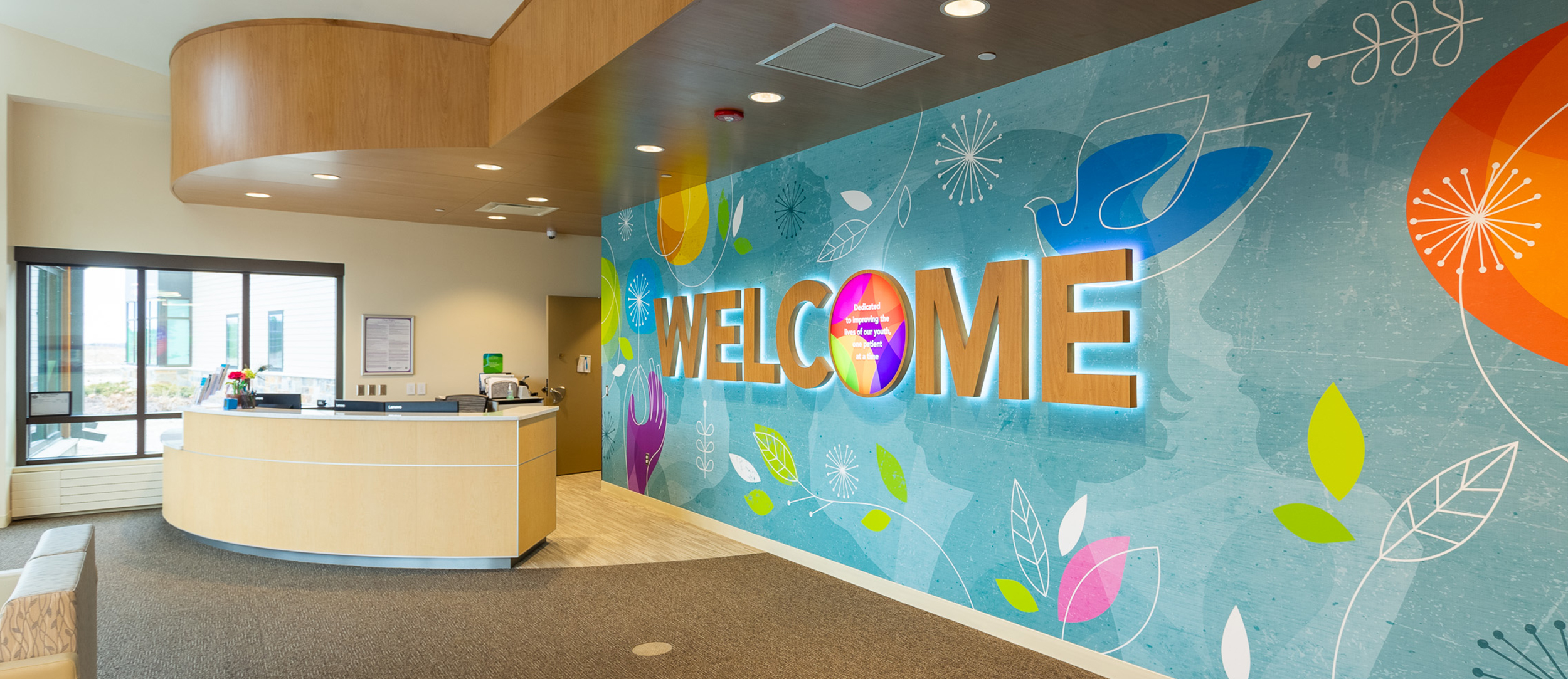

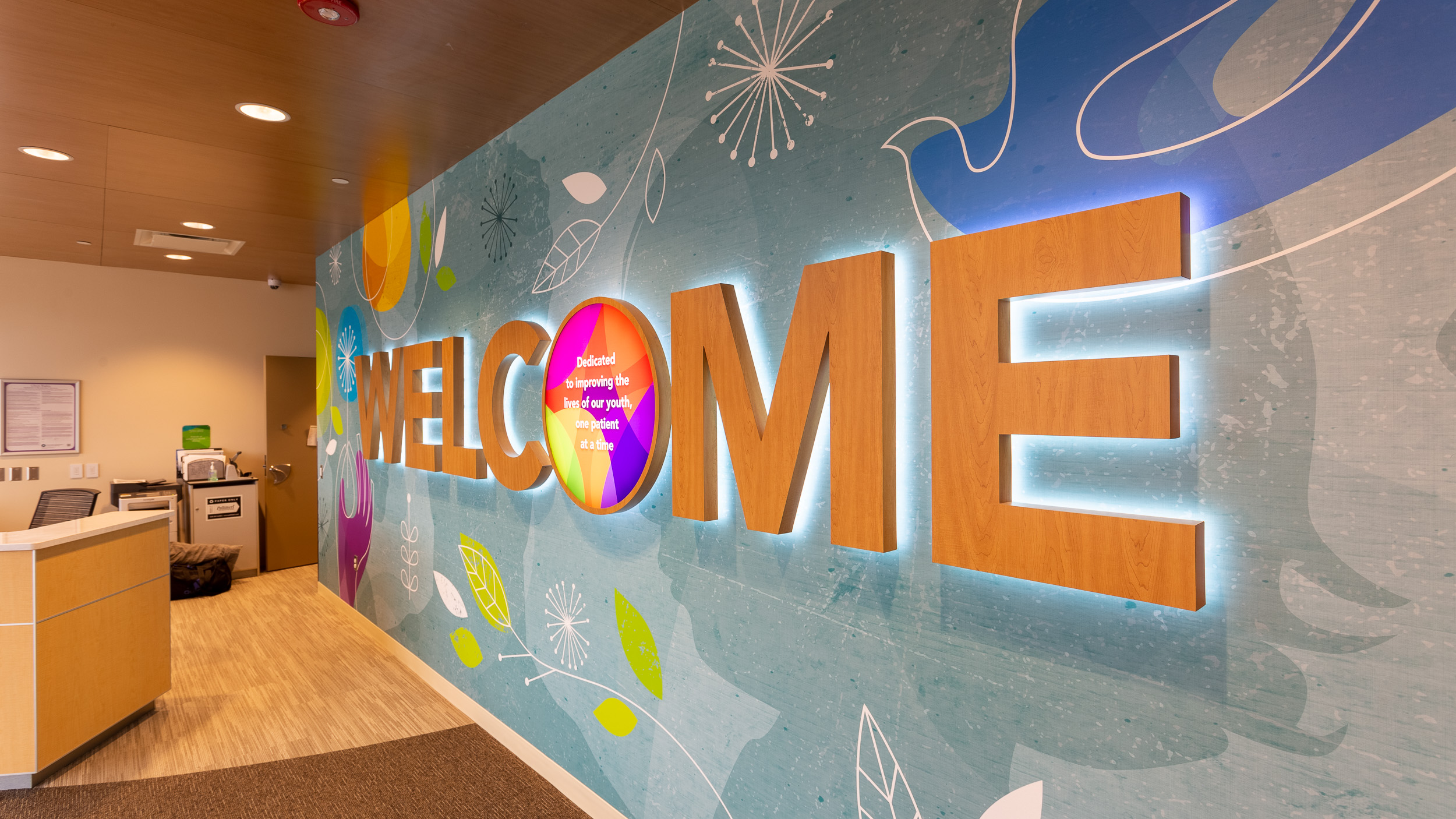
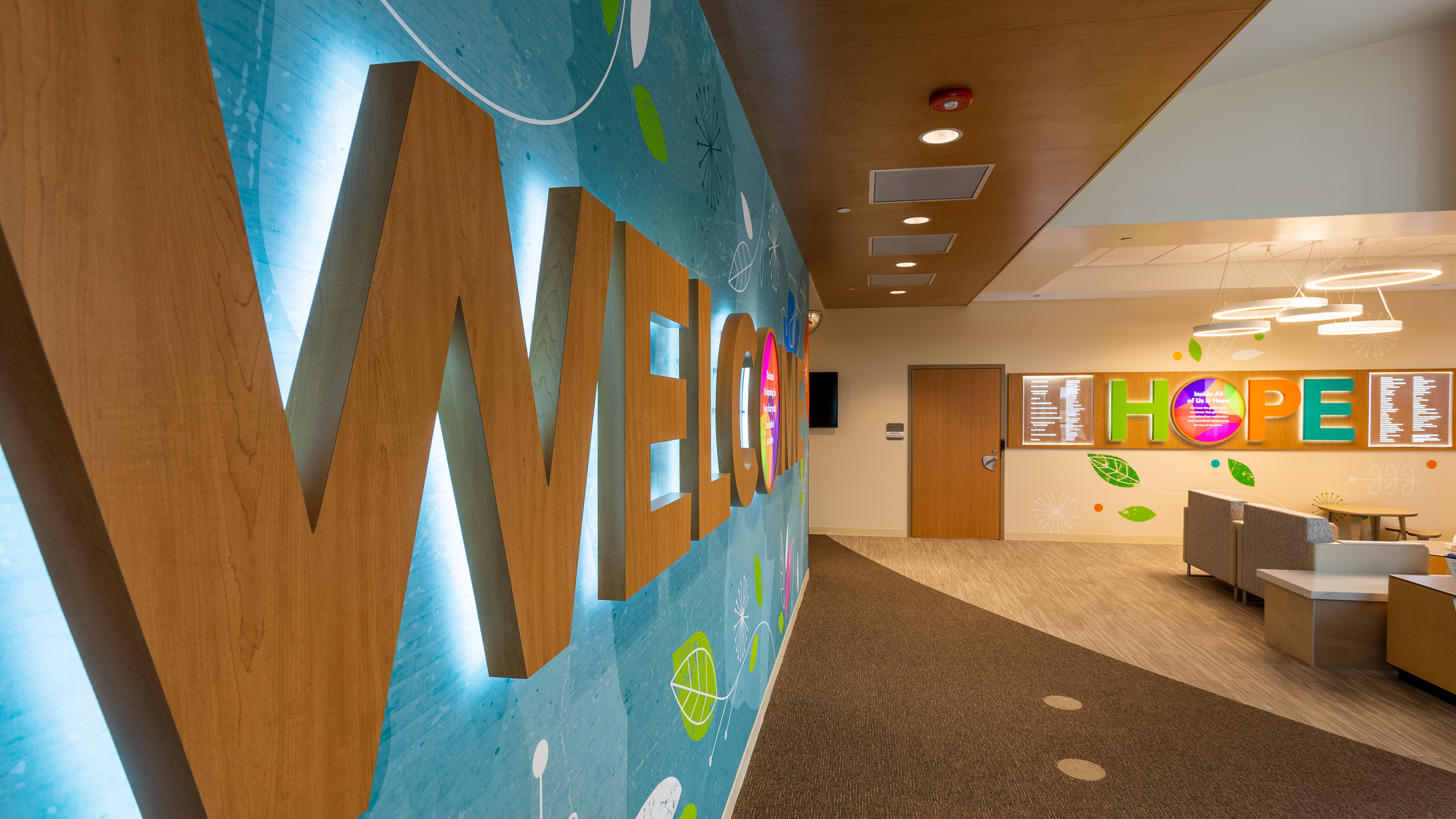
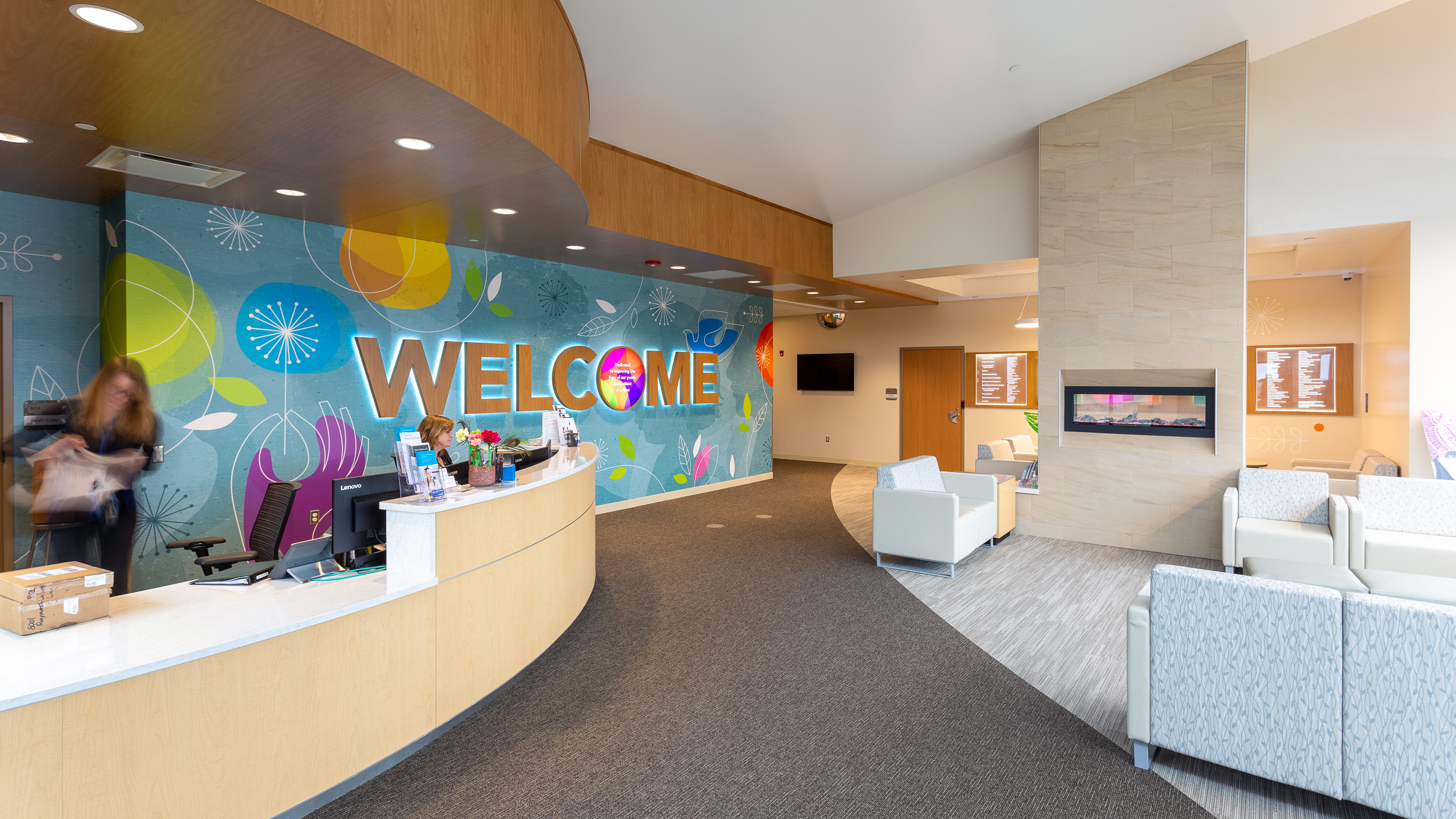
Welcome. A simple sentiment that can mean a lot to a child in crisis. Our intention was compassionate human impact without being overbearing or looking childish. In its presentation, we needed to evoke a feeling of calm, comforting optimism. Soft, halo-lit wood letters are lightweight, lighting-friendly and match the clinic’s interior finishes. Silhouettes of various age groups and genders were used to evoke a sense of belonging.
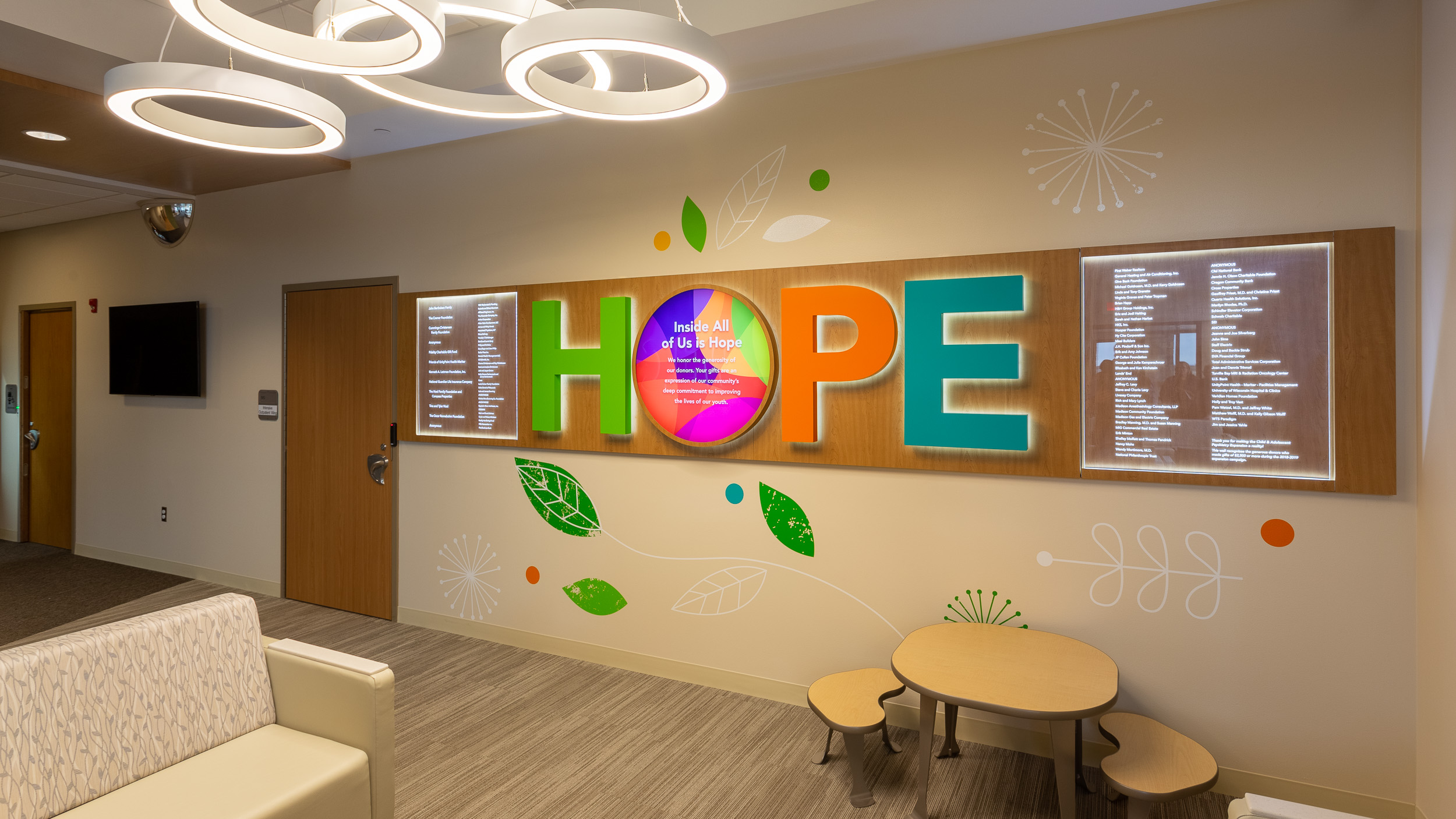
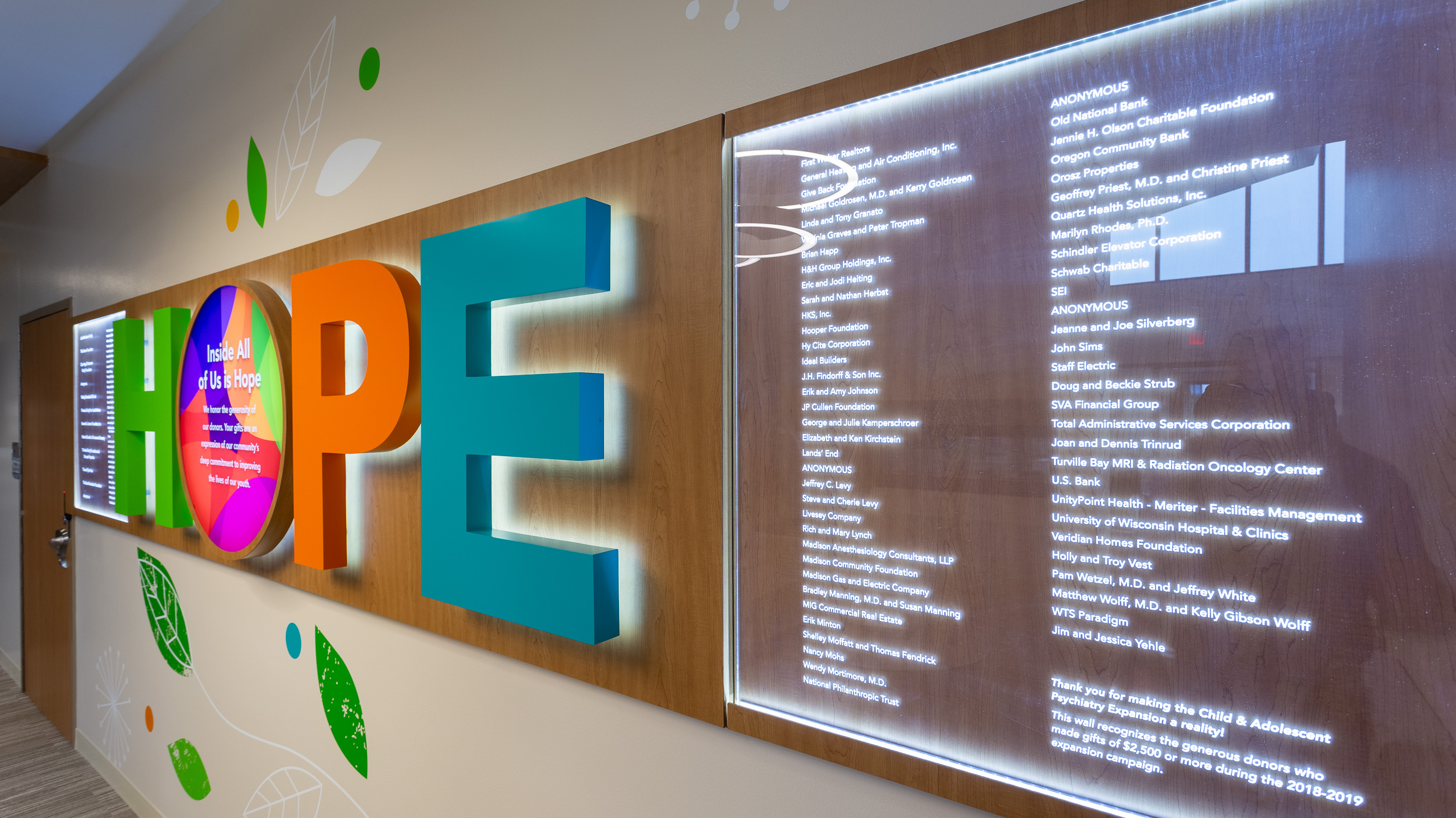
Hope. The clinic donor wall had to work as more than just a list of names. The donors had to be recognized appropriately with a carrier that underscored the experience we were trying to create for the patient. We used laser-etched acrylic, edge-lit with LED lights to highlight each donor name.
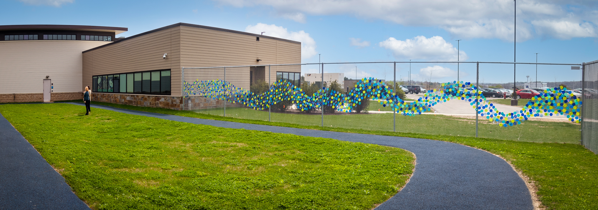
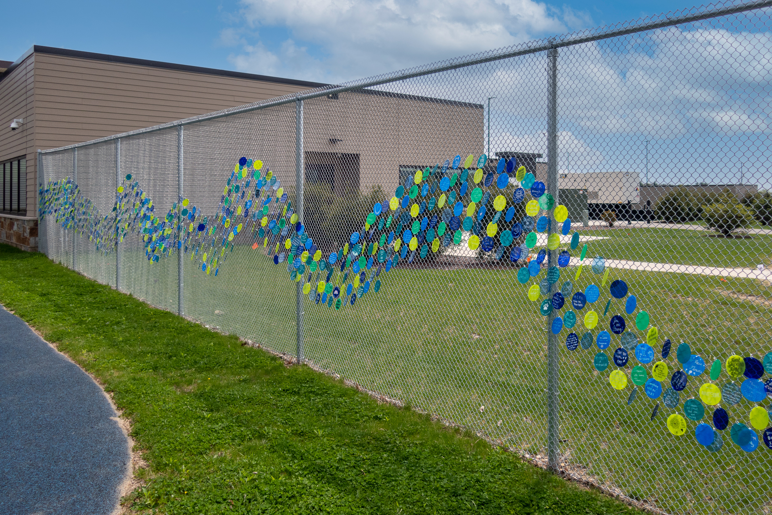
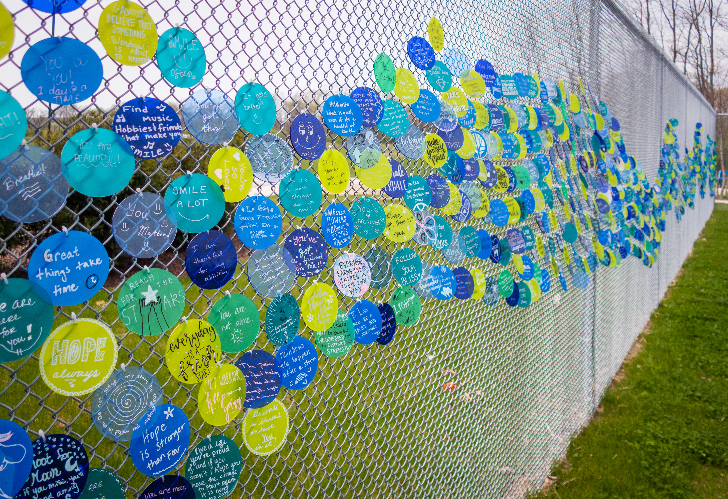
The ‘Hope’ fence is simple in its execution but impactful in its form. From afar, one sees purposely-placed translucent disks forming a soft wave of color, adding interest and warmth to the chain link. Up close, handwritten messages on each disk become visible. Encouraging sentiments and expressive pictographs fill each disk. Each note, permanently scribed to staff and patients, becomes a reminder of hope and healing.
