Menu
Menu

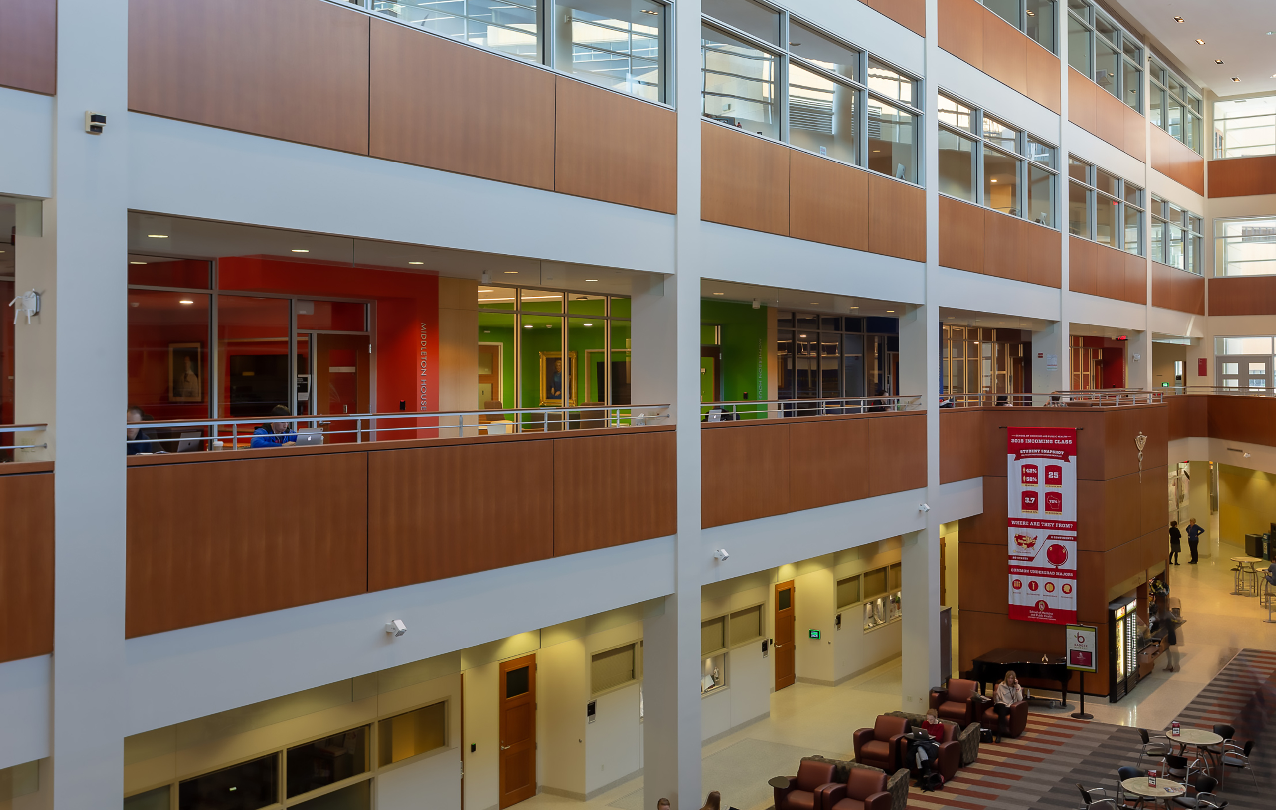
The UW Health Sciences Learning Center (HSLC) is more than a campus building—it’s the home base for future physicians, public-health professionals, and researchers. Despite that central role, the space once felt disconnected from the people and purpose it served.
HSLC’s desire to build on Phase 1 was clear, but the path forward wasn’t. The committee needed a unifying concept that resonated across disciplines and personalities—a framework everyone could rally behind.
Preparing for roles in the healthcare industry is intense, stressful, and often competitive, both within and across disciplines. The experience needed to appeal universally to guests, students, faculty, and other campus stakeholders without favoring any one group.
After multiple rounds of concept development, the breakthrough came in the form of two simple words: respite and sanctuary.
Inside the classrooms, labs, and lecture halls, learning is exacting and demanding. Thysse’s solution created contrast—calm, restorative environments in the shared spaces between. Through depictions of nature and campus culture, the refreshed design infuses brand expression with subtle storytelling while maintaining a bright, restorative, and uplifting atmosphere.
“You’d walk in, and it just wasn’t clear what this place was for. This is the University of Wisconsin’s Health Sciences Learning Center. The facility needed to represent—and support that.”
- Kris Marconnet, Senior Designer at Thysse
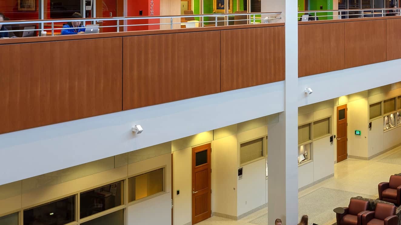
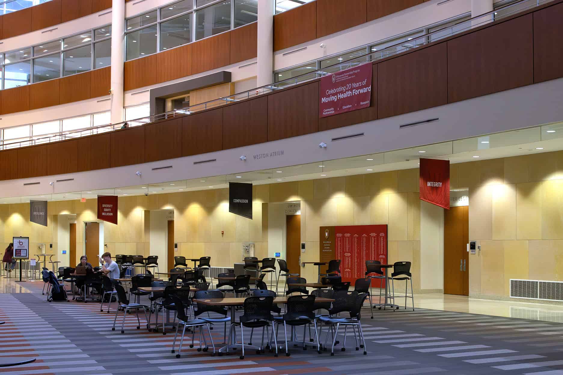
Design for Phase 2 focused on the main atrium and adjacent corridors, introducing four distinct elements that together define HSLC’s evolving identity.
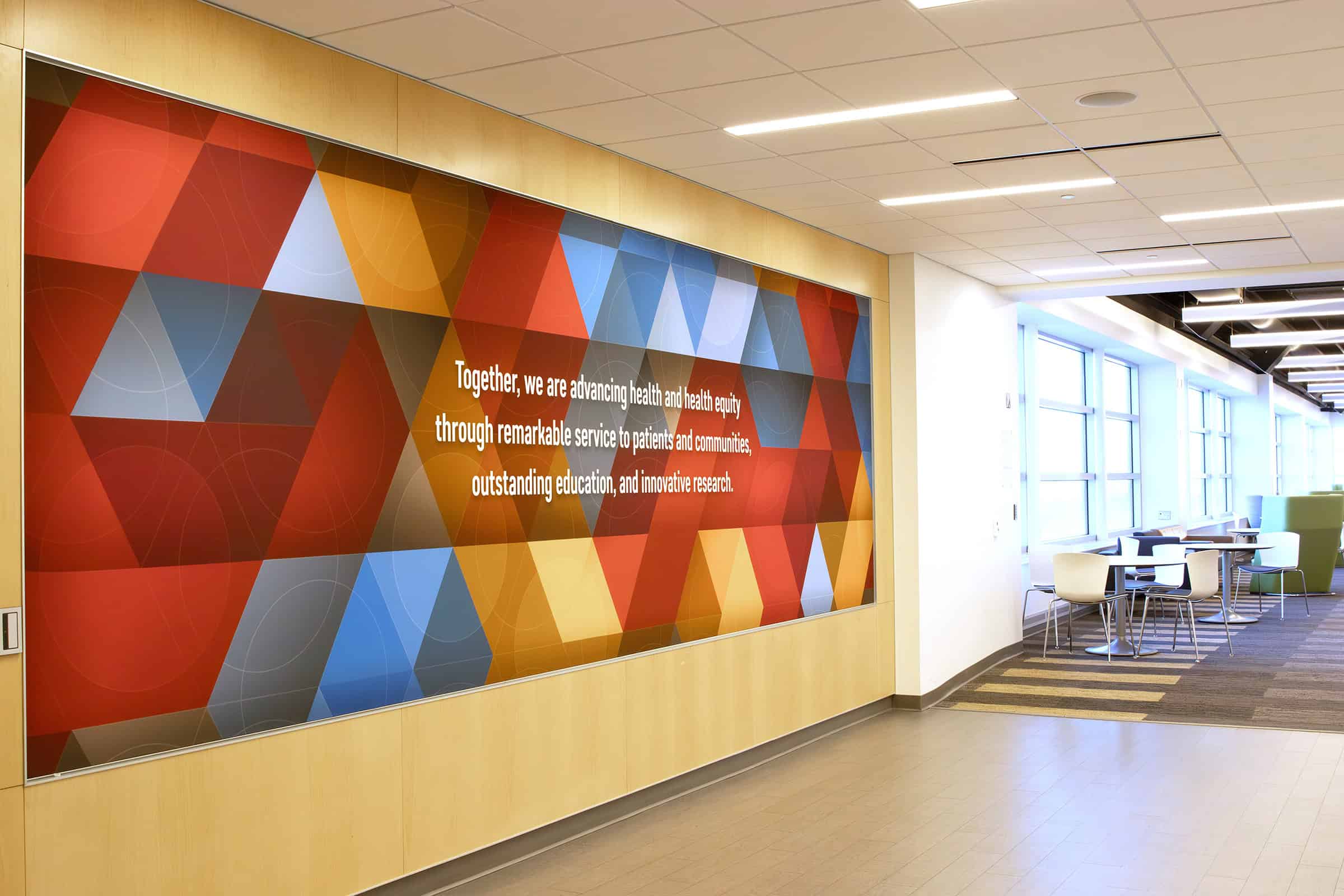
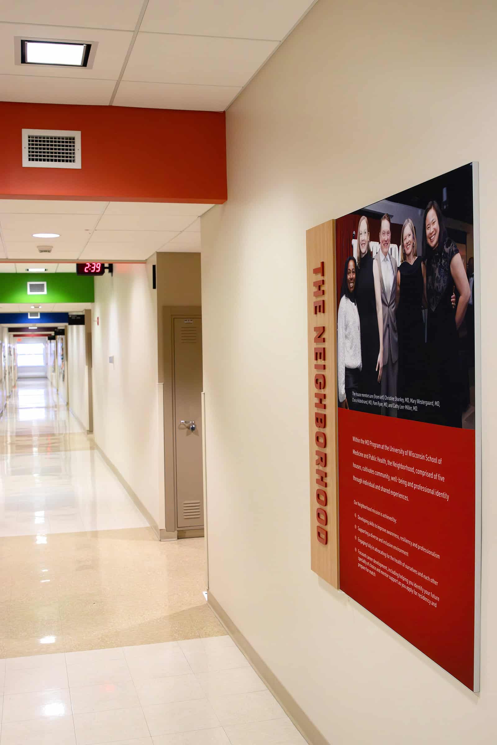
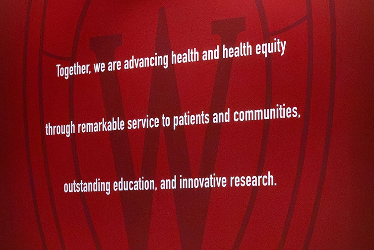
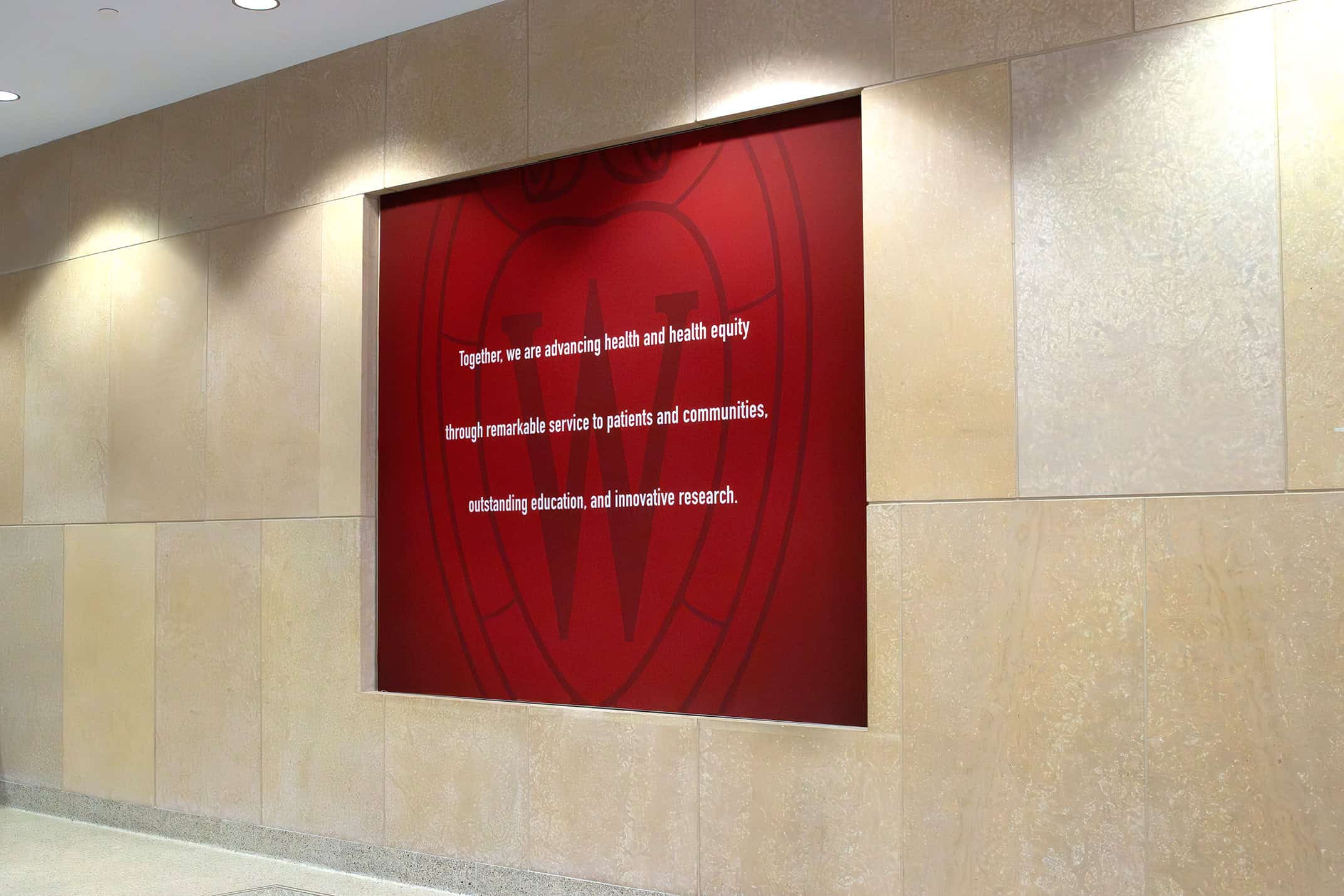
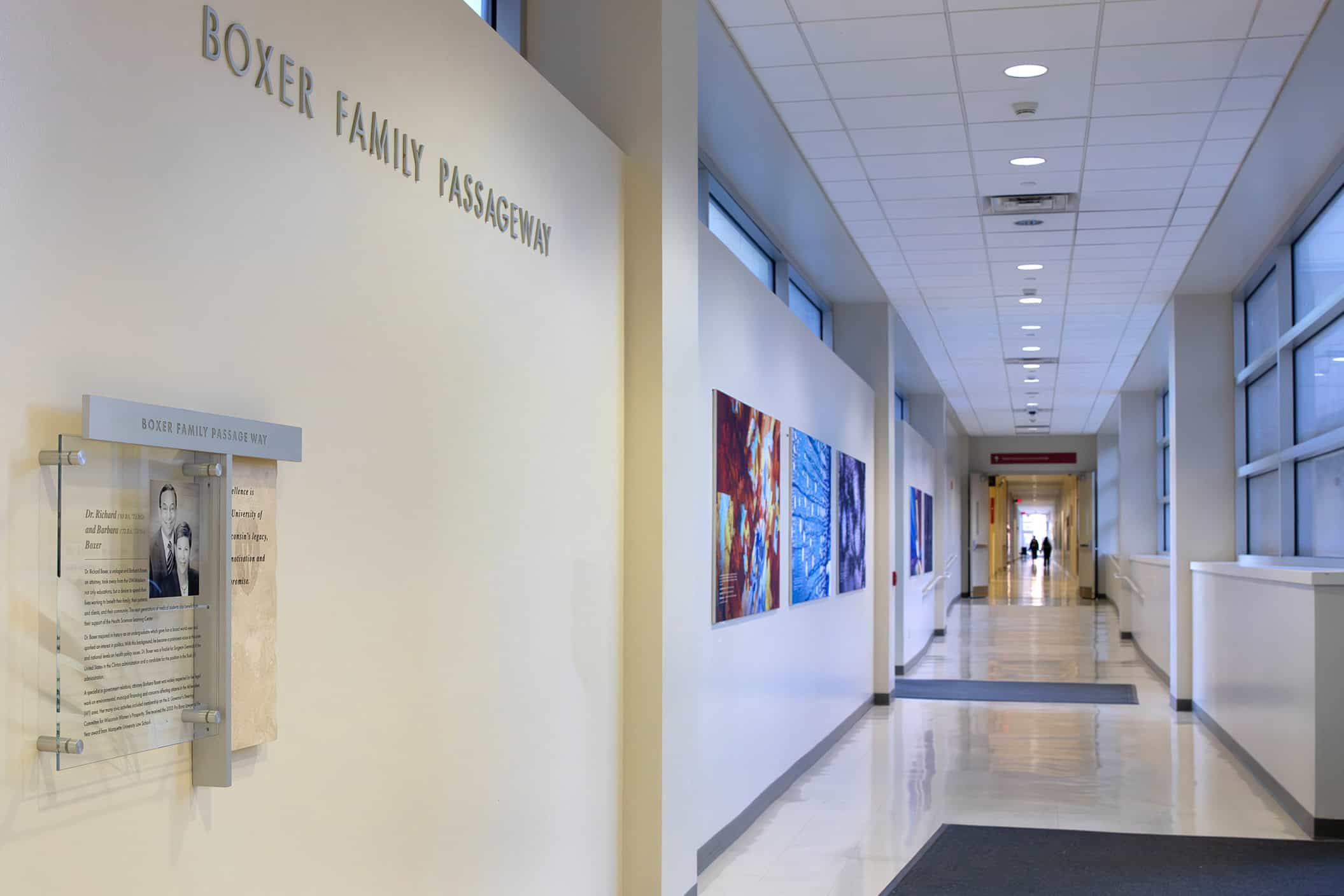
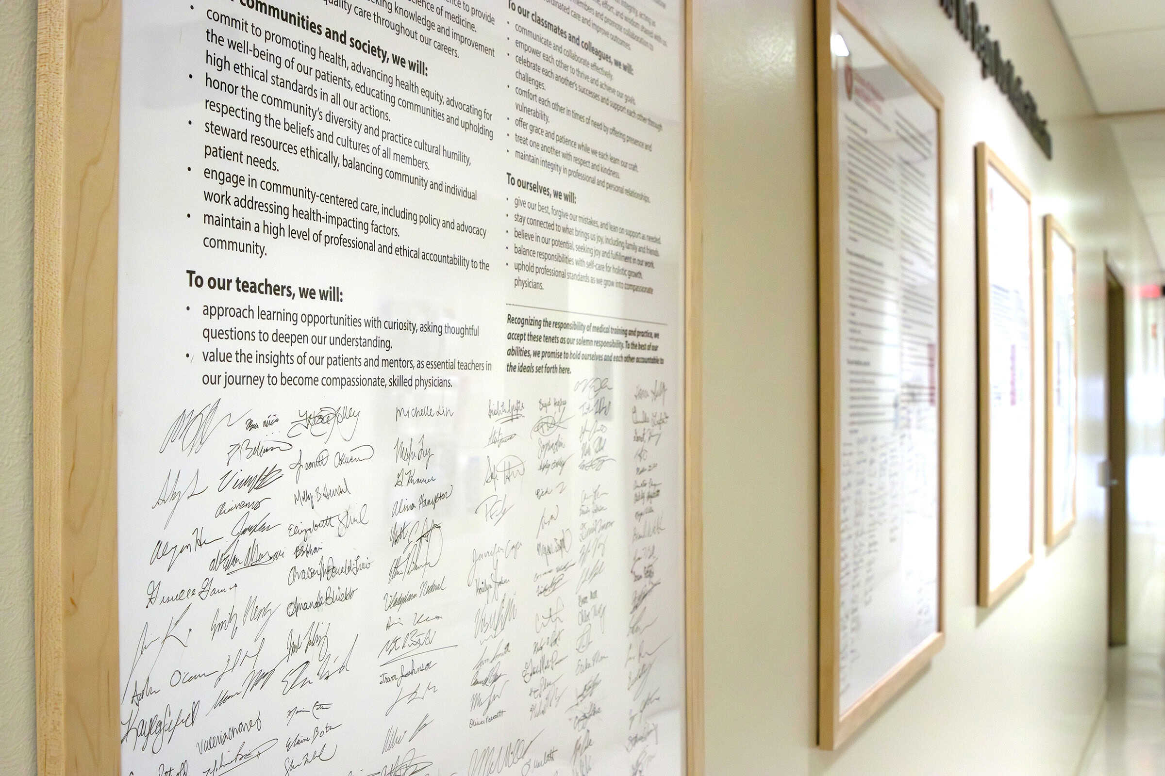
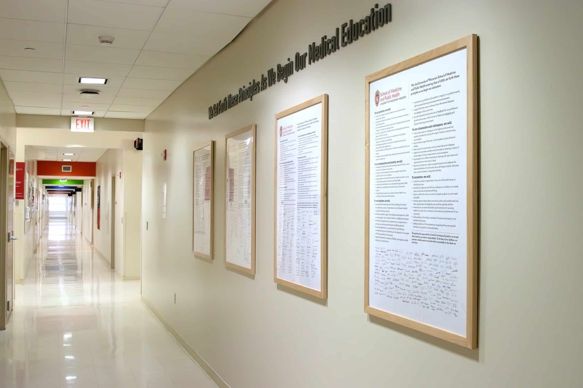
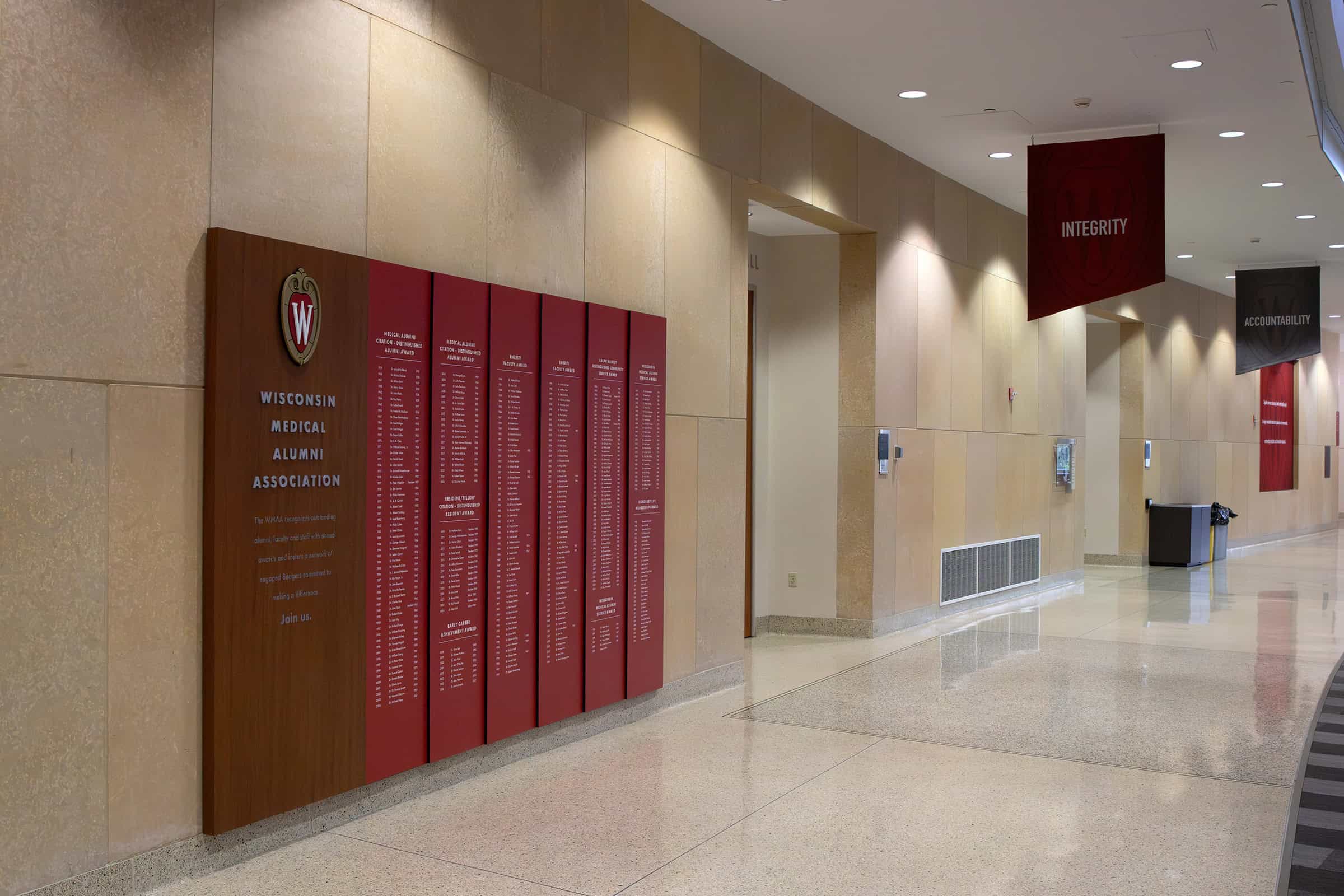
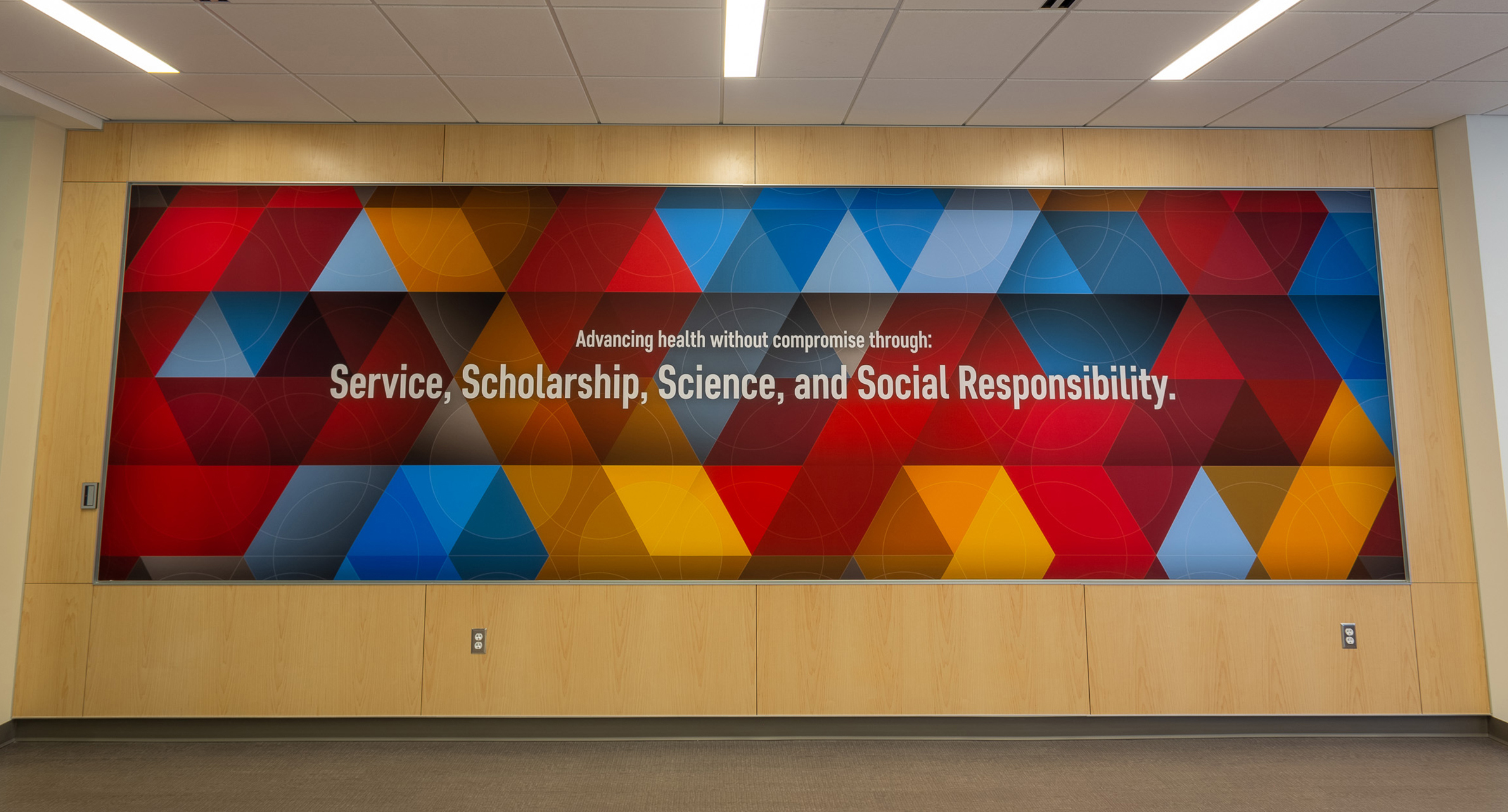
A panelized alcove near the elevator bay presents HSLC’s community statement in a bold yet elegant format.
“Rather than burying it in a brochure or website, we brought it into the physical space. It’s quiet but strong — an invitation into something deeply meaningful.”
- Kris Marconnet, Senior Designer at Thysse
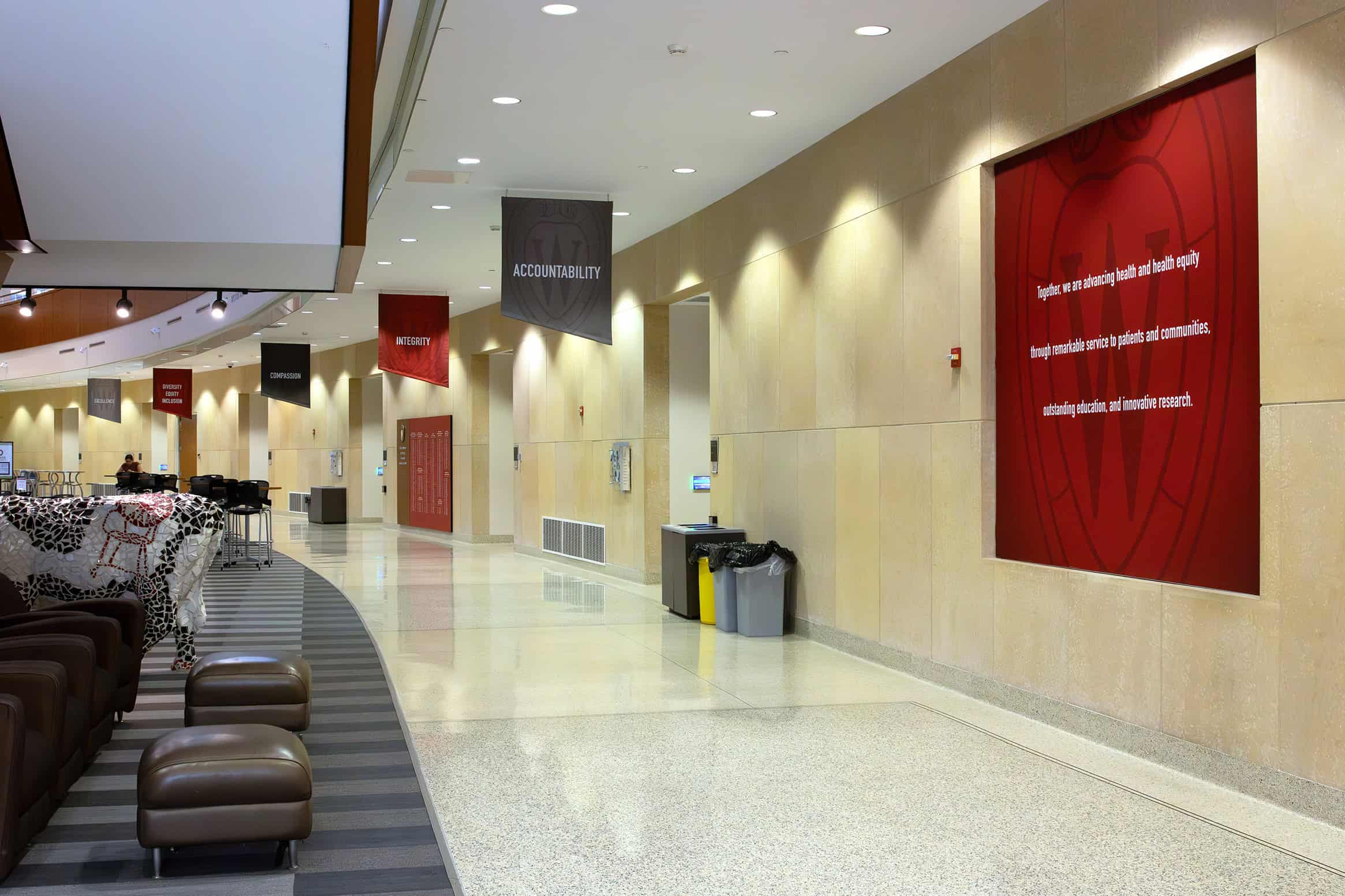
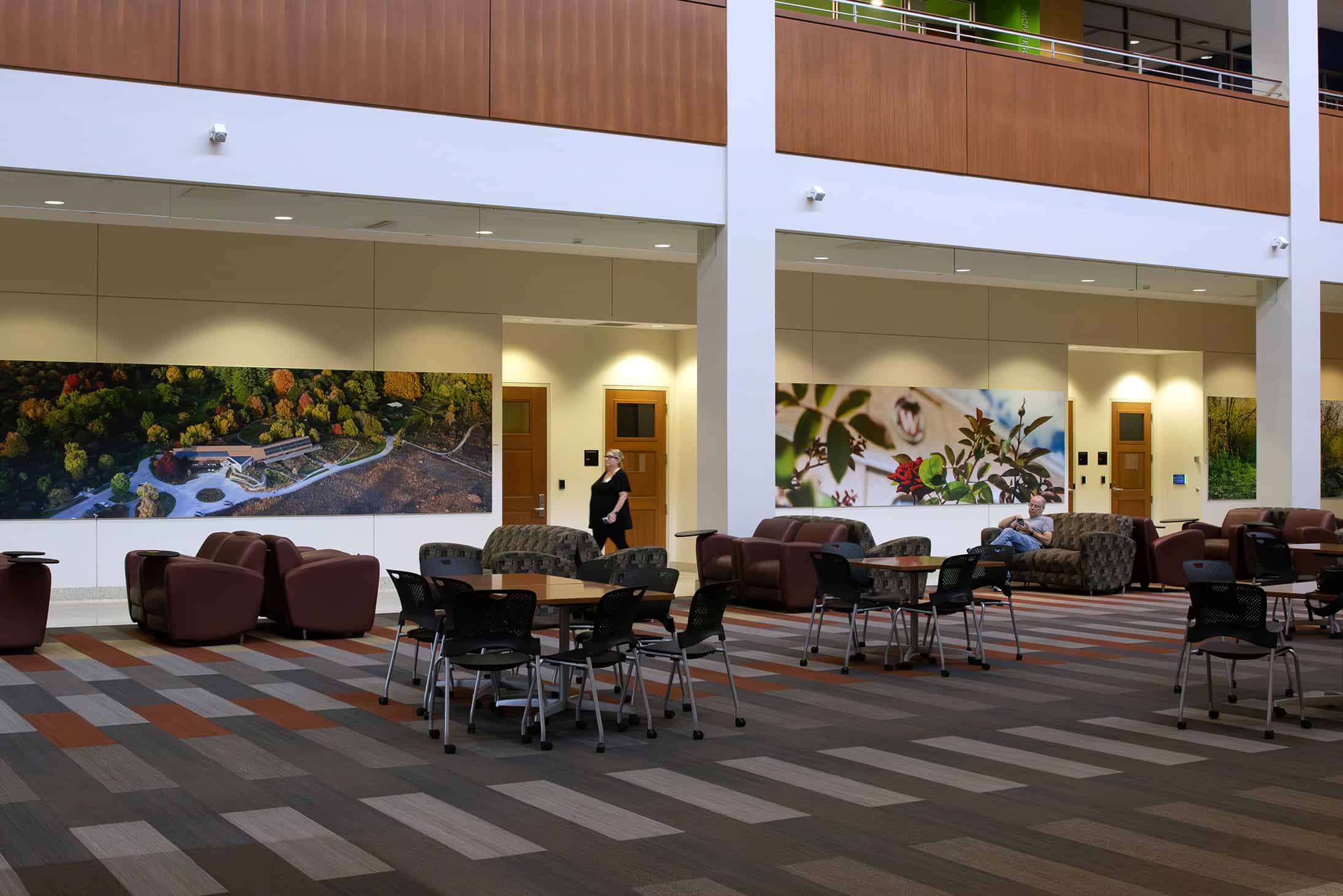
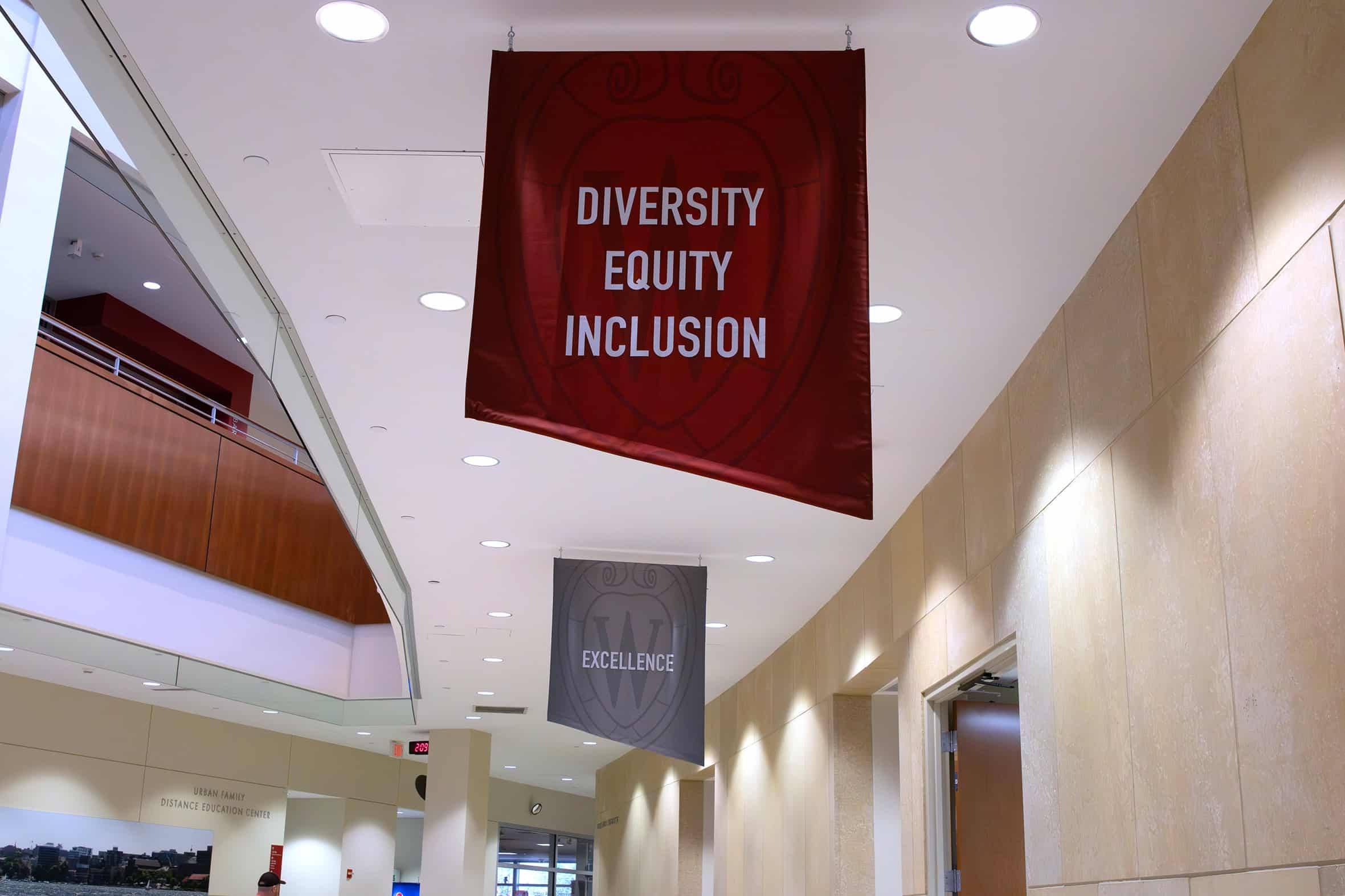
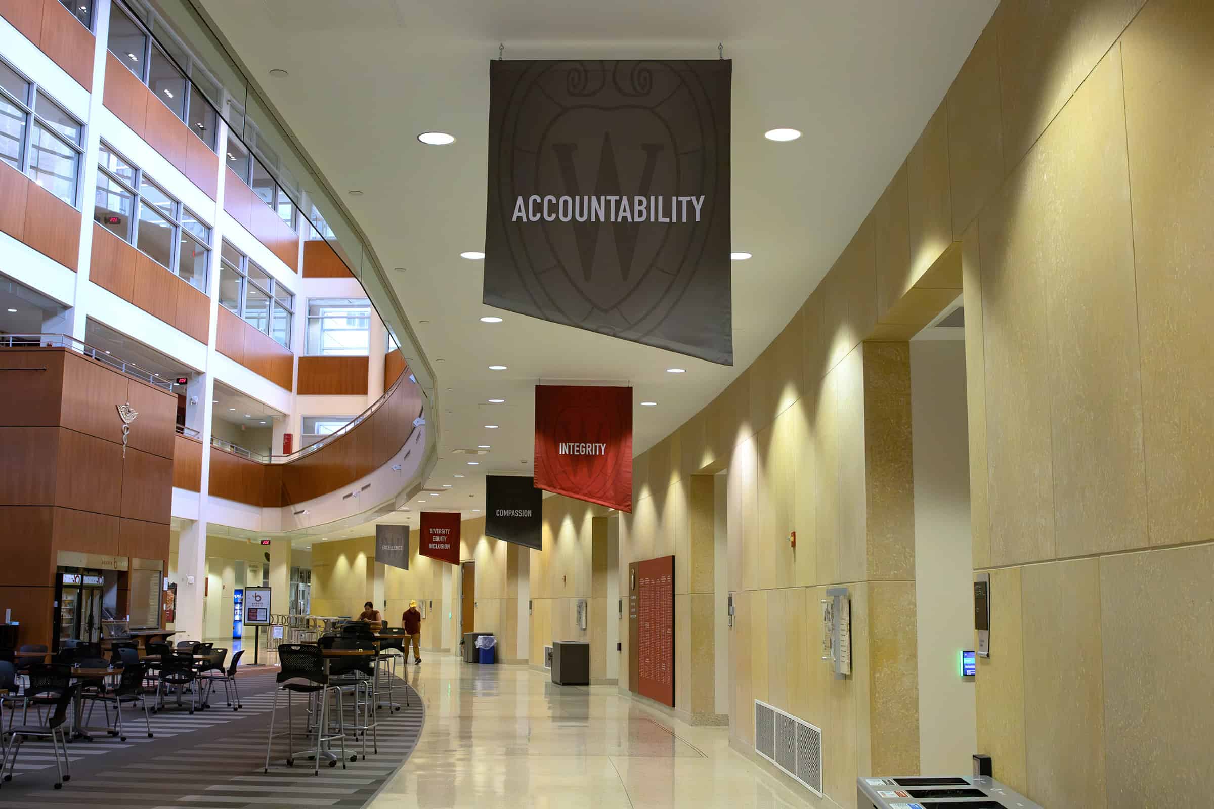
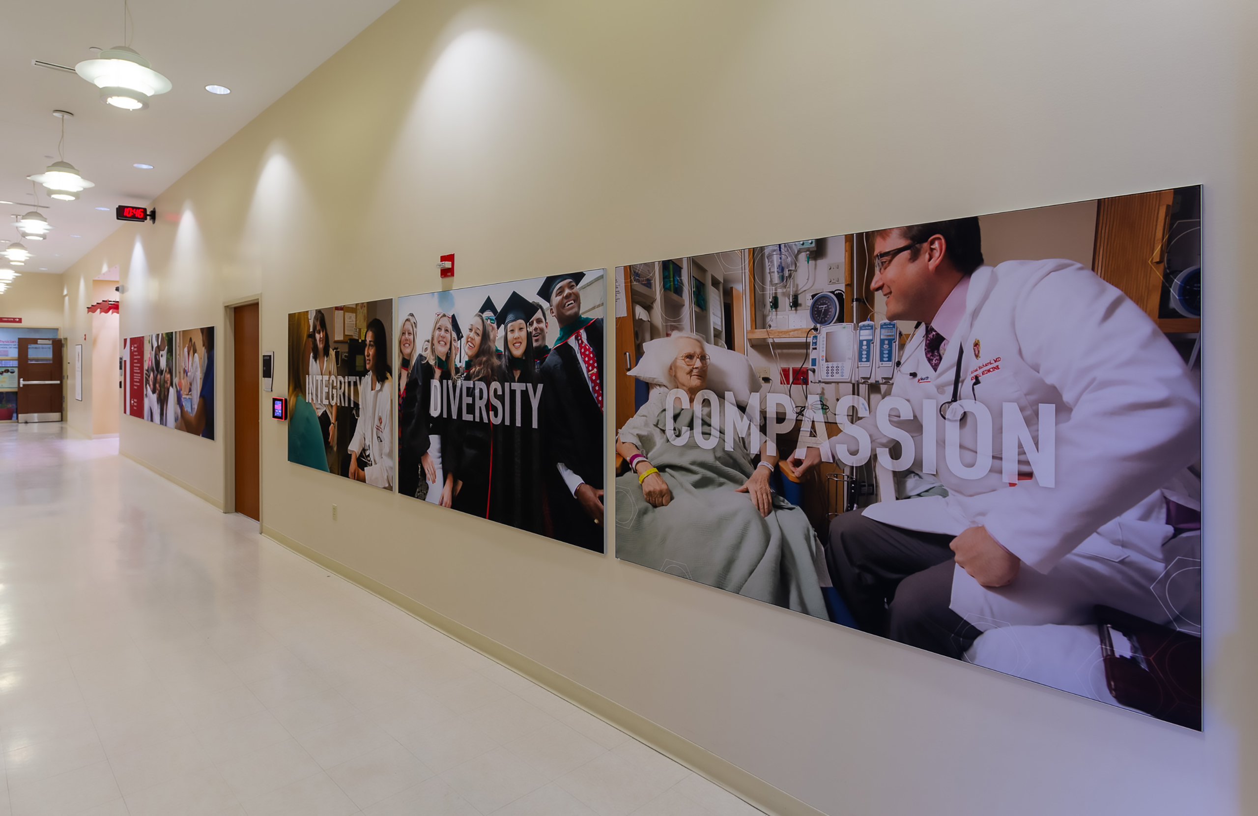
Five custom fabric banners line the atrium, representing HSLC’s core values. They introduce warmth, rhythm, and vertical energy into a large, light-filled space.
“We knew this area needed vertical intervention—it’s a huge space. The banners bring those values from eye level up and above—anchoring the space without overwhelming it.”
- Kris Marconnet, Senior Designer at Thysse

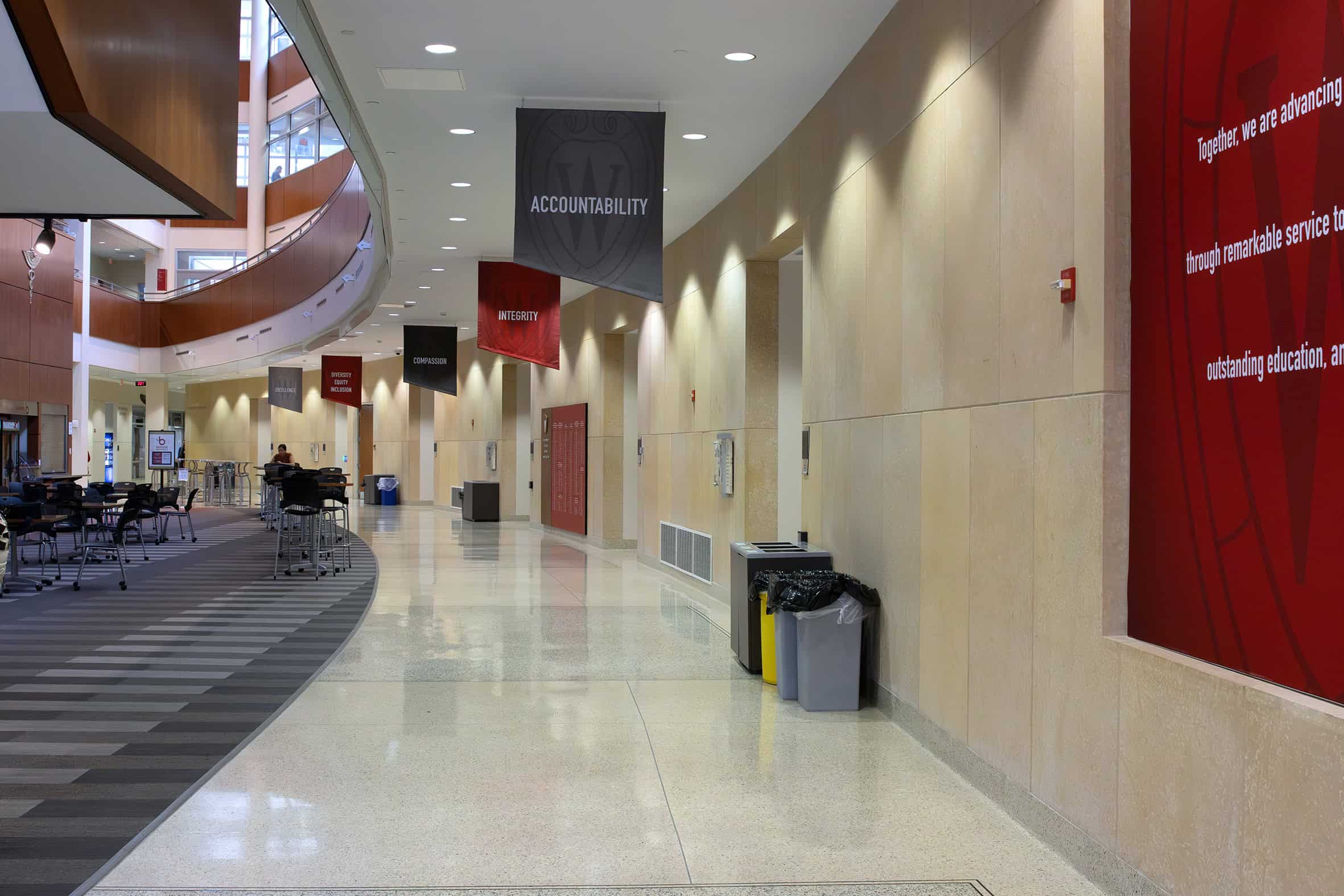
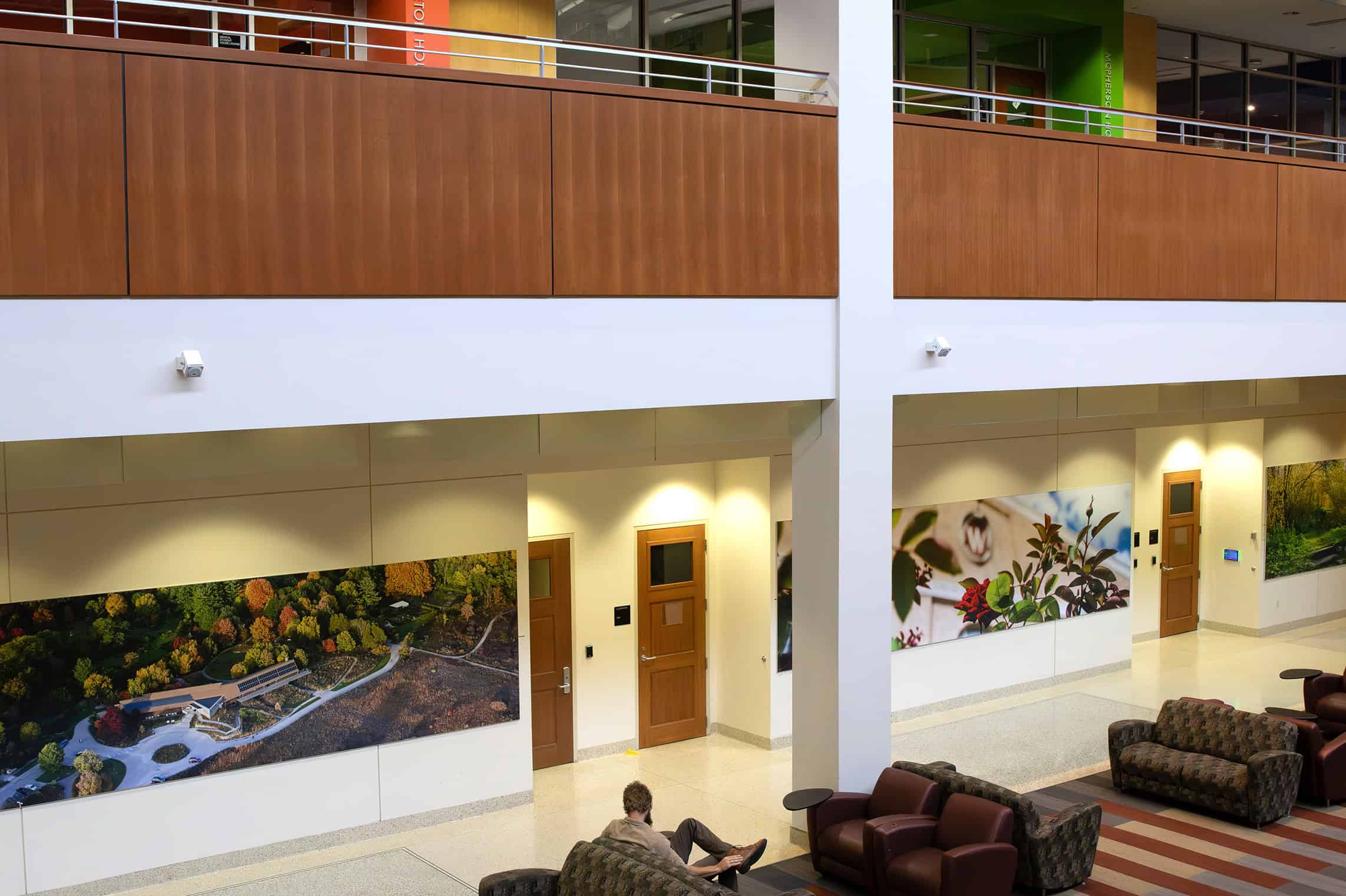
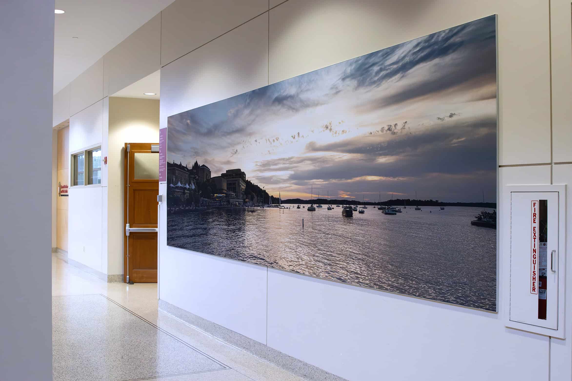
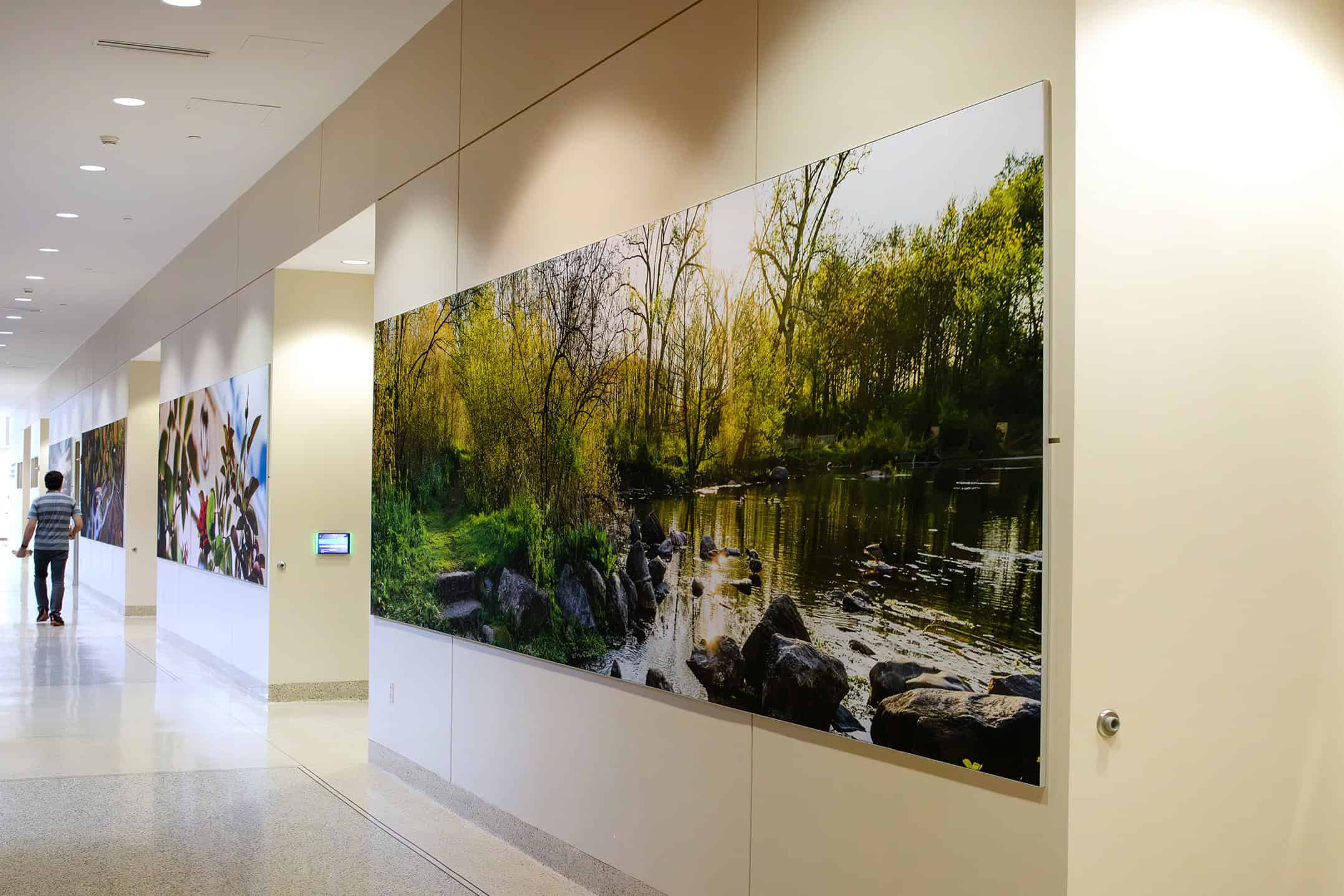
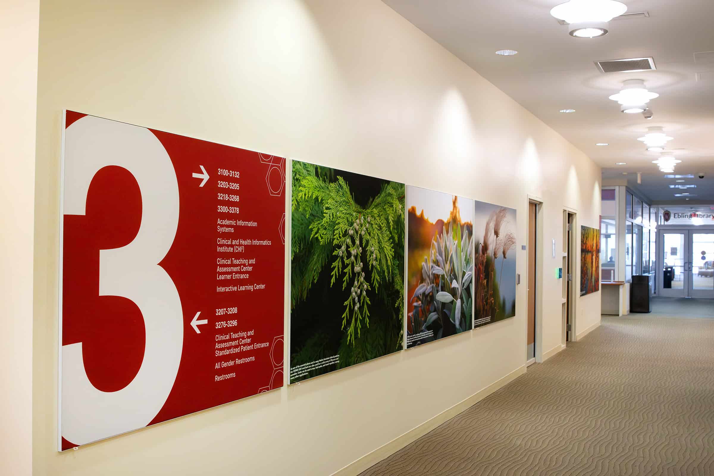
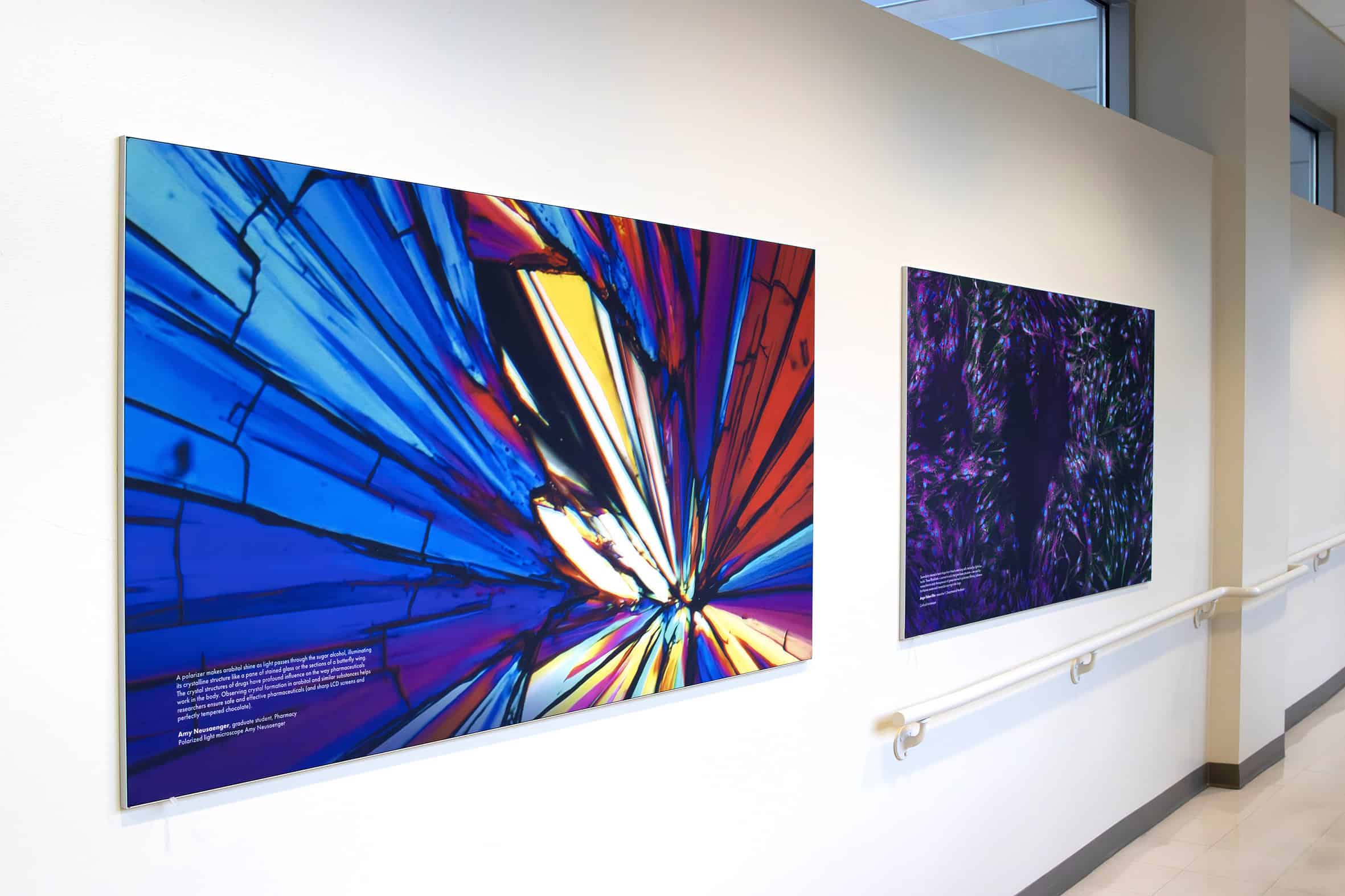
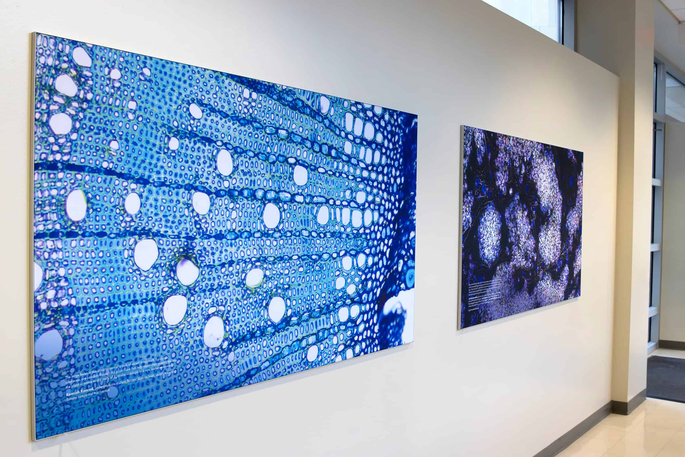
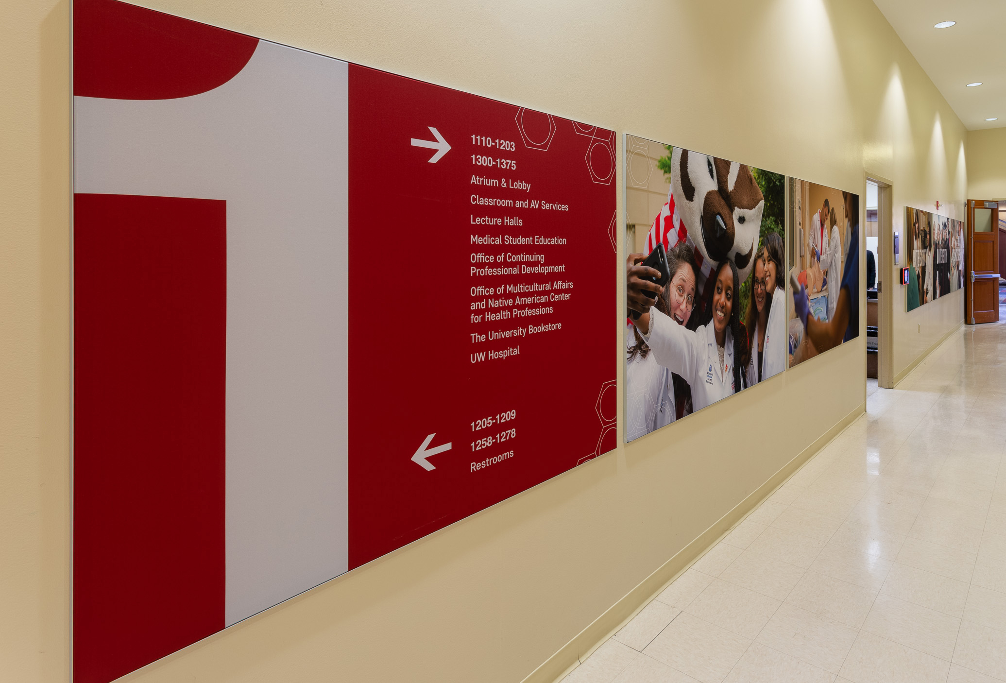
The atrium walls featured aging built-in display cases and clearstory windows meant to share light with rooms beyond. Thysse’s cost-effective solution covered the dated features with silicone-edge fabric graphics (SEGs) mounted in low-profile frames, while the clearstory windows received opaque film treatments to block interior light bleed.
SEGs deliver vibrant, high-resolution visuals and flexibility for future updates—graphics can be swapped easily without replacing frames, allowing HSLC to refresh imagery over time.
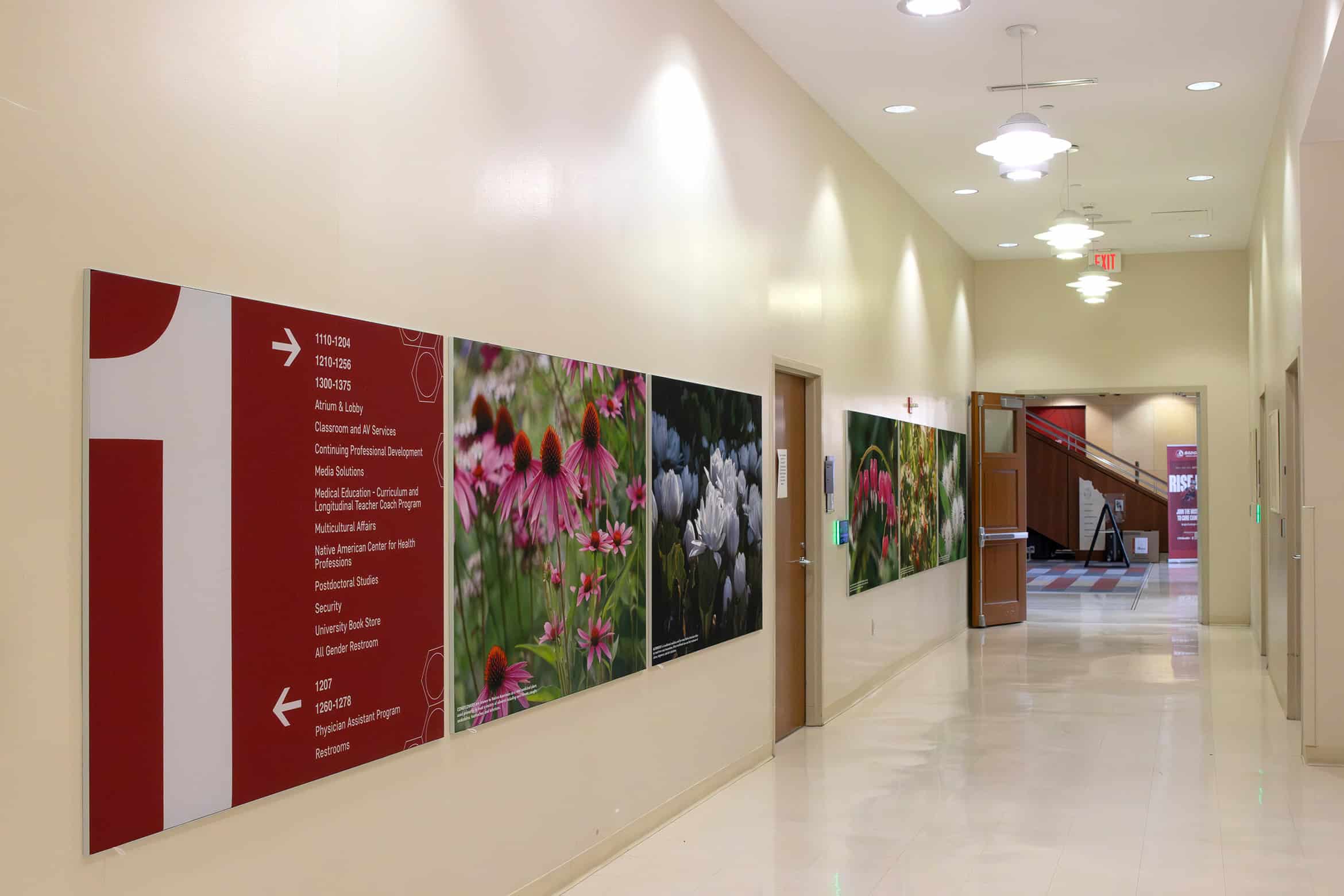
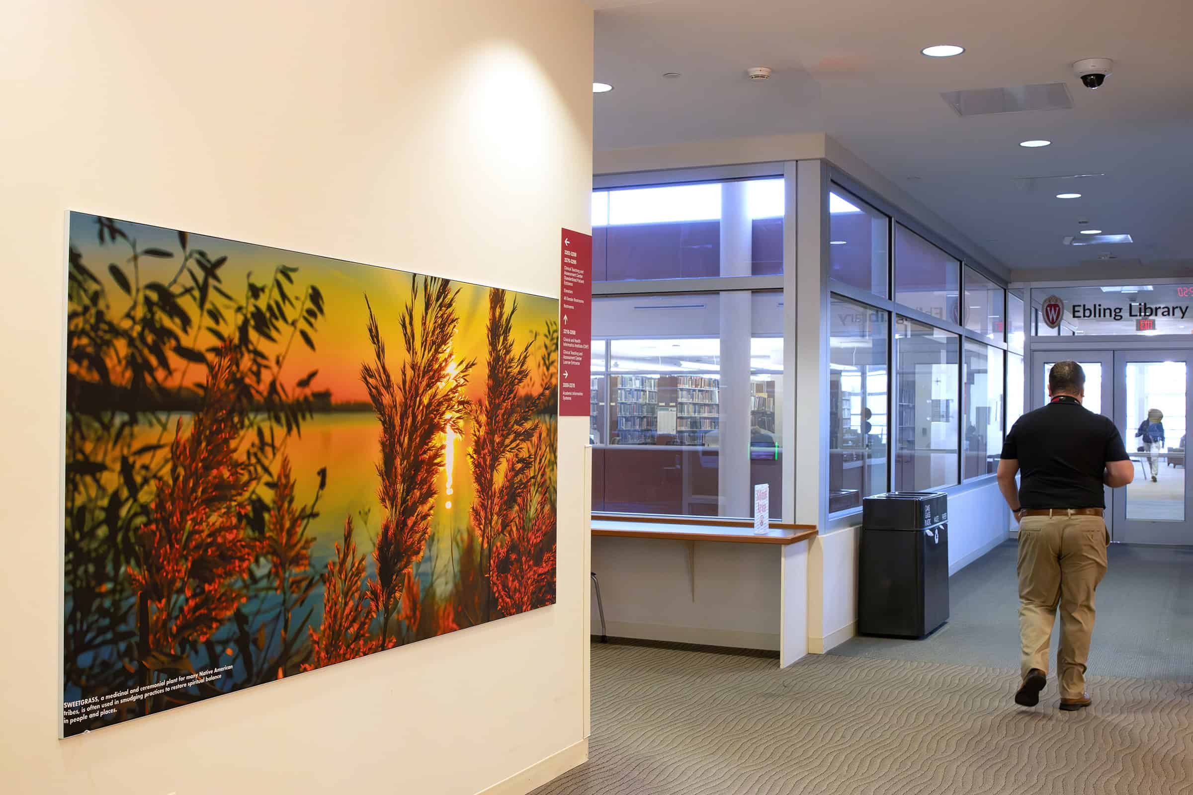
Current imagery celebrates medicinal plants first discovered by the region’s Indigenous peoples, honoring their heritage and contributions to modern medicine.
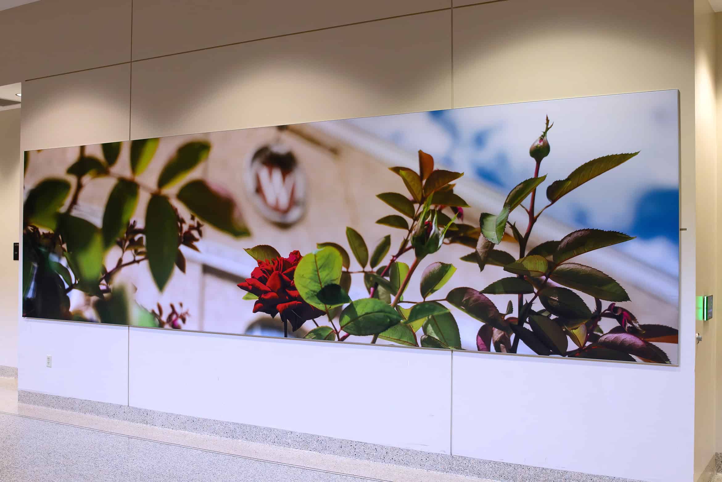
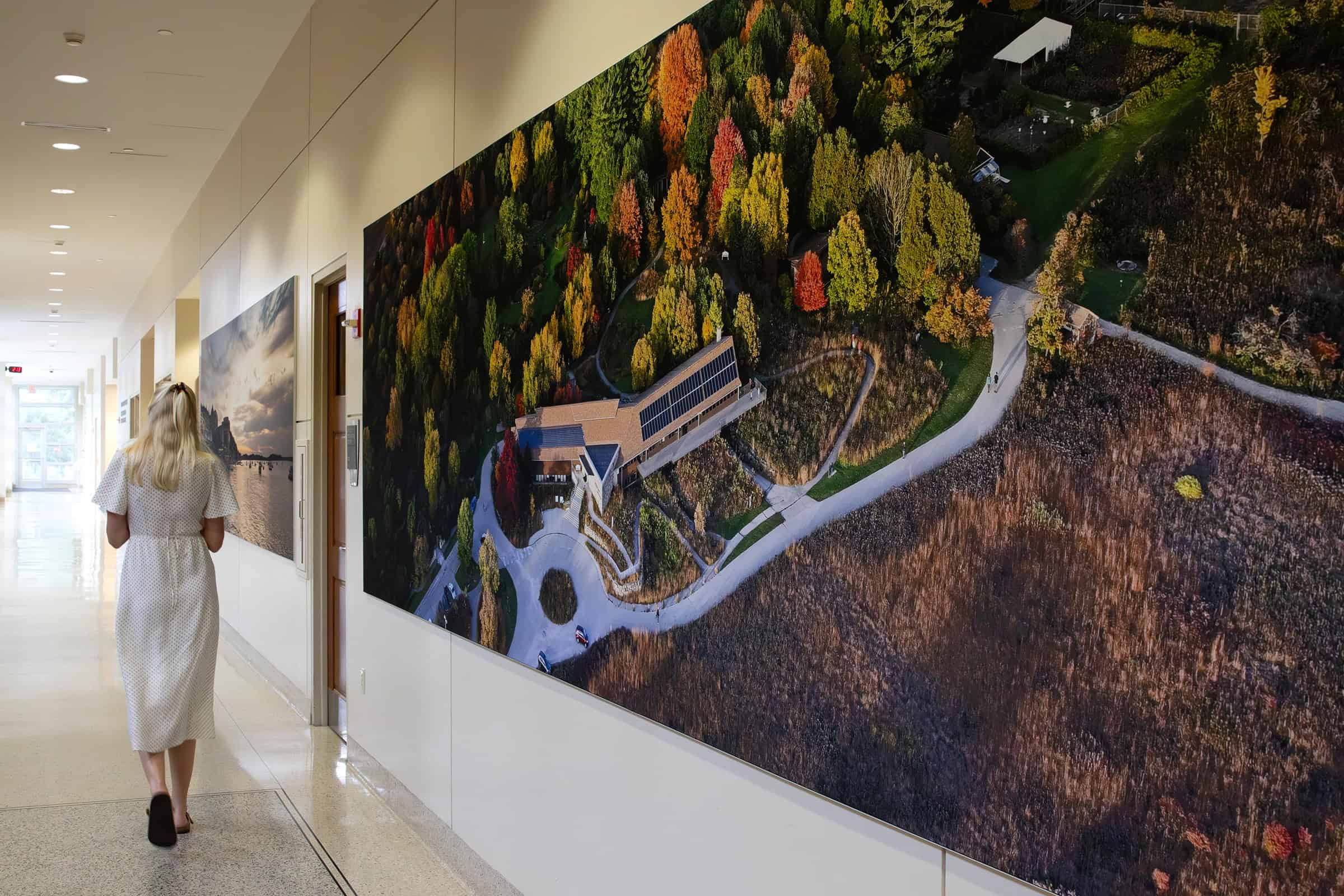
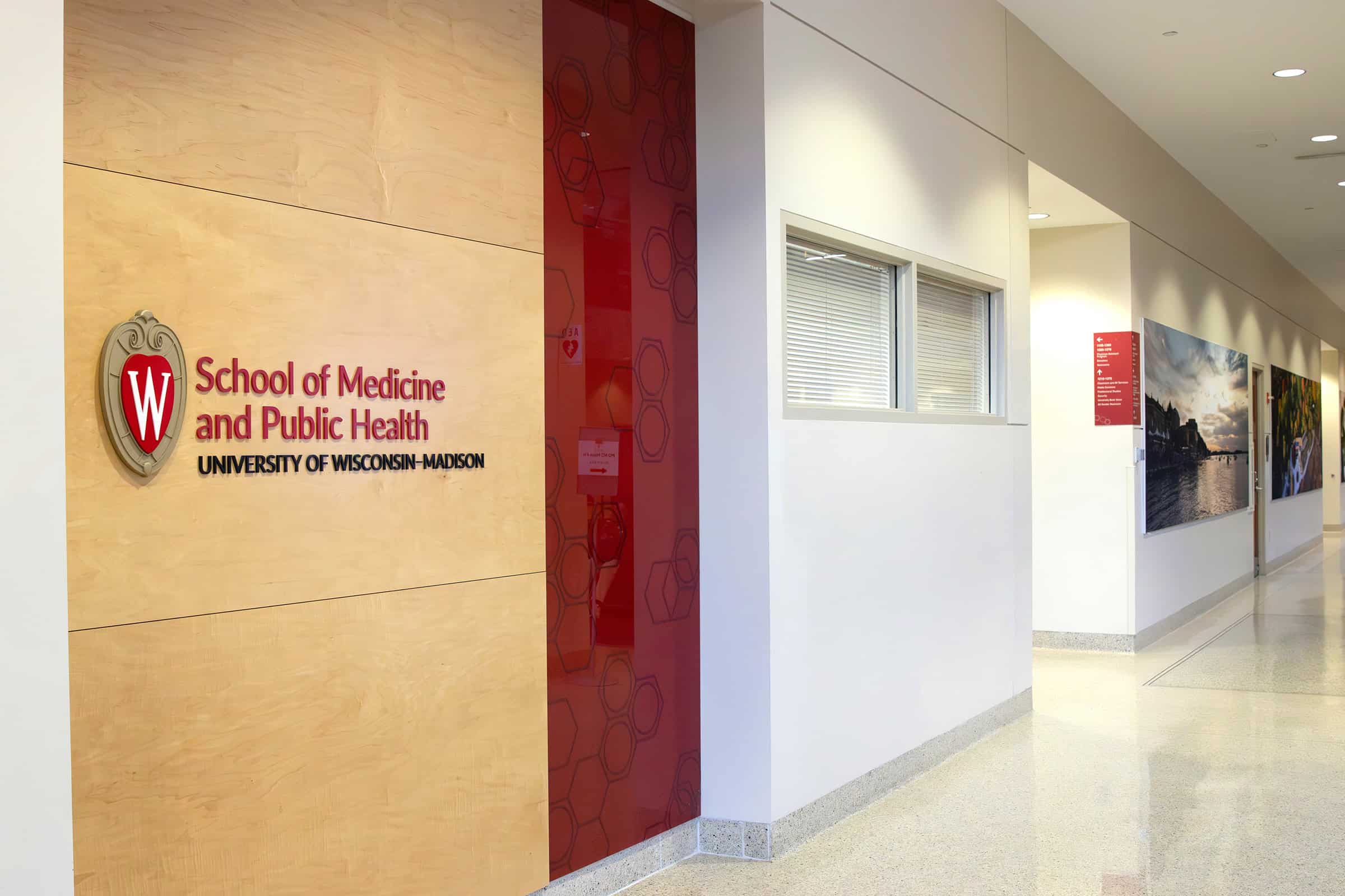
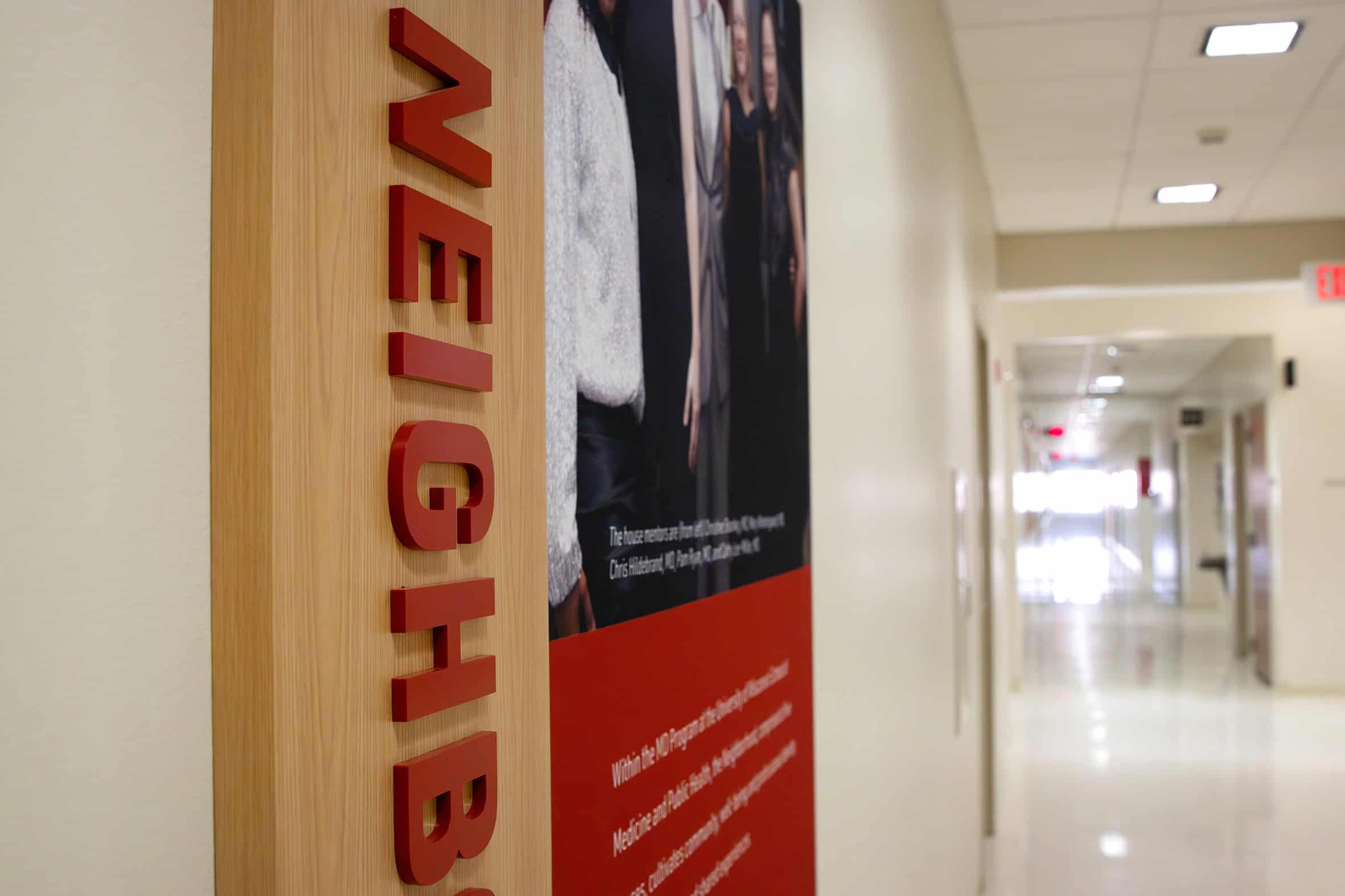
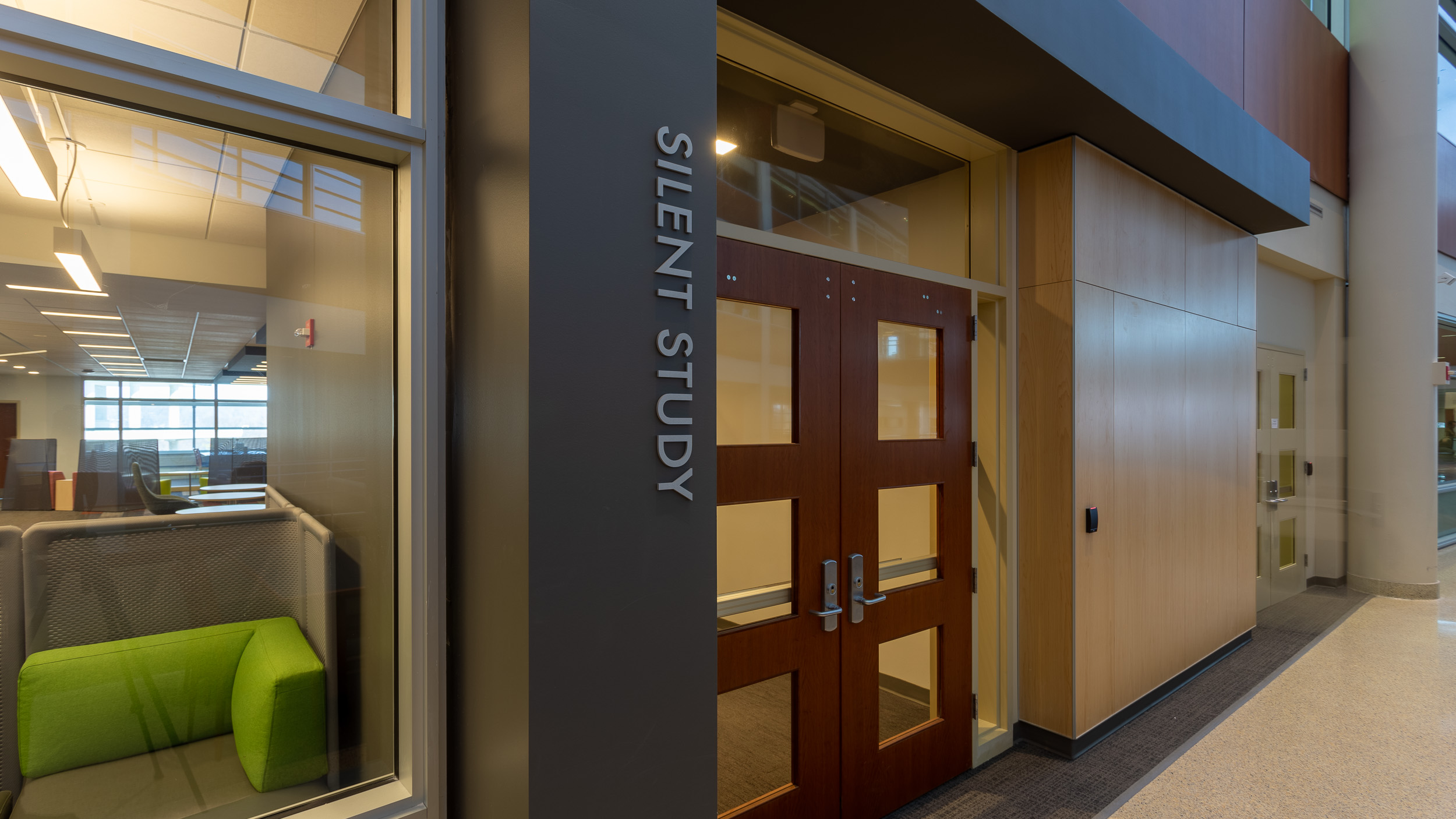
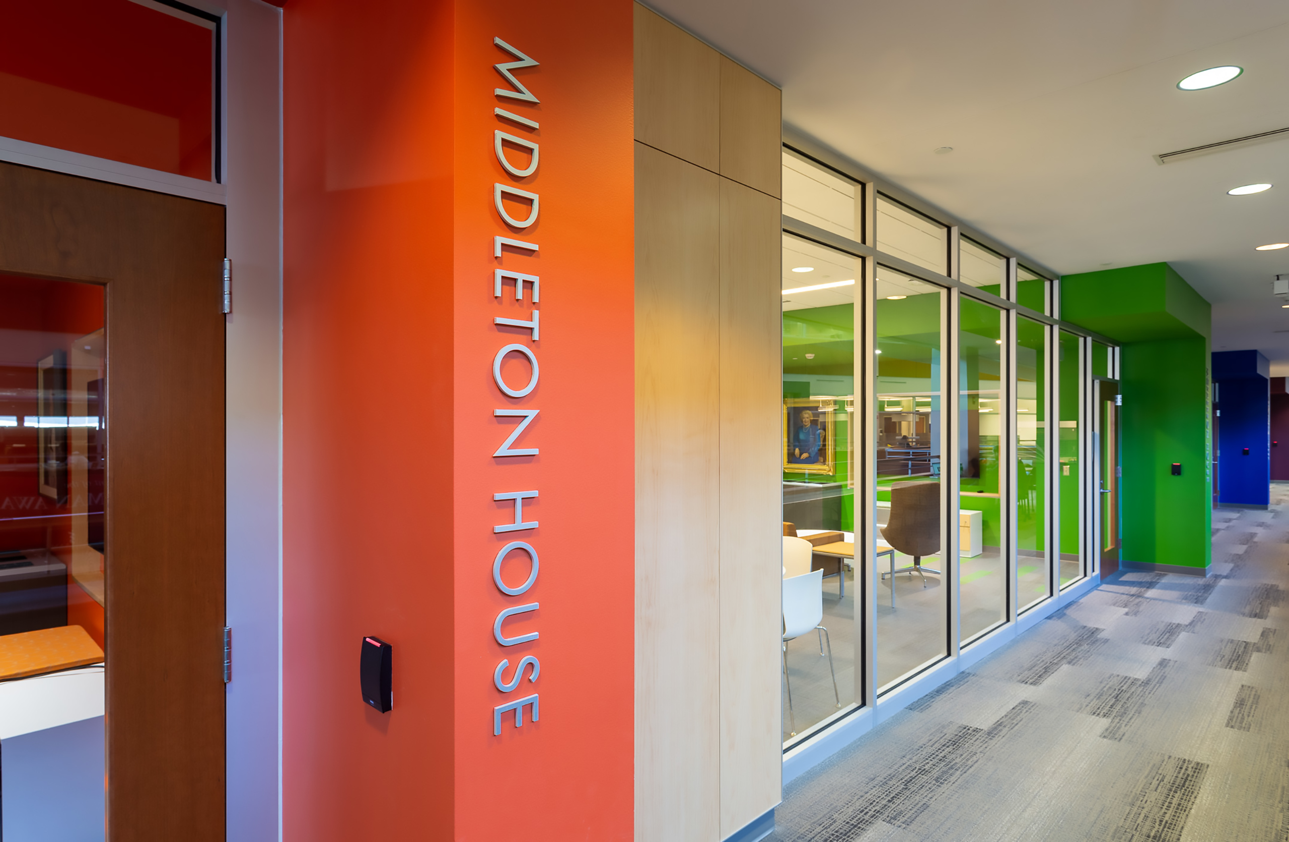
Beyond the atrium, SEG graphics extend down the hallways, complemented by heritage displays and dimensional informational plaques that add variety, depth, and tactile interest to the environment.
Like Phase 1, Phase 2 was designed for flexibility and longevity—anticipating future layers centered on donor recognition, storytelling, culture, achievements, and heritage.
That foresight defines Thysse’s craft. Great design—and great craftsmanship—anticipates what’s next while elevating what’s here.
“We designed this with longevity in mind. It’s modular, scalable, and intentionally flexible so more layers can be added over time without feeling like patchwork.”
- Kris Marconnet, Senior Designer at Thysse
Early reactions have been immediate and personal. Faculty express pride. Students stop to read. Visitors understand where they are—and what this place represents.
A sentiment shared by the broader Thysse Facility Branding team is how gratifying a specific moment in these projects is. It takes courage and trust for clients to take the leap of faith on larger-scale facility branding projects. The team describes this period of subtle anxiety, or reserved optimism that exists while tangible results develop. That special moment is when trust becomes belief—when clients feel the transformation and realize it lives up to their vision. That’s when it gets fun. It’s fuel for creatives—the equivalent of a standing ovation in the performing arts.
Brands—and the stories behind them—have gravity. When they’re expressed intentionally in a physical space, they don’t just enhance the environment; they shape how people feel, engage, and belong. That’s the power of this work. It weaves itself into daily life, reinforcing shared purpose in ways that are subtle, human, and lasting. And with each phase, that sense of connection will only continue to grow.
“The first phase helped them see what’s possible. It wasn’t just wayfinding signs and banners—we started telling their story. That’s the role of environmental graphics in a space like this. It’s not just decorative—it’s about identity. Cultivating a common sense of purpose that reinforces why this place, and how it’s used, matters. It takes so much talent, intelligence, dedication, and passion to do what these students and faculty do. We wanted to celebrate and support that.”
- Kris Marconnet, Senior Designer at Thysse
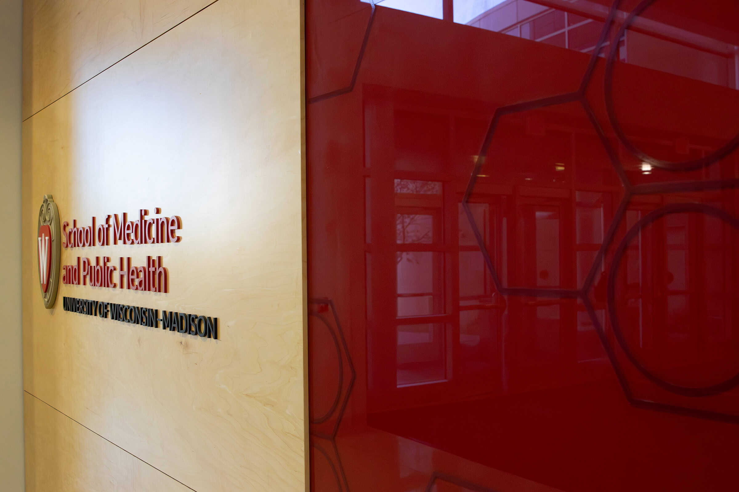
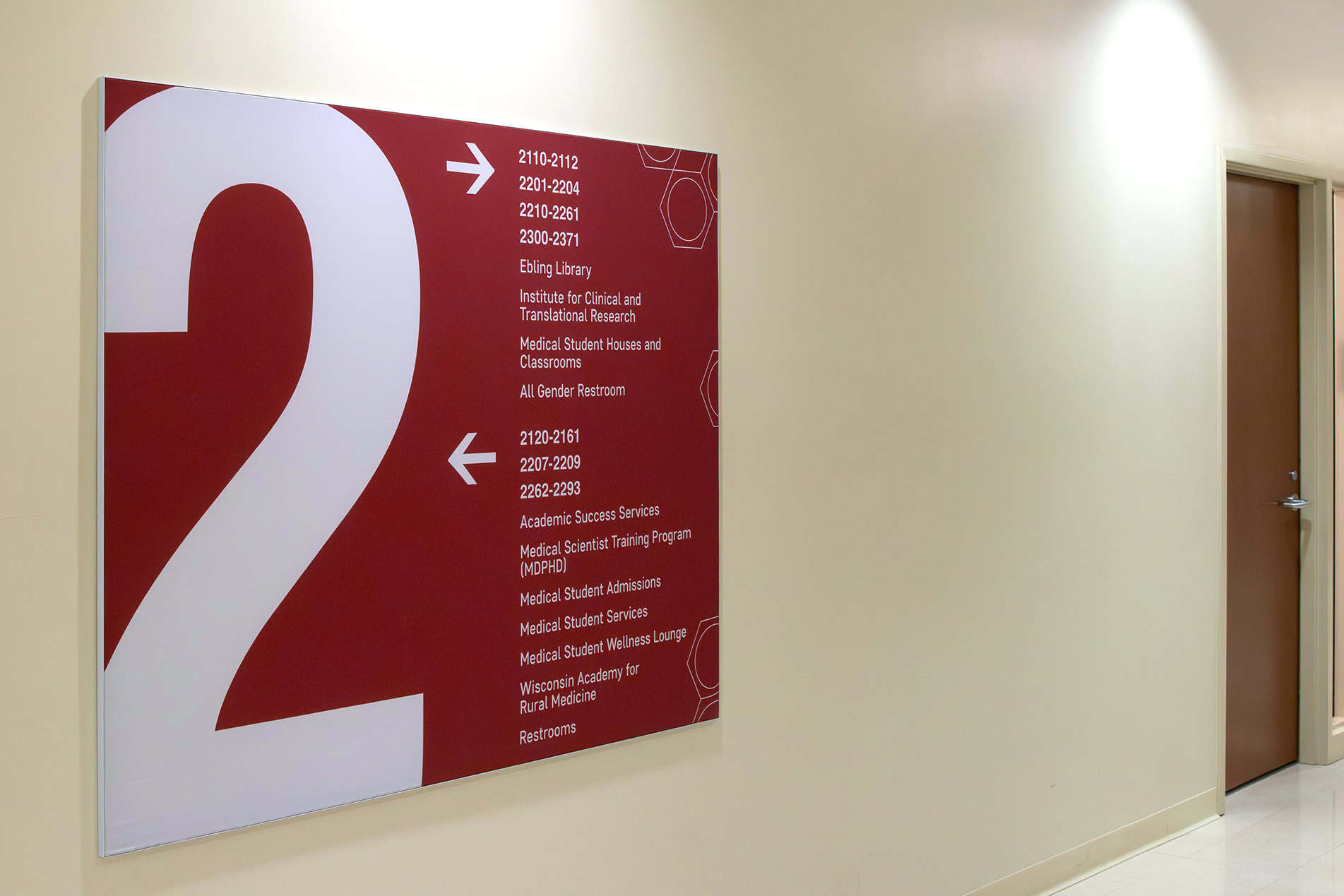
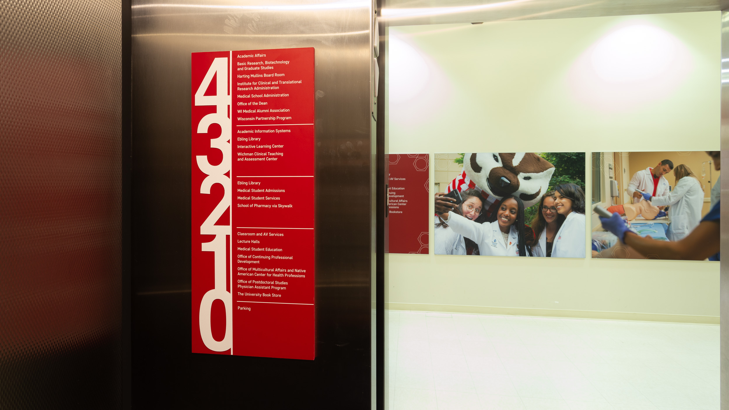
Several years earlier, Thysse partnered with UW’s School of Medicine to address a more fundamental challenge: users didn’t know where they were or how to get where they were going.
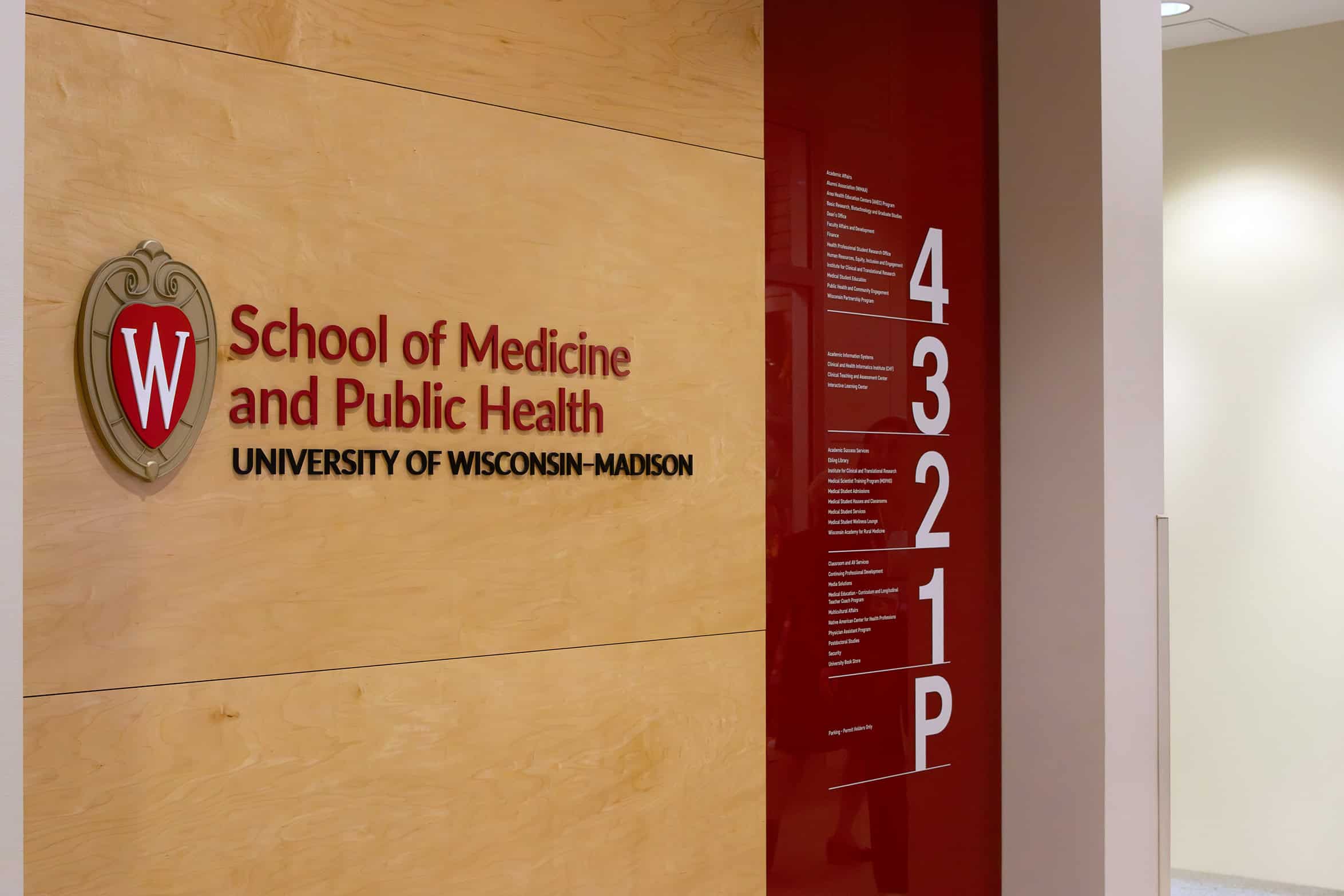
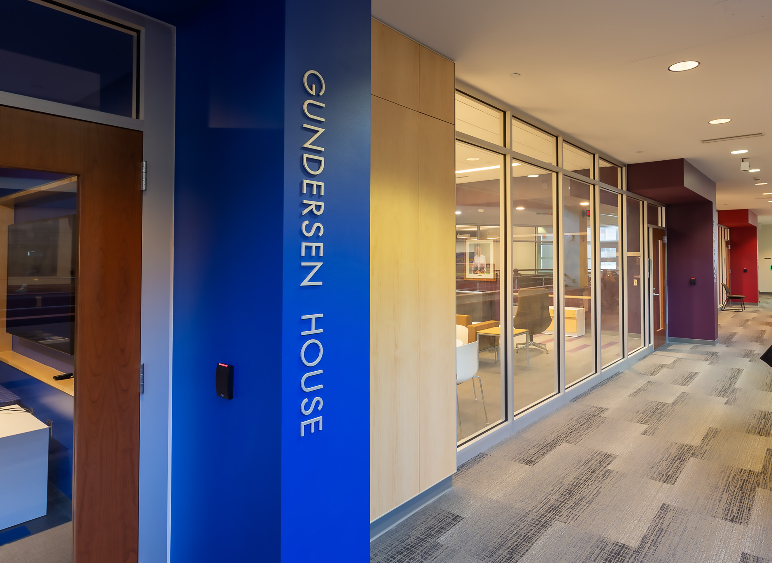
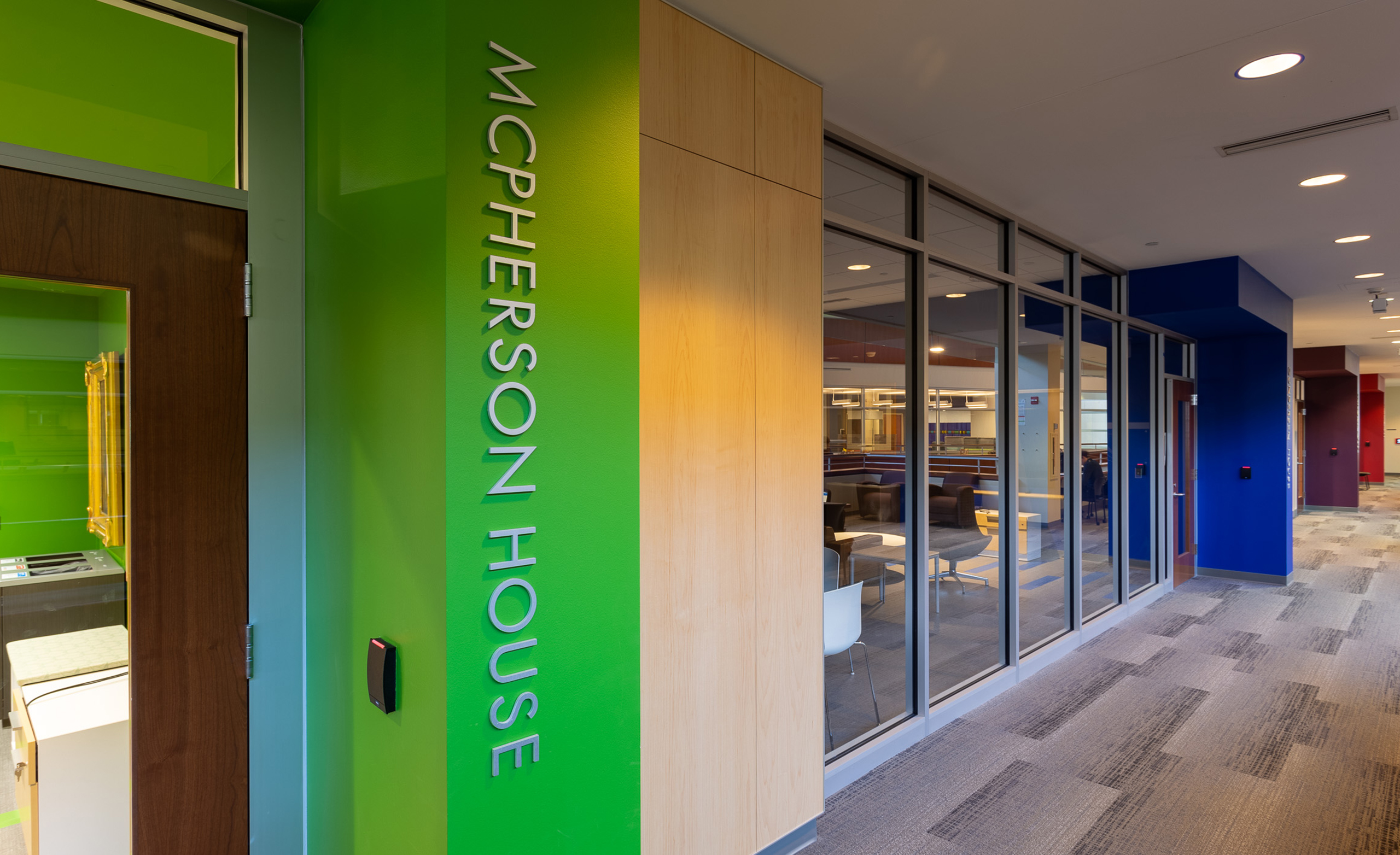
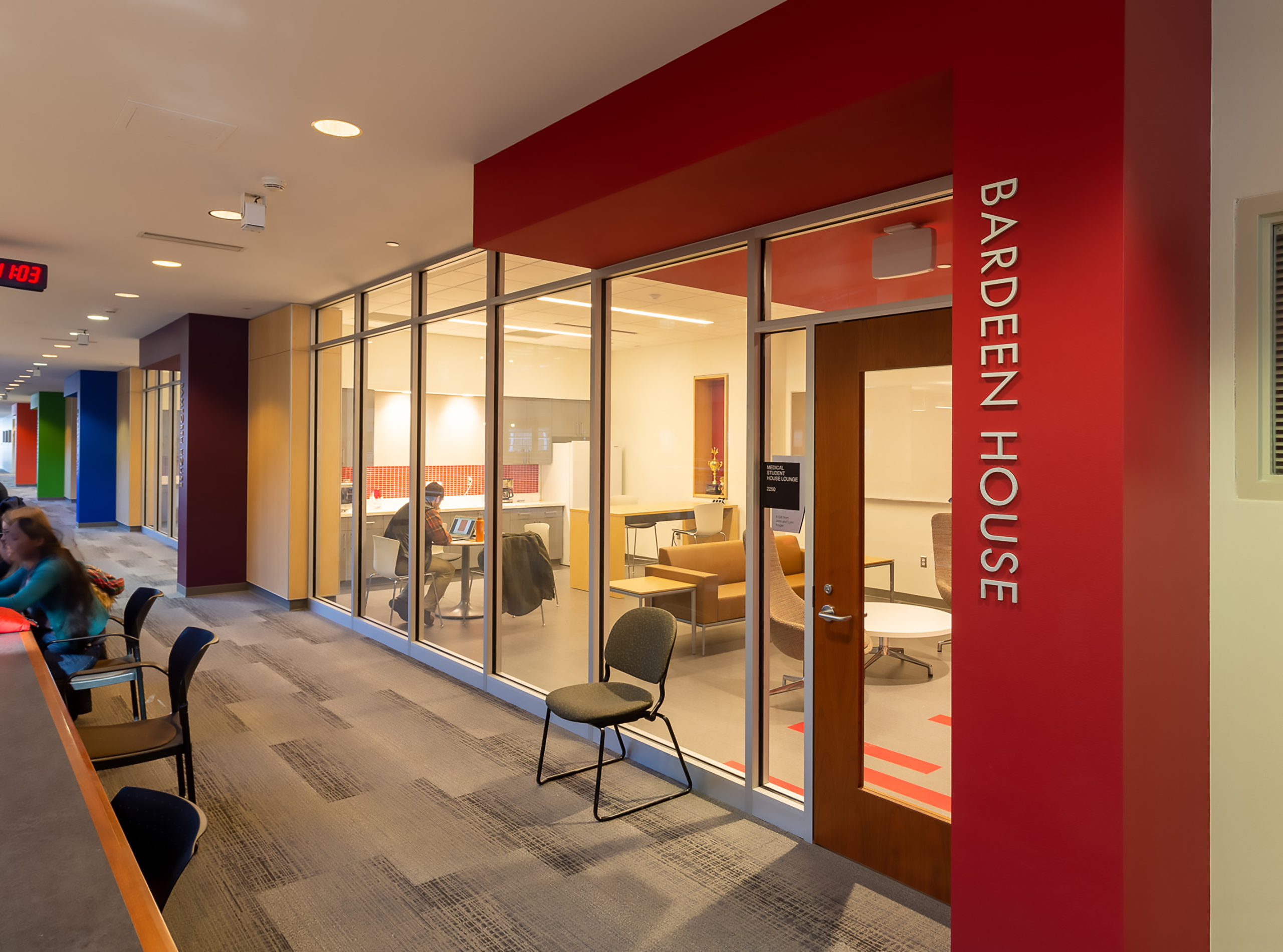
Thysse’s team created a facility brand palette that tied the building visually to the broader UW campus while honoring the Medical School’s unique mission of Service, Scholarship, Science, and Social Responsibility.
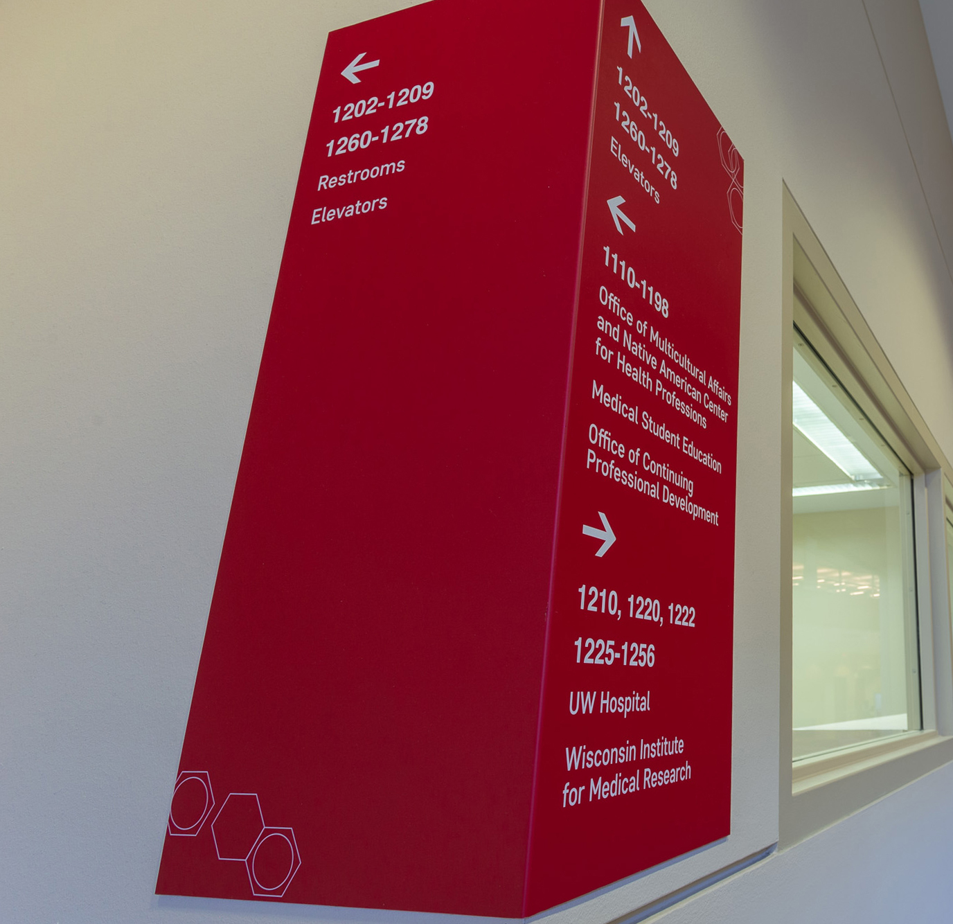
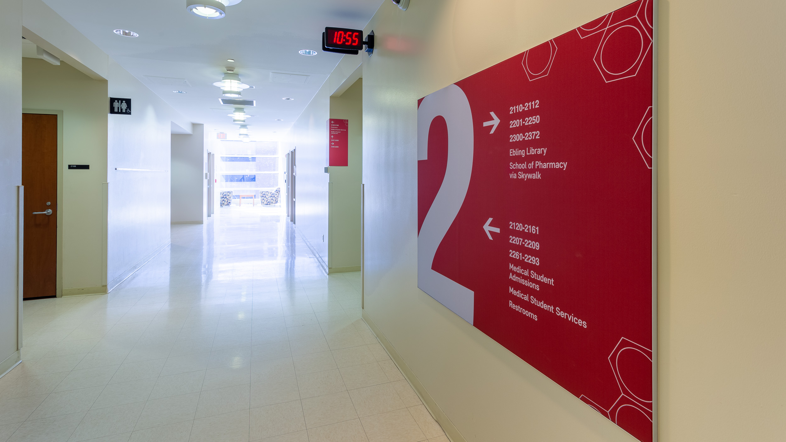
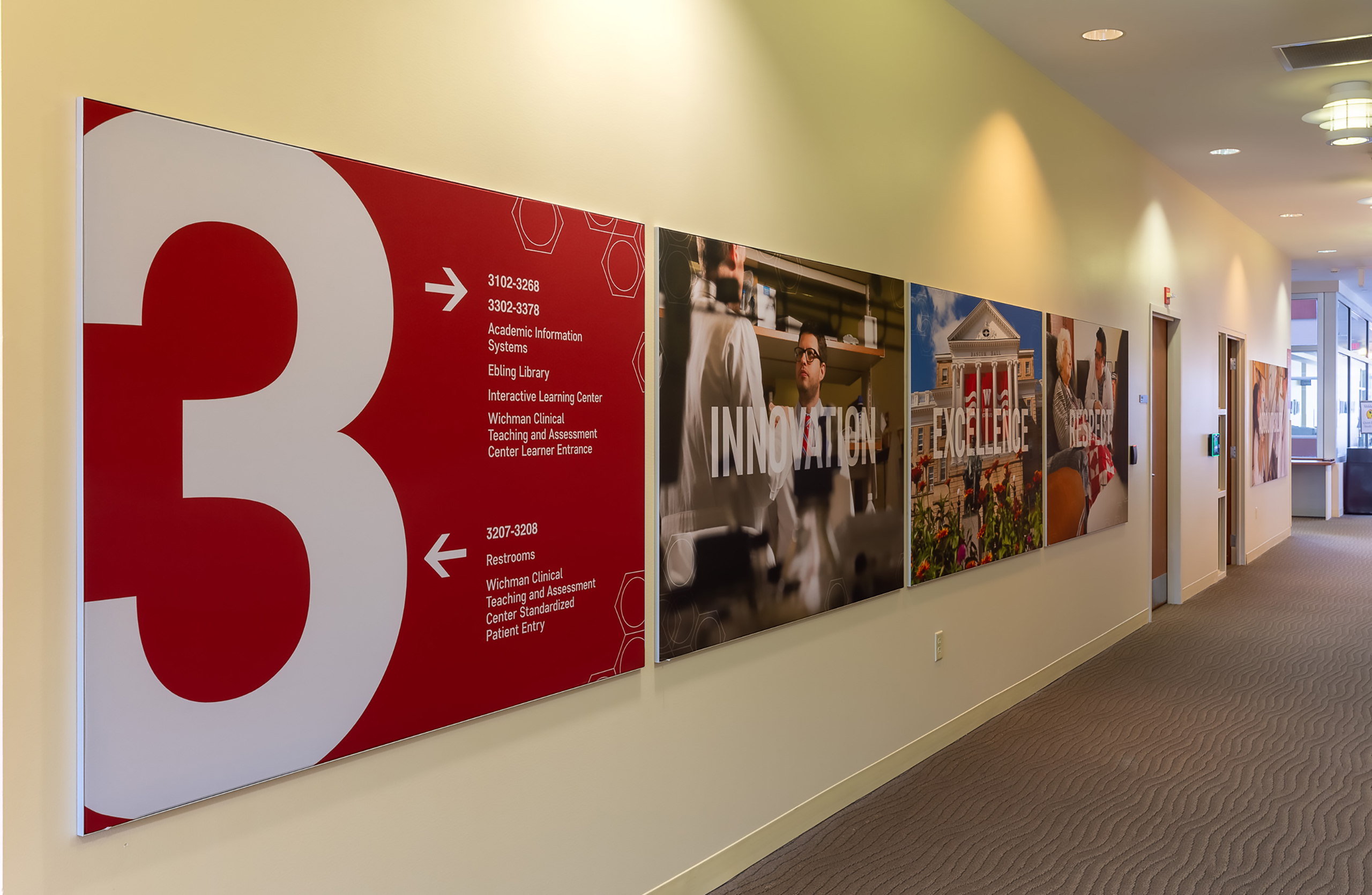
A comprehensive wayfinding system brought clarity and confidence to the space:
Together, these touchpoints built a visual and navigational rhythm that now supports the deeper storytelling layers added in Phase 2.
The result: a cohesive navigation system that communicates both identity and function—grounding the facility in UW’s visual language while reflecting the School’s culture of care and excellence.
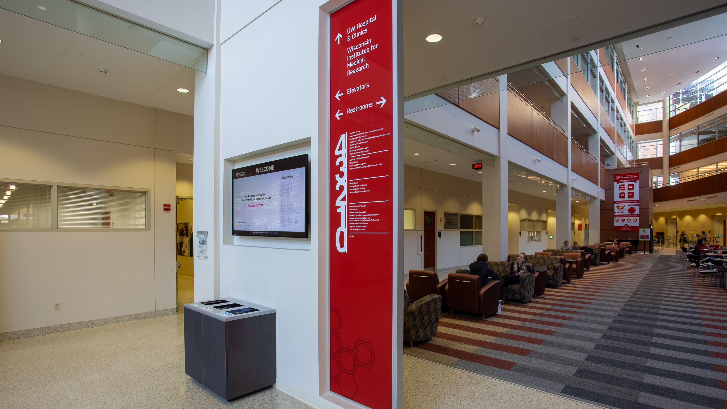
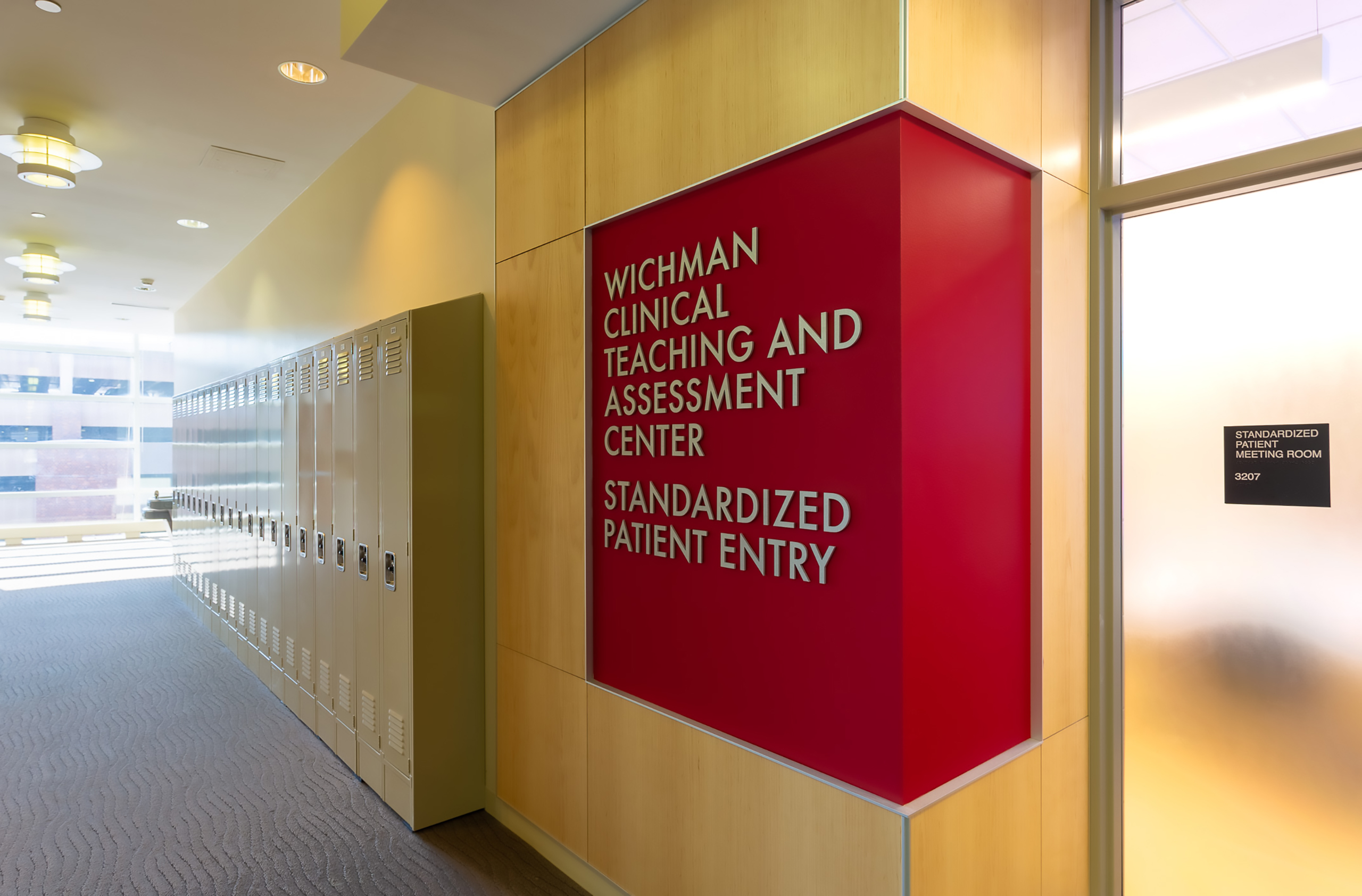
Thysse’s design incorporated dimensional acrylics, silicone-edge graphics, custom banners and printed wall and glass vinyl—elements chosen for both durability and warmth.
From wayfinding and identity to storytelling and values, Thysse’s partnership with the UW Health Sciences Learning Center demonstrates how thoughtful design evolves alongside the institutions it represents.
Each phase builds on the last—transforming a once-quiet building into a space that speaks clearly, confidently, and in the language of its community.