Up Close and Personal - in Color!
Viva Magenta! Pantone™ Isn't the Only Team Excited About Color This Year.
We’re back, baby! USPS currently has 2 postage promotions open for registration: The Tactile, Sensory, and Interactive Promotion and the star of today’s show: The Personalized Color Transpromo Promotion. Bring magic to your marketing messaging and account data through the use of color and personalization. (Brb, signing us up!) This promo encourages brands to combine customized touches with full-color prints to Direct Mail pieces. Add two or more colors to your marketing message or account data and receive 3% off postage rates. If a full-color reply piece is rolled into the mix, that number goes up to 4% total! Yep, it’s that simple.
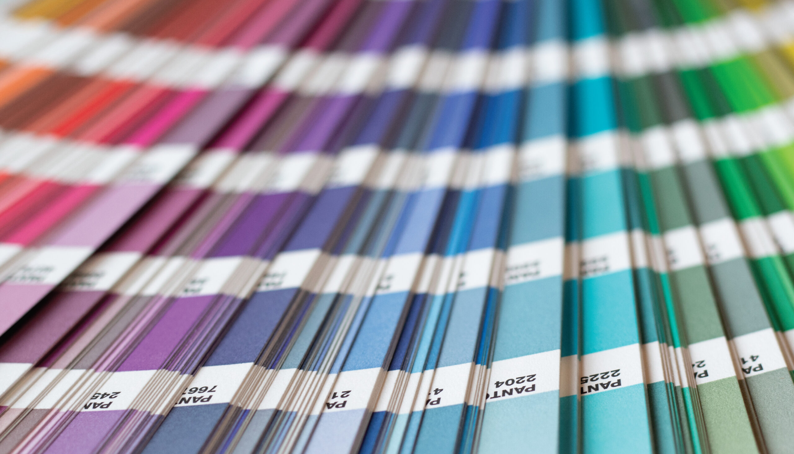
When it comes to communication, color can evoke emotions or change the way the viewer thinks. Each color on the spectrum can be used to enhance your message in a variety of ways; consider each when developing your next marketing piece. The print world talks in terms of CMYK, but color theory is based around the three primary colors. Different iterations and quantities of each can illicit different reactions, read on to help decide what works best for your brand.
Ready F(red)dy?
Looking to snag a little extra attention? Red’s a natural first choice. From catching a cop’s eye to our favorite bullseye superstore, red gets results because it can evoke both energy and danger. Sexy. We suggest you stay under the speed limit to avoid adding “reckless” to that list of descriptors. How does it help in your mailer? Red can also be associated with strength, power, determination, passion, or love. Beyond emotive responses, red can also create a physiological response by enhancing human metabolism, increasing respiration rates, or raising blood pressure. Consider the strong impact shades of red can have on your piece and design carefully!
Yellow, Is It Me You’re Looking For?
Close your eyes and picture a brand using yellow in their logo or marketing. It’s fine, we’ll wait. Got it? Did you see the golden arches of McDonalds, the ghost of SnapChat, the fanning bars of Sprint or the loose hive of Bumble? These brands have very different audiences and products, but each uses a vibrant yellow to quickly grab attention and present a playful, energetic, and youthful vibe. So why isn’t everybody using yellow? It has some downsides, typically when overused. In large quantities, yellow creates adverse physical and emotional responses. In fact, babies cry far more in yellow rooms, and fast food restaurants have used it to quickly usher guests out the door.
Tangled Up In Blue
Blue can bring warmth, peace, even compassionate responses. Think of it as the comfort hue, and use it effectively in your pieces to lower heart rates, create calming effects and give your message a positive energy boost. This can be especially helpful for brands dealing with sensitive messages of products like insurance or finance (think Blue Cross Blue Shield, Chase Bank, or Paypal). Other brands that are true blue? Dell, Zoom, IBM, and even Amazon. We can’t confirm or deny that these brands are anticipating irate customer call-ins, but it’s a distinct possibility…
We could stop here, but because orange is the color of creativity and a primary in our brand palette, we’ll go through one more!
Orange You Glad We’re Here?
We’re a little biased towards shades of tangerine and it could NOT be because Pantone™ 16 is also Thysse Orange, could it? Okay, you got us. But what’s not to love about a warm, approachable and energetic color? It aligns with who we are! We could debate about how well the color exudes creativity, reliability, resourcefulness and how great we are at listening, but let’s no. It’s in there. We view orange as more than just our brand color, it’s who we are and how we work. We wear orange. We live orange. We are orange. AND. WE. DRINK. ORANGE. KoolAid™.
The line at the very bottom is: Colors influence the way our brains interact with a message, item, room, emoji or traffic light…STOP! Thoughtfully leveraging color can produce tangible outcomes, especially in print advertising. The USPS knows it, too. The Personalized Color Transpromo Promotion is part of a series of awesome opportunities to see the difference enhanced mail can make for you, at little-to-no additional cost. It’s on offer to drive mail growth through repeat and expanded usage because USPS knows it works.
This is where we can help: Print advertising and direct mail campaigns can be incredibly effective when run well. They can also hemorrhage efficiency and incur unplanned or unnecessary costs when there are expertise gaps in the process. Thysse modestly rates itself a 10/10 for being the sort of partner you want to work with, and our client retention rates support it. If you haven’t worked with Thysse before, try us.