Mastering Color Consistency: How Thysse Uses G7 Color Management to Deliver Exceptional Print Quality

In the world of branding, color isn't just a visual element—it's a critical component of a company's identity. Imagine walking into a store and seeing a row of products from the same brand, but each one is a slightly different shade. Or receiving marketing materials where the signature brand color varies from brochure to business card. Inconsistent color not only undermines brand recognition but can also erode customer trust.
At Thysse, we understand the paramount importance of color consistency. That's why we've embraced the G7 color management methodology, achieving the highest level of certification—G7 Master Colorspace Qualification. This commitment ensures that we reproduce brand colors with unparalleled accuracy across a diverse range of print media and substrates.
Why Color Consistency Matters
Retail Merchandising Graphics and In-Store Experiences
In the retail environment, visual impact is everything. Merchandising graphics and in-store displays are designed to catch the eye and convey a brand's message instantly. When colors are inconsistent—say, a backdrop that's a different hue from the product packaging—the overall presentation feels disjointed.
Consider a cosmetics brand with a signature shade of purple. If the store signage, product displays, and promotional materials all display slightly different versions of this color, the cohesive brand experience is lost. Customers might subconsciously perceive the brand as less professional, lower quality or less trustworthy.
Marketing Collateral
Marketing materials are often the first point of contact between a brand and its potential customers. Brochures, business cards, and flyers need to present a unified front. However, when sales teams use quick-print services or office color copiers, the results can be less than stellar.
These devices aren't typically calibrated for color accuracy, leading to variations that can dilute the brand's impact. As Julie Thysse, our Preflight and Color Management Manager, explains:
“Inconsistent color may not be a big deal in certain situations... depending on how bad it is. But poor color accuracy conveys through to your customers and brand.’’
Packaging Consistency Across SKUs
In the competitive world of consumer goods sold in retail settings, packaging plays a crucial role in attracting customers and convincing them to touch and ultimately buy your products. For brands with multiple SKUs displayed side by side, consistent color and overall packaging quality is essential.
“A good example is packaged goods displayed next to each other where color variations are easy to see," says Julie. "Showing inconsistency to potential customers can hurt the perceived quality and value of your offering—and brand.’’
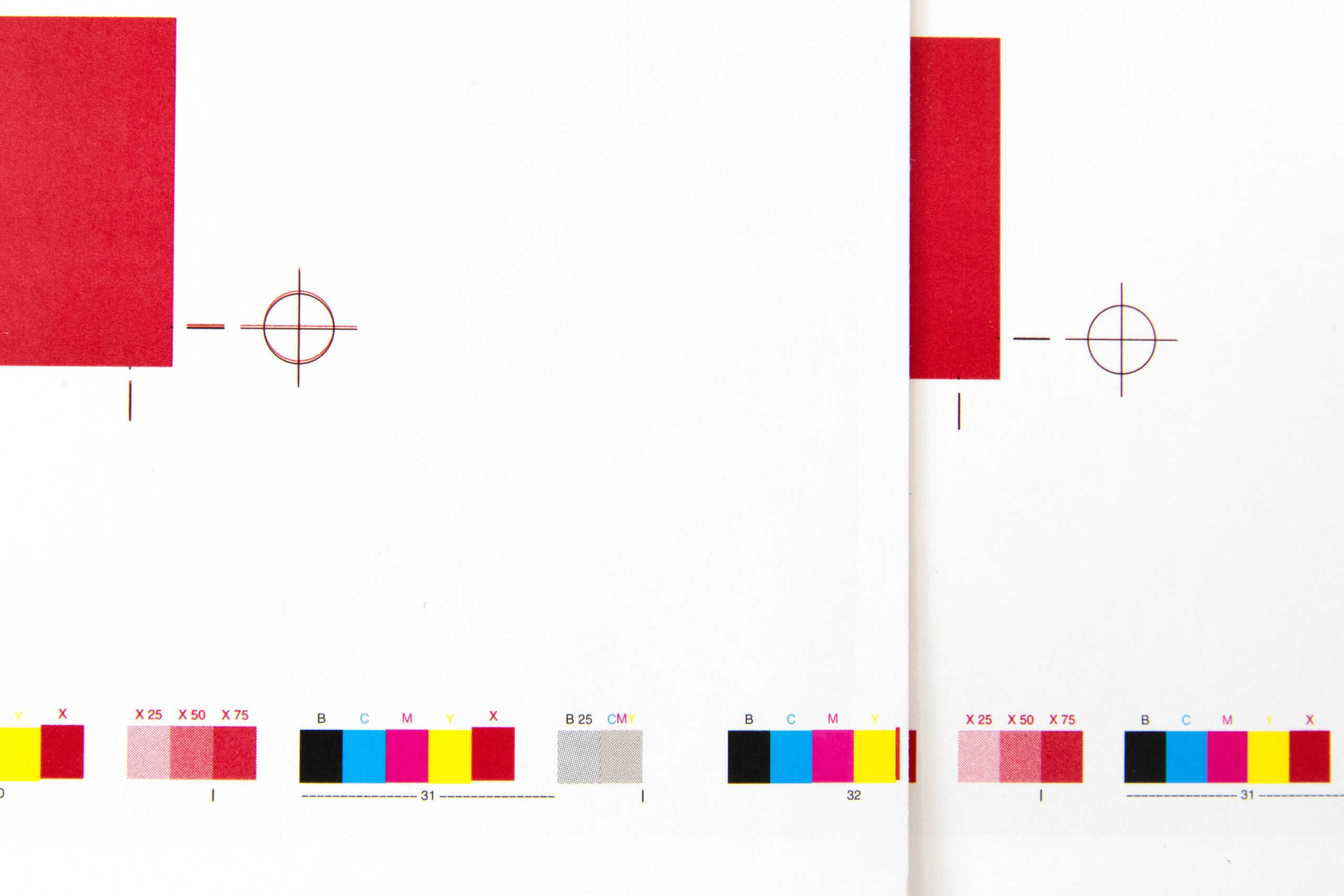
And– a byproduct of getting color right is getting a lot of other things right too. Registration, for example, is the alignment of layers of ink that create the desired color effect. We see registration problems all the time in retail settings. The result is a fuzzy and inconsistent color that’s easy to spot on smaller details, like smaller text callouts. When a potential client struggles to read the ingredients in, say, a box of granola bars or a cleaning solvent, it’s certainly not enhancing the brand experience or likelihood that the patron will make the purchase.

The G7 Method: Ensuring Color Accuracy
So What Is G7 Color Management?
G7 is a globally recognized methodology developed by Idealliance that provides a set of specifications for achieving visual similarity across all print processes. It focuses on calibrating printing presses and devices to a common grayscale appearance, which is the foundation for consistent color reproduction. The theory is that if graybalance is perfectly calibrated, all other colors follow.
“Color management is what a printer does to accurately reproduce your brand colors across all print media," Julie explains. "Clings, brochures, letters, displays, packaging, and signage are all made from different substrates on different print devices that use different inks. Color management is all about achieving consistent visual similarity across all those variables.’’
For a full explanation of the process and what G7 certification means, Thysse’s Ole Allen, Workflow Automation & Color Management Specialist and Morgan Manning, Heidelberg Color Specialist do a great job getting into the colorful details in the video embedded at the top of this article.
The short version, and how it applies to Thysse is, we’re a G7 Master Colorspace Qualified Facility, which is the highest standard in the industry. This certification means we can reproduce color at a level of accuracy where color variations are imperceptible to the human eye.
“Thysse is a G7 Master Colorspace Qualified Facility, which means we're capable of reproducing color at Delta E less than 2 accuracy on any device in our facility," Julie notes. "This ensures that the colors we produce are consistent and true to your brand, regardless of the printing method or substrate.’’
How Thysse Implements G7 Across Diverse Printing Platforms
One of the unique challenges in commercial printing is managing color across various devices and substrates. Thysse leverages the G7 methodology to achieve this consistency across our wide array of printing technologies:
1. Wide-Format High-Resolution Printers
Our wide-format printers can print on a variety of materials, including fabric, wood, and metal. The unique color mixes and coatings needed to get a brand colors to look the same on paper, plastic, fabric and metal is where the G7 process enables us to…be consistent, consistently.
We have a variety of wide-format print devices that are often used for:
- Retail Displays: Eye-catching banners and signage that need to match the brand's color specifications precisely.
- In-Store Experiences: Customized graphics that enhance the shopping environment, requiring flawless color reproduction on unconventional substrates.
- Facility Branding & Wayfinding: Custom wall, window, floor and ceiling graphics as well as utilitarian elements like wayfinding signage and location, room, office or seat names.
2. Toner Devices
For shorter run marketing collateral like brochures, business cards, and selling tools, our toner-based printers deliver sharp, vibrant images on a range of substrates:
- Marketing Collateral: Ensuring that every print asset in your arsenal reinforces your brand identity and burrows deeeeeep into the minds of your audiences.
3. Roll-Fed Digital Devices (High-Speed Variable Data Printing)
When it comes to VDP and personalized marketing materials or direct mail campaigns, our roll-fed digital printer excels. Thysse recently invested (July of 2023) in new, state-of-the-art roll-fed print technology that’s able to offer:
- Variable Data Printing: Personalizing each pixel in every piece without sacrificing color consistency, crucial for maintaining brand integrity across millions of unique prints. This robust capability has enabled Thysse to meet rapidly growing demand for more targeted print communications, primarily in mail and low, highly targeted pagecount catalogs.
- High-Efficiency Output: Delivering large quantities quickly while adhering to strict color and quality standards.
4. Offset Presses
Our offset press is the workhorse for high-quality, static artwork:
- Packaging: Producing packaging materials where color consistency is vital, especially when products are displayed together on shelves. In a competitive packaging industry, Thysse has found a niche producing card and small carton packaging on behalf of brands that demand the highest quality and color accuracy.
- Large Runs of Marketing Materials: Ideal for catalogs, magazines, and other materials where uniformity across the entire print run is non-negotiable. Embellishments like UV dispersions are a great way to elevate the wow factor, but require expert operators to deliver both the effects and accurate brand color.
The Pitfalls of Not Managing Color
While convenient, not managing color by accepting inconsistent print materials, or enabling selling teams to source their own print sources can hurt brand consistency.
"Not all brands actively manage brand color to the same standard, or at all," Julie points out. "And not all printers offer color management."
Without proper calibration and adherence to standards like G7, colors can vary widely. This inconsistency can make marketing materials look unprofessional, reducing their effectiveness and potentially harming the brand's reputation.
A recent new client came to Thysse looking for a solution to this exact problem. Selling teams were gathering, creating and printing their own selling tools which was leading to brand chaos beyond inconsistent color. The color management solutions Thysse offers solved half of the problem. But, getting control over brand content was something we were able to do for them as well via a custom Brand Portal. In a nutshell, it enabled their marketing team to offer and control the assets available to the selling team, reduce overall print costs while improving quality– and make the process more efficient.
Elevate Your Brand with Thysse's G7 Expertise
Color is a powerful tool in branding, and consistency is key to leveraging that power effectively. In a marketplace crowded with competitors, standing out requires attention to every detail—including the exact shade of your brand colors.
At Thysse, we combine advanced G7 color management with a broad range of printing capabilities to deliver exceptional results. Whether you need vibrant retail displays, consistent packaging across SKUs, or high-quality marketing collateral, we have the expertise and technology to make it happen.
As Julie concludes:
"Hopefully you now know a lot more about color management and how Thysse does it. If you have questions about how to implement color management or would like to work with us, please reach out through our website or give us a call!"
At Thysse, we believe that every print piece is a representation of your brand, and therefore important. We’ve assembled a world class team of experts and empowered them by investing in the finest print technology available to exceed your expectations on each and every project. Plus, we’re just downright great to work with.
If your current print universe could use a tune-up, reach out and discover for yourself the sort of difference a great partner can make.

