Colorful Language: Perplexing Print Lingo Defined
Communicate with your printer like a pro for spot-on results and smoother workflows.
Vamoose. Widdershins. Non-sequitur. Cattywampus. Will using big words make you a better person? No. But will it change the trajectory of your business and catapult your career to another level? Also, probably no. However, familiarizing yourself with some key print-related jargon will make you sound like a whiz in verbal exchanges with your printer. More importantly, understanding common lingo involved in the creation of your projects means you can better communicate your goals and expectations – ultimately resulting in a more buttoned-up final product, the best bang for your buck, and overall less-stressful communication along the way.
Below we’ve compiled a short list of uber-useful print production terms and their definitions. However note that the following is just one of three lists we have yet to unveil – the others pertaining to Graphic Design and Brand Development. If awkward innuendos are your thing, be sure to check out the wild n’ wacky terms used in Specialty Graphics installations here.
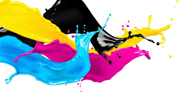
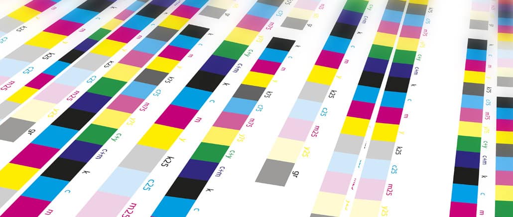
CMYK
Remember the primary and secondary color wheels you learned about in your elementary school art class? Blue + yellow = green? This is roughly the same concept. CMYK is an acronym that refers to the 4 color ink plates used in the color printing process: Cyan, Magenta, Yellow, and Key (usually black). Different combinations of the 4 are used to create the full range of colors, with the key plate being used to print the detail – a tidbit you might recall if you’ve been following along with our monthly Trivia questions.
Offset Printing
The most commonly used commercial print method, offset involves transferring an inked image from a metal printing ‘plate’ to a rubber cylinder, then rolling the image onto a sheet of paper. All of this of course happens inside a massive, state-of-the-art machine. Offset produces the highest-quality prints, with the most accurate color reproduction and clean, crisp images. However this method is more cost effective when used for larger press runs.
Spot Color
Ever need a super specific color, like your exact brand shade? That’s where spot color comes in! Instead of mixing inks, we use a premixed, solid color ink for spot colors, making it perfect for nailing consistency. Think special finishes like metallics or fluorescents—it’s all about precision.
Digital Printing
That small laser or inkjet printer you have hooked up to your laptop at home? That’s a digital printer. However the ones used for commercial printing purposes are larger, faster and more precise. Unlike offset that utilizes plates, digital printing transfers ink directly onto the paper. Digital is often seen as more cost effective, and a better option for shorter press runs.
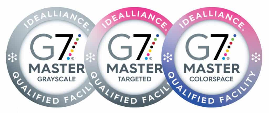
G7 Certification
A three-tiered certification system that indicates a printer’s ability to accurately reproduce colors and maintain color consistency across their various substrates and print processes. That means the red on your logo will match the red on your website, your packaging, your store signage, and so on. Color consistency has a significant impact on consumers’ overall impression of a brand, learn more about the science of color management here.
Digital Proof
Not to be confused with a pdf proof (viewed on screen), a digital proof is a physical copy of a project printed on a digital printer (see above). Digital proofs are a cost effective way to check things like fonts, graphics, lines, copy, and page layout with excellent accuracy. However, since digital uses process colors, it is not always an accurate representation of the actual pantone colors that may be specified for your job.
Resolution
The detail or visual sharpness of an image. If an image appears very crisp and clear, it has high resolution. If it appears blurry, low resolution. The resolution of an image in the graphic design world is measured in pixels per square inch (PPI) or dots per inch (DPI).
Trim
The trim size represents the actual dimensions of your project. In other words, the trim marks where the paper will be cut, or trimmed away, from the surrounding border. In order to avoid potential white slivers from being visible around your piece after it has been cut, your graphic designer will typically extend the background beyond the trim.
Bleed
Far less violent than it sounds, bleed is the extra ⅛” border of background color extended beyond the trim. The bleed prevents accidental white slivers from showing up around the edges after a piece has been cut and ensures a polished final product.
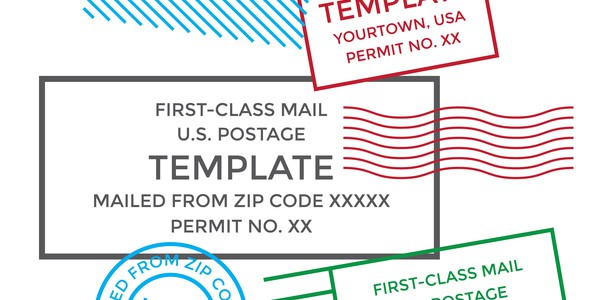
Indicia
In the realm of direct mail, an ‘in-dee-shuh’ is essentially a printed postage stamp. They save time and money associated with having to manually stamp each individual piece, however they must adhere to a strict set of USPS formatting guidelines. It is generally the responsibility of your graphic designer to ensure these requirements are met and incorporated into the design.
Kitting
Sorry, no kittens involved. However, kitting is extremely beneficial for cutting costs and streamlining your work flows. Kitting (or kit packing), is assembling multiple related items into a single package and shipping them to a list of recipients. Commonly kitted items include signage resets for retail stores, promotional products for trade shows, and folders stuffed with pre-sorted documents.
Bindery
The department within a commercial printer which handles any finishing processes involved in a project, including scoring, cutting, stitching, stickering, foiling, assembling, embossing, and of course, binding. Bindery ensures your project looks polished and professional, and applies the final touches that make your printed piece stand out from the rest.
Spot UV
A fancy finishing technique that makes certain areas on a printed piece appear high-shine and glossy. Spot UV treatments are particularly eye-popping on a matte background, adding depth and visual contrast. This is a great finishing option to make certain elements of your piece stand out, such as your company logo on a business card for example.
Scoring
Ever wonder how greeting cards get those clean, crisp folds in the center? In the print world, scoring means to press or emboss a crease-line onto a substrate to allow for easier folding. Fold lines are especially beneficial for thicker substrates like cardboard. Pieces that require scoring should be designed so that the crease line runs in the same direction as the grain of the paper. Substrates should also be carefully selected to avoid the possibility of cracking.
While we hope you spend some time familiarizing yourself with the terms above, we also recognize that becoming a human commercial print dictionary doesn’t always fall high on the priority list (that’s our job!). The great news is that Thysse’s team of graphic designers and production specialists have conversations about this stuff on the daily, and they’re always happy to break down any unfamiliar terms throughout the process. Got a print project in mind? Head to our contact page and drop us a line or check out our Print Services page to explore more on your own.
