Avoiding Common Prepress Mistakes: A Complete Guide to Flawless Print Production

Why Prepress Matters
It starts before you hit "export" — but if you’re reading this because a file needed adjustments, don’t worry. We’ve all been there.
Prepress is the step between design and production that ensures your files are ready to print accurately and efficiently. It’s more than a technicality; it’s about translating your creative vision into a flawless final product.
Mistakes in this phase can cause project delays, extra costs, or reprints. At Thysse, we review every project using our internal checklist—but when files come in already following best practices, everything moves faster and smoother. Whether you're working on packaging, signage, mailers, or a short-run brochure, here’s how to avoid the most common pitfalls.
Top 7 Most Common Mistakes: Pre-Export Issues
1. Low-Resolution Images
Why it matters:
Print requires 300 DPI (dots per inch) at the final printed size. Images pulled from the web or upscaled from small originals often look fine on screen—but once printed, they’ll appear soft or pixelated.
How to fix it:
- Ensure your images are 300 DPI at 100% scale.
- Don’t scale up smaller images to fit the layout.
- Double check resolution in Photoshop or InDesign via the Links panel.
💡 Heads up: While Illustrator is powerful for creating logos, icons, and illustrations, it’s not ideal for laying out image-heavy designs. For multi-page layouts or anything involving multiple high-res images, InDesign is your best bet.
2. Missing Bleed
Why it matters:
Bleed is the extra space beyond the edge of your document that allows color or images to run off the page, preventing unwanted white edges after trimming. Even a millimeter of movement on the cutter can create visible slivers if bleed is missing.
How to fix it:
- Add 0.125" bleed on all four sides when setting up your document.
- In InDesign: You can set bleed in the New Document dialog under “Bleed and Slug.”
- In Illustrator: Set bleed when creating a new file or go to File > Document Setup to adjust.
- When exporting to PDF, always check “Use Document Bleed Settings.”
Reminder: Bleed settings don't automatically apply during export—you must select “Use Document Bleed Settings” in the export dialog.
🟡 Important Exception: Some wide format or mounted signage projects may require different bleed settings—or none at all—depending on how the graphic is installed. Your Thysse rep will let you know if this applies to your project.

3. Incorrect Color Mode
Why it matters:
Files built in RGB (red, green, blue) are optimized for screens—not for print. RGB colors often look bright and vivid on your monitor but can shift dramatically when converted to CMYK (cyan, magenta, yellow, black), the color mode used by commercial printers. Without converting, your print may not match what you see on screen.
How to fix it:
- Always convert your files to CMYK before exporting.
- In Illustrator:
- Go to File > Document Color Mode > CMYK Color.
- Check your Swatches panel—remove any unused colors and make sure the remaining swatches are CMYK or designated Spot Colors.
Convert color mode in Illustrator
- In InDesign:
- When creating a new document, choose the “Print” intent. This sets CMYK as the default color space.
- You can double-check and clean up swatches just like in Illustrator.
Set up a CMYK print document in InDesign
- In Photoshop:
- Go to Image > Mode > CMYK Color.
- To adjust resolution and color profile at the same time, go to Image > Image Size and ensure resolution is 300 PPI, then Edit > Convert to Profile if needed.
Bonus Tip:
- Clean up your Swatches panel by deleting unused colors.
- Use Spot Colors only if necessary (e.g., metallics, Pantone matches, or brand colors). Clearly label them and place on their own layer if needed.
4. Fonts Not Outlined or Embedded
Why it matters:
If your fonts aren’t embedded in the PDF or converted to outlines, there’s a risk they’ll be substituted with a default font during production. That can cause serious layout issues—especially if your branding depends on specific typefaces or if your text reflows unexpectedly.
How to fix it:
- In Illustrator:
- Select all text (Ctrl+A or Cmd+A), then go to Type > Create Outlines.This converts your type into vector shapes that won’t change.
- In InDesign:
- Outlining should be a last resort. It’s usually better to embed fonts in your PDF.In the export dialog, under Advanced, make sure Subset fonts when percent of characters used is less than: is set to 0%.This ensures all fonts are embedded.
Pro Tip:
- Always save a separate version of your file with outlined fonts—labeled something like
ProjectName_OUTLINES.inddor.ai. - This lets you go back and make edits to live text later without recreating your layout from scratch.
Reminder:
Illustrator is primarily built for illustrating—not page layout. If you're building multi-page documents, packaging, or more complex layouts, InDesign is often the better tool.

Top 7 Most Common Mistakes: During Export Issues
5. Missing Crop Marks
Why it matters:
Crop marks show exactly where your piece should be trimmed. Without them, our finishing team has no visual cue to align the cuts—especially important when working with full-bleed designs. Even if your artwork has bleed, missing crop marks can still throw things off.
How to fix it:
- When exporting your final PDF, check the box for “Crop Marks” under Marks and Bleeds.
- Also check “Use Document Bleed Settings” to ensure the crop marks align with your built-in bleed area.
- Use Thysse’s PDF export preset, which has these settings dialed in. It’s based on Adobe’s “High Quality Print” preset but tailored to our workflow.
Download Thysse's Adobe PDF Export Preset
Pro tip: Always open your exported PDF in Adobe Acrobat Pro (not just a web browser) to confirm that crop marks and bleed are displaying as expected.

6. Spreads Instead of Single Pages
Why it matters:
Designers often build layouts as reader spreads—think pages 2 and 3 side by side. But in print production, we need individual pages to correctly impose, trim, and bind your piece. If you send spreads, we may have to bounce the file back for re-export, which can delay production.
How to fix it:
- In InDesign, when exporting your PDF, deselect “Spreads.”
- Always export as single pages, in the order they’ll be printed (not how they’ll be viewed).
- Thysse’s export preset is already set to export as single pages—just make sure “Spreads” is unchecked if you’re adjusting manually.
Note: If you’re building a fold-out or specialty piece where the spread layout is intentional, let us know—we’ll help guide setup and export so nothing gets lost in translation.
7. Skipping Proof Review
Why it matters:
Trust us, we’ve seen it all—missing images, RGB colors, text reflow, even placeholder copy that accidentally made it to press. The final proof check is your last chance to catch these. Previewing your PDF in a browser won’t cut it. You need to look at it the way we will.
How to fix it:
- Open your exported file in Adobe Acrobat Pro, not your web browser.
- Zoom in and scroll through every page. Look for:
- Blurry or pixelated images
- Fonts that look “off” or misaligned
- Missing links, placeholder text, or layout issues
- Crops and bleeds showing as expected
- Finishes placed on the correct layers (if applicable)
- Compare against your original design and proofread as if it’s the final product—because it is.
Pro tip: If anything looks different than expected, go back to your design file and adjust. It’s easier to fix now than after press time.
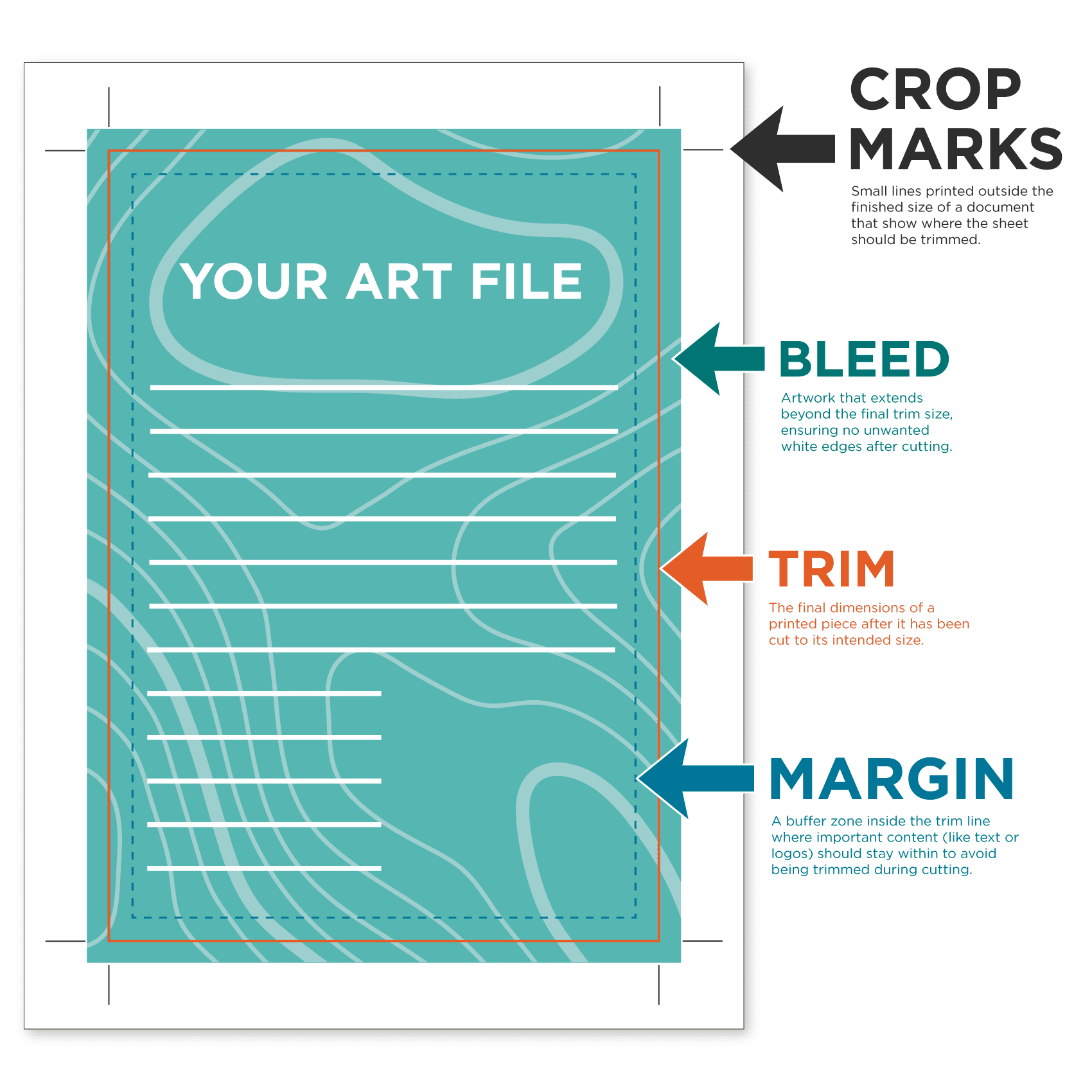
Glossary of Print Terms
Bleed
Artwork that extends beyond the final trim size, ensuring no unwanted white edges after cutting.
CMYK
The four ink colors used in full-color print: Cyan, Magenta, Yellow, and Black. Always convert to CMYK before export.
Crop Marks
Thin lines printed outside the trim area to indicate where the final piece should be cut.
DPI (Dots Per Inch)
The resolution of an image. 300 DPI at 100% scale is the standard for high-quality print.
Embedded Fonts
Fonts that are included within your PDF so they display and print correctly—especially important if you're not outlining them.
Outlined Fonts
Text converted to vector shapes. This ensures layout accuracy when the original fonts aren’t available.
Packaging (Files)
The process of collecting all elements—linked images, fonts, and design files—into one folder for print handoff.
Spot Color
A premixed ink, often used for brand colors or special finishes like metallics or neons. Used instead of (or alongside) CMYK.
Swatches Panel
The color palette in Adobe design programs. Cleaning it up before export helps prevent errors or accidental color shifts.
Trim Size
The final dimensions of your printed piece after cutting.
Preflight
A final check of your file to ensure it meets all technical requirements for print production.
Updated: August 6, 2025