Menu
Menu

“I’ve always loved a beautiful calendar,” says our designer. “More recently, I’ve found myself clipping out national park photos I’d love to visit one day. The idea that those images usually end up tossed or left unused felt like a missed opportunity—and that’s what sparked the concept for our 2026 calendar.”
We concepted a few initial pages and a loose cover design. From there, we pulled in the right people: production experts to test feasibility, account managers to weigh costs, and mailing advisors to ensure the piece would move smoothly through the postal system. By the time the concept was finalized, we had confidence that it wasn’t just beautiful—it was functional, too.
Covers
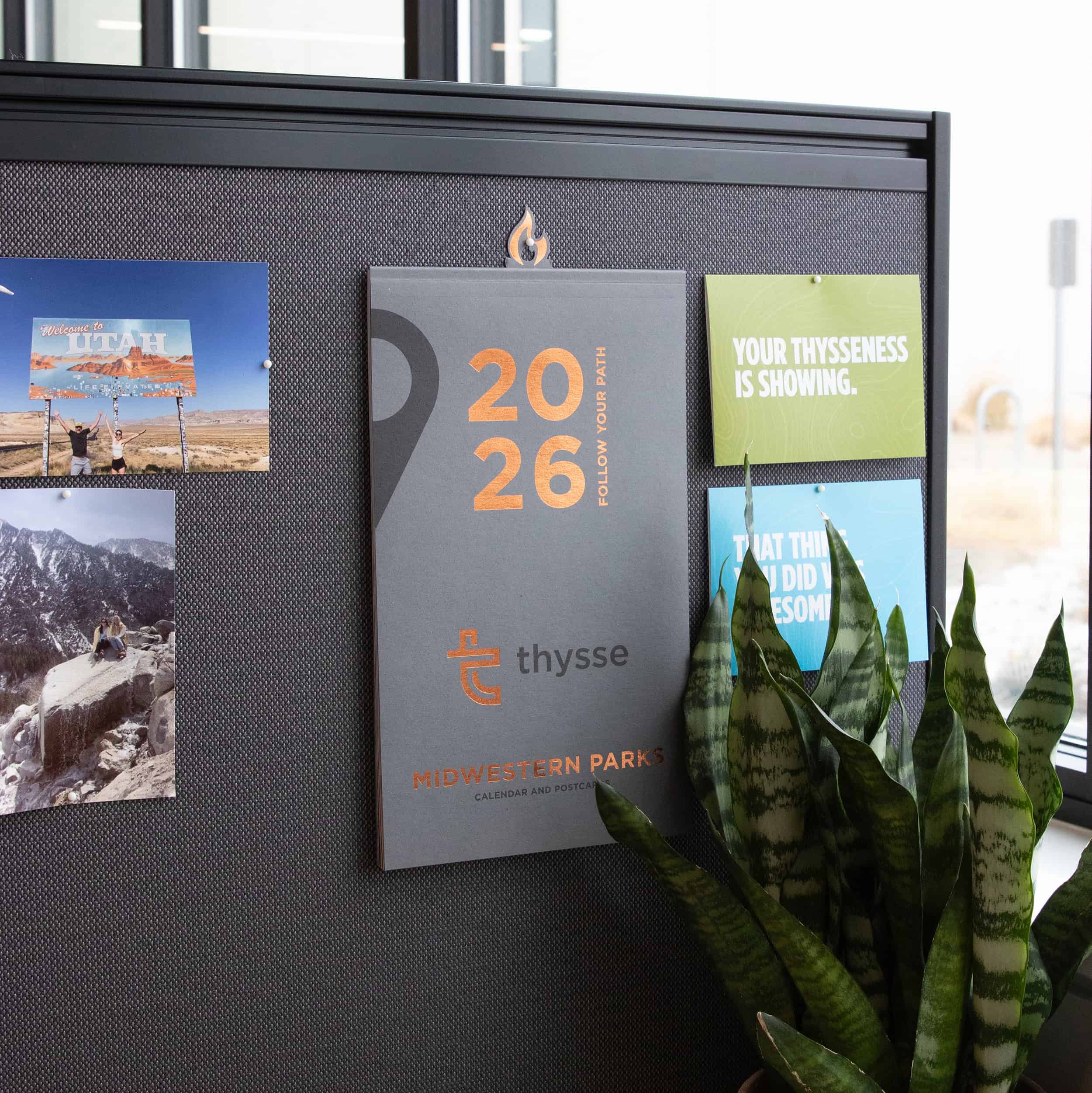
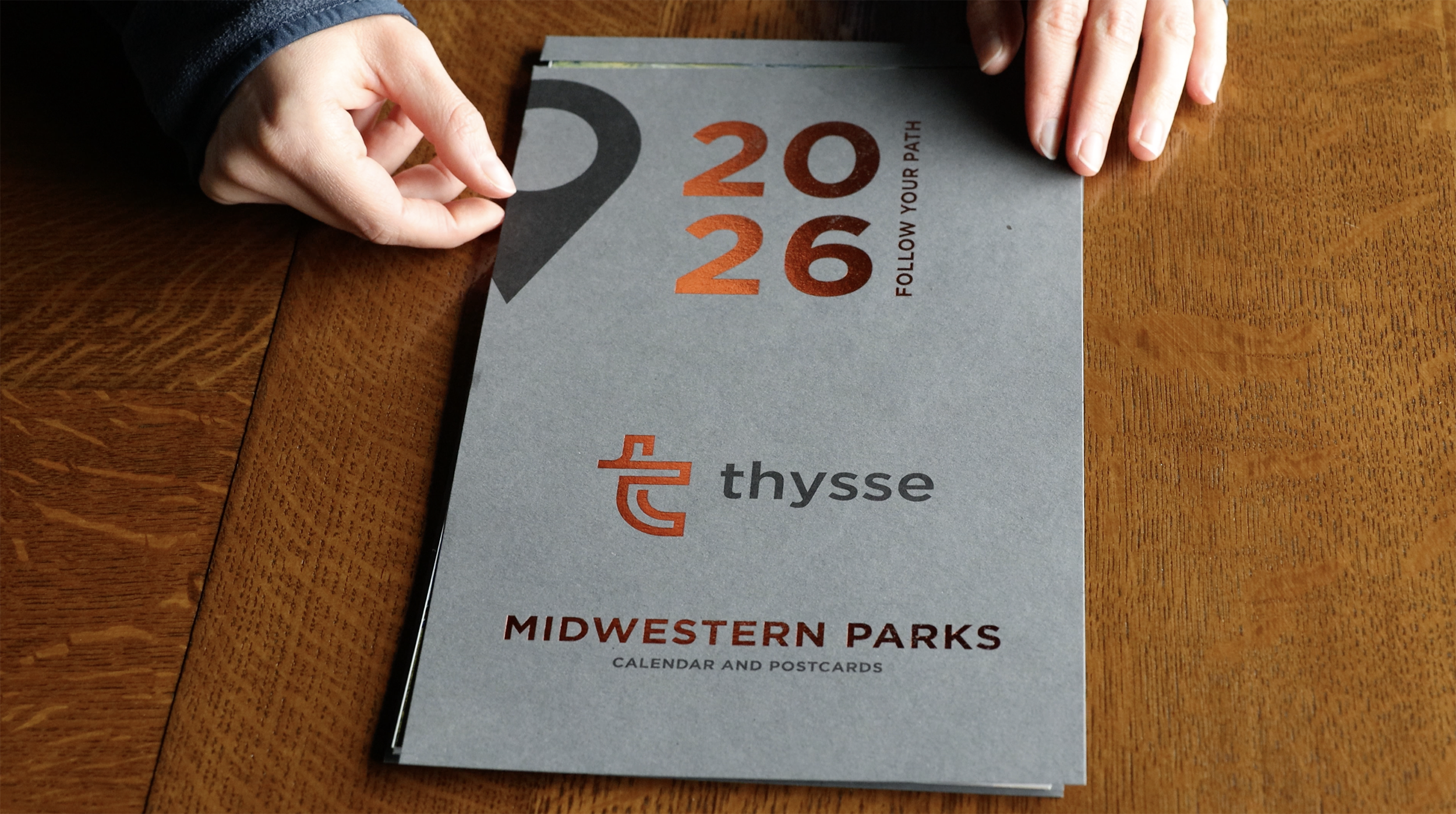
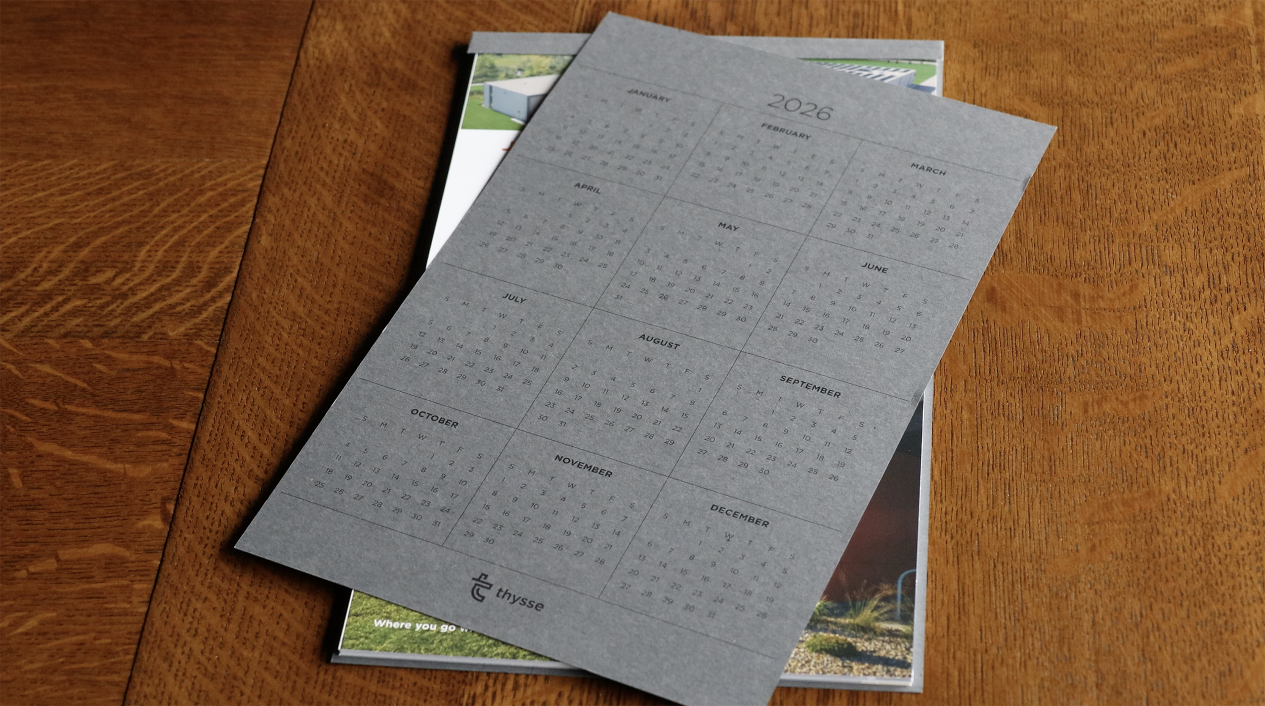
Printed on an earthy fibrous stock, the cover combined classic black ink with a hit of Thysse orange foil that gave it a quiet shimmer. The foil carried through to the back cover as a checklist of park badges, each illustration aided by AI for concepting. A goal throughout the design process was to put every inch of paper to work, giving it purpose. Inside, perforated annual calendars for 2026 and 2027 added bonus utility: easy to tear off and tack up at a desk or carry into a meeting.
Opening Page
The opening page worked double duty: one side introduced Thysse, the other guided readers through the features of the monthly calendars and postcards.
Monthly Pages (Triple Duty)
Each month’s page did more than mark days on a grid:
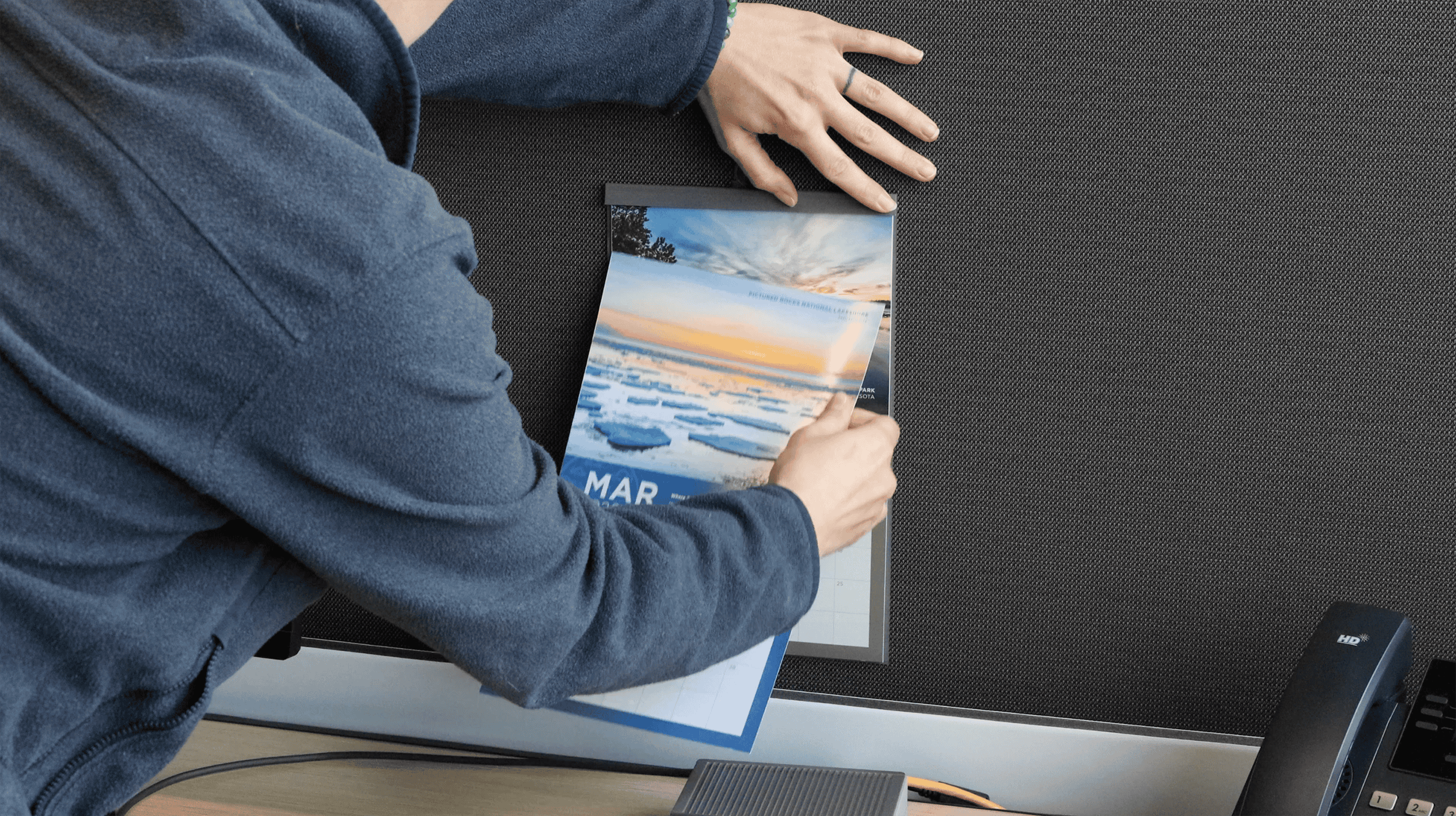
Hanger Tab
The weight and thickness of the calendar was enough to potentially cause tacks in cubicle walls to fall out, so we came up with an elegant solution: A custom flame shaped hanger tab, foil-stamped in Thysse orange to mimic flame. Built as part of the cover itself, it tucked neatly into the back of the calendar—no added bulk, more seamless for storage, shipping, and display.
Every stage of this project was reviewed and tested. We ran blank tests for clean perforations, consulted mailing experts to confirm smooth processing, and put the hanger tab through weight trials. We didn’t move forward until the piece was proven—because quality and service are what our clients know us for.
As our production manager, who’s been with Thysse for nine years, put it:
“This is the best calendar we’ve ever done.”
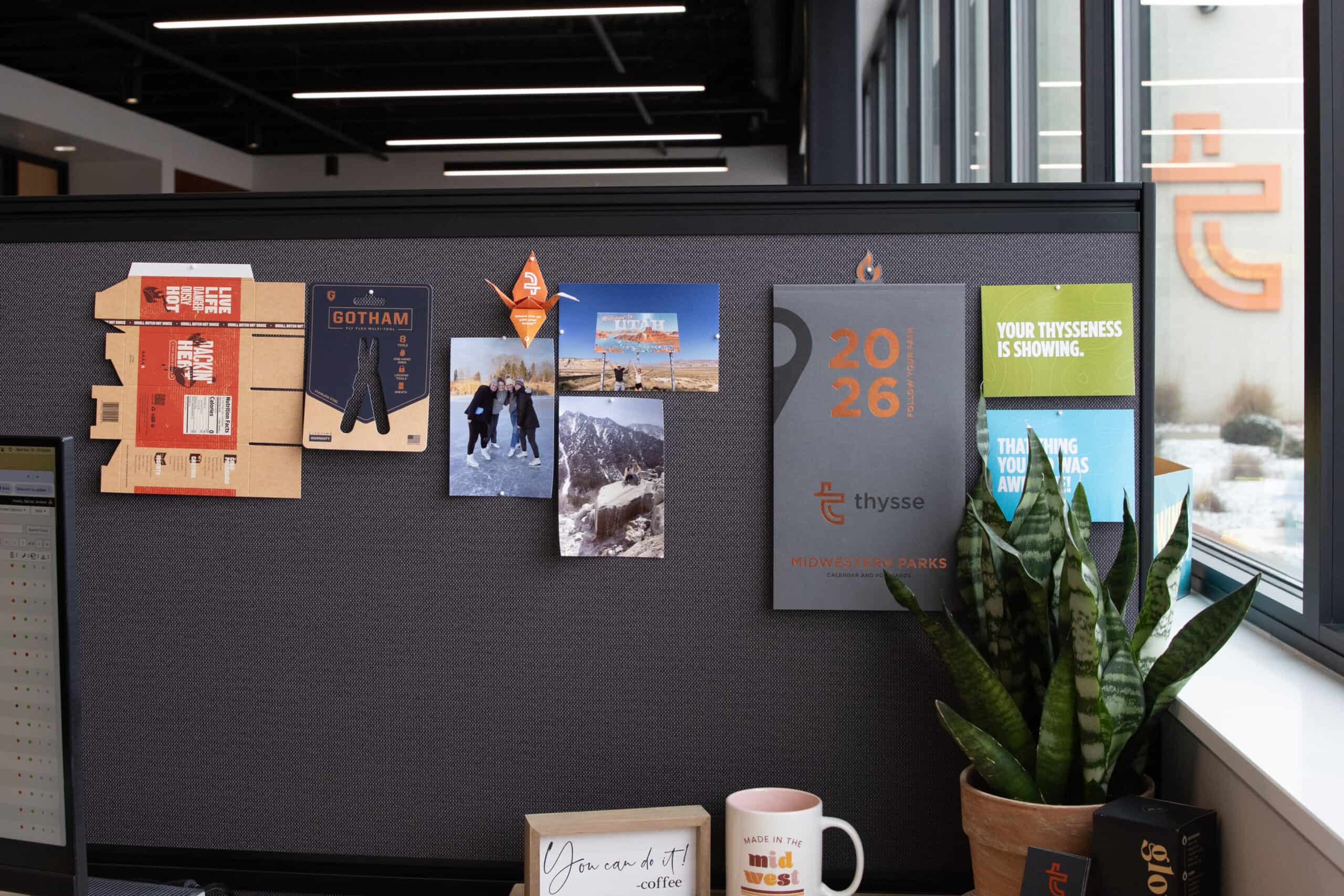
The 2026 calendar is more than a date-keeper. It’s designed for reuse—so every page has a life beyond its month.
As these calendars land in offices and homes, they’re built to be used—written on, mailed out, checked off, displayed—and kept.
Most print pieces serve a function—but a signature piece does more. It earns attention, creates connection, and stays in use longer—the kind of return that makes the added investment worthwhile.
The 2026 calendar proves it: every detail was considered, tested, and refined until it worked flawlessly—perforations that tear cleanly, hanger tabs that hold, postcards that mail without issue. That level of care comes from collaboration, and it’s the same diligence our clients experience when their own projects are in production.
A signature piece isn’t about adding more for the sake of it. It’s about elevating the right details, with a partner who knows how to balance creativity, practicality, and execution. That’s what turns something familiar into something people keep, share, and remember.