Menu
Menu
Destrée Design Architects developed the approved concepts to support the building’s medieval fantasy theme. Their approach leveraged AI-generated artwork—highly effective for exploration and storytelling, and immediately embraced by the client—but not yet suitable for large-scale architectural reproduction.
“They were beautiful ideas,” recalled Thysse’s Wide Format & Facility Branding Director Emma Lyones. “They absolutely served their purpose in the concept development phase. But the files weren’t usable for print production. We simply can’t take a six-inch image and blow it up to cover a 10-foot wall.”
Bridging that gap—between inspired concept and buildable reality—required deep expertise in custom wallpaper printing, environmental graphics, and wide format (also known as large format) production. It also required creative problem-solving well beyond the typical design-to-print workflow.
Thysse’s role was not to redesign the concepts. It was to reconstruct them—translating approved ideas into production-ready environmental graphics that could be manufactured, installed, and experienced at architectural scale.
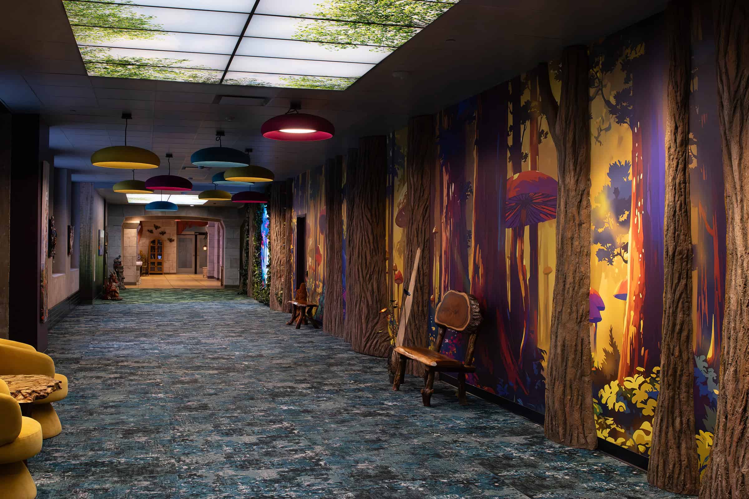
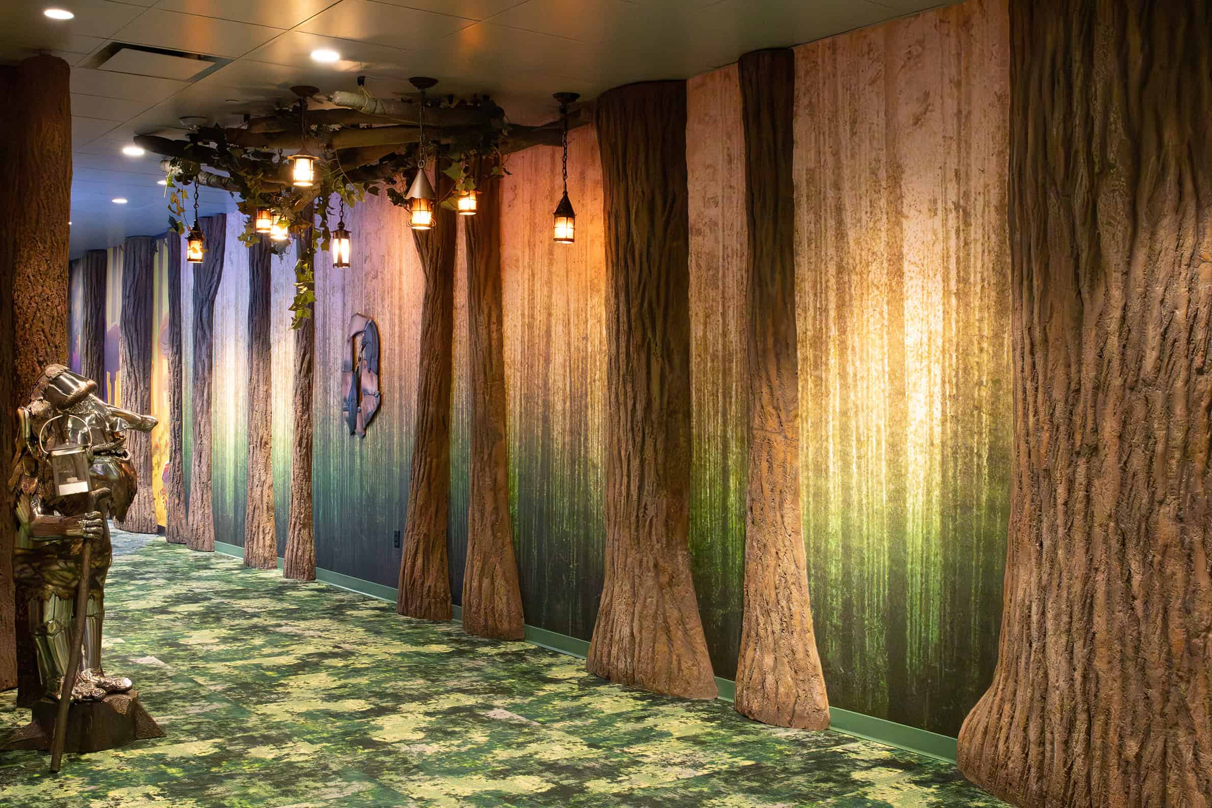
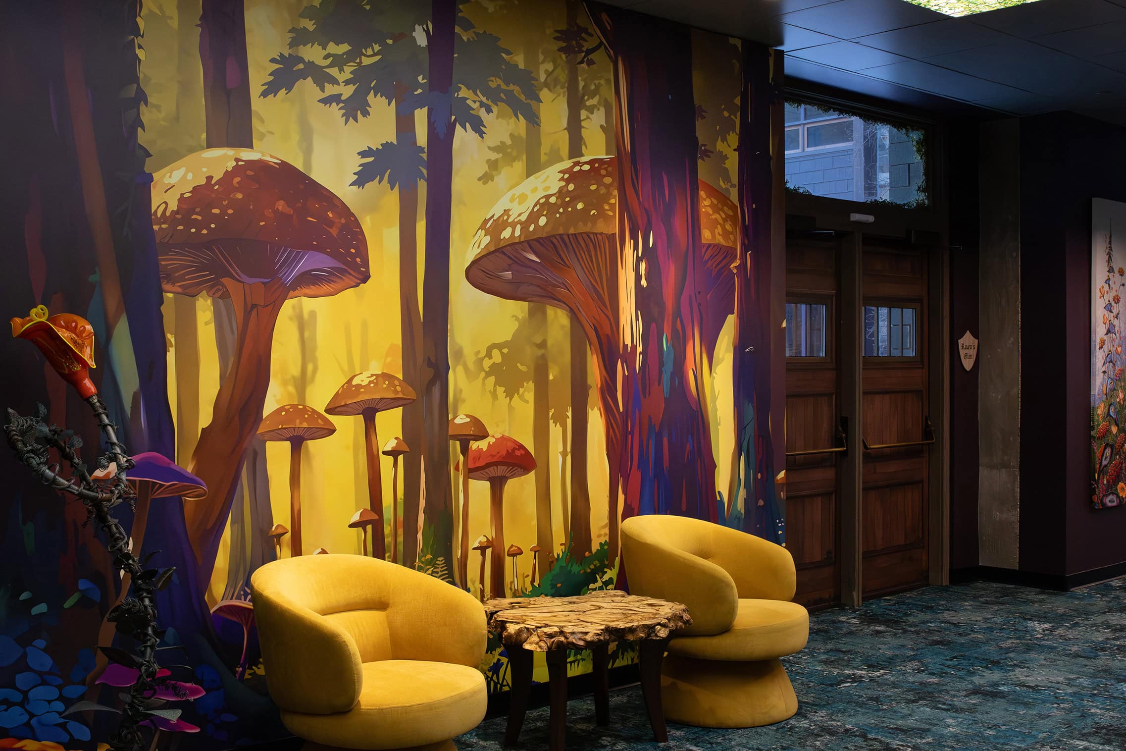
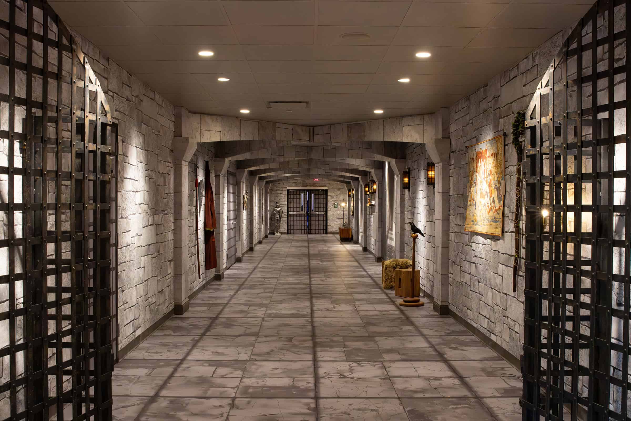
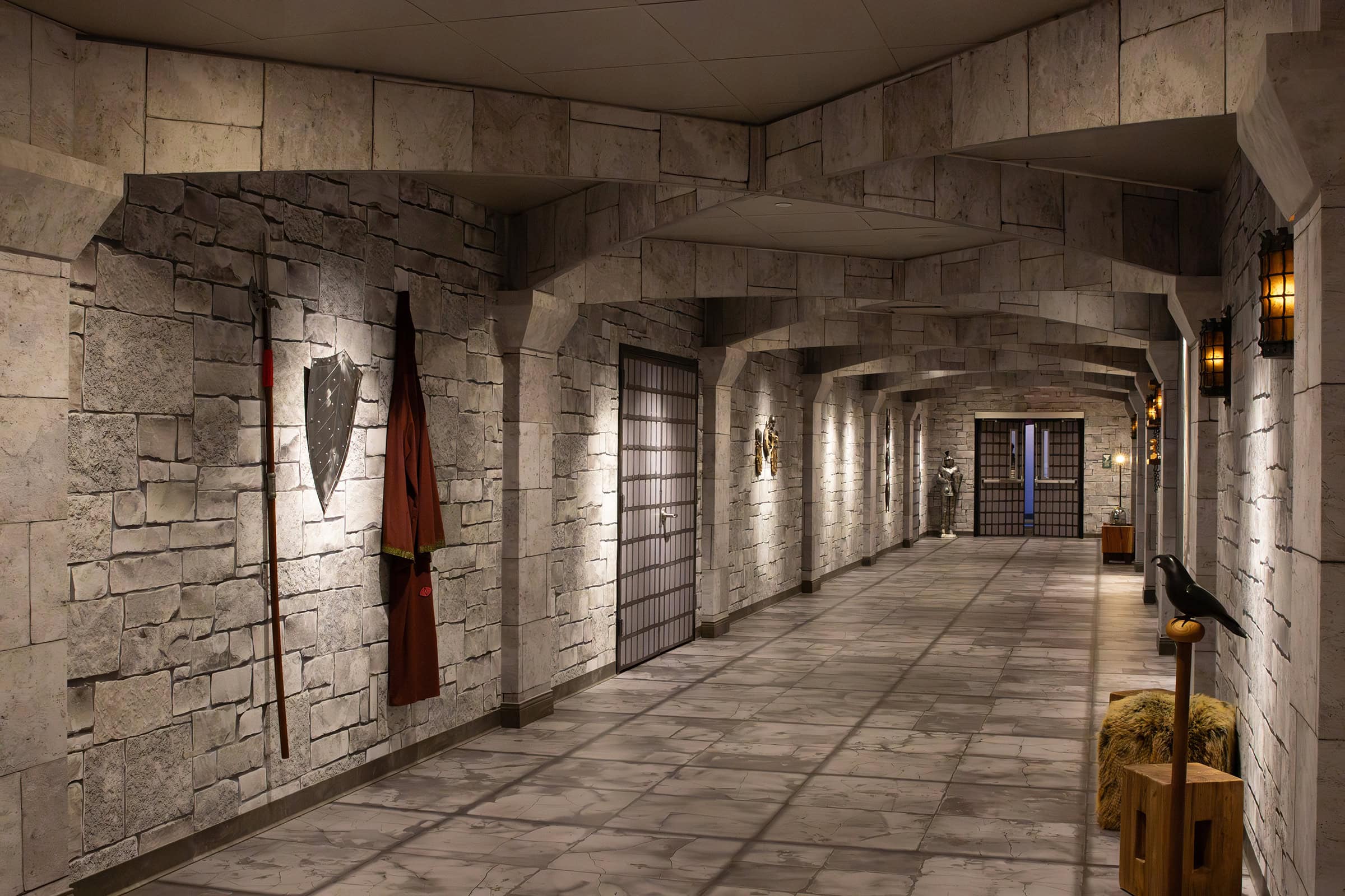
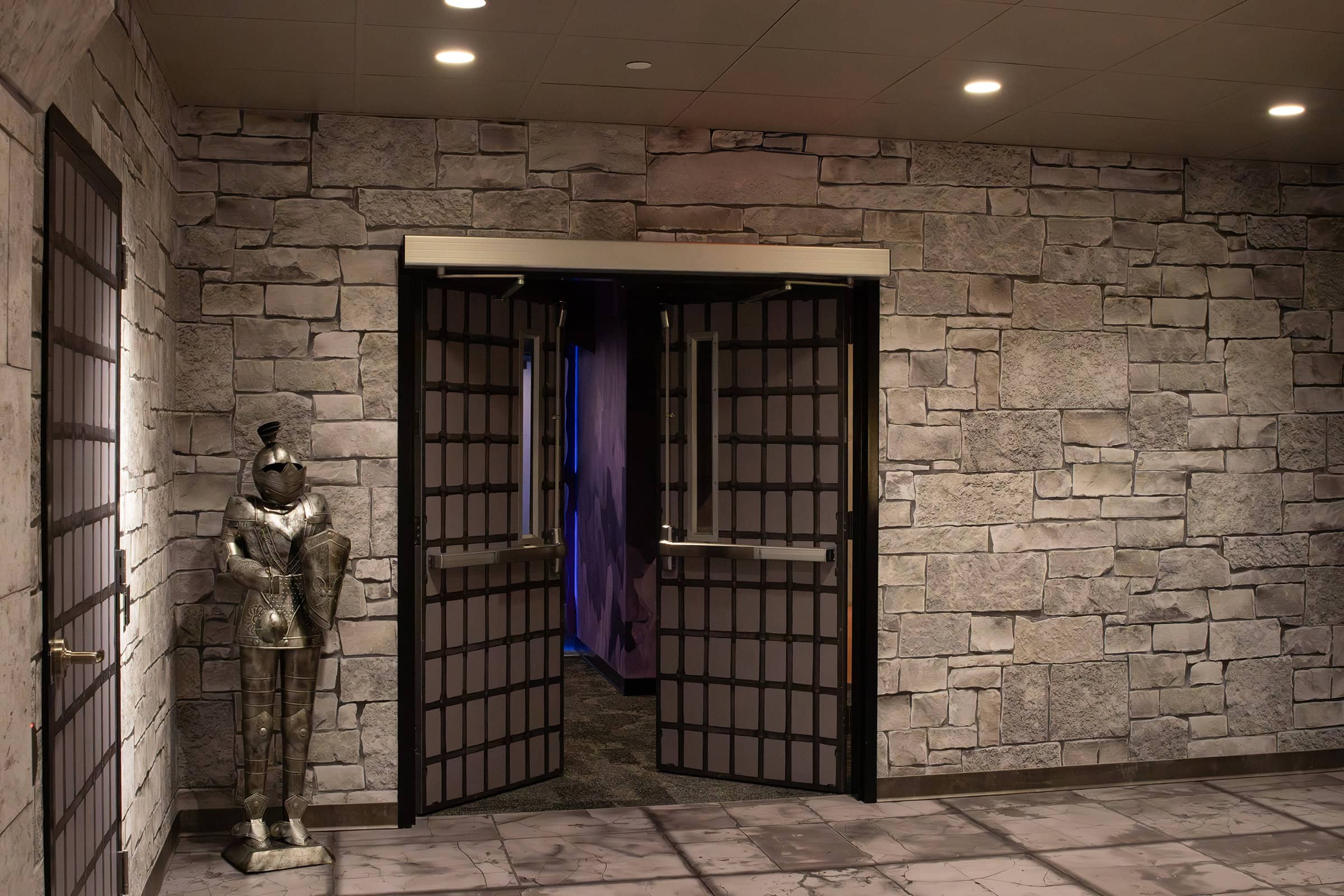
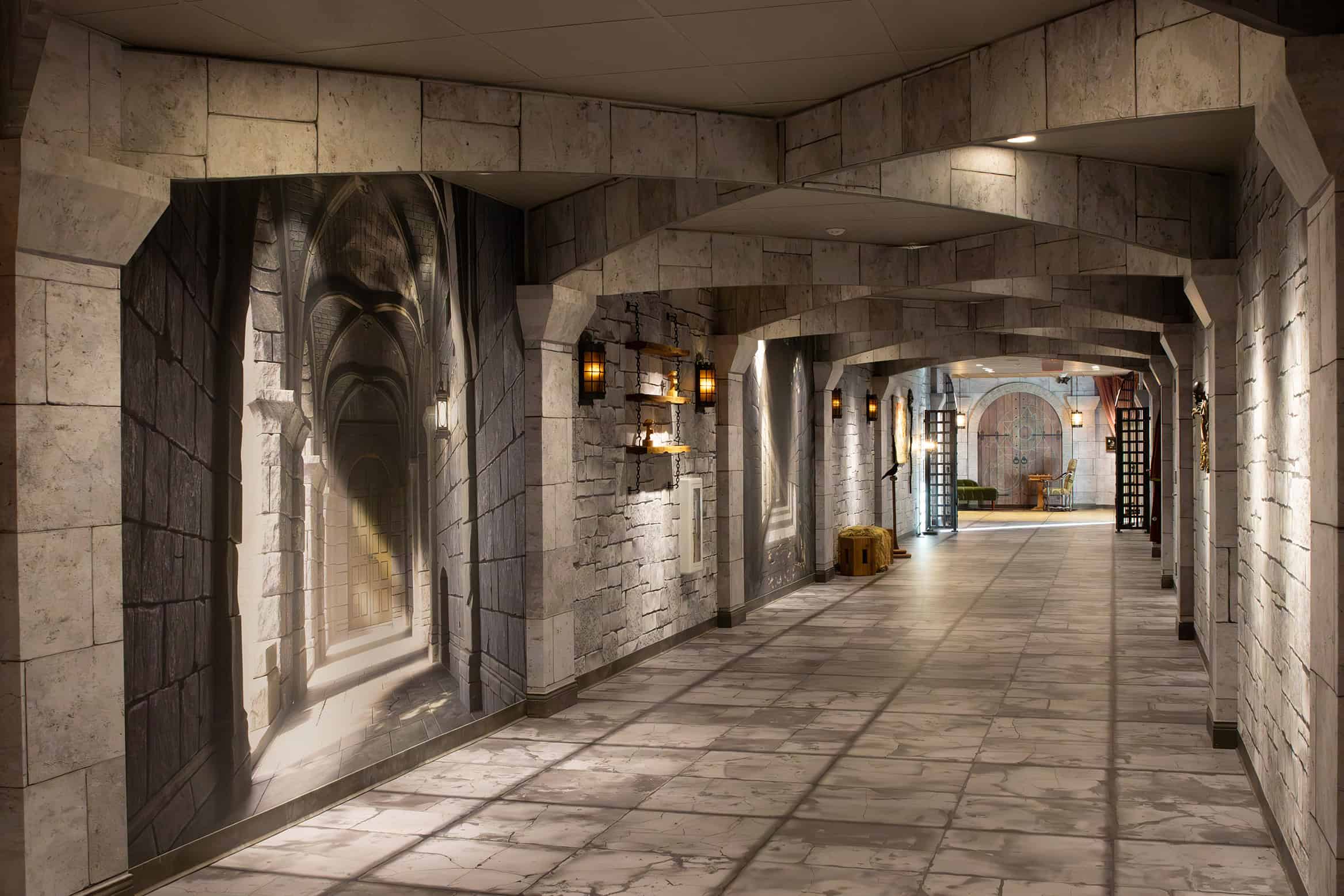
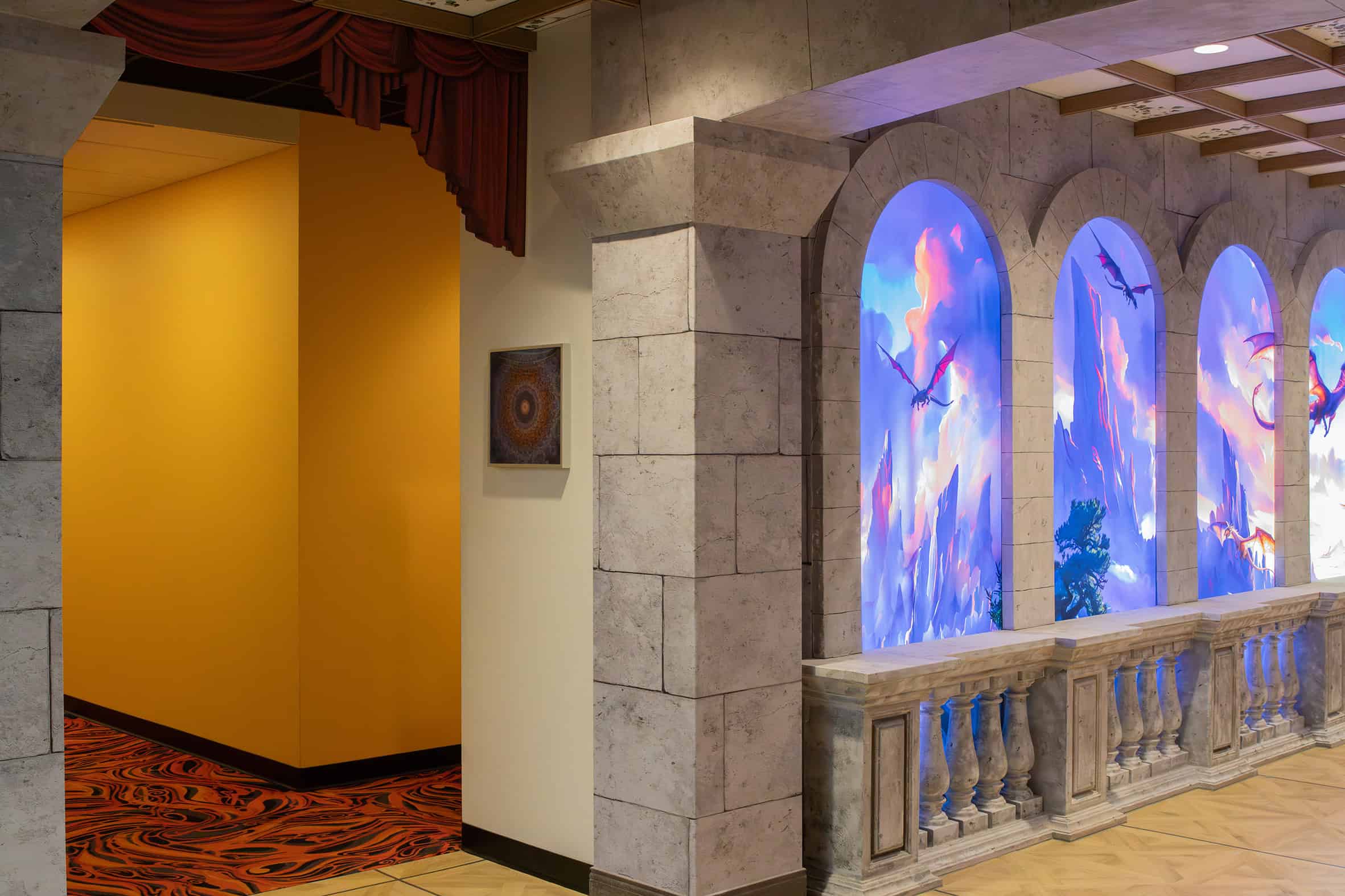
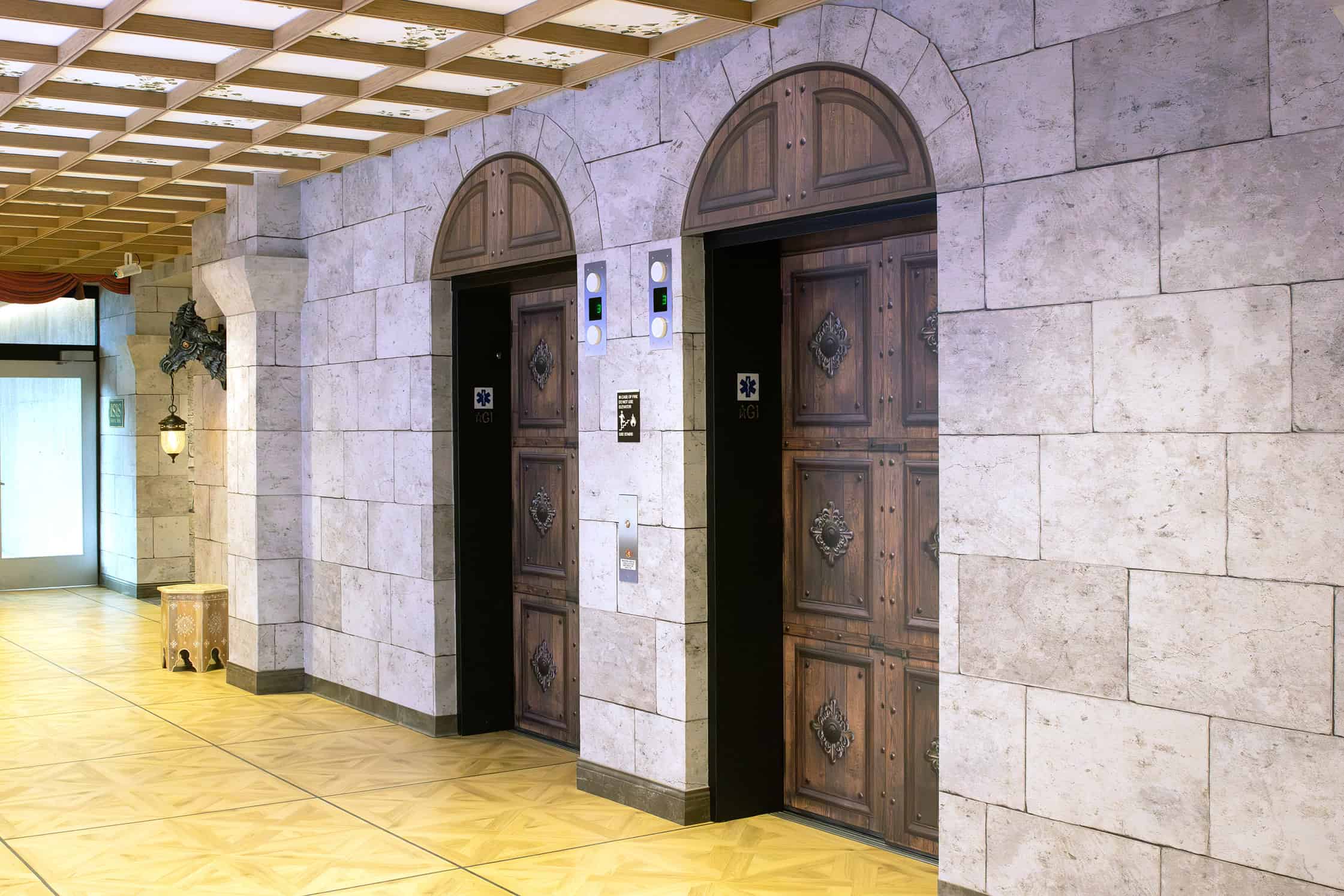
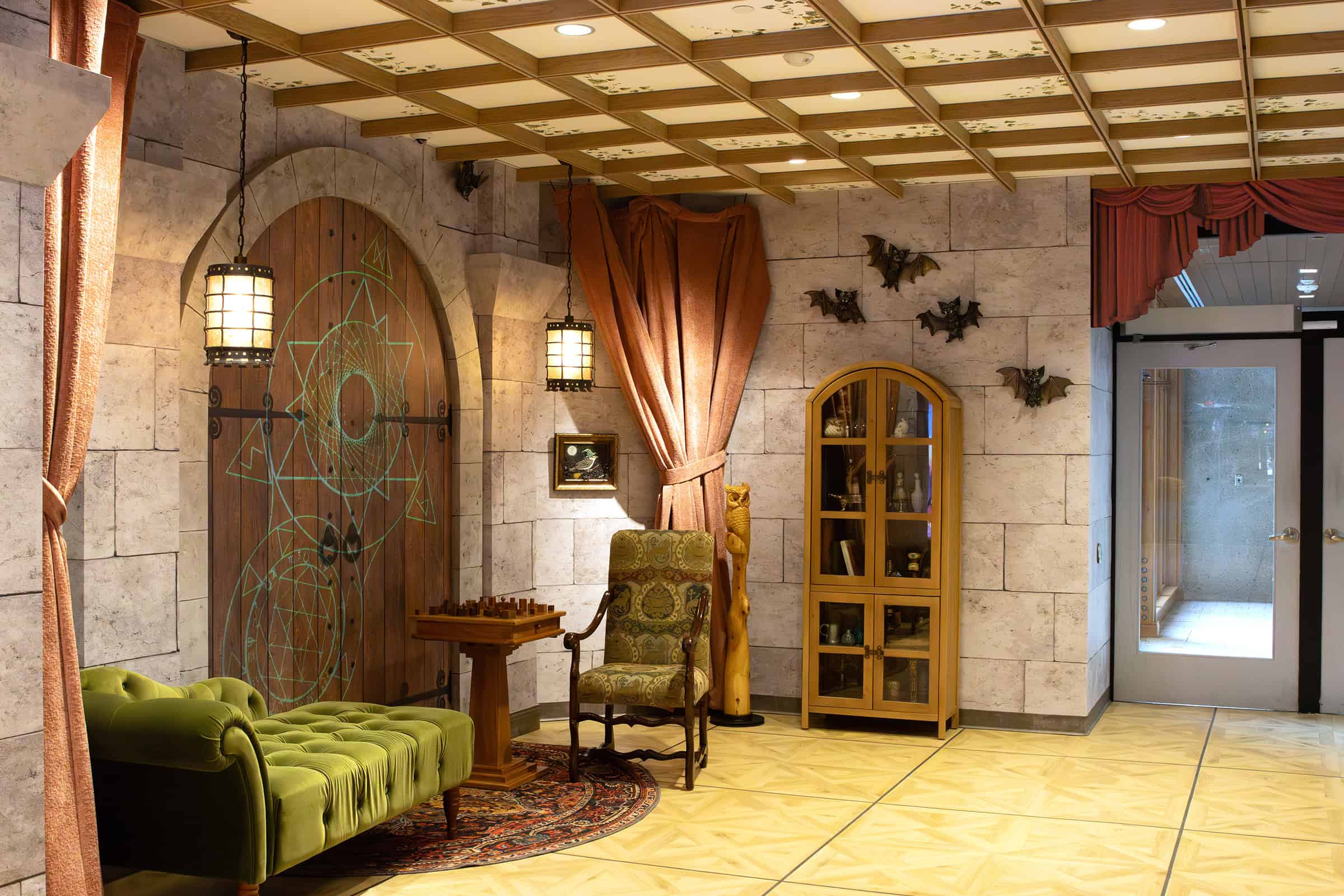
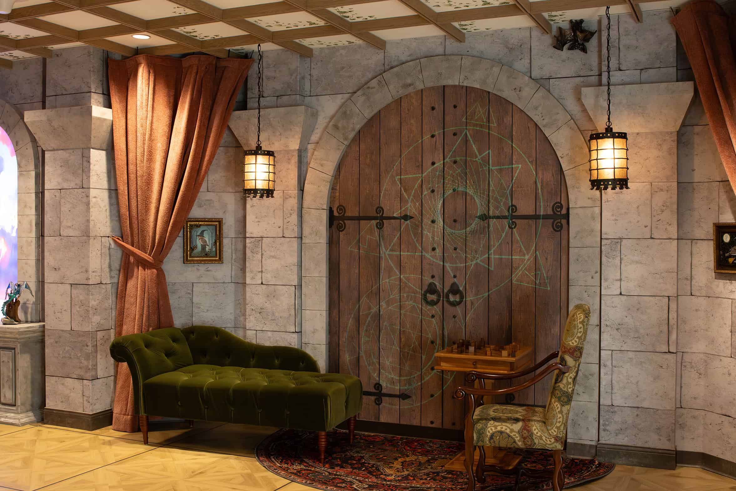
The client’s vision called for true photo-realism. Stone, wood, iron, foliage, and fantasy architecture couldn’t simply suggest texture—they needed to withstand close inspection at full scale. Every surface would be life-sized, immersive, and permanently installed, which meant the detail had to hold up from every angle.
“The detail and resolution needed to achieve photo-realism at this scale is just completely different than designing for digital applications,” said Senior Experiential Designer Angie. “It needed to feel like these concepts were real places—it wasn’t just textures repeated on a wall.”
The scope of that challenge is best illustrated by file size alone: artwork that began as roughly 50 megabytes of concept imagery ultimately expanded into more than 300 gigabytes of production-ready files.
To achieve that level of realism, Thysse assembled an international team of CAD modelers, artists, and special-effects masters to rebuild most scene elements in 3D. Stone blocks, iron hardware, oversized mushrooms, distressed boards, and beams were modeled and textured individually—assembled digitally by placing bricks, layering materials, and controlling surface detail with precision. All elements were created within CAD environments scaled exactly to the dimensions required for wide format production.
As the artwork took shape, Thysse conducted detailed site surveys to ensure that every element would align with real-world conditions. Mounting surfaces, lighting, electrical fixtures, architectural transitions, and safety requirements all informed final design decisions—ensuring the finished graphics would install cleanly and perform as intended in the space.
Once the environments were fully rebuilt, the project moved into refinement. The client requested subtle adjustments to lighting effects and stone color variations, prompting additional digital tuning. These changes progressed through hard-copy proofs and then onto the actual substrates planned for installation, allowing the team to evaluate color, texture, and realism under real lighting conditions.
“One of the adjustment requests was to add sunlight and warmth to the corridor,” Angie explained. “I brought that through in Photoshop—illuminating the space without losing the tone of the concept.”
This foundational work—rebuilding, scaling, refining, and validating the artwork—made it possible to move confidently into custom wallpaper printing, vinyl production, and specialty flooring applications at architectural scale.
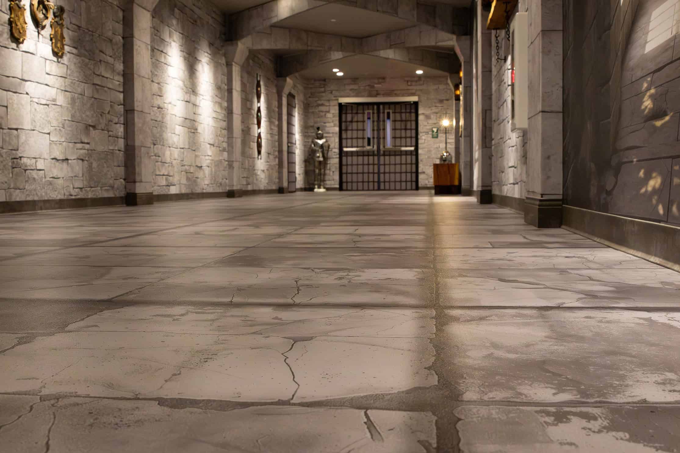
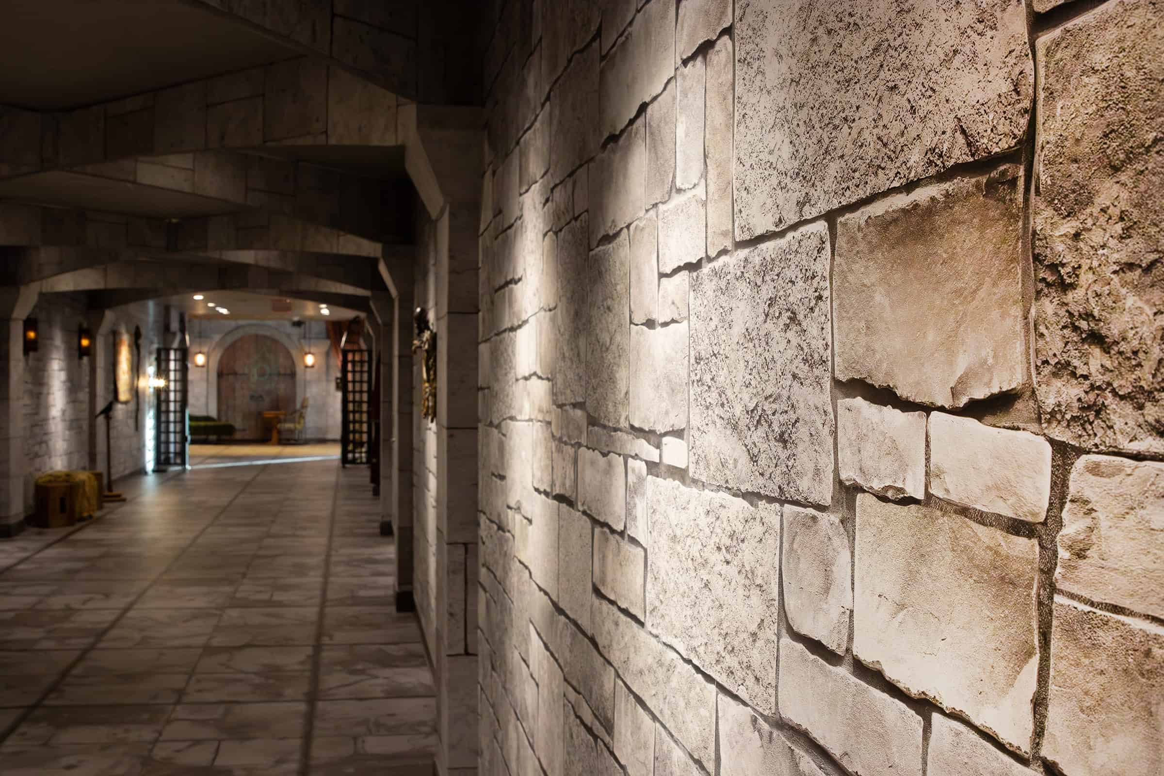
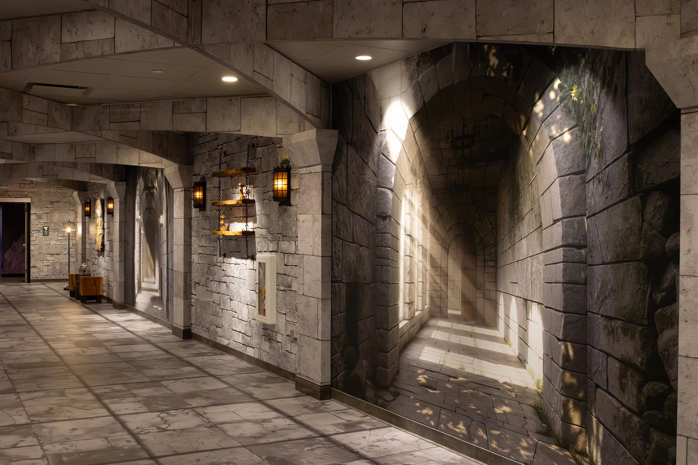
Even with the artwork fully rebuilt, the corridor presented one of the project’s most demanding challenges: color consistency across multiple materials, finishes, and lighting conditions.
The environment incorporated a wide range of substrates, including:
“Every material has a different white point,” explained Thysse Experiential Designer Kristyn. “A tiny shift in magenta or yellow—or even subtle variations in the substrate itself—and suddenly your stone looks wrong. That’s something we manage on any project, but it becomes far more complex when you’re dealing with hundreds of feet and dozens of seams across multiple materials that all need to look right within the same field of view.”
For the experience to feel believable, color harmony wasn’t optional—it was foundational.
“From the client’s perspective, the stones all had to look like they came from the same quarry,” added Emma. “Creating that continuity across wallpaper, vinyl, and G-Floor requires different color profiles and print-device settings for each material. We did extensive testing before we ever showed client-ready samples. There’s just a lot that goes into doing something like this if you want this level of result.”
Achieving that consistency required close collaboration between designers, color management specialists, production teams, and installation partners—along with coordination across multiple stakeholders, including Destrée, the client, and construction teams. It’s a level of technical rigor and communication that often isn’t fully anticipated at the outset of facility branding projects—but it’s essential when every surface must read as part of the same world while coming together in a dynamic job site.
With artwork rebuilt for scale and color locked across substrates, the final phase was execution. This corridor wasn’t a single installation—it was a sequence of environments that had to feel cohesive, immersive, and intentional.
Thysse partnered closely with Schmeltzer Paint Co. to bring the printed artwork into the physical space, aligning graphics across walls, floors, columns, and architectural details.

“It’s the install that makes this all real. You can design the most beautiful thing in the world, but if it’s not produced and installed right, the vision collapses. We’re aiming for suspension of disbelief—and that only happens when everything works together.”
- Angie Biermeier, Senior Designer Thysse
Some elements pushed materials beyond their typical limits. “Wallpaper isn’t meant to wrap the way it did on the MDF column caps,” Emma recalled. “But they figured it out—and the result speaks for itself.”
By the end of installation, the printed elements no longer read as graphics. They felt architectural—integrated into the space rather than applied to it.
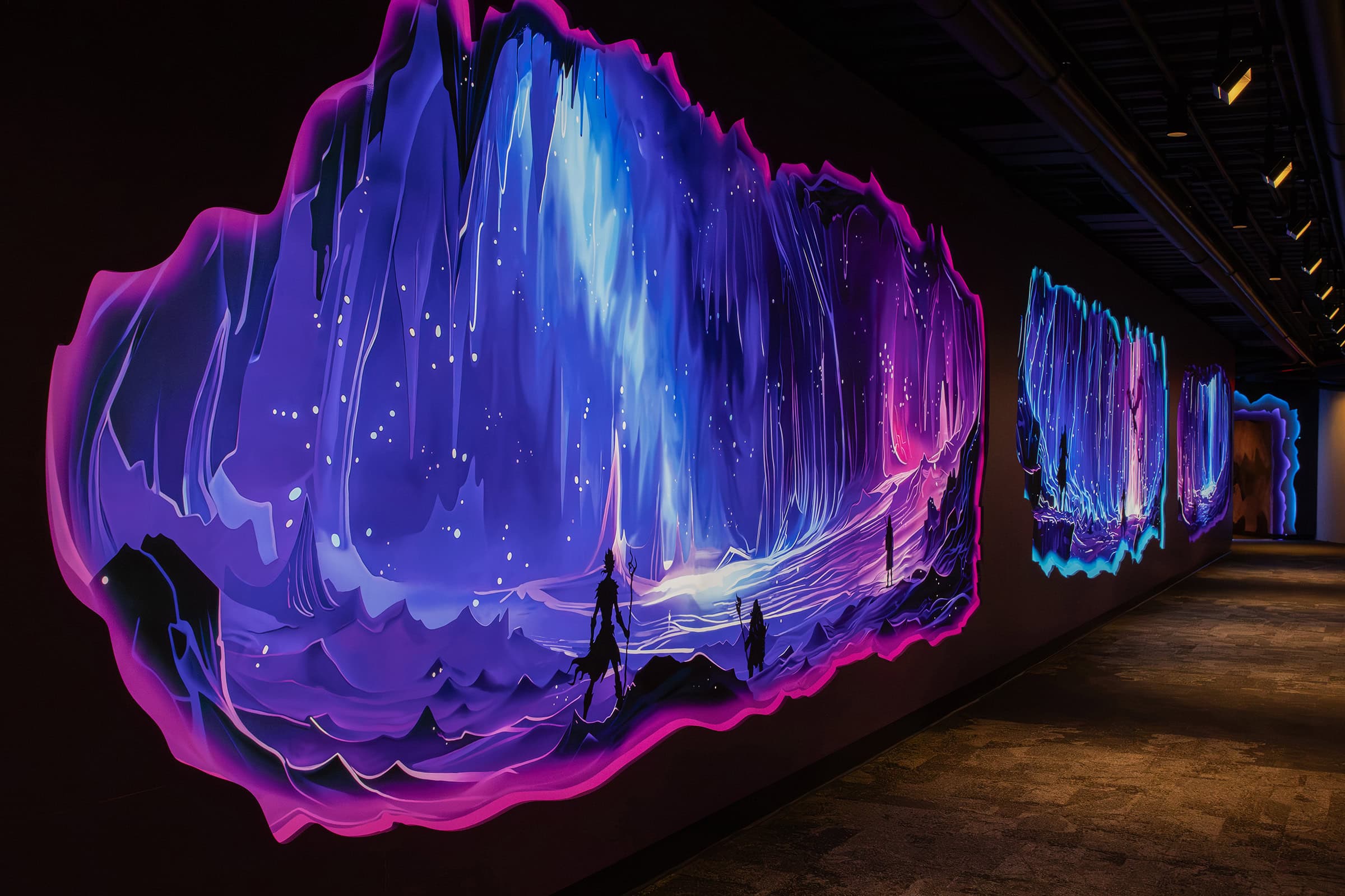
The impact is immediate. What was once a dark connector is now bright, cinematic, and immersive. Visitors slow down. They look closer. They lose track of what’s printed and what’s structural.
“When the stone looks so real that visitors forget it’s printed—that’s when you know you nailed it."
- Kristyn Hodel, Designer Thysse
For the Thysse team, the project reshaped how large-scale artwork is approached—deepening capabilities in reconstruction, scale, and collaboration, and strengthening relationships with specialized talent across time zones. It also reinforced an important truth: conceptual art is only the starting point. Execution is what makes an environment functional, durable, and real.
What makes this corridor work isn’t any single moment or material. It’s the way each environment—the enchanted forest, mushroom walls, dungeon, and castle elements—connects visually and physically without breaking the illusion.
Forest scenes had to marry printed artwork precisely to live architectural edges. Mushrooms needed to align with real trees. Stone textures had to feel dimensional across wallpaper, vinyl, and rubber flooring. Light, shadow, and scale had to behave the way our eyes expect them to in the real world.
None of that happens by accident.
Projects like this succeed when creative vision is matched with technical execution—when artwork is rebuilt for scale, materials are tested and tuned, and installation is treated as a craft, not an afterthought. That’s where facility branding moves beyond decoration and becomes experience.
For Thysse, this project reinforces a simple truth: immersive environments are engineered long before anything is printed. They’re built through collaboration, material knowledge, color science, and a relentless focus on feasibility.
When all of that comes together, a corridor stops feeling like a hallway—and becomes a place people remember.