Menu
Menu
Wipfli isn’t your average advisory and consulting firm. For nearly a century, the company has helped organizations thrive on their own terms. With 3,000+ associates, global alliances, and more than 50 offices across the U.S. and abroad, Wipfli combines national capabilities with local insight. Its expertise goes far beyond accounting—delivering assurance, tax, advisory, outsourcing, technology, leadership development, and risk strategies. At its core, Wipfli’s mission is simple: create human connections that drive success and help organizations navigate complexity with confidence.
That same philosophy extends to their spaces. As their footprint grew, Wipfli recognized that their offices were more than just workplaces—they were expressions of the brand itself. The challenge? Translating a unified corporate identity into physical environments that also reflect the local character of each city and the people who call it home.
Having worked with Thysse for years on high-quality print materials, Wipfli already trusted the craftsmanship and communication behind every project. When it came time to expand their brand into the built environment, they knew where to turn.
That alignment between brand identity and built environment is the essence of facility branding and experiential design—where your physical spaces reinforce who you are.
Each new Wipfli office came with its own architectural quirks, cultural nuances, and regional flavor. The firm needed a way to create a consistent, instantly recognizable identity while leaving room for local storytelling.
Thysse’s task was to design a facility branding system that could scale—working for new builds, renovations, and acquisitions alike. The system needed to be cost-effective, easy for on-the-ground teams to implement, and maintainable long-term.
Equally important was the experience of working together. With overlapping timelines, multiple decision-makers, and projects rolling out across the country, clear communication and dependable scheduling were just as essential as exceptional design.

“Every office should feel like two things at once. You should know you’re in Milwaukee—or Minneapolis—but you should also instantly know you’re in Wipfli.”
- Kristyn Hodel, Designer at Thysse
Thysse’s Experiential Designers approached the challenge strategically: by creating a modular visual system that could adapt to any building, any region, and any layout—without losing the Wipfli identity.
Every project began the same way: with an in-person site survey trip to measure and document walls, sightlines, lighting, finishes, and building features—down to the outlets, switches, and safety devices. The team captured photography and notes, then used that data to develop detailed digital proposals.
“Each proposal was like a storybook,” Hodel explains. “We’d show mockups of key walls, conference rooms, entryways—detailing suggested manufactured features, and paints. These proposals include details like anchor systems aligned to mounting surface specs and the substrates we’d use. The client could see exactly how their brand would come to life in their space before a single graphic was produced. After the real features are produced and installed, it’s often hard to easily differentiate between the proposal renderings and real photography, which is great for the client. What we propose is almost exactly what it’ll look like.”
These highly-accurate visual presentations simplified the approval process for Wipfli’s internal team and helped coordinate logistics with installers, other contractors, and client stakeholders. Clear communication and coordination are essential aspects of projects that run smoothly, and pictures, as they say, are worth thousands of words.
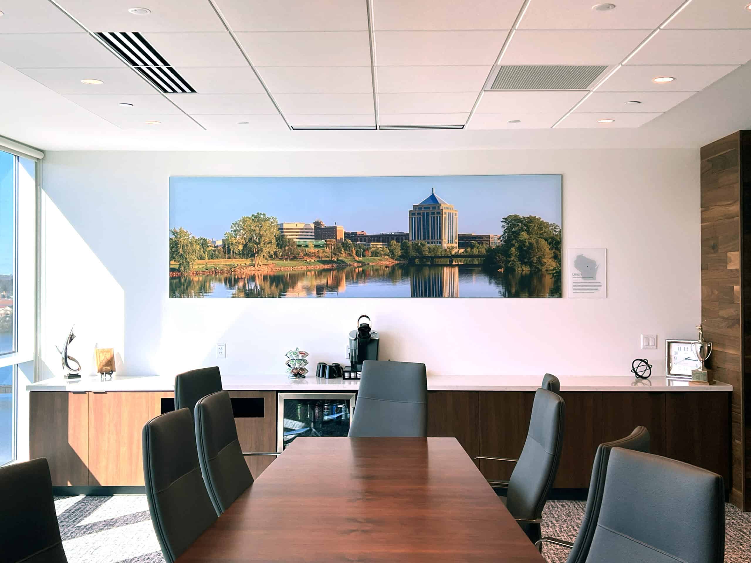
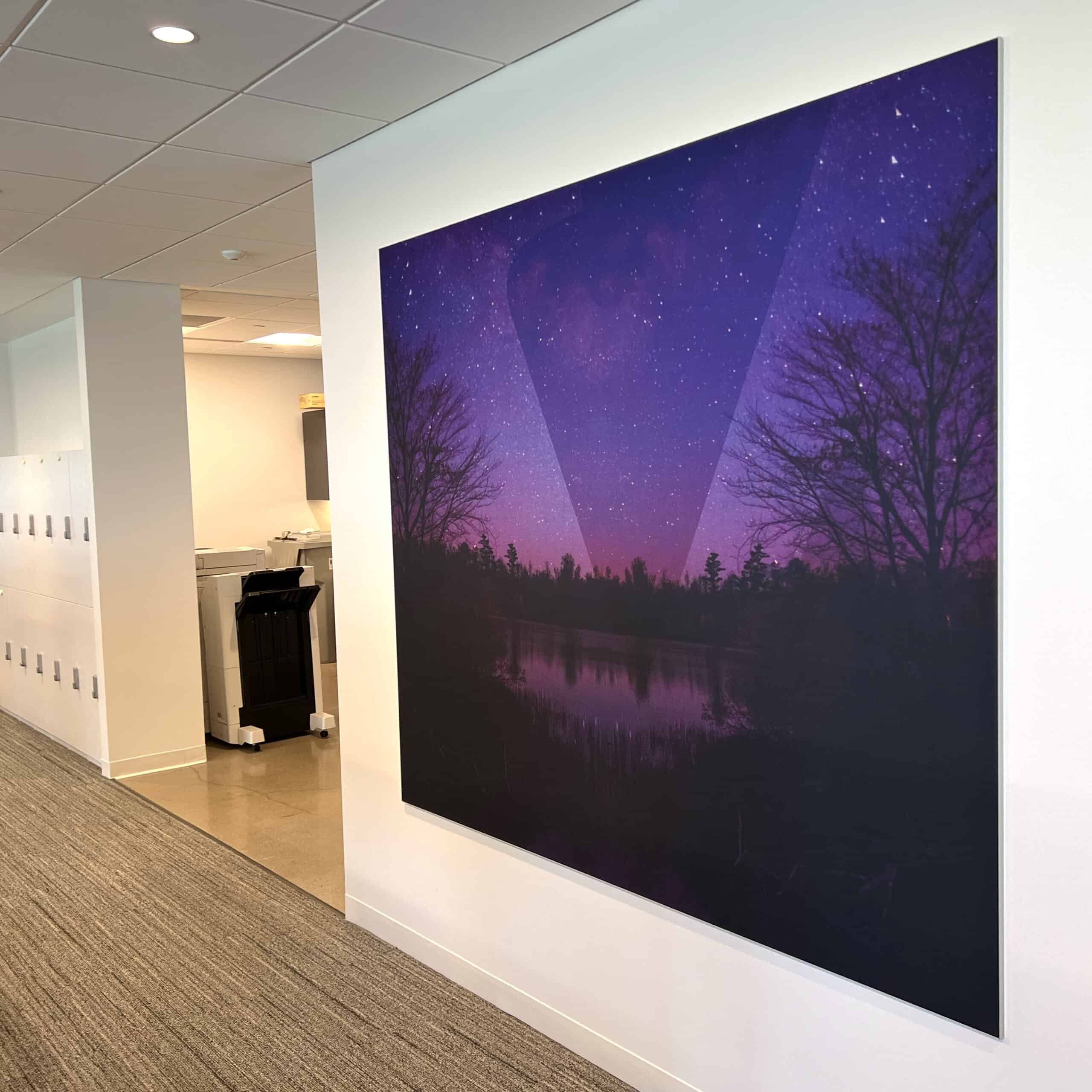
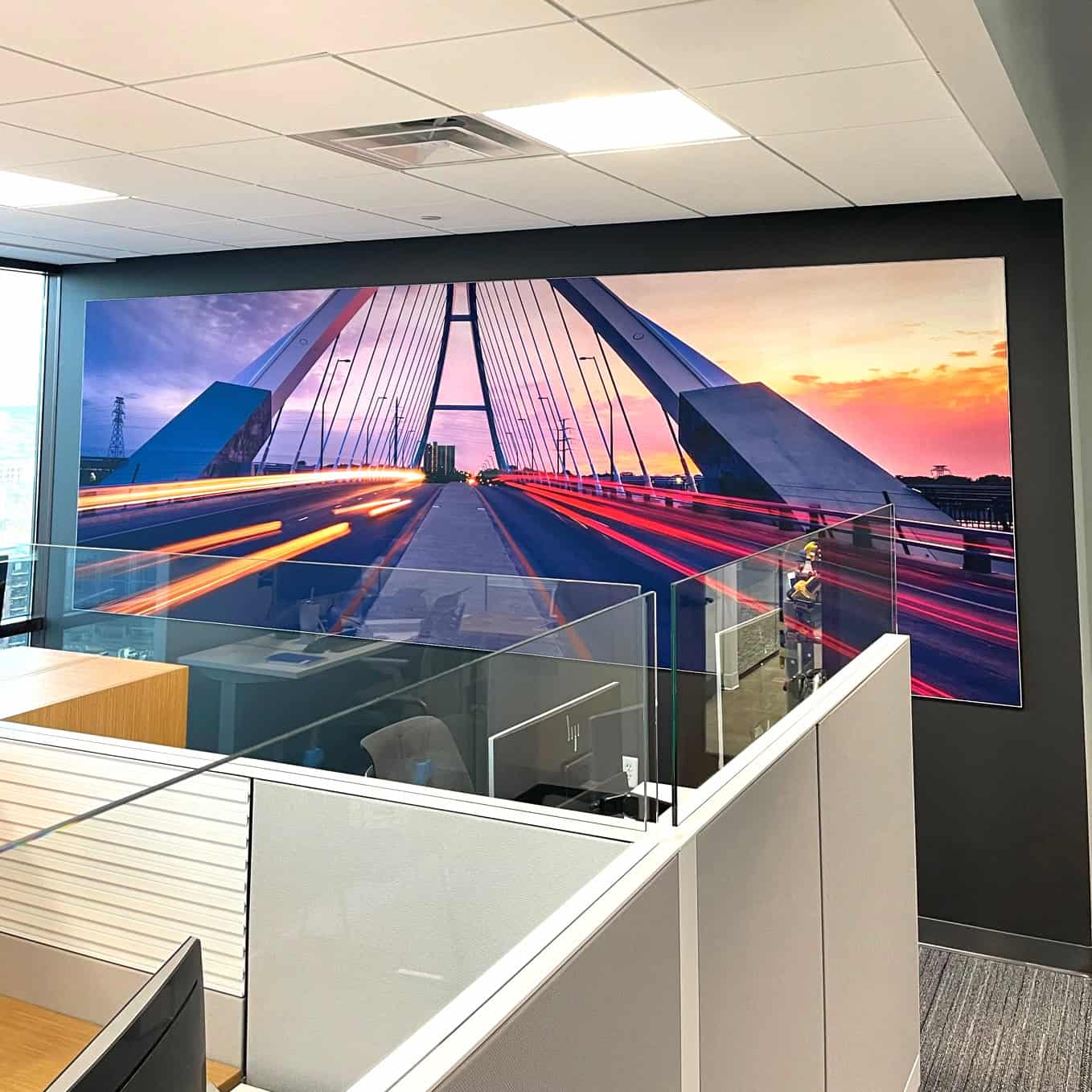
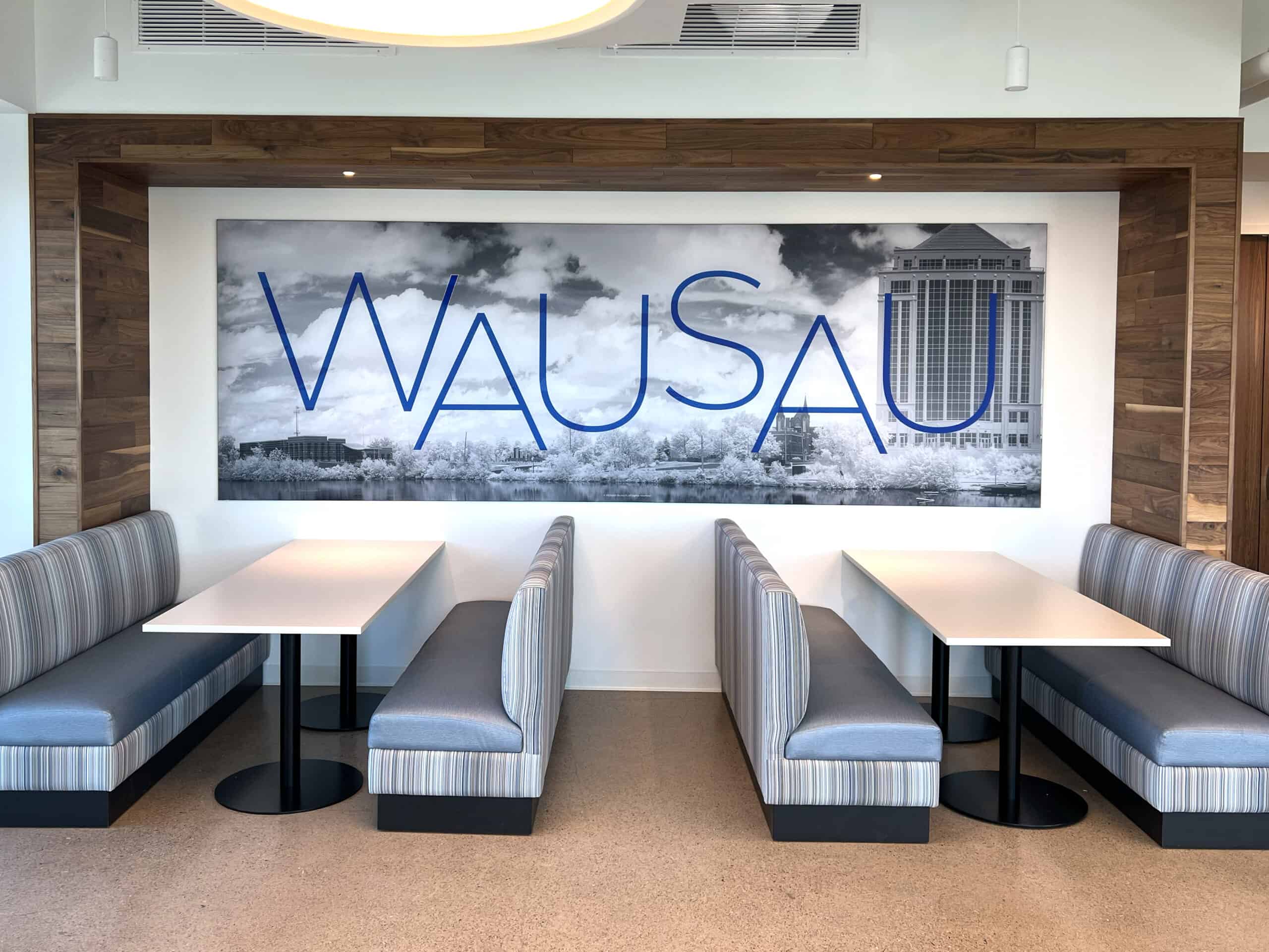
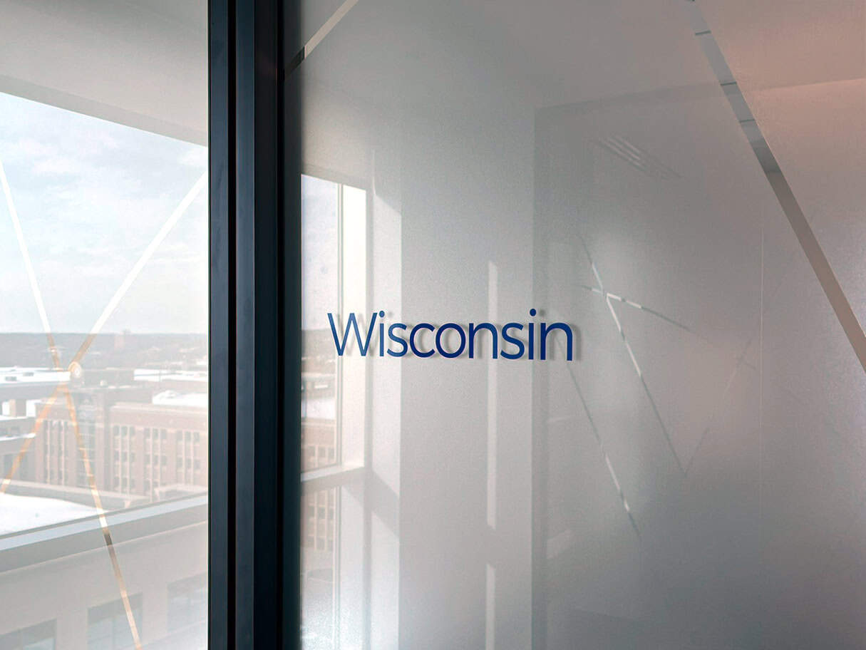
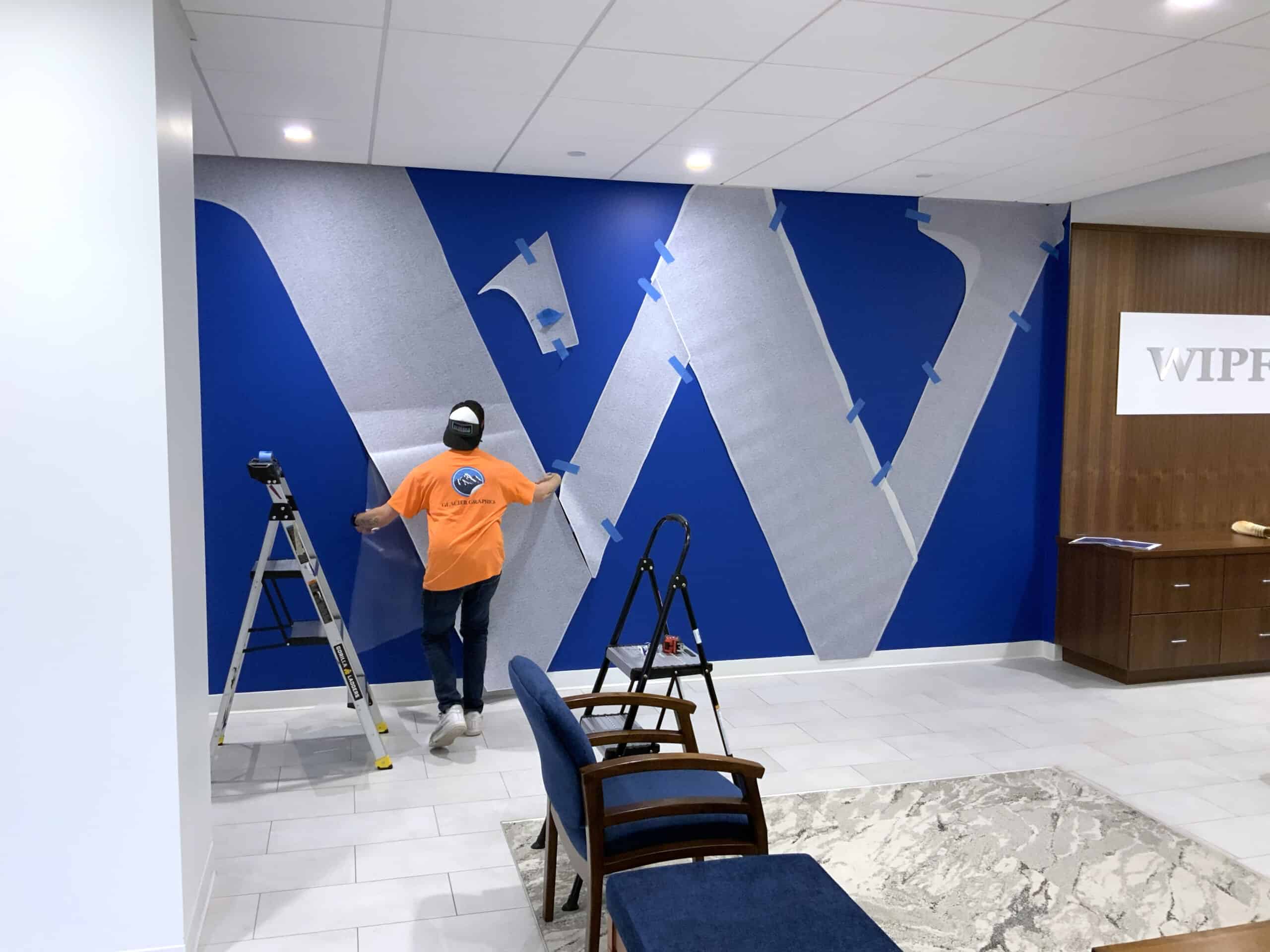
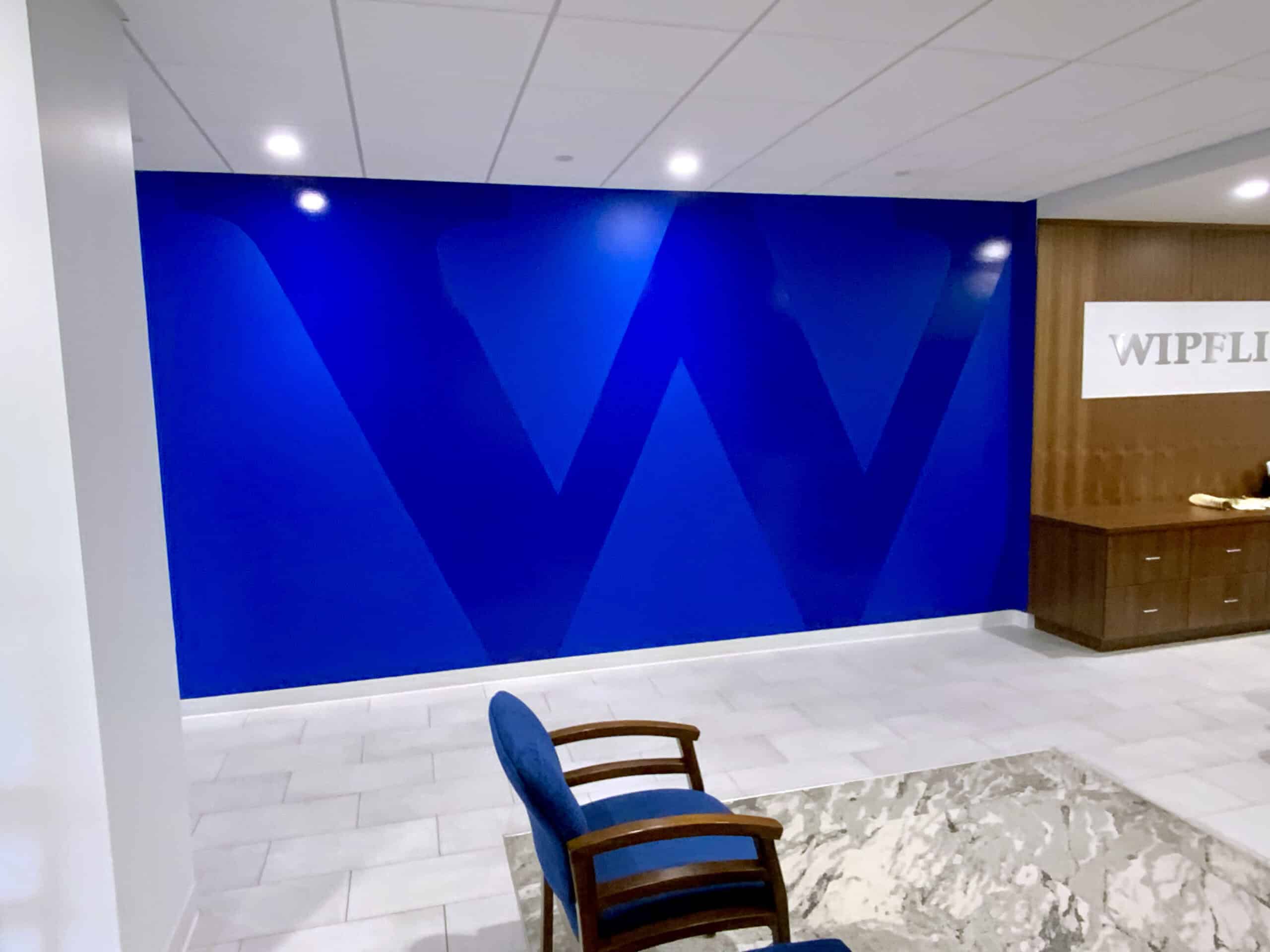
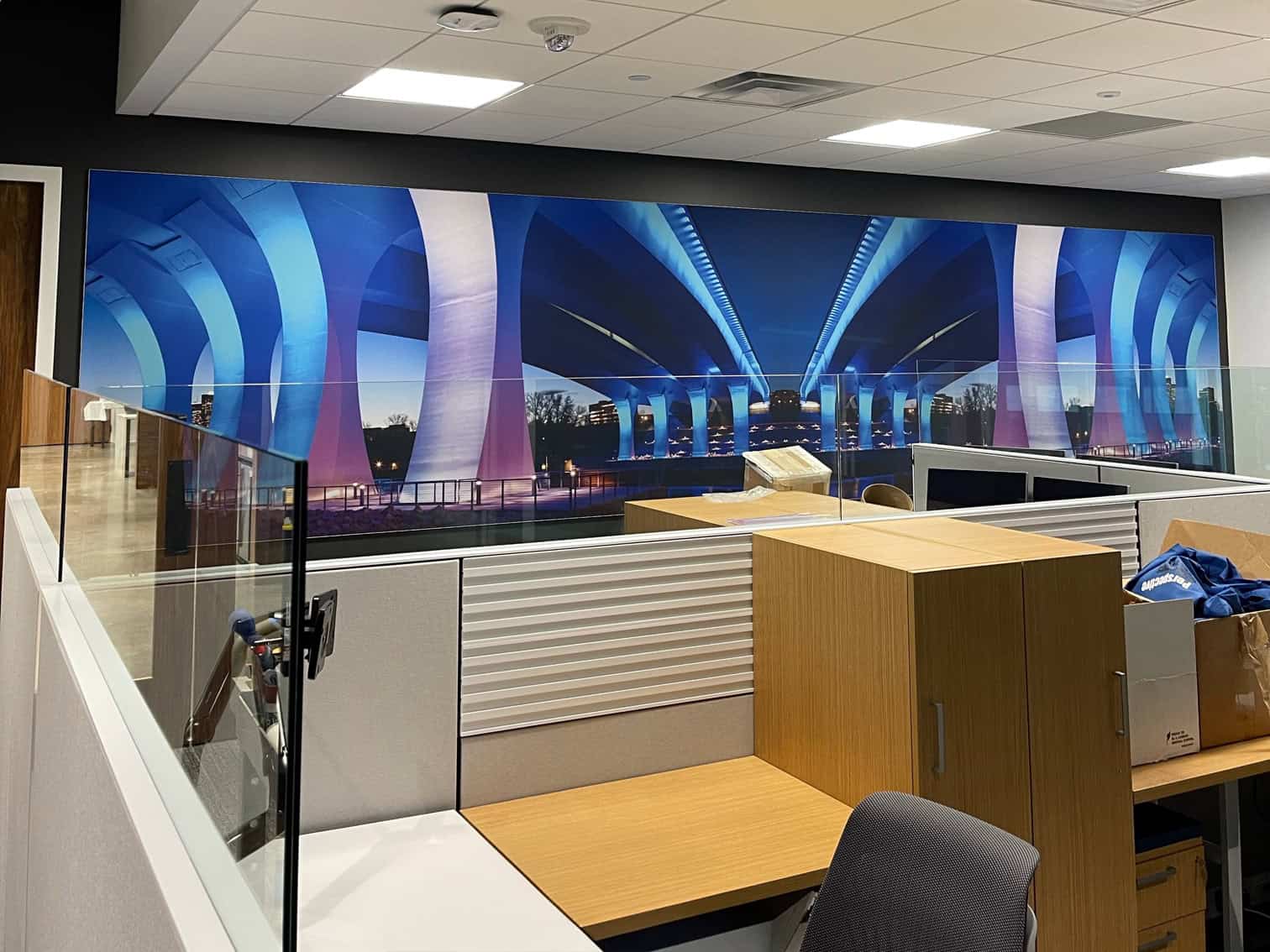
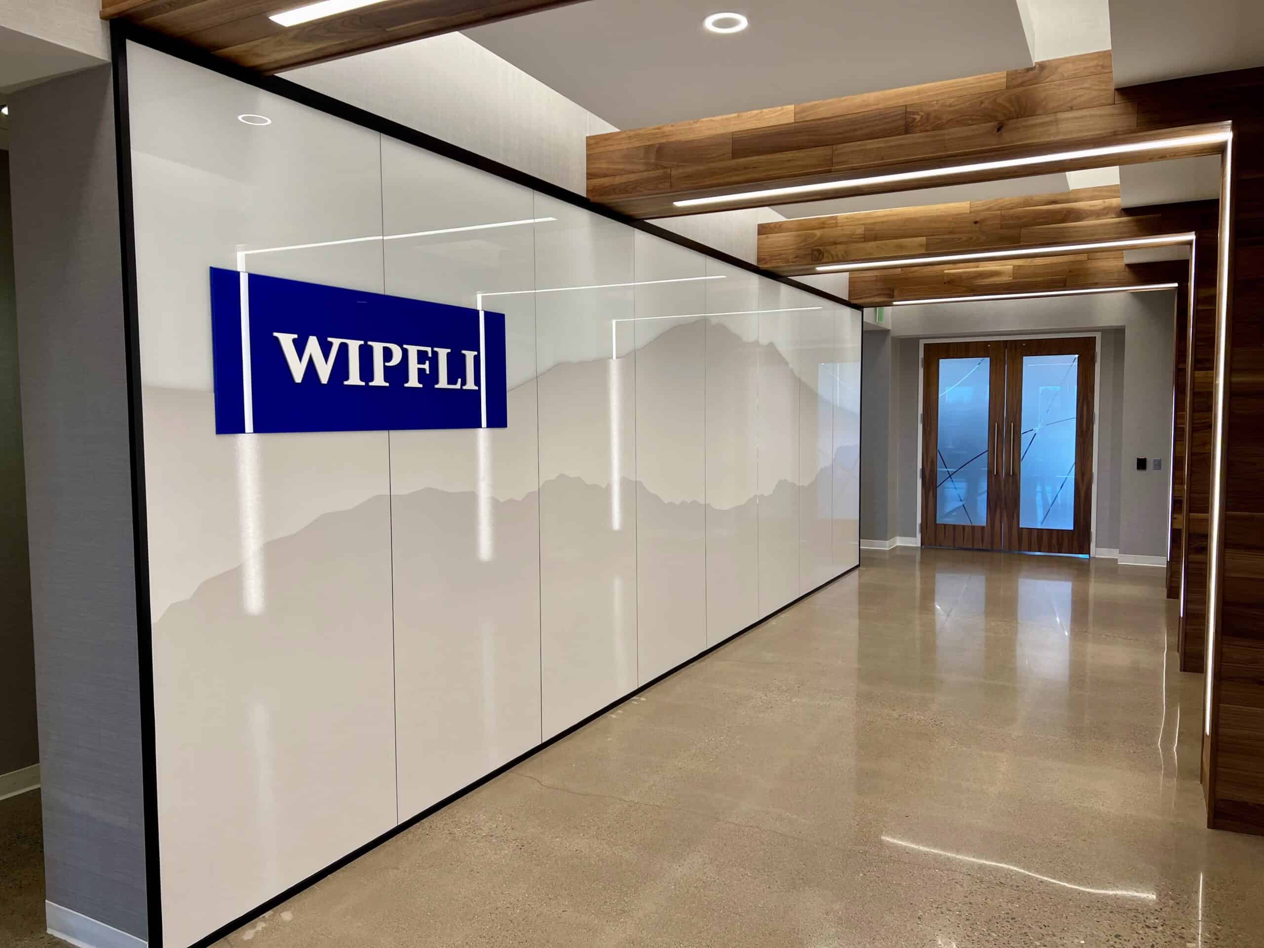
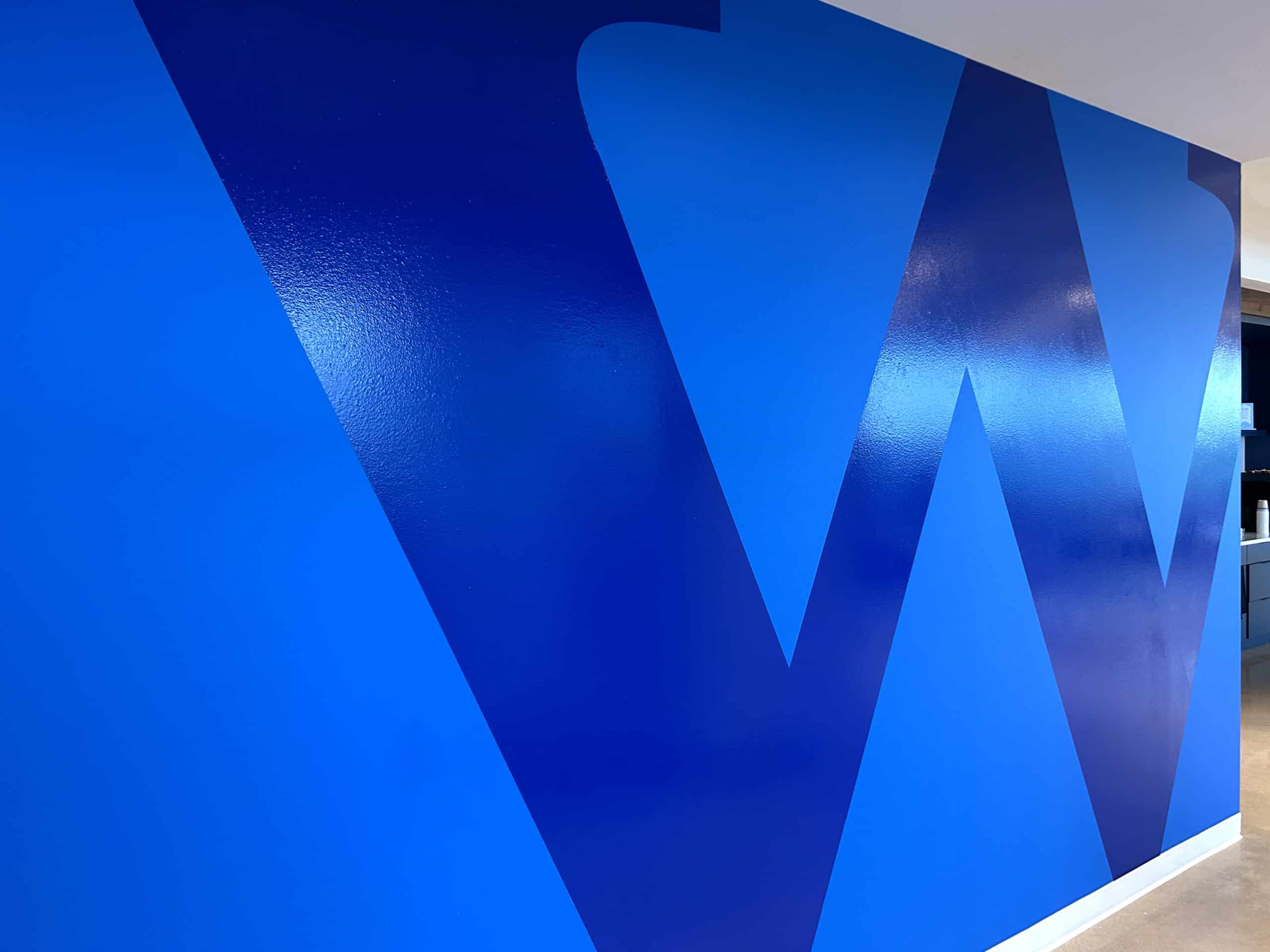
While consistency anchored the system, local storytelling gave it life. Each office featured Wipfli’s signature blue accent wall—a strong, confident tone pulled directly from the firm’s brand palette—and a large “W” graphic applied in contrasting vinyl. But beyond that shared foundation, every location celebrated its community through regionally inspired imagery.
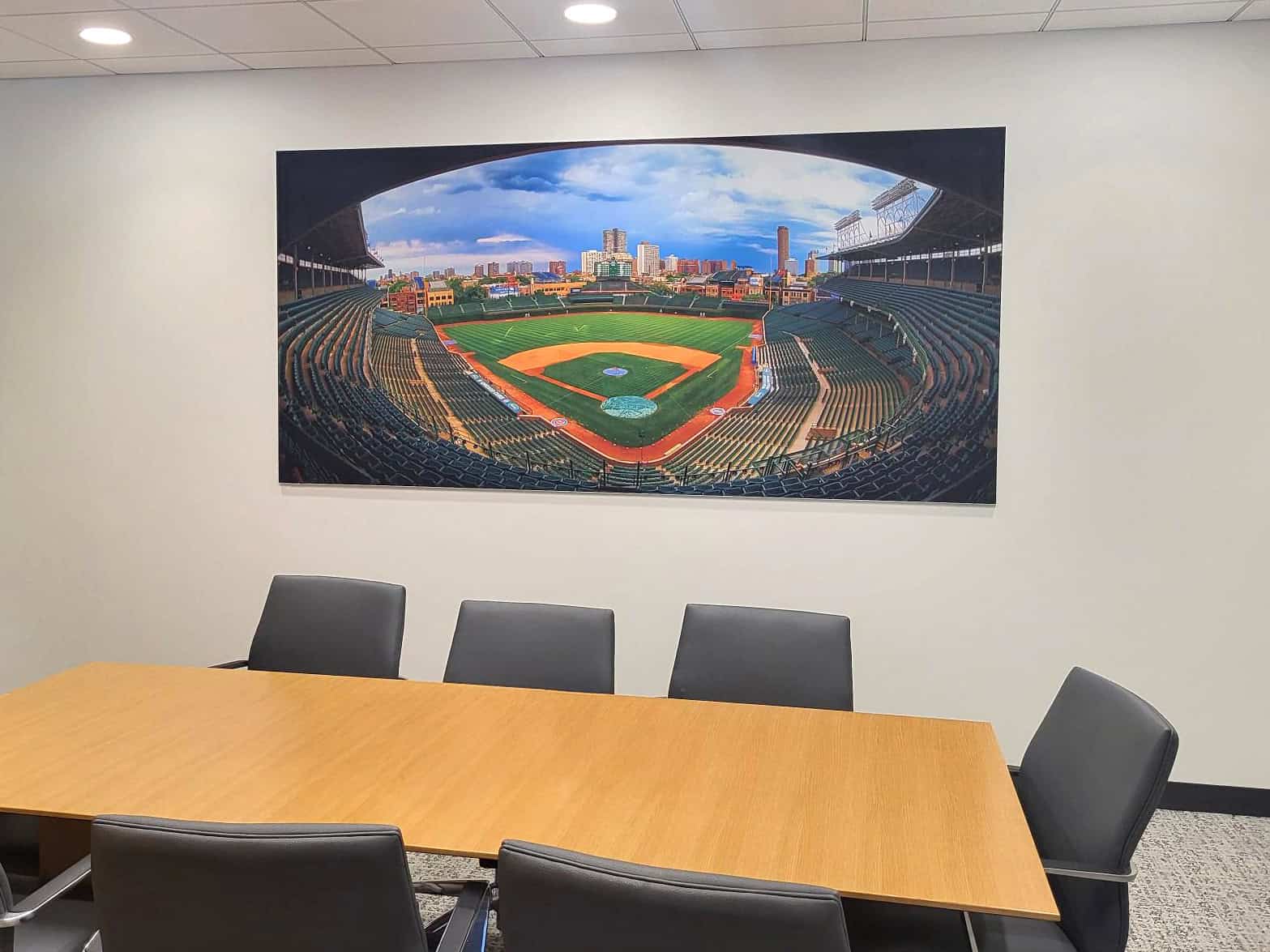
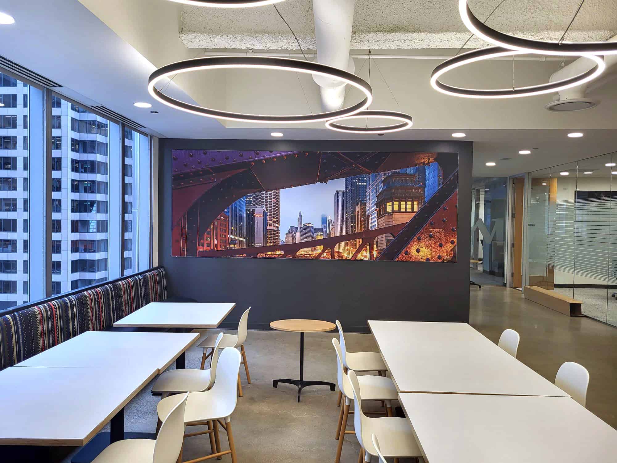
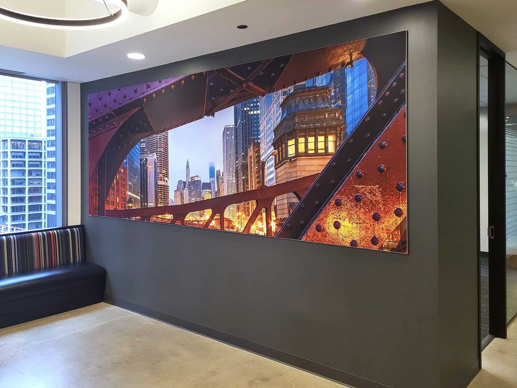
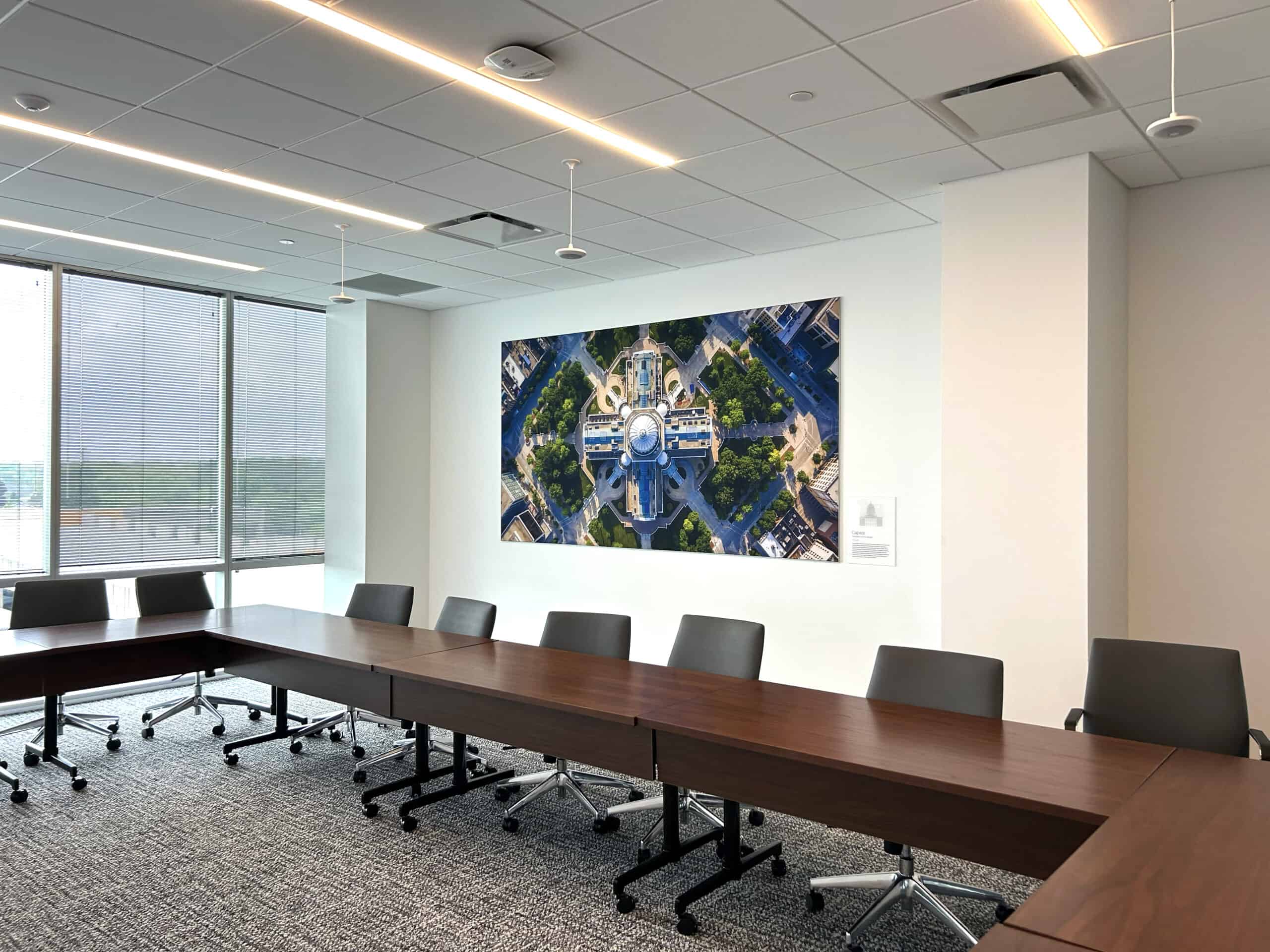
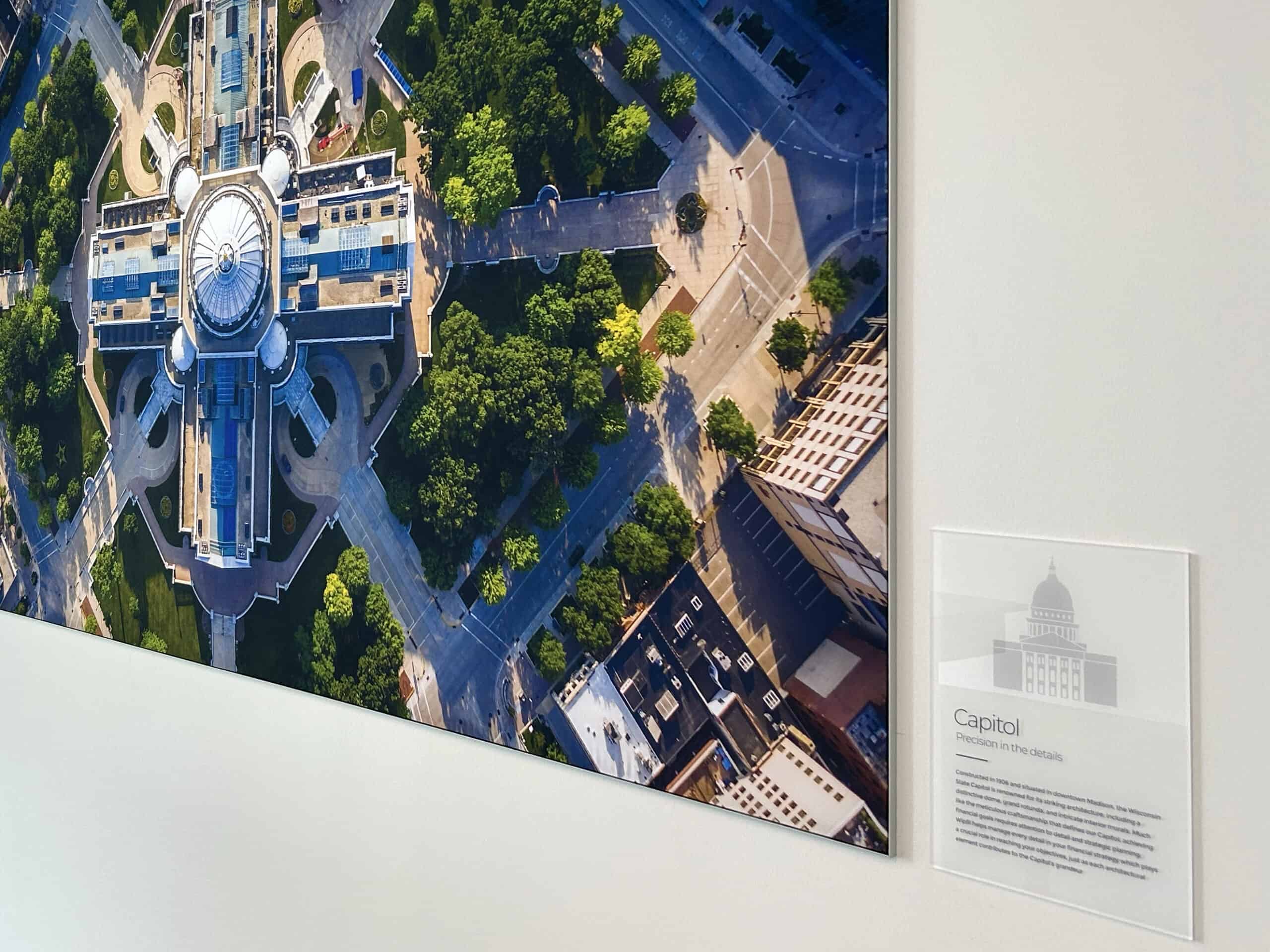
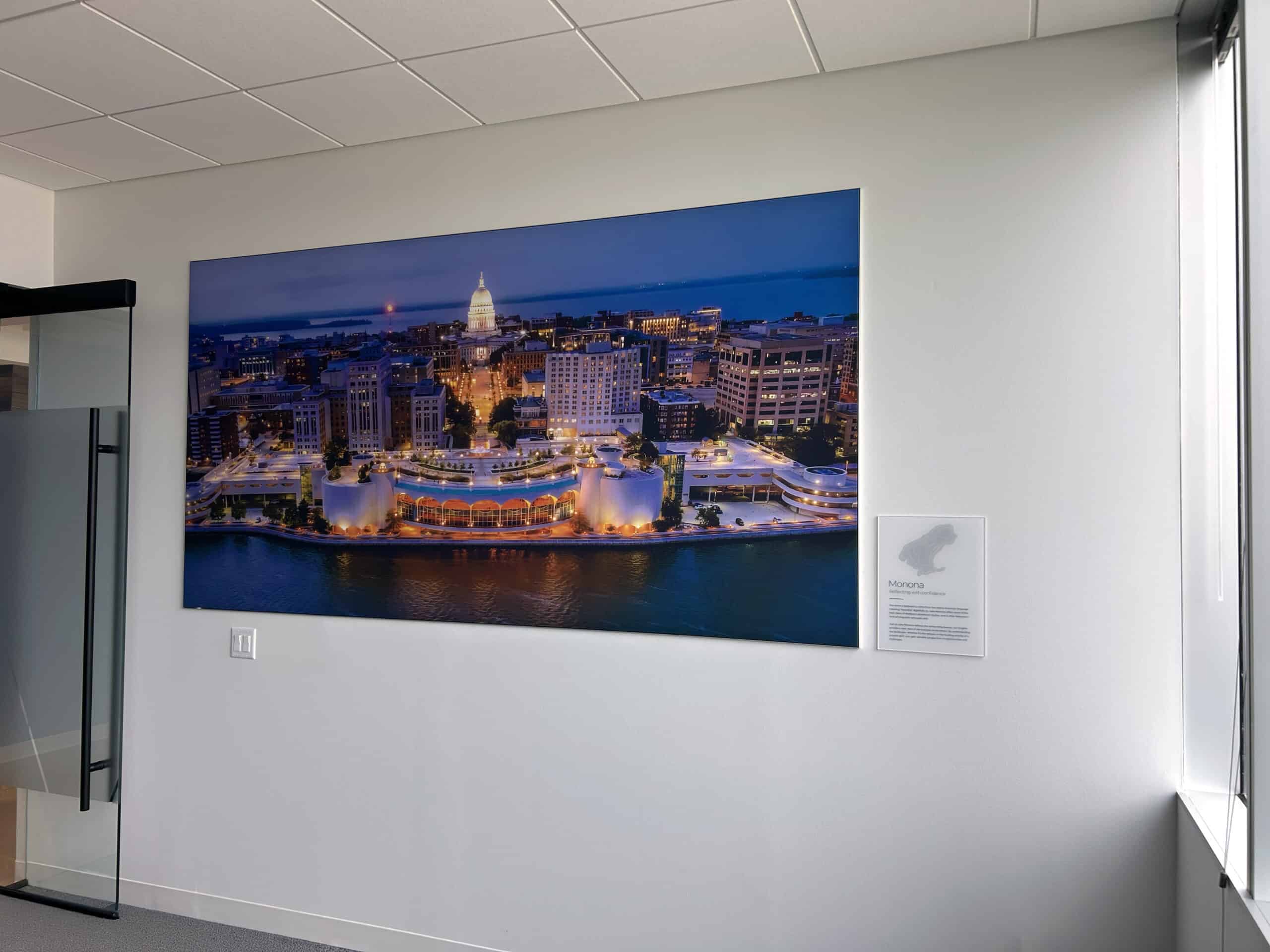
For Madison, the graphics centered around the Capitol and lakes. In Chicago, they highlighted the city’s iconic architectural heritage. Each location became an opportunity to weave in localized photography that reflected the culture, landscape, and landmarks of the area.
“They really wanted each space to feel personal and unique,” says Hodel. “So we used local imagery to create those connections—something familiar to the people working there and instantly meaningful to visitors. But we didn’t want to lean on the obvious postcard shots; our goal was to capture a new angle on each city—something recognizable, but reimagined through Wipfli’s brand lens.”
To achieve this, Thysse sourced photography from stock libraries, local photographers, and regional archives—curating visuals that felt authentic, not generic. The result is a collection of environmental graphics that make national branding feel local, fresh, and genuinely connected to place.
The backbone of the Wipfli system was simplicity—repeatable materials, timeless finishes, and thoughtful craftsmanship. They needed a scalable solution.
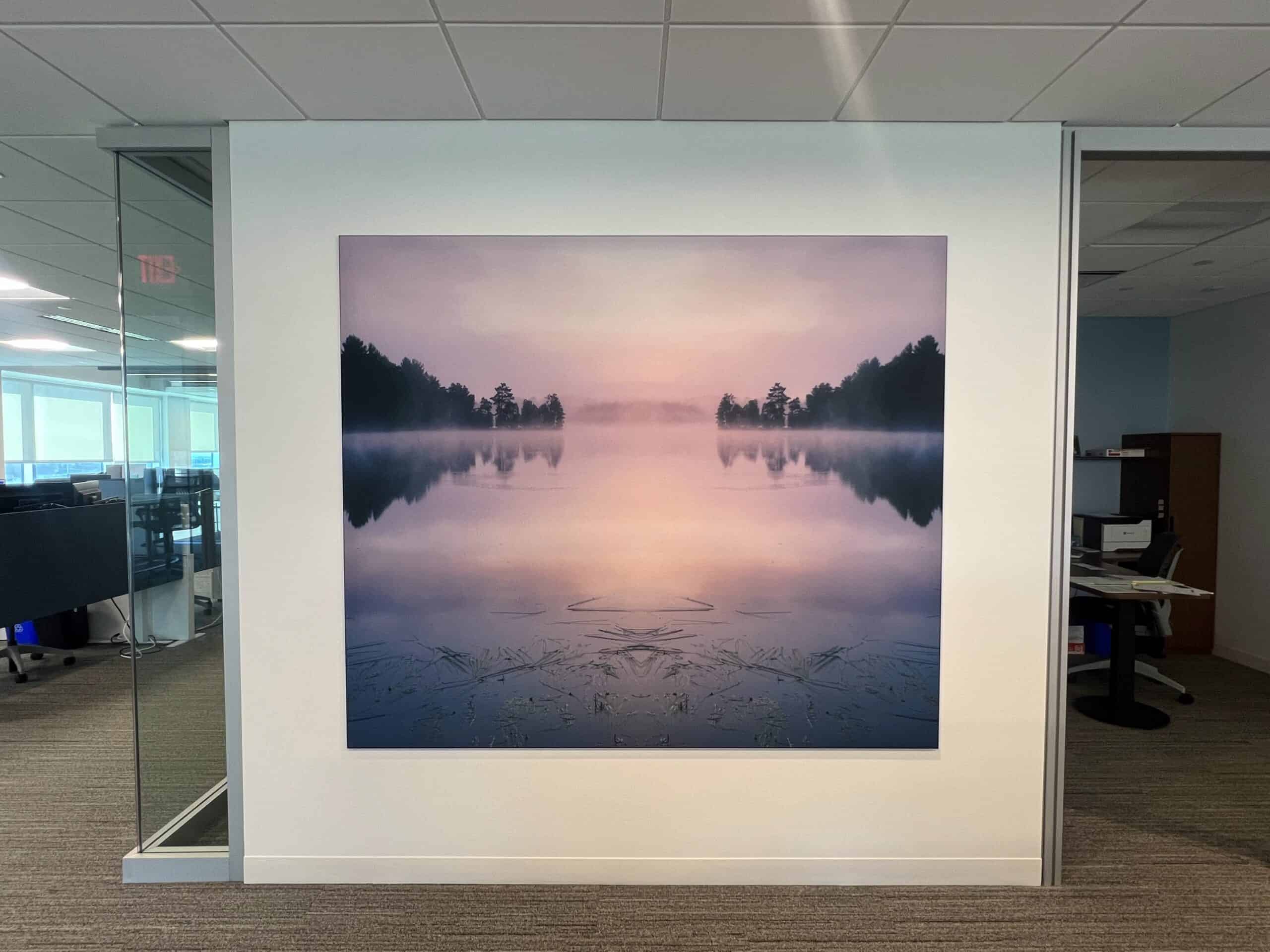
Silicone Edge Graphics (SEGs) offered the perfect balance of flexibility and quality. The tension-fabric prints could be easily swapped out, allowing Wipfli to refresh imagery as their offices or cityscapes evolved—without the cost of redoing entire walls.
“SEGs are high-impact but low-maintenance. They fill a wall beautifully, deliver vivid color, and can be replaced for a few hundred dollars. That made them ideal for a brand managing dozens of sites in locations that change over time.”
- Kristyn Hodel, Designer at Thysse
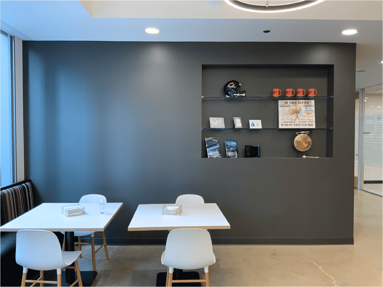
Each major conference room graphic was paired with a frosted acrylic plaque explaining the local connection—for example, how a landmark, landscape, or cultural symbol tied to Wipfli’s values of service and innovation. The layered design featured printed icons and translucent textures that gave the plaques a tactile, dimensional quality.
These details weren’t just decorative; they were purposeful. They encouraged employees and guests to pause and connect with the story behind each space—an embodiment of experiential design.
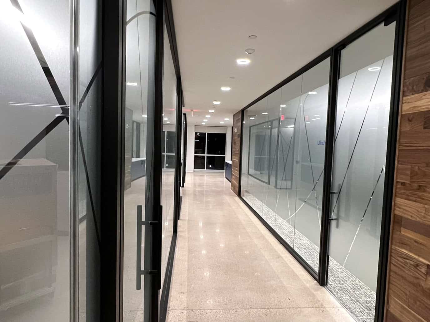
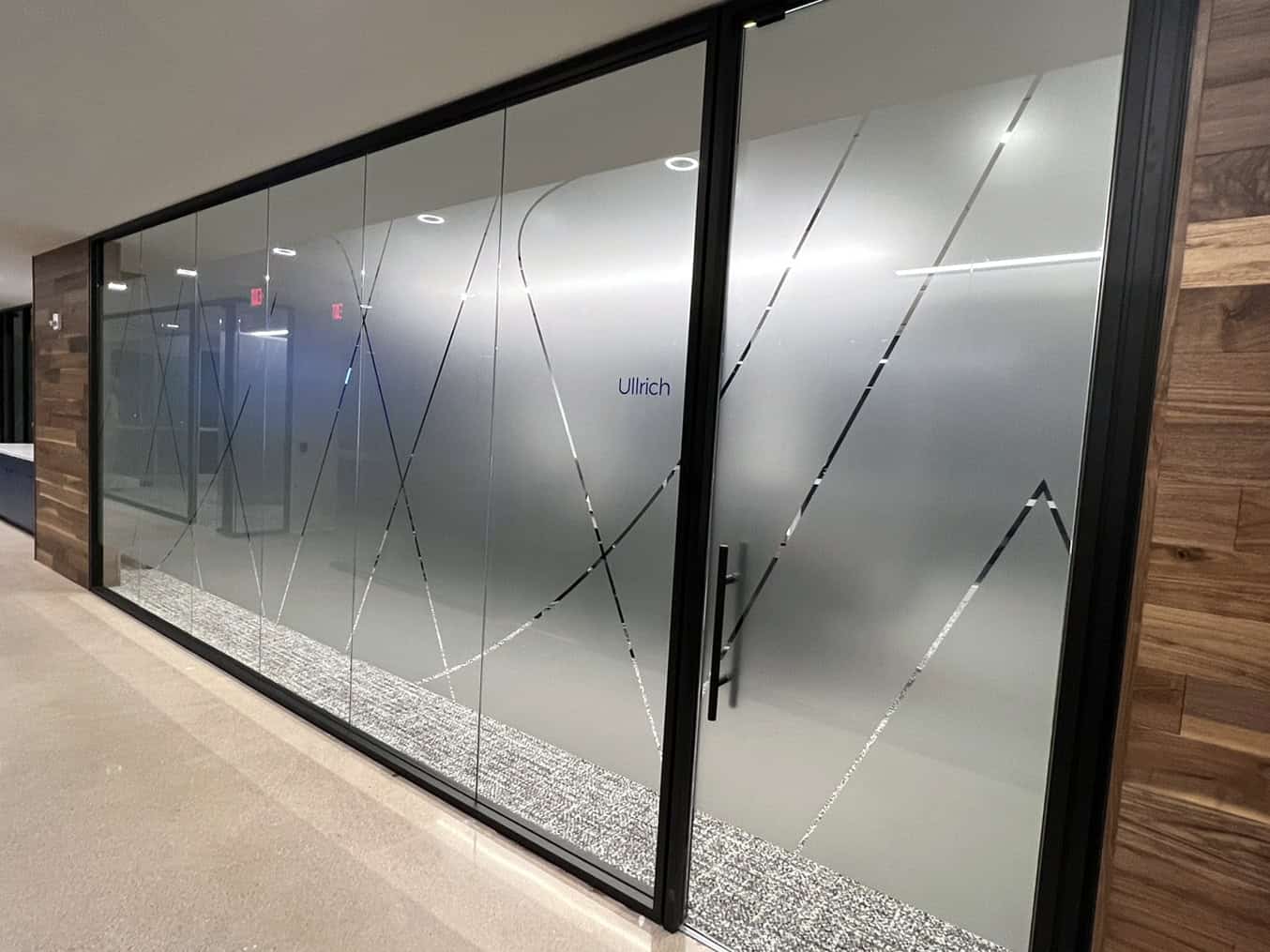
Custom glass vinyls provided privacy where needed while reinforcing brand identity. The design—an abstract “W” pattern—created cohesion throughout the space and carried the Wipfli mark into transitional areas without overwhelming them.
Beyond design, the success of the program relied on Thysse’s disciplined project management and communication.
Each site rollout involved coordination between Wipfli’s internal team, Thysse’s designers, print production specialists, and installers across multiple regions. Weekly progress meetings and shared documentation ensured that nothing slipped through the cracks.
“With a national rollout like this, things can easily get lost in translation,” Hodel explains. “Our job was to make it easy—the right visuals, delivered in pristine condition with clear labeling and instructions, on time—across every site.
There’s planning, coordination and communication that has to align with production, delivery and installation teams—as well as the client stakeholders at the site. There’s really quite a bit that goes into smooth execution, and it’s a critical step in the project. It’s a stage where things can go sideways quickly—so we really stay on top of it.”
Thysse’s on-site support team was there to keep installations on track. There are often challenges to overcome, but experience and a proactive approach delivered projects that were completed on schedule, on budget and on brand.
By the time the Chicago location wrapped, seven Wipfli offices had received the new branding treatment—each distinct yet unmistakably unified.
The system proved so effective that Wipfli’s in-house design teams began managing aspects of future rollouts themselves. With the templates, color references, and production specs Thysse had developed, they were able to bring some aspects of the broader rollout mission in-house while continuing to rely on Thysse for fabrication and print production.
“That was the goal from the beginning,” says Beth Hamacher, Director of Business Development—Facility Branding. “To create something that’s not just meaningful and beautiful—but scalable and maintainable. We set them up with a system they could run with. Our goal is always to find the smartest solution for our clients—not simply the one that costs the most. That’s true of our Wide Format team’s approach too. There are lots of ways we can do things, and sometimes the cost/impact ratio is wildly different across potential solutions—we’re transparent about that.”
The result of this multi-year collaboration is more than a set of coordinated offices—it’s a living brand experience.
Visitors now step into spaces that feel intentional, confident, and unmistakably Wipfli. Employees see their city reflected back at them, creating a sense of pride and place. And as Wipfli continues to grow, the framework Thysse built ensures that each new location fits seamlessly into the family while celebrating that local identity.
This is what facility branding looks like when it’s done right: brand experiences that simultaneously connect, inspire, and anchor the people who give purpose to the space.
The partnership between Wipfli and Thysse is ongoing, even as the rollout evolves across new phases. With the foundation set, Wipfli’s future offices—wherever they emerge—have a clear visual language to follow.
Each new location adds evidence that thoughtful facility branding helps organizations create experiences that infuse meaning and bolster the identity their logo represents.