Menu
Menu
Most conference room projects start with a wall, a rough idea, and a whole lot of potential.
Before the first quote gets drafted or a design gets mocked up, I’m usually already in the space—reviewing wall textures, measuring around outlets, and talking through goals with the client. Sometimes there’s an inspiration board. Sometimes there’s just a hopeful shrug. Either way, I’m building out estimates and figuring out what’s actually going to work.
Then the creative team swoops in with the magic. We prototype, proof, produce, and install. And when it all comes together? It feels effortless—which is exactly how we planned it.
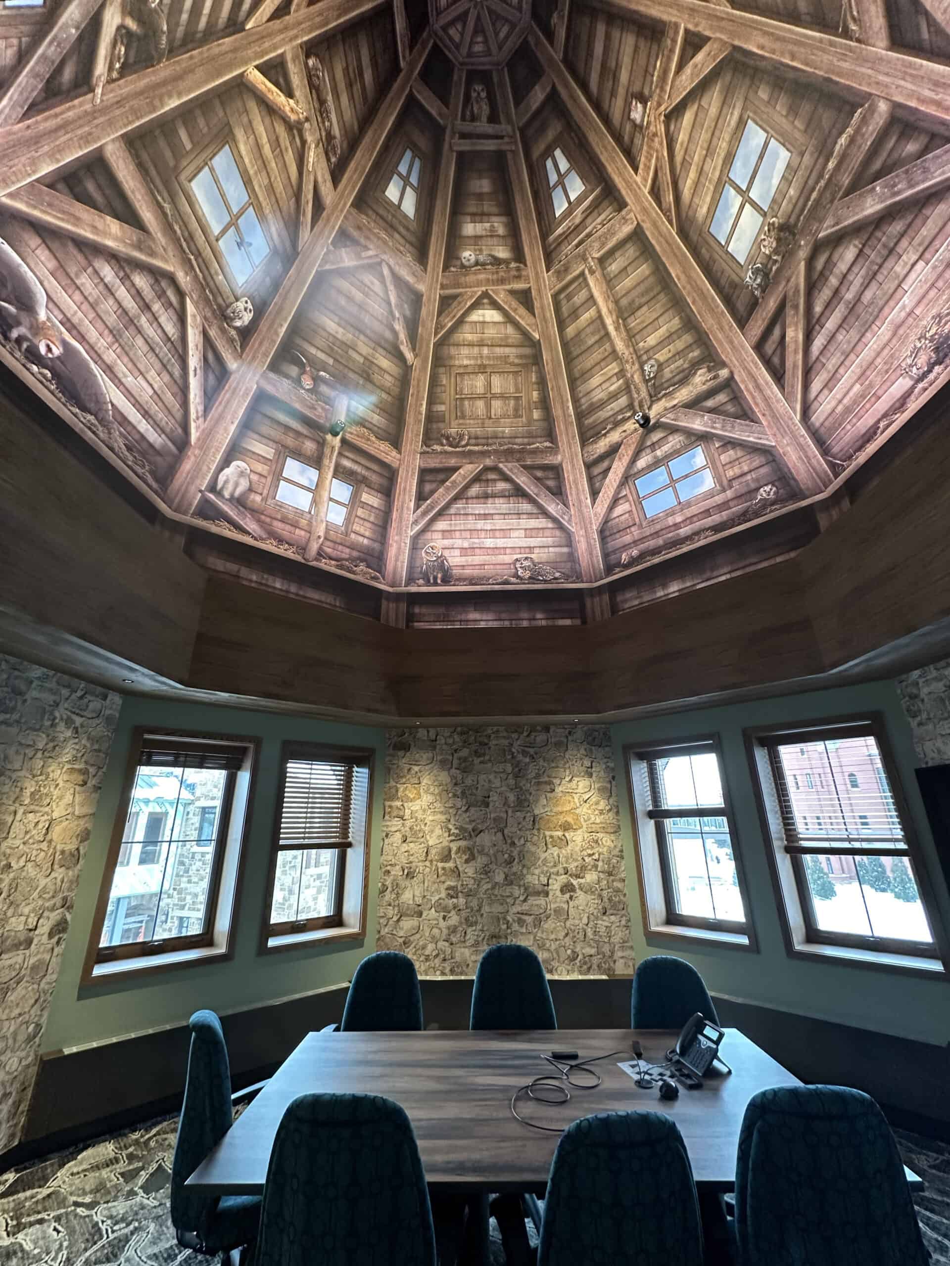
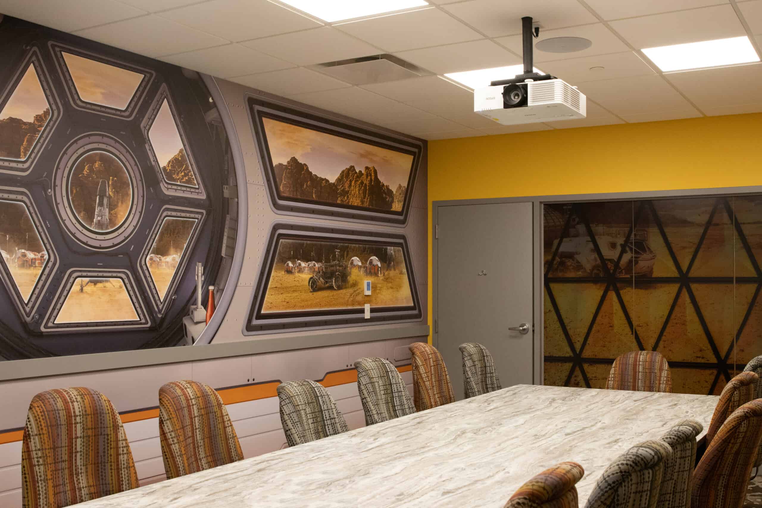
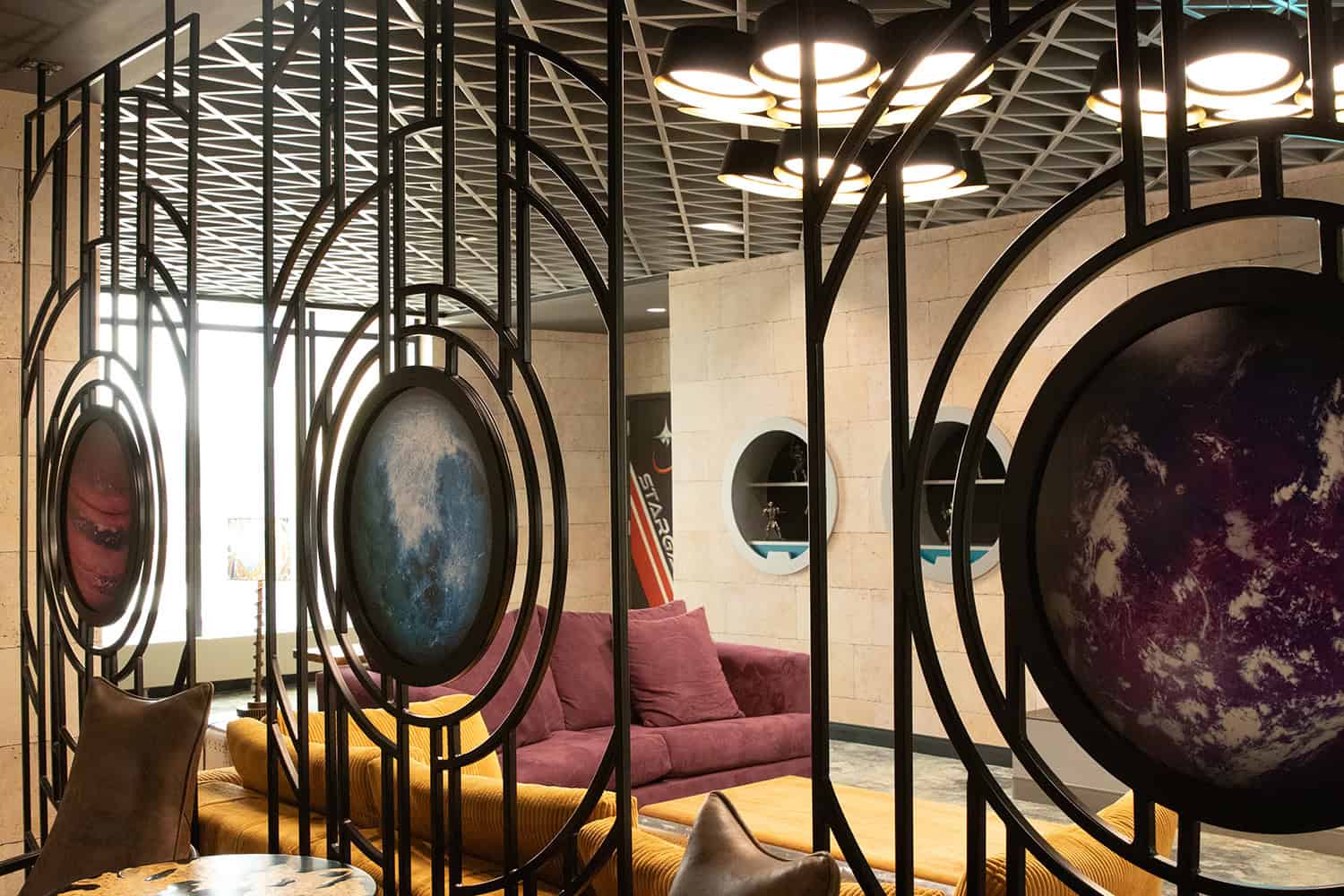
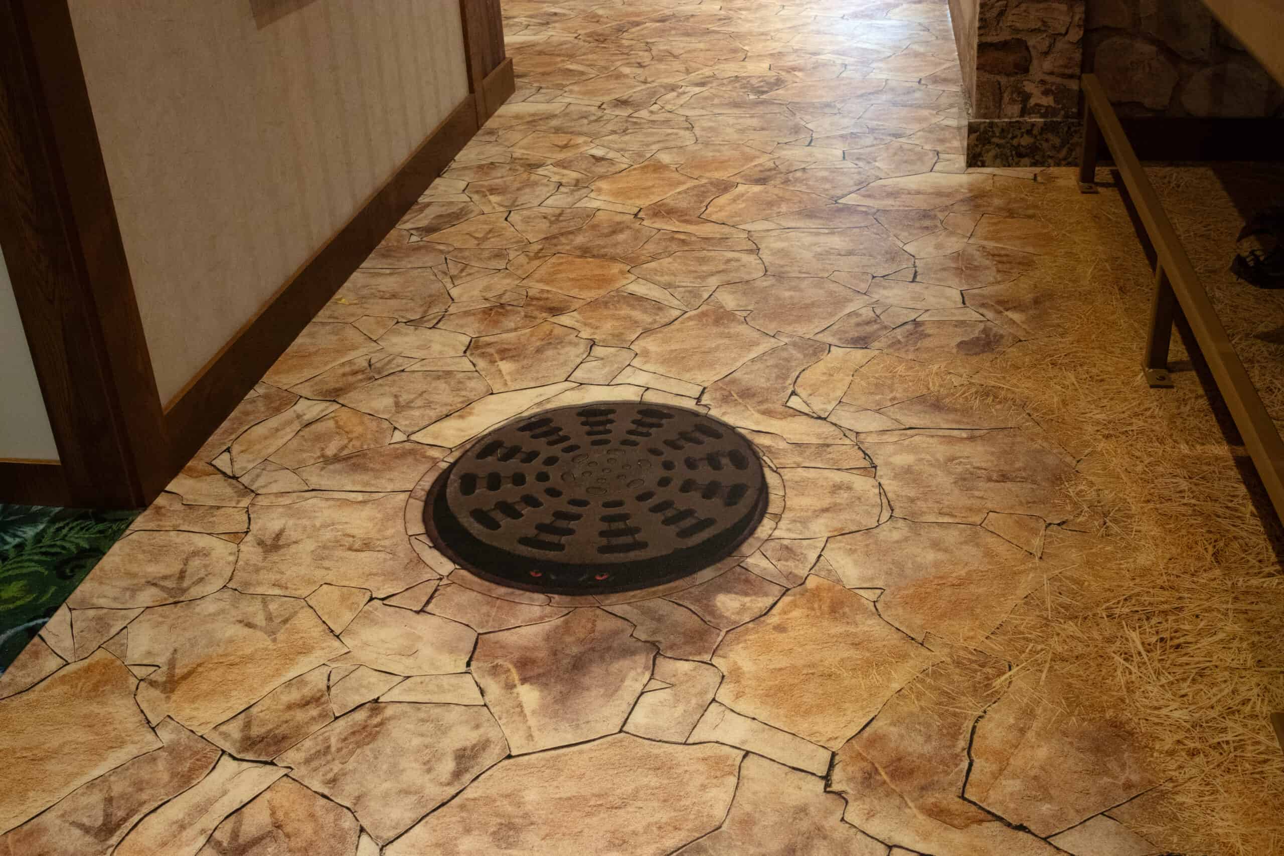
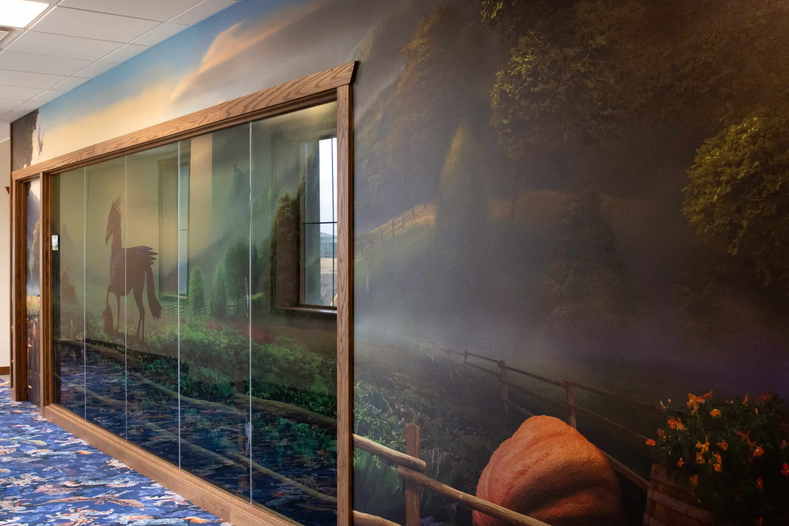
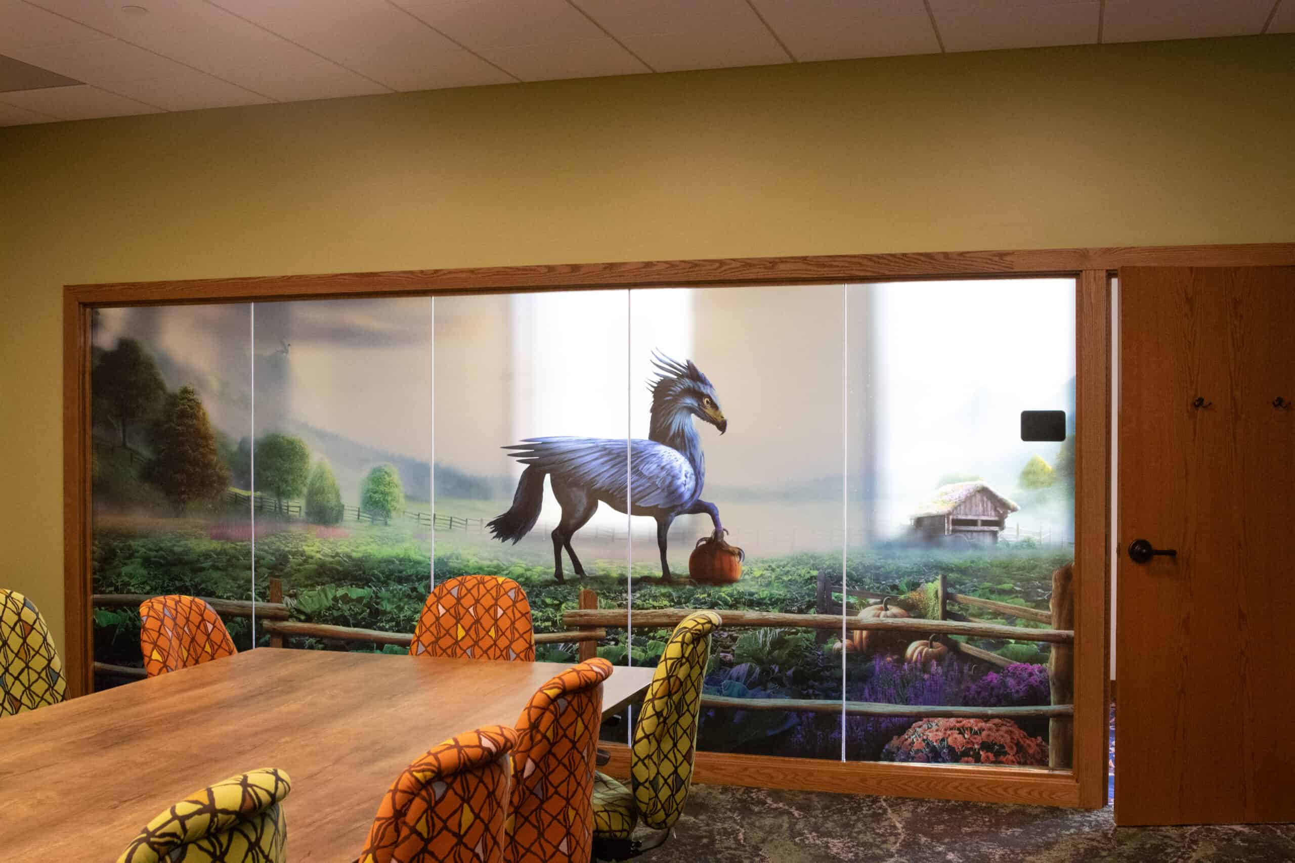
Conference rooms are surprisingly technical. The location of a logo matters. The wall texture matters. The placement of a single line of type? Yep—that matters too. Especially if there’s a giant table in the way.
Seriously though—hands down, furniture is the number one cause of office graphic fails. It's just so easy to overlook in new spaces. It seems strange to some clients, but we actually need to know what chairs, tables and cabinets they're planning to use. ...And exactly where they'll go."
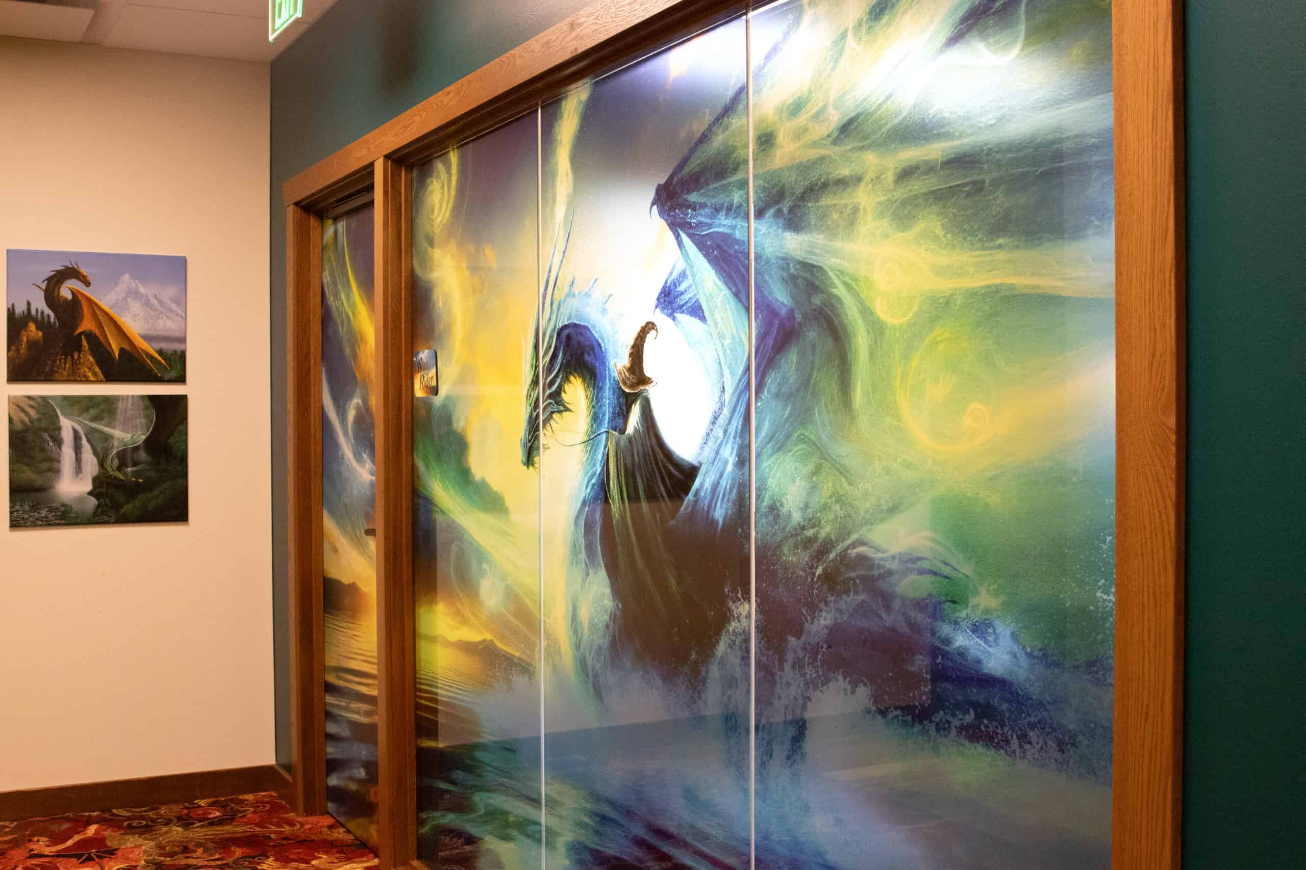
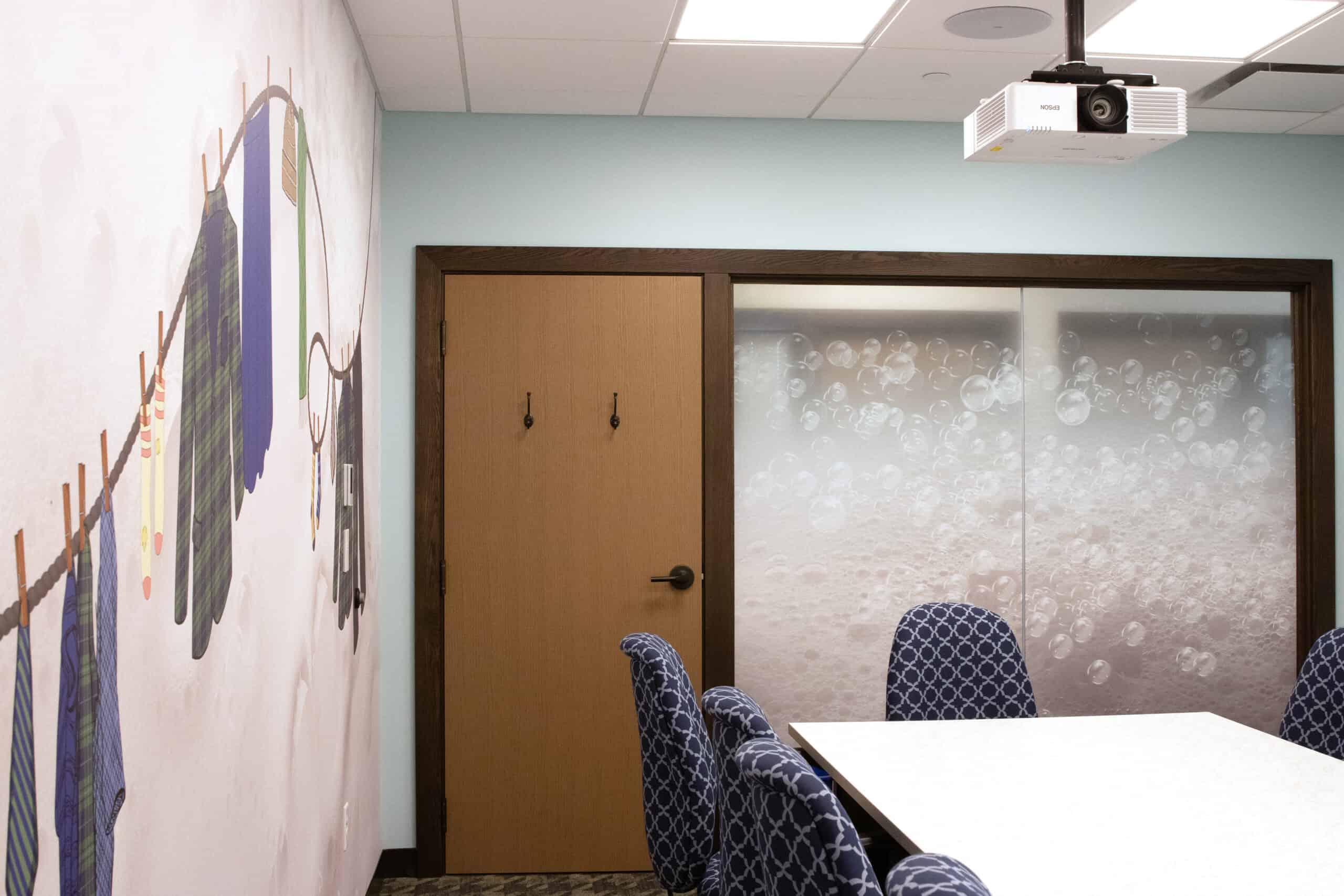
That’s why we consult on materials and install strategies before creative even begins—so their (or our) design team can do their best work knowing exactly what they’re working with. Privacy vinyl? No problem. Dimensional logos? Absolutely. Faux wood wallpaper with a ceiling wrap to match? We’ve done it.
Every project is a little different, but the goal’s always the same: make the space feel intentional.
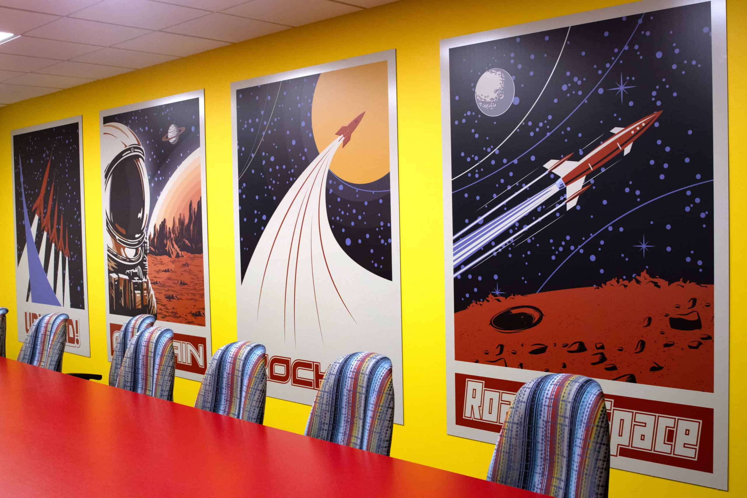
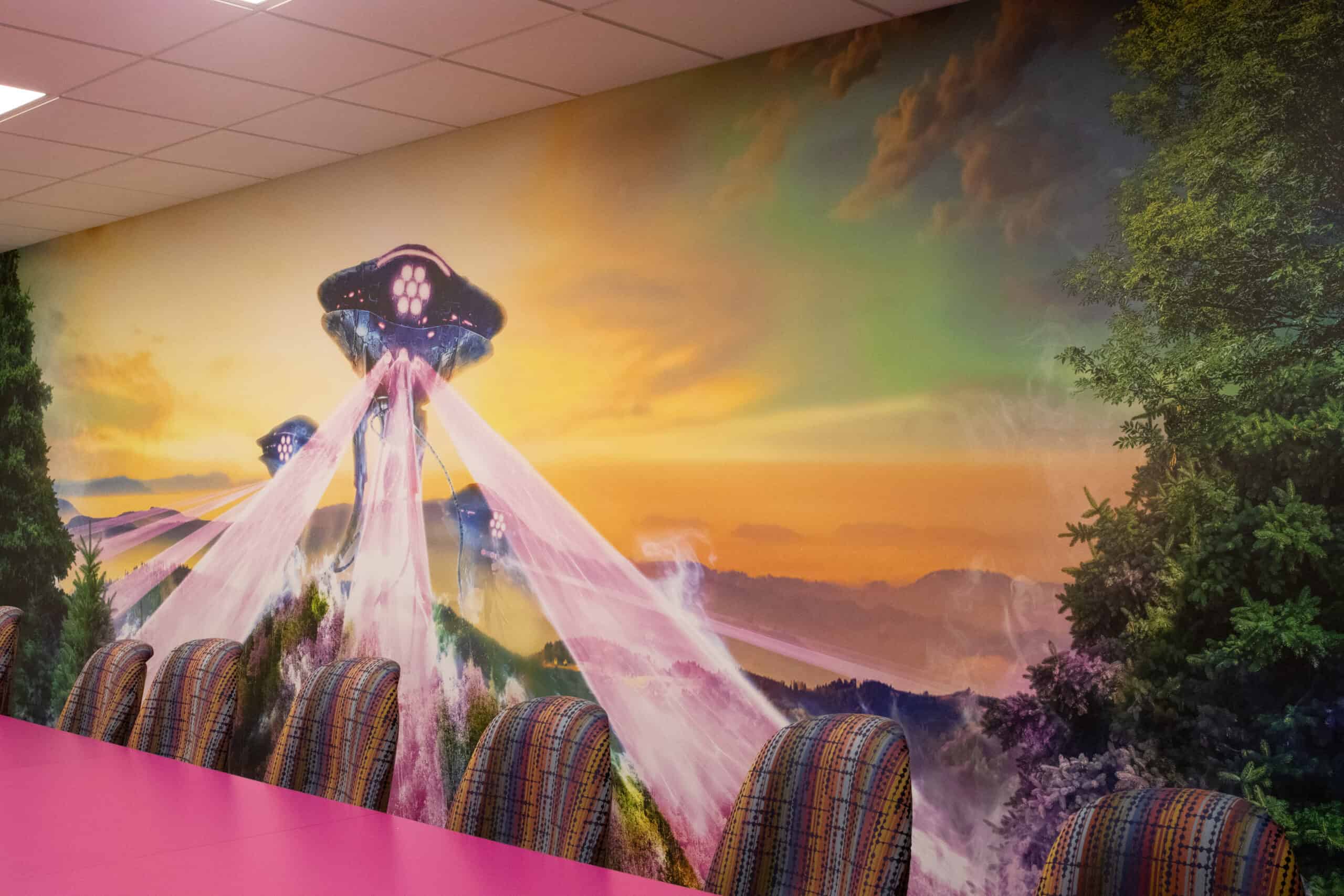
We’ve worked on rooms that just needed a simple visual anchor—a logo, a brand color, a single statement. We’ve also helped transform rooms into fully themed spaces, with textures, lighting, and layered graphics that feel more like a destination than a meeting room.
For corporate clients, conference room graphics support branding and professionalism. For nonprofits, it’s about warmth and connection. For fast-growing companies, it’s a way to bring consistency and brand continuity to team members and clients. The new location, expansion or renovation can reinforce that brand's identity and offer stability—even when things are evolving fast.
When people walk into a room that looks finished, it changes how they show up.
Thoughtful graphics set the tone without making a scene. They support privacy. They carry the brand. They make the space feel like it belongs to the people using it. And when they’re done right, they mostly stay out of the way—which is kind of the point.
If you're not sure what "finished" means, here's one way to look at it: you want the room to feel established. Put-together. Basically the opposite of that “I just moved out and hung up my college art” vibe.
Because we understand the full picture.
We’re often brought in early, alongside builders and facilities teams, so we can get ahead of the weird wall textures, access issues, or timeline surprises that show up later. We help plan, quote, prototype, and adjust—long before anything gets printed, let alone installed.
Then we stick with it through every stage—so when the final graphics go up, they land exactly where they’re supposed to.
So yeah. Big or small, simple or elaborate—it’s the same playbook. The devil’s always in the details, and that’s where we stay focused. It’s how we make it happen.